Hello!
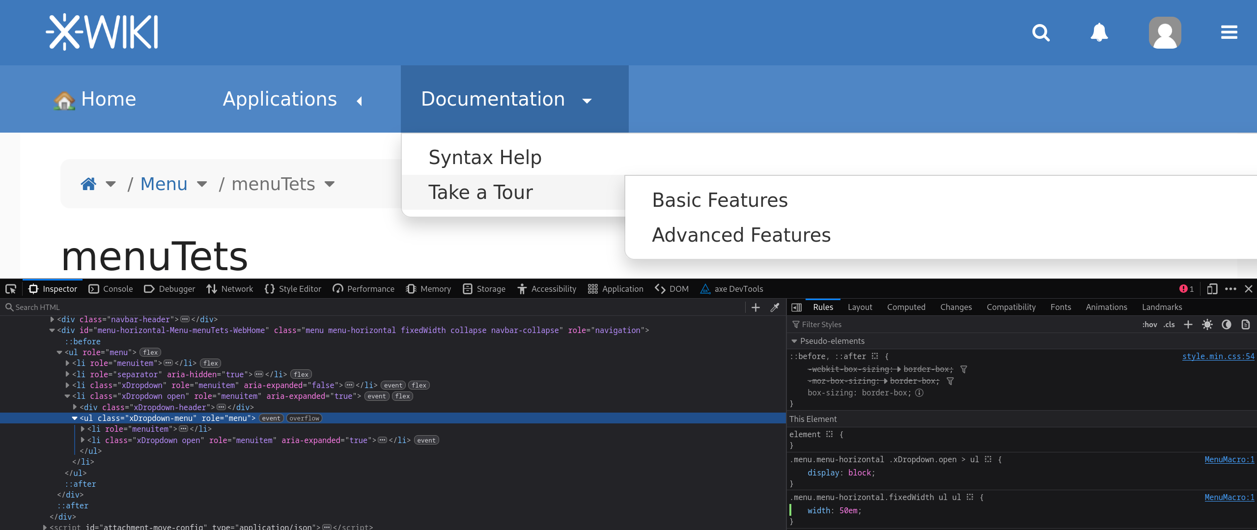
The arrow should point down when the submenu is opened through regular means.
We have a similar pattern for the administration menu accordeon and the navigation panel.
IMO this inconsistency should be solved the other way around, the breadcrumb is pretty much the only place where we have down pointing carets in the default state.
Note that at the end of Improvements to the default skin and Iceberg color theme - #7 by tkrieck @tkrieck proposed an updated design.
-1 from me to change the menu arrow directions.
+1 for the hovered direction of the submenu arrow. Currently they point down but it would make more sense for them to point to what was revealed on the right ![]()
+1, this inconsistency is my fault and I don’t remember it so it was probably just a style I forgot or some custom existing style that I tried to keep as is.
-1. It could be a usability regression for some menus that rely on this linewrapping.
Imagine instances with a 4-depth menu, it would be longer/harder to navigate if every level had a random width and possibly go over the edge of the screen.
We can consider increasing this 12em size (or even making it easily customizable), but I’m against trying to fit everything on one line. What would be the limit? Where do you cut the line when this limit is reached? How do you make sure submenus don’t go off screen?
For reference, there was a layout issue pretty close to this discussion: Loading...
Note that it’s completely okay to have on your own instance, but I don’t believe it’d be good for all users to get it through XWiki Standard ![]()
Thank you for starting the discussion here!
Lucas C.