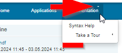
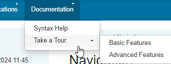
Upon moving from XWiki LTS 14.10.20 to 15.10.5 (also on 15.10.6) notice the following problems with the Menu macro, my case horizontal top menus, the sub-menu arrows changed direction (from pointing down to left) and flyout sub-menus have extra lines where they didn’t before:
Before 14.10.20
After 15.10.5 (or 15.10.6)
Info: Not sure if these were the arrows used before but during the upgrade the following were flagged as removed:
It happens if a menu element that has sub-elements is also a link.
If you remove the link from for example “Computer Education” in the Menu-Navigation page, the Dropdown symbol that is currently below “Computer Education” should go back up inline.
But obviously it is often desired to have that page also as a link.
Removing the link for me didn’t help, “Computer Education” is just too long so it wraps to the next line. I now think its a sizing issue which I compensated for when fist created my menu but now something changed. See my other post about space before and after.
Wow, thank you that was quick! In your Youtube Video everything looks very good now!
However I am probably doing something wrong when testing (on a normal stable release 16.0 Server).
If I go to /xwiki/bin/edit/Menu/MenuMacro?editor=object&force=1 and edit the SSX for Flamingo and at the very bottom paste this:
.xDropdown-header span a {
  padding: 0;
  display: inherit;
}
            /* Reposition the toggle when in a dropdown of fixed size
              to avoid eating away at the bit of space we have for the text. */
.xDropdown-header .xDropdown-header-toggle {
  position: absolute;
  right: 0;
  top: 0;
}
This is what happens:
The arrow always is on the top right position (even on the “top level”) and also the weird place in front of the link-text still exists. However the arrow is no longer on another line.
Also what is kinda weird generally is that the dropdown arrow is looking left when not hovered over and down when “opened”. This is probably as both the top level and the levels below it use the same button / icons, but levels below the top level open to the right instead to the bottom. But that is just a tiny non important flaw.
.menu.menu-horizontal>ul ul li.xDropdown {
    padding: 0px 0px;
}
The result is now:
The arrow on the “top-level” are still looking not fittingly, but the weird space before the link goes away. But I guess this addition is quite an “dirty hack” as I don’t really understand CSS too well and found that by try and error. That is simply the workaround we are using on our productive server for that space to go away.
It took me awhile to find where to make the changes (SSX?), but after seeing TomTheWise reply I figured it out and now I’m good. My menu is working acceptably well now.
Hello!
The code block you got should not be positioned at the end. The position is important because it is nested into other code blocks and its effects change depending on this nesting.
Here is a conversion to an “independant” block you can paste at the end of the StyleSheetExtension:
.menu.menu-horizontal>ul ul li.xDropdown>.xDropdown-header>span>a {
  padding:0;
  display:inherit
}
.menu.menu-horizontal>ul ul li.xDropdown>.xDropdown-header>.xDropdown-header-toggle {
  position:absolute;
  right:0;
  top:0
}
Those changes got merged to the project in March 2023, so you should already have it if you move to LTS
Can you elaborate on why this looks weird?
This is inconsistent with former versions of XWiki, but this is more consistent with other dropdowns available, for example: the navigation tree, the facet picker in advanced search.
I’ve been trying to make it more consistent across different UIs (there’s a project of adding some for the admin section clarity), and I’m interested to know what makes you feel like it’s weird
Thank you!! That new “independant” block works perfectly and very good!
What I mean with the dropdown direction: behaviour, every dropdown thing (also children macros and everything) opens the content below it.
But the content for example that opens when you hover over “Take a Tour” opens to the right, so it would make a tiny bit more sense if it would look to the right if opened. But this is quite unimportant and probably not worth the effort.
To be honest I agree with the notion that these arrows look strange, they don’t feel natural. Maybe our designers @tkrieck or @amilica could provide some feedback and suggestions for improvement here?
It is a bit strange, yes. The main menu in the header can use a down faced arrow, no problem. However, inside the menu, a right arrow is more descriptive of the action because the fly-out opens in that direction. Other software and OSes also follow the right arrow convention inside contextual menus.

