Hellooo everyone! ![]() I want to propose some small changes related to the spacing in the navigation tree.
I want to propose some small changes related to the spacing in the navigation tree.
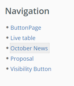
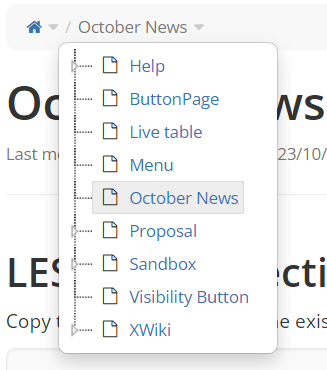
Current look
This is how the nav tree in the side panels looks like, currently:
This is how the nav tree in the breadcrumb looks like, currently:
Issues with the current look
In the first case (in the side panel):
- very little space around the current page name
- the current page name is very close to the bullet point
While being small issues, they make the UI style feel clumsy/unintentional and they consist one of the issues that bothered me since I entered my first XWiki instance ![]()
In the second case (in the breadcrumb), the spacing is enequal on the right and left side of the [icon+current page name] group.
Changes made
/* Tackling bad spacing on current page in nav tree
from the breadcrumb*/

.breadcrumb .jstree-xwiki .jstree-clicked {
padding: 0 9px 0 0;
border-radius: @border-radius-small;
}
/* Tackling bad spacing on current page in nav tree
from the side panel */

#leftPanels .jstree-xwiki .jstree-clicked, #rightPanels .jstree-xwiki .jstree-clicked{
border-radius: @border-radius-small;
padding:0 5px;
}

#leftPanels .jstree-xwiki .jstree-hovered, #rightPanels .jstree-xwiki .jstree-hovered {
border-radius: @border-radius-small;
padding:0 5px;
}
/* Alligning the rest of the pages in the navigation tree in the side panel
with the current page based on the latter's padding */

#leftPanels .jstree-xwiki .jstree-anchor, #rightPanels .jstree-xwiki .jstree-anchor {
padding:0 5px;
}
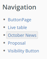
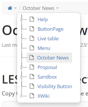
Updated look
In the side panel:
In the breadcrumb:
See changes live 
You can see how these changes look live in my own public instance: