As part of Loading... I started to work on moving the attachments tab to a livetable view, which will add the needed pagination, using also the All Attachments page as example.
Since this is a major change for the UI of the attachments, I would like to ask your opinion on it.
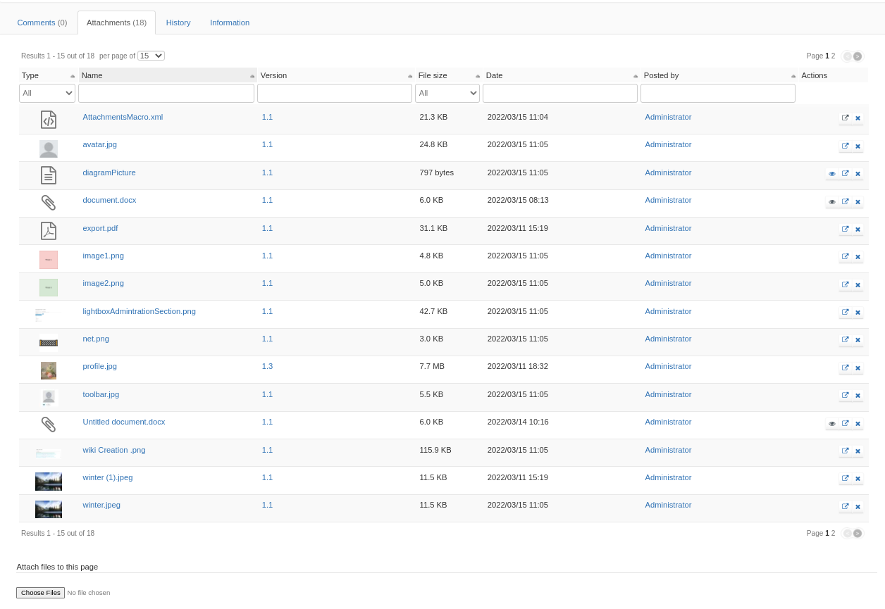
My proposal is to keep all the information, divided into separate columns :
Note that after closing this issue I will work on updating the code to use the Live Data Macro, instead of the current Livetable, which will give the possibility to hide some columns when a less crowded UI is wanted.
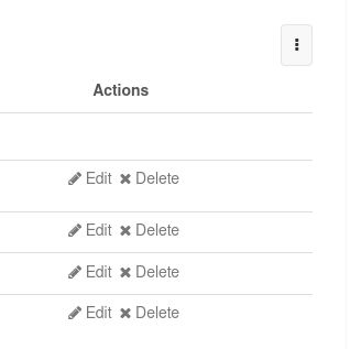
For the actions column, imo we should stay uniform with the other LT/LD actions and have the icon + the action name as a link.
In addition, @MichaelHamann observed that the current attachment icons are very small. This is creating usability issues since that make them difficult to see and click.
+1 especially if you work on using a livedata for it since at first sight it looks like a lots of column indeed. So would be nice to be able to remove some.
Re the actions column I agree with @mleduc it should not only display icons but also the action title. Especially since the icon for “rename/move” is really confusing.
I remember providing some feedback already but I don’t recall what was the answer.
So putting again some thoughts here:
I wonder if it’s not too much to display all these columns at once, that looks crowded (much more crowded for sure than the current attachment view). With LDs you have the option to hide columns and they’re still available for users to show them if they want or to filter on them. Maybe that could be a solution for file size & posted by for example.
OTOH all these info was available before but I’m a much more condensed way. I wonder if a different LD layout wouldn’t look better. We could imagine a LD view similar to what we have now, with a list of attachments displayed as:
The LD filters would still need to be able to filter the information but that’s a feature of the LD already.
The author should display an avatar IMO. If the column is of type User I think it’s automatic. That looks like something to fix.
I think we should display less than 15 entries by default, I’d say 5.
So IMO we could push what you did (with the author fix and maybe the 5 entries displayed only) and then quickly move to LD and discuss if we want the compact layout.
Any others who think that the shown view above is too crowded/complex for a docextra tab and that using a view like the current one would be better?
+1 with the action names in the links. I think this is all about consistency. While the view is more crowded it is easier to understand for users that know this kind of table. I’m wondering if we could remove the “version” column (or at least hide it by default) and instead add an explicit “history” action to the actions column (which you can otherwise reach by clicking on the version number). I think it took me quite some time to find out that there is a history view for an attachment and how to reach it.
Indeed, I agree it would be nicer and more consistent with documents (in the doc LT we don’t display the version in a column for ex) and a better UX to discover history.
Indeed, this is better than an entire column for version. Thanks!
@vmassol thanks for the feedback! I opened this post as an answer to your suggestions from my PR, to be easier to gather opinions.
I also think that these changes could be pushed, with the applied suggestions, and a new proposal should be done just after, when moving to LD, to solve any possible UIX regressions.