I see how this user is setting a column width on a table directly. I would like to default the minimum column width in a way that will default a rule for any pdf export. I can’t expect my non-technical users to edit source.
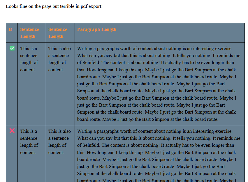
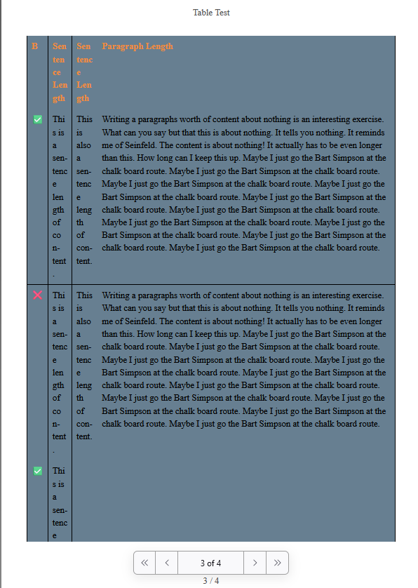
I have a table with several smaller columns (containing a single sentence’s worth of text) followed by a column containing a paragraph’s worth of text. I want the lion’s share of the width in the exported pdf devoted to the last column, however what’s happening is too extreme. The sentence size columns are literally a single character or two in width (due to kerning looks like) including the headers.
There is actually some nuance here too. If a column only contains single character it would be ideal to be a single character width. The minimum should apply only before the column starts wrapping text.
Table source:
|=B|=Sentence Length|=Sentence Length|=Paragraph Length
|✅|This is a sentence length of content.|This is also a sentence length of content.|Writing a paragraphs worth of content about nothing is an interesting exercise. What can you say but that this is about nothing. It tells you nothing. It reminds me of Seinfeld. The content is about nothing! It actually has to be even longer than this. How long can I keep this up. Maybe I just go the Bart Simpson at the chalk board route. Maybe I just go the Bart Simpson at the chalk board route. Maybe I just go the Bart Simpson at the chalk board route. Maybe I just go the Bart Simpson at the chalk board route. Maybe I just go the Bart Simpson at the chalk board route. Maybe I just go the Bart Simpson at the chalk board route. Maybe I just go the Bart Simpson at the chalk board route. Maybe I just go the Bart Simpson at the chalk board route. Maybe I just go the Bart Simpson at the chalk board route. Maybe I just go the Bart Simpson at the chalk board route.
|❌|This is a sentence length of content.|This is also a sentence length of content.|Writing a paragraphs worth of content about nothing is an interesting exercise. What can you say but that this is about nothing. It tells you nothing. It reminds me of Seinfeld. The content is about nothing! It actually has to be even longer than this. How long can I keep this up. Maybe I just go the Bart Simpson at the chalk board route. Maybe I just go the Bart Simpson at the chalk board route. Maybe I just go the Bart Simpson at the chalk board route. Maybe I just go the Bart Simpson at the chalk board route. Maybe I just go the Bart Simpson at the chalk board route. Maybe I just go the Bart Simpson at the chalk board route. Maybe I just go the Bart Simpson at the chalk board route. Maybe I just go the Bart Simpson at the chalk board route. Maybe I just go the Bart Simpson at the chalk board route. Maybe I just go the Bart Simpson at the chalk board route.
|✅|This is a sentence length of content.|This is also a sentence length of content.|Writing a paragraphs worth of content about nothing is an interesting exercise. What can you say but that this is about nothing. It tells you nothing. It reminds me of Seinfeld. The content is about nothing! It actually has to be even longer than this. How long can I keep this up. Maybe I just go the Bart Simpson at the chalk board route. Maybe I just go the Bart Simpson at the chalk board route. Maybe I just go the Bart Simpson at the chalk board route. Maybe I just go the Bart Simpson at the chalk board route. Maybe I just go the Bart Simpson at the chalk board route. Maybe I just go the Bart Simpson at the chalk board route. Maybe I just go the Bart Simpson at the chalk board route. Maybe I just go the Bart Simpson at the chalk board route. Maybe I just go the Bart Simpson at the chalk board route. Maybe I just go the Bart Simpson at the chalk board route.
In XWiki web app:
In PDF Export:
Other thoughts:
The pdf view looks like it’s close to flexing the column width so that the row length is as short as possible, but for this case that doesn’t work out well. Part of the challenge is landscape/portrait (although making my browser window narrow always looks better in the webapp than the pdf export). Maybe a table just isn’t the ideal way to capture longer form data, and I can definitely reformat/restructure without using tables. It works well in the webapp itself though, which makes it frustrating. Maybe if there’s a way to make a rule that no column with text wrapping is say more than twice the width of any other wrapped column? Obviously there are cases that just will never work (adding more sentence length columns will quickly lead to no possible solution), but it looks to me like we aren’t there yet.
Example rules that I think will look better, but I don’t know how to implement:
So, the column with the cell with the most content should be say no more than twice the width of the other columns. Unless this results in cells with no wrapping, in which case those cells should be equal in width to their unwrapped content, yielding any remaining space to the column with the cell with the most content.
I’m not married to that “double” rule. It’s just an example. Very open to whatever will look best.