What do you think of the items proposed here? Do you disagree with adding such an icon to the XWiki icon Set? Do you think a different mapping would be more appropriate for some icon themes?
In one week, if no negative view has been shared about those proposals, I will:
Add a line in the doc about this wording / icon consistency rule.
Create a ticket and a PR to implement this new icon on FA4 and Silk in xwiki-platform
Create a PR to implement this new icon on the FA5, material icons and glyphicon extensions.
Thank you for your interest in this proposal!
I’m looking forward to your feedback
Lucas C.
Is there any reason why you chose repeat icons and not undo icons? For example, from Font Awesome I would have used the undo icon as it allows you to undo the customization. In general +1 for adding such an icon.
No specific reason. I just text searched icons in FA and repeat was the first appropriate one I found.
IMO undo is a bit less specific than reset: undo gets you back one step in the edition process while reset gets you back the whole way – it’s kind of a undo all action.
We already have an undo icon in the XWiki icon set, it’s not mapped on Glyphicon or Material Icons (see a bit above https://www.xwiki.org/xwiki/bin/view/Documentation/DevGuide/FrontendResources/Icons/#HIconstrategy ). At least for Material Icons the mapping is straightforward. EDIT: We also already have icons for rotate-right, repeat and refresh I should have taken more time to check alternatives before starting this proposal. /EDIT
PS. Updated the Material mapping in the first message, the refresh icon looked more similar to the other mappings I proposed to use.
I am going into this with the premise that reset is a sort of undo, but with only one step “back to factory default” way of working.
The most common thing I’ve been seeing with undo in icon form is a back button of sorts. Sometimes circular, sometimes a skewed arrow, but always backward (not considering RTL languages). There’s also pure text form, which in my opinion is clearer but can also feel very heavy on the visual side.
From what I’ve researched, we have some pointers toward the circular back arrow.
CK Editor (not circular, but pointed backwards)
Obsidian
Notion
Regarding the circular forward button, the issue is that it is also used by Chrome and Firefox as a “reload page” button.
Left-pointing or right-pointing arrows may be a matter of culture? Much like LTR or RTL writing? I don’t know.
About using an arrow to mean reset, maybe it could be confused?
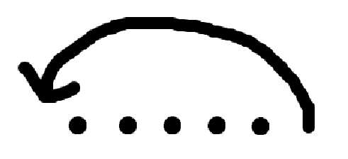
I was thinking about something like a series of dots then an arrow that points to the first one, but couldn’t find anything online:
I think an icon like Restart alt Icon | Material UI would be the most semantically sound, but I’m quite sure we don’t have anything like that in the fonts we use.
The main question we need to address in order to close this topic then becomes: Should we include icons in the XWiki Icon Set mostly for semantics?
Technically we can already access most of the icons proposed above from the icon set. However, the semantics will be slightly different (it can be difficult to find if you don’t know the icon set perfectly) and some mappings might not be the same.
It’s related to the fact that we didn’t chose yet between Object based and Concept based for our naming convention (I failed to identify this choice when we voted for the icon naming convention). Note that Silk is heavily object based, while FA is more concept based, so currently the XWiki Icon Set is a mix of both…