My reasoning is to have the most important and first visualized field at the top, so the user can start filling them right away. Having them at the end means that the user will need to spend more time to find the required fields, even if it is a small form.
We can play around these buttons during implementation, but just to give an example, below is a picture with different configurations.
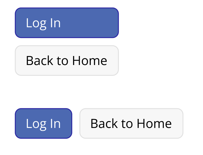
Login and registration icons are not universal, at least during my research I could not identify any pattern in other applications. We could apply only icons and see how it turns out, but I fear they will be not as effective communicating the action as the labels.
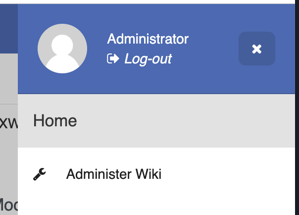
This is the behavior we have today, the user icon is replicated in the header and in the sidebar, see the screenshots below. I have some ideas to remedy this, but they will be part of a different proposal.

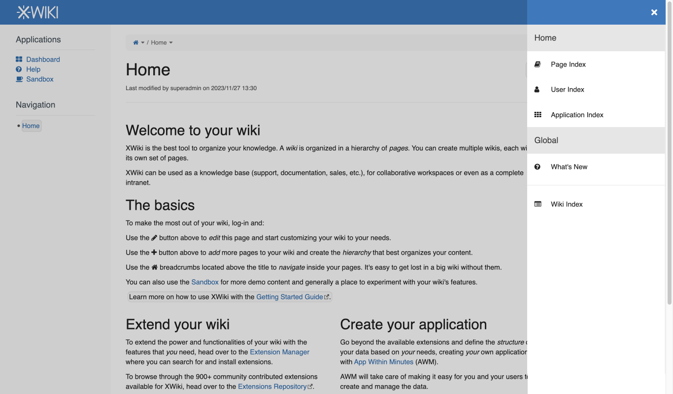
When the user is logged out, yes it would be empty, see my mock below. For now, I kept the blue bar to keep things aligned, but we could remove it and see if it fits better.
Agreed on both points, I will update the final design page with these.
Nicely put. I could not have explained better myself.