To kickstart 2024, I would like to propose some adjustments to the registration flow in XWiki. Doing some desk research, I found some issues regarding the whole process that could be improved with a few changes.
The main issues are:
Registration on the default distribution is not immediately visible.
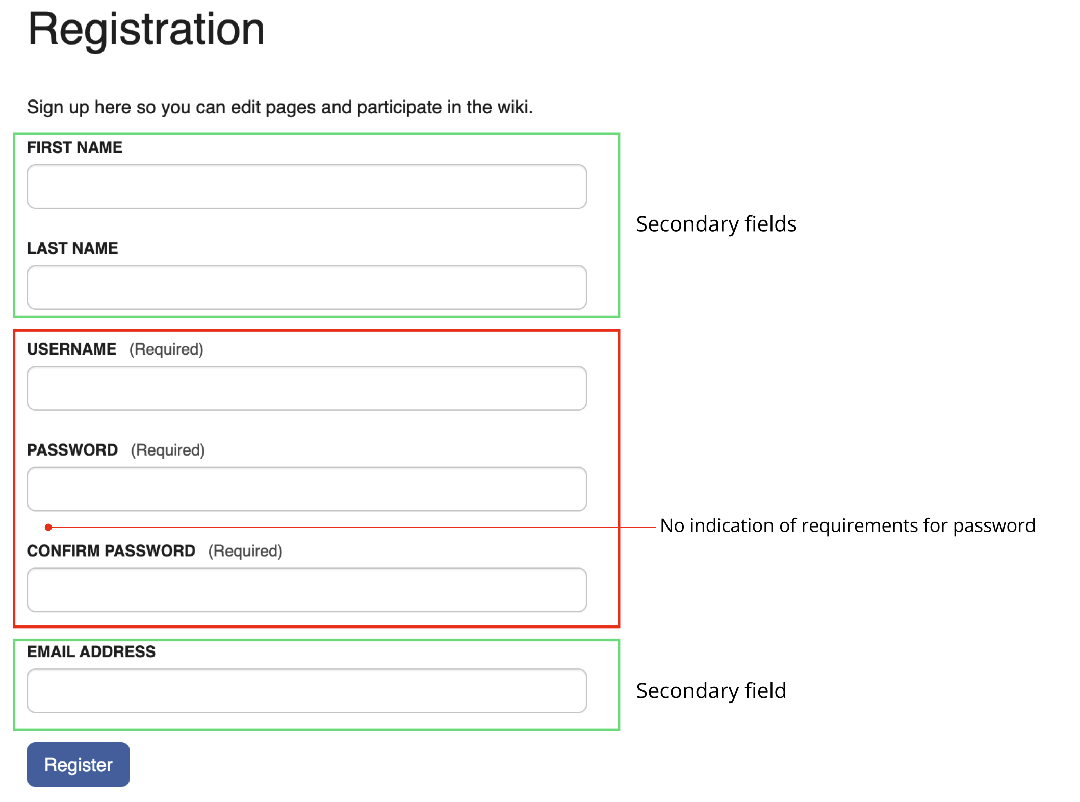
Password rules are not visible to the user and rely on a trial and error method until the password meets the requirements set by admin.
The registration message and design is very bland.
How to improve?
Below you can see some mockups for these issues.
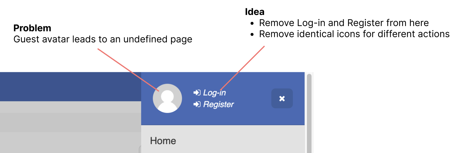
A - Registration on the default distribution is not immediately visible.
Currently, the buttons for registration and log in are hidden inside the sidebar, requiring the user to search for them. My proposal is to have these links always visible in the header as links and without icons.
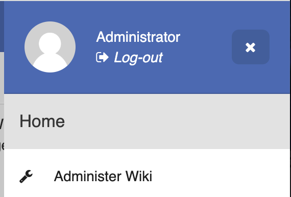
Logging out
This action will be kept unchanged. While the position of the action will be different from logging in, logging out is mostly a secondary action and IMHO could be hidden at a first glance.
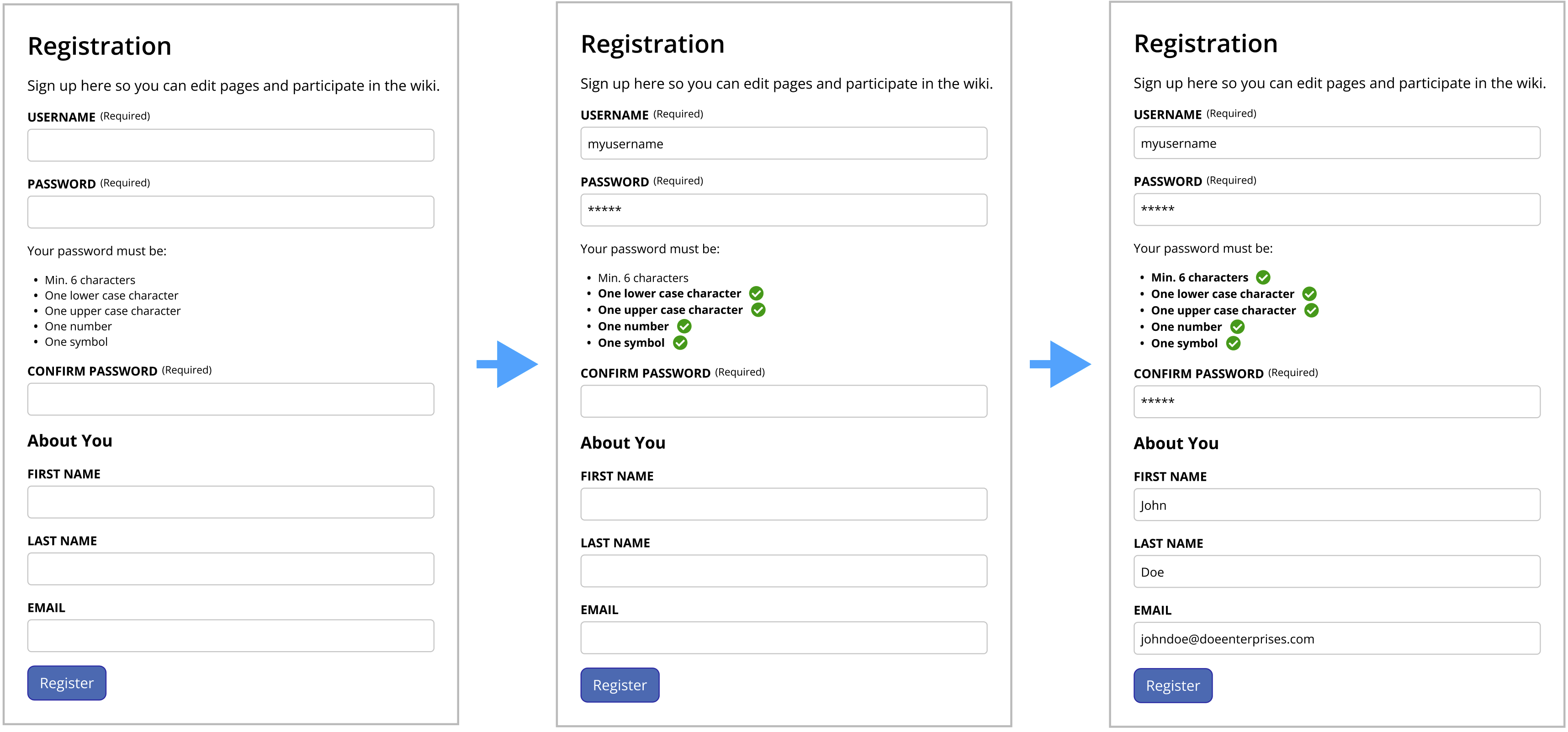
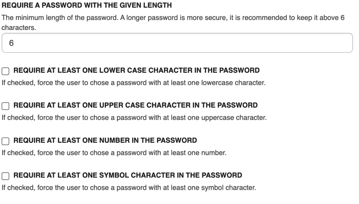
B - Password rules are not visible to the user
It would be nice if we could have the rules written on the form itself, so the user can think of a password and immediately validate it against all rules. We already have a validation, but it is a single message that keeps changing.
Still on this form, the required fields were moved to the top of the page, so they are immediately visible and actionable.
C - Better message registration and design
This is mostly a visual design issue, on this page we have very little information so we can have more decorative elements and a clearer hierarchy of elements.
Is this really the plan, or you just forgot that we currently have the user profile photo (and the notifications controller) between the search and the menu button when we are logged in ? I see no mention of removing that in your proposal.
Looks good. It always bothered me that the register and login were so hidden.
thanks for working on this! Globally +1 on all the proposals.
About the register/login hidden not that it will also probably solve a usability issue when javascript is not working, and I’m personally wondering if we shouldn’t move also logout (or make it available from user profile maybe), for the context see: Loading... and in particular my last comment on it.
About the register form itself I have one question: if CAPTCHA is required where do you put it, at the top or close to the register button? Also email field can be required so I’m wondering if it shouldn’t always be moved up.
The captcha needs to go close to the register button as it has some time constraints. It’s best to have the user resolve it when they are ready to submit the page.
Regarding the e-mail, agreed I will update the proposal.
I’m just wondering if adding an image to the successful registration page is really needed as it make the page heavier for not much added value (or, might be valuable but I’m missing something).
Also, did you check if the current information we have on password validation is enough to generate the nice list with green checks you propose on the registration form?
It is not necessary. I added it mostly for visual interest and to keep things fresh. But we could get away with it, like this version below. In this case I would left align the whole page to keep it in line with the registration title. With the image applied, this pattern is not necessary.
It is important to note that only the checked options in the admin page would be shown on the registration page. So the list could be all 5 items or any combination between them.
I just have some issues with the proposed order for the fields (to me, it makes more sense to put the personal information at the top, and the more “technical” and required part closer to the registration button).
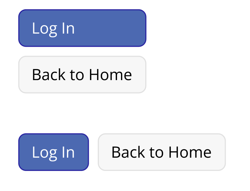
Also, some nitpicking: on your second proposal (without the registration picture), it feels wrong to have left aligned buttons with the smaller one on top. I think I would keep the global centering even without the picture, which would align with other UI elements such as confirmation pages.
Should these be icons rather than text or do you think text is needed and why? (hard to find some obvious and well known icons?). It looks a bit odd seen that other items are icons, also makes it more (too?) visible maybe.
Would the user icon also be visible inside the drawer (in which case, isn’t it some duplication)?
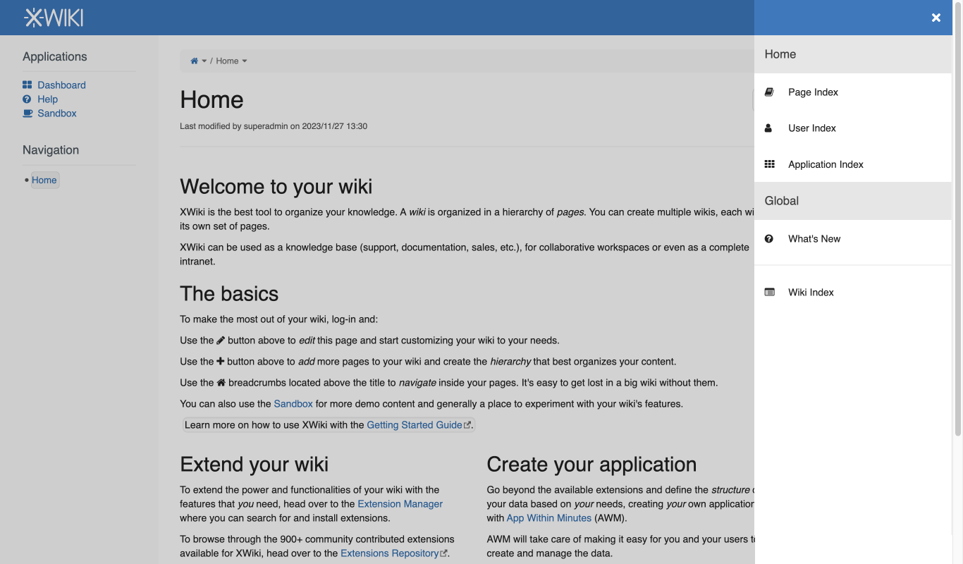
+1 for the idea, however I have a small comment: What would the top section of the drawer look like in your proposal? It’d be pretty much empty (except for the ‘close drawer’ button) so maybe it’d be good to remove this blue background header in this situation.
+1 from me on this point too
Form validation is a bit complex regarding accessibility (lots of specific markup and strict rules), but it’s also a critical step in ensuring accessibility of XWiki. So it’d be good for whoever ends up implementing this to take into account assistive technologies users (I can help too if needed ).
I suppose the username is only used if none of the two fields (first name and last name) are not provided. We can just fallback on using one if there’s only one provided IMO.
+1 from me on this point. Maybe we should also provide the name of the wiki instance in this welcome message, just to make things as clear as possible.
It seems to me like undraw images are SVG, so they are not too long to load. I just looked it up and this one is 8.5 kB. I’m not very knowledgeable about optimization but this seems like an okay load to me
For reference, noavatar.png is 1.4 kB.
In my opinion, finishing registration to a wiki is a crucial step for a user, and we want them to recognize and remember this step. Finding proper words to explain why I think this is difficult ^^’
This is a first step to contributing to the wiki, and displaying a special page makes this look like an achievement towards being an active member. On paper, what we have as of now is also a special page only shown when finishing the registration, but it’s featureless and easy to completely forget about.
This achievement encourages users and shows them that they are on the right path (might be a step towards gamification? ). In my opinion it can be a slight incentive for non-technical users to stick with XWiki. For power users and people who already are part of the community, I agree that such a picture would be useless.
My reasoning is to have the most important and first visualized field at the top, so the user can start filling them right away. Having them at the end means that the user will need to spend more time to find the required fields, even if it is a small form.
We can play around these buttons during implementation, but just to give an example, below is a picture with different configurations.
Login and registration icons are not universal, at least during my research I could not identify any pattern in other applications. We could apply only icons and see how it turns out, but I fear they will be not as effective communicating the action as the labels.
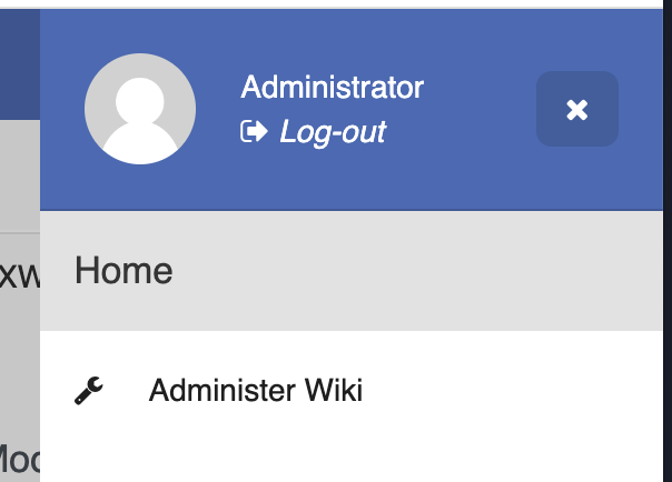
This is the behavior we have today, the user icon is replicated in the header and in the sidebar, see the screenshots below. I have some ideas to remedy this, but they will be part of a different proposal.
When the user is logged out, yes it would be empty, see my mock below. For now, I kept the blue bar to keep things aligned, but we could remove it and see if it fits better.
Hey everyone, thank you all who participated so far. As most people have agreed on the changes, I will mark this post as solved and update the final proposal.
Two points remains to be tested during development, use of icons instead of links on the header, direction of the buttons at the end of the registration process. These two are very easy to change on the frontend, I’ve left a note on the final proposal here: https://design.xwiki.org/xwiki/bin/view/Proposal/Registrationflowupdates
If you have any questions, issues or ideas for this proposal, please get in touch.