Here’s why I believe this could be a valuable addition:
Common Use Case
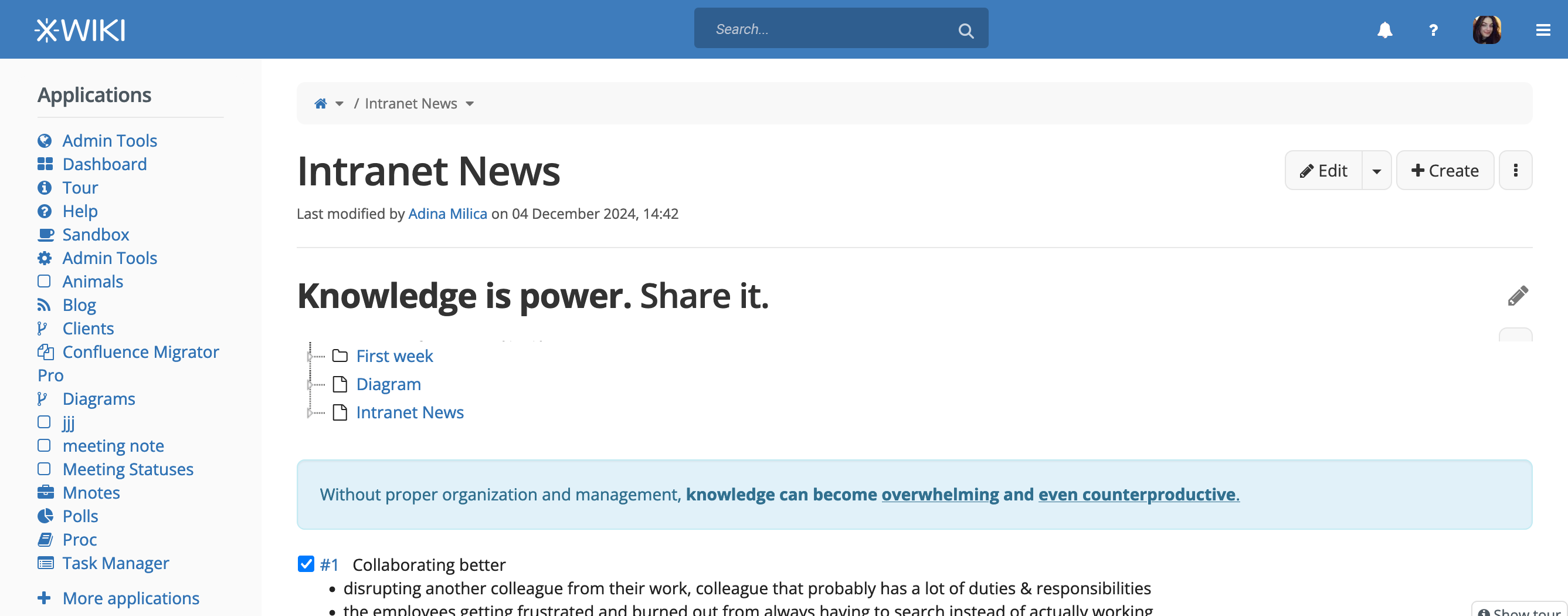
Many content heavy platforms (Wikipedia, Youtube, Spotify) prioritize a prominent and easily accessible search area, often centered on the interface. This design choice helps users locate the search functionality and can speed up the process of getting to a desired content.
XWiki’s Diverse Use Cases
XWiki instances vary significantly in scope. For smaller to medium sized instances, a centered search box might not feel necessary. However, for larger instances with deeply nested and extensive hierarchies, having a highly visible and central search area could be a good feature in terms of usability and efficiency.
Current Situation
While it is technically possible to customize the search box to a centered position today, these methods typically require coding skills. This creates a barrier for users without technical expertise who want to make their instance more search friendly.
Proposed Solution
The proposal introduces a customization option for a centered search box that does not require coding. This option could be located in the Global Administration section, under the “Header” Section of the Presentation menuitem under Look & Feel. At least it seemed an appropriate place for it, let me know if you have a better option.
Important: Default Behavior Remains Unchanged
This proposal does not alter the current default behavior of the search box, which remains positioned on the right side of the header. This ensures that existing setups are not disrupted, while offering flexibility for those who wish to enable a centered search box.
0 for me since we don’t see a default usage for it (if it was proposed as an improvement to what we have I’d be +1 - with the right justification). It adds to the complexity of XWiki, see below. I’m putting 0 since I don’t want to block it if we think it’s needed.
I don’t remember having seen the request enough to warrant a config option in the Admin UI for it (maybe I’m wrong). And it’s still possible to do it for the few cases where it’s needed (using UIX or SSX or skins). What I’d have done is add a FAQ entry with the solution for doing it.
Note that adding this has a cost:
One more feature to code/maintain/document
More clutter and harder to use XWiki in the Admin UI
I think it’s hard to decide where we stop in term of offering easy to change UI options. For example what if someone asks for the ability to move the drawer menu to the left of the logo for example. This is probably a bad example (but you get the gist) since a centered search is probably a more common and a more useful config option than a left drawer XWiki already allows to do a lot through UIX/SSX/JSX and Skins.
Side note: I guess this could also be implemented as a contrib extension too and this could solve the negative points listed above.
I’m also not convinced by the usefulness of such a configuration option. If the problem is that the search is not visible enough then I’d rather add a configuration to have the search input always expanded, but even for this, as Vincent noted, it may be simpler to document how to do such a customization.
Thank you for the proposal, Thiago! It’s something I’ve contemplated in the past too.
Custom UI problem
I think a centered search is better generally UX wise, but that is for a platform that does not rely on extreme customizations as part of its selling point / income stream.
In many XWiki custom projects I’ve seen, the menu was added to the header (which is much more elegant than having it as a secondary bar under the header). So, for many usecases, many people might actually prefer having the search bar on the right side.
If we go on the XS route:
I think a more subtle centered search bar could be good, but this search bar should move automatically to the right if the user adds items to the header.
What I’m trying to say: if we change the search bar’s position to the center, we shouldn’t make its position configurable, but adaptable by code.
A more subtle look
The look of my ideal search bar in XWiki is one that needs 2 new color theme colors unfourtunately (that is so we don’t rey on mix-ins for its colors)
Note: when making the center example I felt kind of eneasy about how it looked and I realised it was because I didn’t have both of my side panels enabled.
I definitely think the centered search bar is better for UX, but UI wise it creates a bit more asymmetry in the cases in which the user selected only one of the panels to be shown.
Small note: XWiki is meant to be a versatile platform (a dev platform even) but not as a strategy to sell anything nor get an income stream from it (it’s open source and free anyway).
Youtube and Spotify do have their search bars in the center
Just a small idea that came to mind when reading your comment: we do offer similar customization for side panels. The most generic/powerful tool for admins but most costly to allow such customization would be to create the same system for the top bar (maybe reuse the one we already have for panels???). This is probably not worth the time though.
If it’s not already very simple to do, I’m sure we can make a small CSS/JS change in XS to make it a very straightforward customization .
The dark blue background looks a lot like the :hovered dark blue we use on the buttons of this header bar: @navbar-default-link-hover-bg. Not sure what the other color would be. If it’s important we use a grey here, I’m not sure if we have anything that would fit (variable relying on @gray-light by default).
Last comment, if we do go along with this, it would probably be a good thing to do it alongside an update of the page layout to use CSS grid. Would need to be discussed separately of course, it’s a different proposal.
I’m -0 on adding this as an Admin config. Like Vincent described, this is very specific and a lot of admins will probably never use it. Having an easy way to customize it (along some FAQ/doc to share it) would be enough in my opinion.
If we make it an Admin config, I’d rather have something more generic like the Panel organisators.
I could propose this for the roadmap brainstorming for XWiki 17.X cycle if we agree it’s an improvement (as a way to evaluate the need and criticity for this).
I’m not sure I understand what you’re proposing and if you mean offering an Admin UI similar to the Panels UI (with various positions, drag and drop, etc), then it’s even more costly that what was proposed. ATM, it seems that Marius, you and me are more against spending too much on this, in regards to the added value.
In any case, I personally really don’t see this as an important item for XWiki 17.x compared to all that we need to do and that already know about
Thanks everyone who posted their opinion so far, indeed it seems we are mostly -1 on this one. Personally I would not mind a new customization option, but it’s kinda hard for me to judge on the maintenance side, thanks everyone for me letting me know.
I will leave the discussion opened a bit more in case someone wants to chip in, but I will close it soon enough.
Note: It’s more -0 than -1. But yes, I agree, most people are not very fan if the idea. For me, this means that if we do it, we could still do it as a contrib extension. Or simply document how to do it in a FAQ entry.
How would this look like on mobile where the width might not have enough space for logo, search bar, register and login links, and the menu toggle button?
We adapted our wiki so the search bar is always visible. (As far as I remember this wasn’t as easy as it sounds. Because of some scripted parts dis-/enabling the search bars functionality only provided by the magnifying-glass-button. But this button we wanted to hide.)
I think this is more important than the actual position in the header.
I think I saw a thread on the same subject on Help / Discuss, but can’t find it, so I’ll post here.
From an admin of a instance used to by a technical audience, I always rely on XWIKI standards to fix and improve wiki usage for my users, instead of do customizations on my own.
So I always welcome all the UX/UI proposals, evaluations and improvements you all make release after release.
So if you in the end agree that moving the bar at the center will be an improvement / modernization, I think you should offer a FAQ to revert to the old behaviour, instead of offering a configuration option.
I agree. I’m really not expecting to configure the UI, but something like a default template when export to PDF.
Seconded. This could work as a config option because I think it’s half-way between a layout option and a behaviour option (it will render the UI as if someone clicked on the search icon, that’s the behaviour).
Just to add some feedback from a production instance: I recently talked to some project managers that document their projects in our XWiki instance (together with their teams) about an unrelated topic. As a temporary solution for their problem, I suggested the search functionality and I was shocked when I found out that they rarely use and / or don’t even know about XWiki’s robust search (and its options). These users are the power users of our instance. I would definitely have expected them to use the search without me telling them about it. So from my experience I think any type of improvement mentioned in this thread would already help. Not only in terms of UX but also user education as well
Thx for the feedback! I have a different view on this. For me putting something proeminently as a way to discover it is not such a good thing because once you know about it, you don’t need it visible so much anymore to know about it… You need to have it proeminently displayed if it’s a feature you use all the time (i.e. it’s one click away), but not for discovery reasons.
FTR whether the search is expanded and centered or not, it’s still always one click away so I don’t think that we have ATM hinders usability.
For discovery, we have the Tour application that starts up for every new user. Thus if your user didn’t know about the search, it’s probably that they skipped the tour since it’s explained in the 3rd step:
Also, it’s not like the search feature is hidden: it’s displayed on every single page with the magnifying glass icon, which is a very recognizable icon. IMO if they didn’t use the search it’s because either they didn’t need it, or they were not used to using search to find information in an app, but it’s not because it wasn’t expanded nor centered. I could be wrong though ofc
The doc looks a bit complex. I wonder if we couldn’t instead provide a XAR with a new UIX for centered search and just disable the current search UIX. WDYT?
On mobile the default behavior will still be a button to open search, there’s not much we can do.
Thank you for your feedback. This is very interesting from an UX point of view on user behavior.
Perhaps we can check the effectiveness of the onboarding tour. I don’t know right now a method to do it, but maybe it’s a thing we could seek feedback on. As a user, I usually skip those on any app or website.
Thank you Lucas! Does the search suggest box is moved as well with this method?