Proposal for Improvements to the Wiki Creation Process


Hey everyone,

I’d like to propose some changes to the wiki creation process. As highlighted in XWIKI-17251, it’s currently quite easy for users to inadvertently select an empty wiki. The issue with this is that an empty wiki isn’t just devoid of content—it also doesn’t install important extensions like search functionality.

Flavor Selection

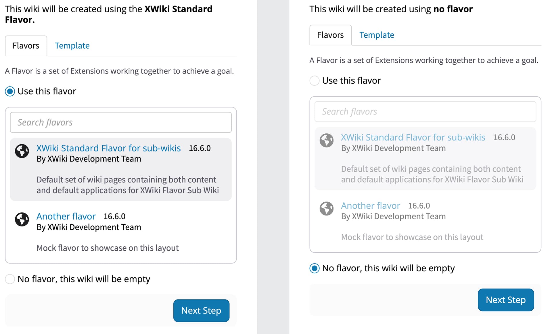
The primary goal of this proposal is to have the standard flavor pre-selected by default, as noted by @vmassol on @surli 's behalf on the Jira. But also, to introduce some friction to the flavor selection process, to make it just a little bit harder to select, inadvertently, the completely empty wiki.

We can achieve this by informing the user that the Standard Flavor will be used, while also providing an option to change it. The option “No Flavor, this wiki will be empty” would be hidden by default. See the example below:
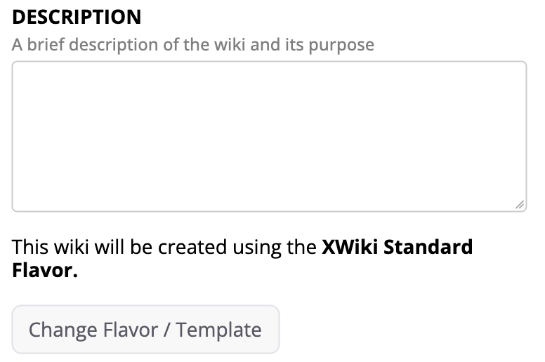
When the user clicks the Change Flavor / Template button, the controls for flavor selection would appear, offering the following options:

  • Select a Flavor (defaulting to Standard),
  • Select the “No Flavor” option, which would disable the flavor selection box,
  • Go to the Template tab.

In this version, these options are displayed directly below the main form (currently, they are on the right). This layout is intended to keep everything more contextual, following a top-to-bottom flow. While it may take up more horizontal space, I believe that making a once-in-a-while process more “guided” is more important than being exclusively space-efficient. However, I’d love to hear your thoughts on this approach.

Other Changes

These next changes, while proposed for the wiki creation flow, could impact other screens as well. If accepted, they might need to be broken down into more specific Jira tasks.

1 - Selected Wizard Step

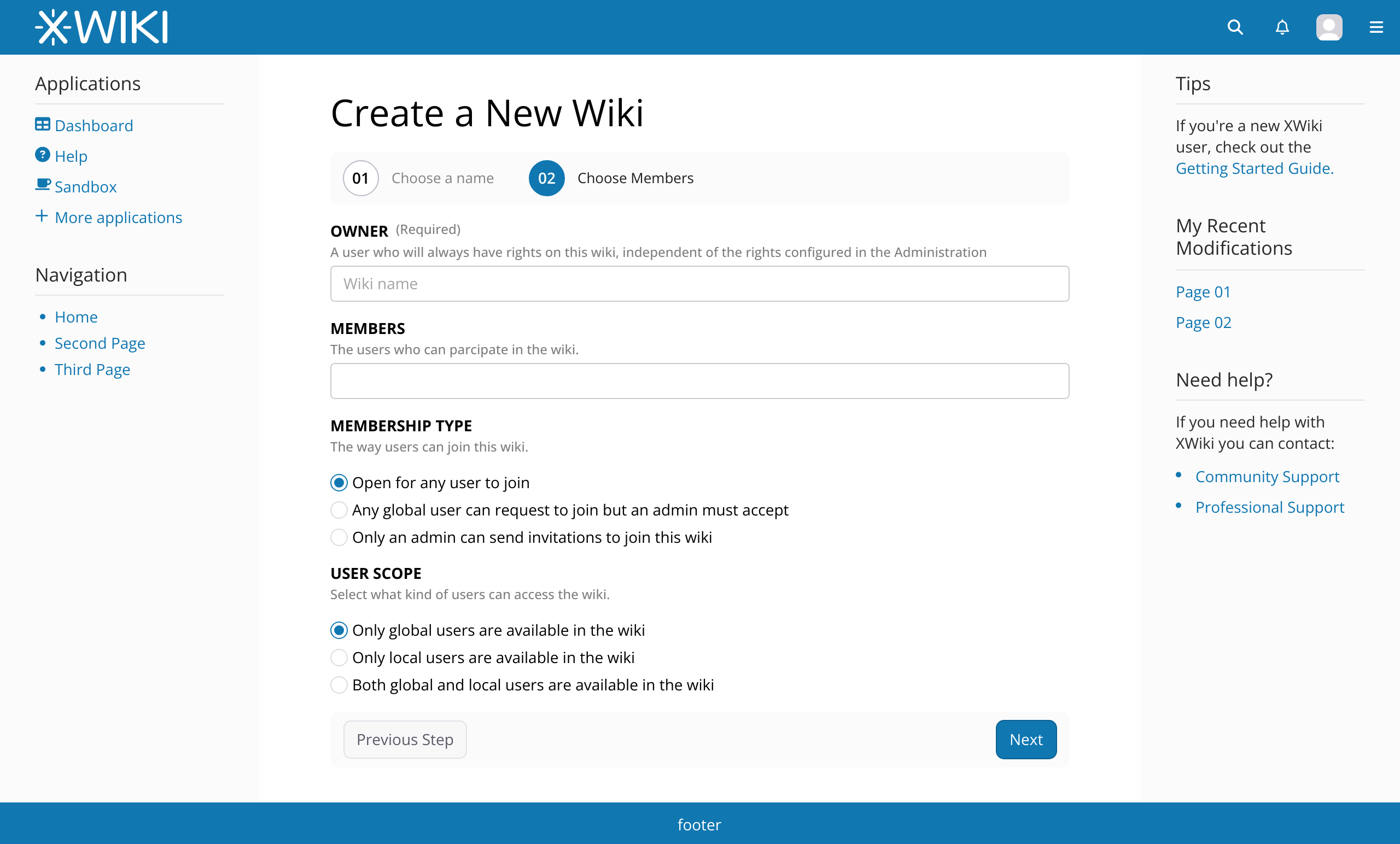
Although the main focus of this Jira is the flavor selection, there’s room for other improvements. For example, the steps in the Wiki Creation wizard currently give visual prominence to steps that are not the current ones. This is especially noticeable in a two-step situation like this:

Example: What’s selected here? While you might think that the “Users” screen is selected, it’s actually the other way around.

Screenshot 2024-08-19 at 11.01.18

It would be better to invert this logic and give more visual prominence to the current step.

Proposal:

Screenshot 2024-08-19 at 11.09.06

2 - Integrate Page Title and Step Indicator

While we’re at it, we could also integrate the step indicator with the current page title, cleaning up the interface and bringing the step indicator into view, as it currently sits in the far-right corner of the screen.

Current:

Proposal:

Note: here on the forum both images appear to be of different sizes, this is because the resolutions I usually work in Penpot. Please, see the context images at the end of this post to get a better understanding on the proportions.

3 - Creation Progress Bar

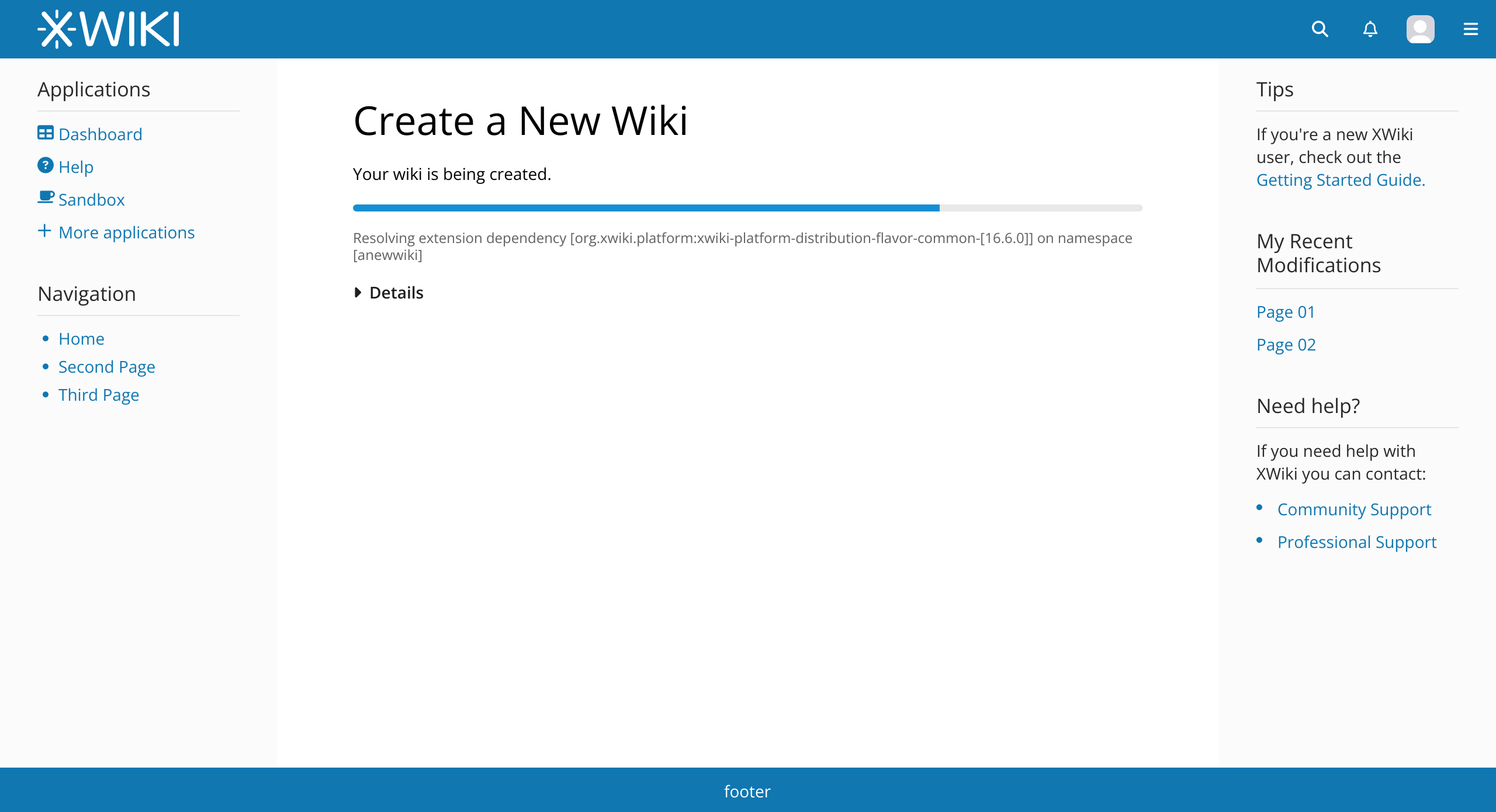
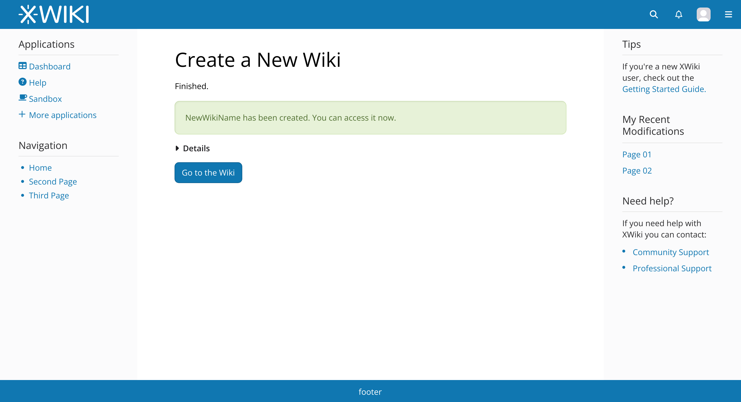
The final proposed change is to the progress bar at the end of the process.

To streamline the interface, I propose hiding the previous steps under a “Details” panel that can be opened (default: closed) while showing only the current step beneath the progress bar. The bar itself would remain the same, with a possible color change to align it with the theme’s primary color.

The “Go to Wiki” button could be left-aligned to make it more visible.

Additionally, I suggest minor changes to text content and styles, including removing the blue color from non-link text and eliminating outdated icons.

All Changes in Context

To wrap up this post, here are all the proposed changes in the context of the whole screen:
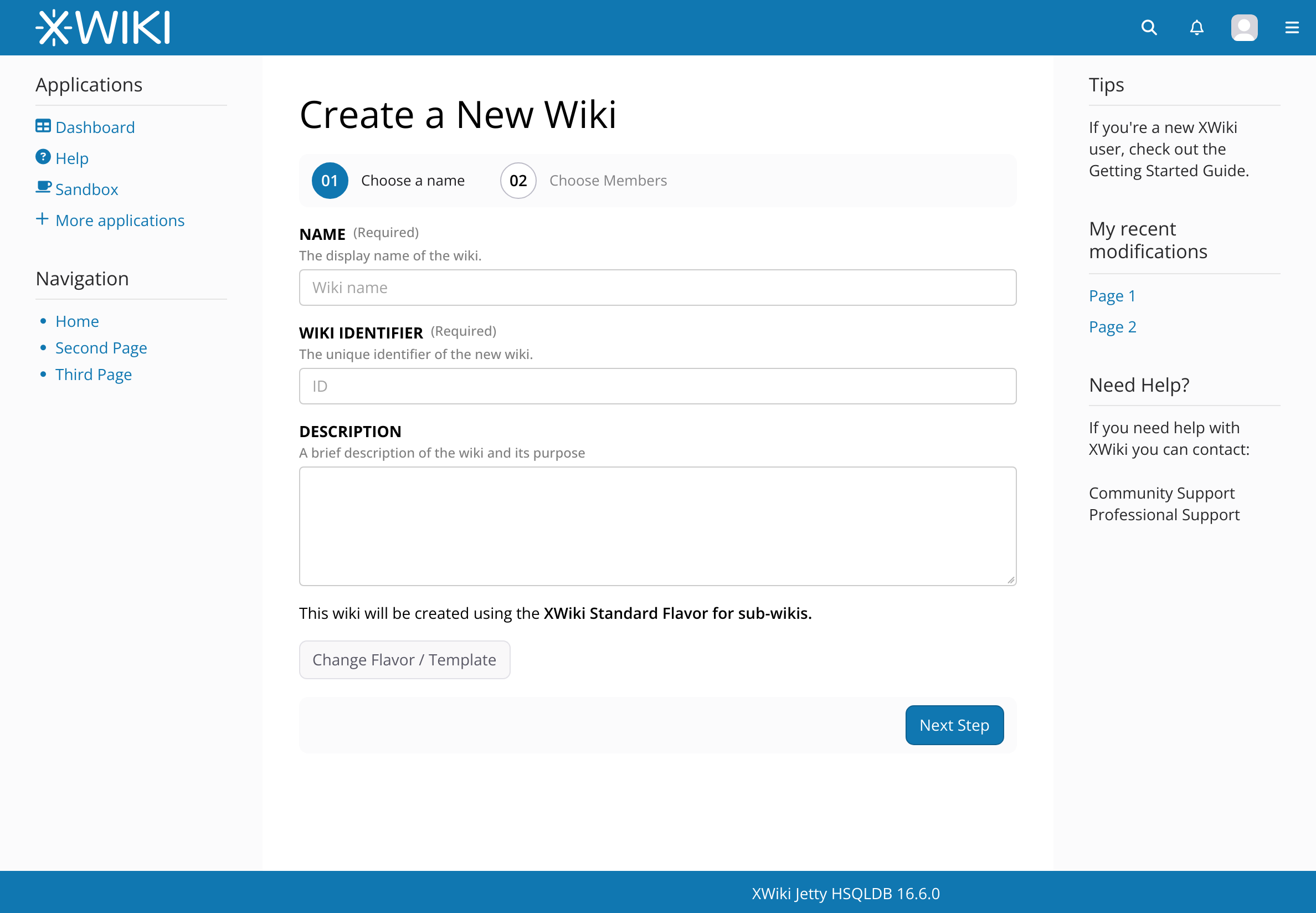


Please, let me know your opinions and if there’s anything else you’d like to see in this context!

Thanks for reading!
+1 because it takes less step for the most common use case.

Note that I’d like that we do the same for the Flavor selection when running XWiki for the first time, see https://www.xwiki.org/xwiki/bin/view/Documentation/UserGuide/Features/DistributionWizard#HFlavorstep

+1 too for the default

sounds good

sounds good too

+1

Since you proposed to change the wizard L&F, I think we should also propose to do the same for the DW: https://www.xwiki.org/xwiki/bin/view/Documentation/UserGuide/Features/DistributionWizard

Thx!

Thanks for the reply, indeed this would be needed for all Wizards in XS, isn’t the Wizard UI a single component?

If it’s not, then a new proposal will be needed.

Are you referring to the Distribution Wizard? WDYM by a component?

See https://www.xwiki.org/xwiki/bin/view/Documentation/UserGuide/Features/DistributionWizard for how it looks visually. In short there are several screens/steps and the user progresses in a given order.

Thx

1 Like

I mean (and I ask because I really don’t know) if the Wizard is a reusable component across all screens that have the wizard UX paradigm, so if one instance is updated all the other ones follow through OR if each screen (the Distribution Wizard in this case) needs to implement its own wizard, with js and styles.

ok, got it. I don’t think it was coded to be reusable (maybe it could be made reusable, idk, AFAIR it’s @mflorea who coded it). I’m pretty sure it’s not reused elsewhere either.

1 Like

The reusable part of the Wizard is currently only some CSS xwiki-platform/xwiki-platform-core/xwiki-platform-web/xwiki-platform-web-war/src/main/webapp/resources/uicomponents/wizard at master · xwiki/xwiki-platform · GitHub that expects some HTML structure. There’s no reusable JavaScript code or Velocity macros. You can see it as a Bootstrap component (without JavaScript behavior).

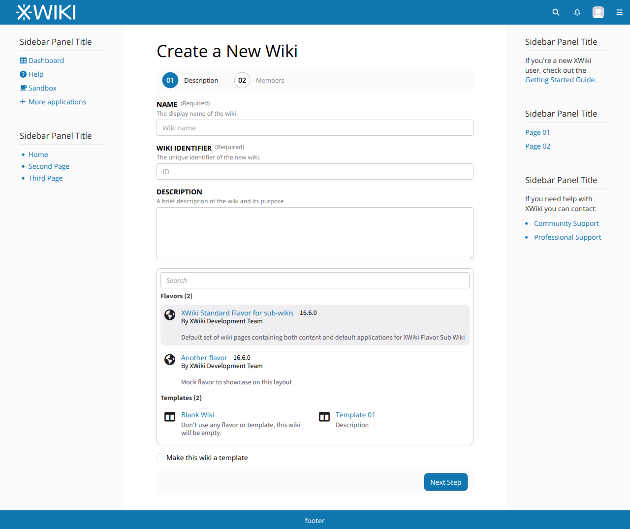
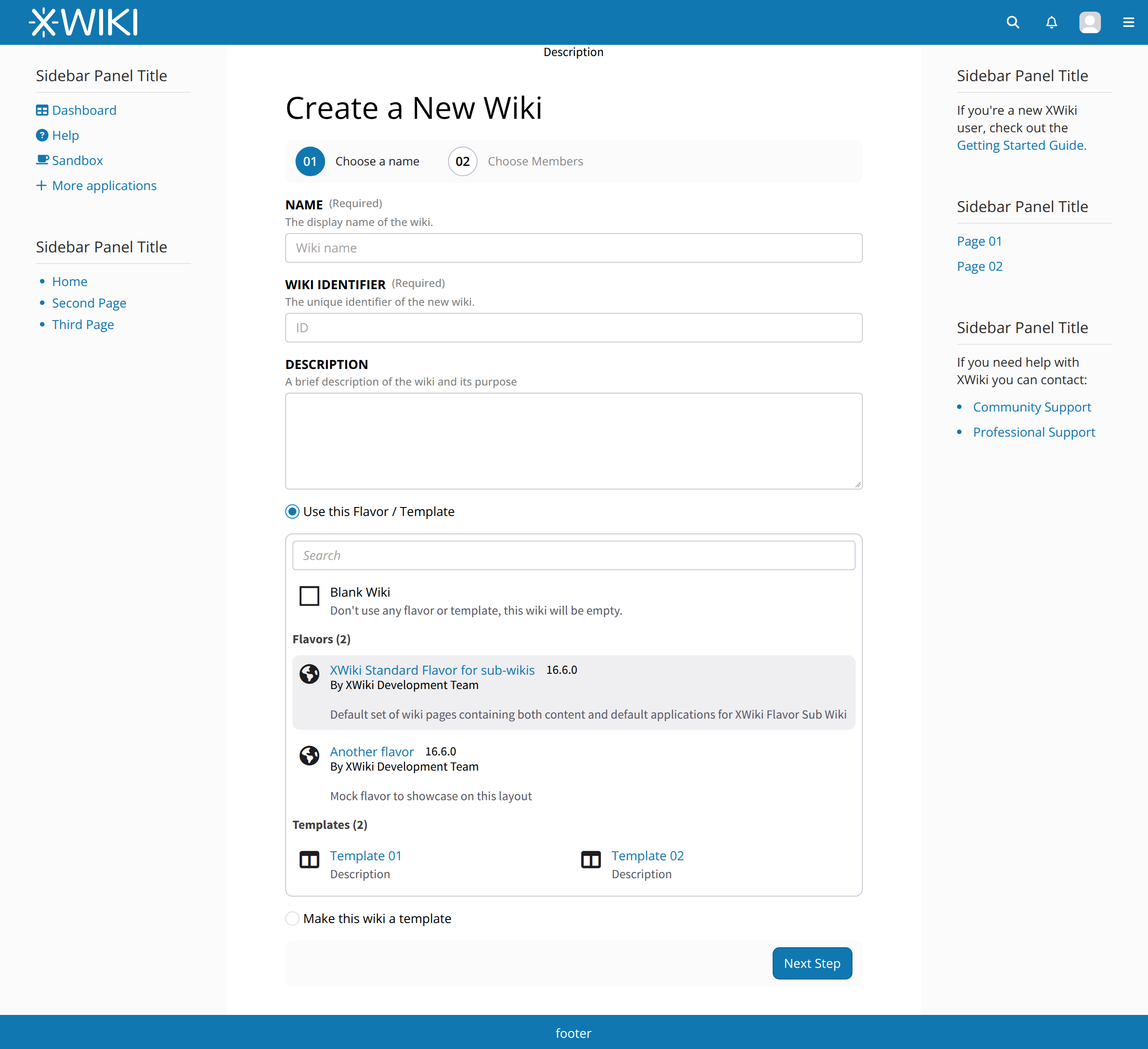
I’m not convinced by this. When you create a new page there is no separate “Don’t use any template” checkbox. You have the “Blank Page” option inside the page type picker, along with the other (real) page template options. Moreover, I don’t like the tabbed UI to chose between flavors and templates. I’d rather have something like this:

Name
The display name of the wiki.
[ Wiki name ]

Wiki Identifier
The unique identifier of the new wiki.
[ ID ]

Description
A brief description of the wiki and its purpose. 
[  ]

Source
Flavor or Template to use as the initial content of the new wiki.
--------------------------------------------------
Flavors (1)

----------------------------------------
| XWiki Standard Flavor for sub-       |
| wikis 17.0.0-SNAPSHOT                |
| By XWiki Development Team            |
| Default set of wiki pages containing |
| both content ...                     |
----------------------------------------

Templates (2)

---------------------------------
| Blank Wiki | My template wiki |
---------------------------------

--------------------------------------------------

[ ] Make this wiki a template to be used when creating other wikis

(i.e. rely on the fact that the XWiki select widget used to pick the page template supports grouping the options into categories). Of course, the standard flavor should be preselected.

I agree that it’s not very obvious which is the current (selected) step. The proposed style changes look good to me.

I’m not sure about this because I don’t see how it can scale when there are more steps. The current behavior is not fully scalable, but at least it allows you to have some very short names for the steps, and then each step can have a long title. With your proposal we will quickly need multiple rows when adding more titles, unless you suggest to display only the previous, current and next steps (so at most 3 steps at any moment) on the top bar of the wizard.

Thanks,
Marius

1 Like

Hi everybody,

I think its fine the way that you put it. I’ve updated my mockup to reflect this, check it below:

Both of these are not really scalable with very restricted viewports sizes so a new line should be necessary anyway. We could mitigate and instead just use the short name of the steps (Name, Members) and not use the long name.

WDYT?


I’ve updated the main proposal with the latest changes (except the names, for now) and I plan on closing this topic by the end of the week if possible.

Thanks

This is a step forward. Thanks! A few comments:

  • We need to be consistent on the step title case (“Choose a Name”)
  • The first step does more than choosing the wiki name, so I feel we need to find a better title (e.g. use “Description” for the first step and “Members” for the second step)
  • I would put the “Blank Wiki” as the first item in the list of templates, without a checkbox. You can select it as you would select any of the templates. Even if it’s not technically a template, I think it makes sense for the end user to see it as the “Blank Wiki” template. Another reason for doing this is to emphasize less the Blank Wiki option, which is not the most common one, and more the flavor option, which is the most common one. Selecting the XWiki Standard flavor should be the first available option.
  • I know in the current implementation choosing an existing flavor / template and making the new wiki itself a template are mutually exclusive, but it doesn’t make sense to me (unless I’m missing something). Why can’t you make a new wiki template by starting from an existing template / flavor? ping @tmortagne

Hope this helps,
Marius

That’s actually more a question for @gdelhumeau, but I doubt it was a strong desire to prevent it. I agree with you that, whatever the way a wiki was created, there is no reason to prevent it to be a template.

@mflorea Thanks for the inputs! I’ve made a few adjustments.

Changed the names to “Description” and “Members”

Seems fair, I’ve adjusted the mockup

I changed it to a checkbox instead. Conceptually it makes sense to start a wiki template from another one, if the implementation changes, the checkbox can be used.

I also removed the first checkbox (Use:) since it doesn’t make sense anymore given the second option is not mutually exclusive.

Thanks again.

1 Like

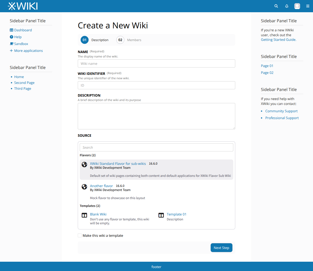
I’m wondering if we need a label for the Flavor / Template list (like “Source”). Without it, the Flavor / Template list seems to be connected to the Description field. Looks good otherwise!

Thanks,
Marius

I agree.

But in any case, that last version looks great.

Makes sense, I’ve updated the mockup and the main proposal.

I’m solving the topic but, as always, this discussion will remain open for any additional feedback. Thanks everyone.

1 Like