Proposal for the "Panels" screen in Global Administration

Hey everyone, I would like to propose some changes to the Panels screen inside “Look and Feel” in the Global Administration section of XWiki. Below, a list of a few reasons for these changes and after that, the proposals themselves. There are quite a few changes, some easier than others but as always, feel free to give you feedback on each of them.

Current Issues:

  • Unclear drag-and-drop functionality: It’s not obvious that you can drag and drop panels from the list into the sidebars. While the cursor pointer changes, it’s still unclear where panels should be placed.
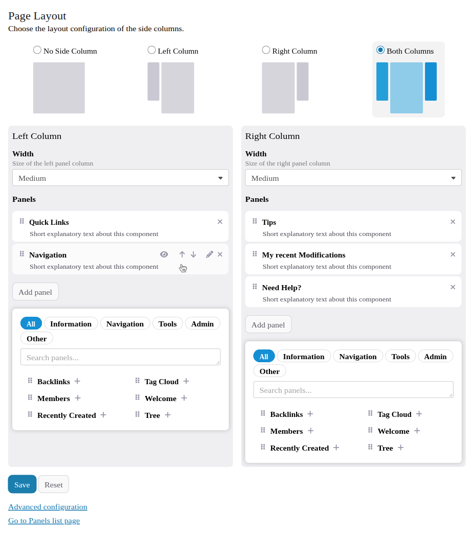
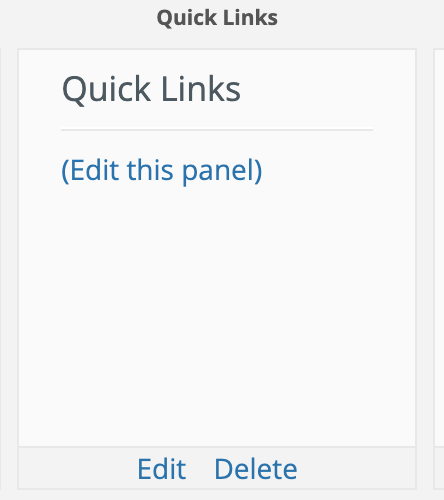
  • Panel previews: Each panel comes with a preview that appears interactive, but it’s not. The lack of interactivity is fine, but it’s not well communicated. It can also make the visual communication misleading. For example, the “Quick Links” panel is not configured with default values so the preview is empty with a non-working link “(Edit this panel)” and a (working) “Edit” link below it, very confusing all in all.
  • Panel list and configuration tabs: The panel list is separated from the main configurations, which is confusing and lacks a clear reason.
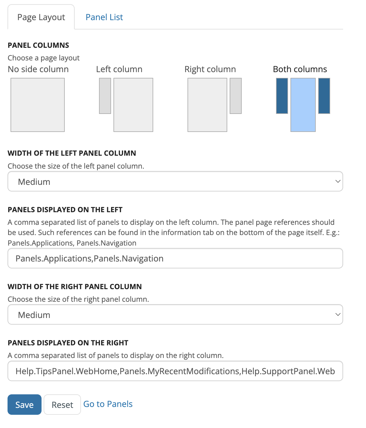
  • Complex configuration process: To use the fields “Panels displayed on the left” and “Panels displayed on the right” users must know the exact name of each panel and enter it manually into a text field. This might be ok for a very experienced user, but it’s not beginner friendly at all.

Having these in mind, I would like to propose some changes to this screen:

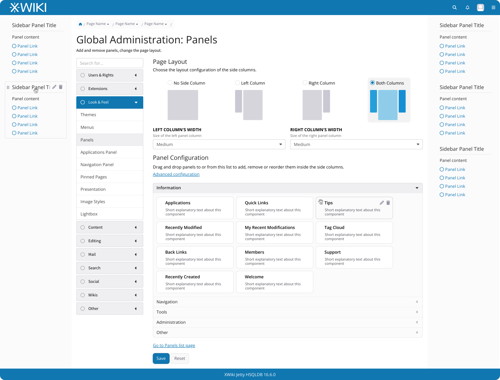
    • Combine “Panel Layout” and “Panel List” tabs: Merge these into a single view for a more intuitive experience.
    • Layout selector accessibility: Add a radio box to the layout selector with to improve accessibility.
    • Concise text revisions: Shorten and simplify the texts to make them more direct.
    • Optimize width selector layout: On desktop, display the width selector side by side to save space.
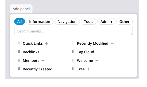
    • New Panel Configuration Section: Incorporate the removed “Panel List” tab into this section.
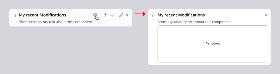
      5.1. Panels will have a fixed height and show their description instead of a content preview.
      5.2. Controls for editing panels will appear on mouse hover and will always be visible on mobile.
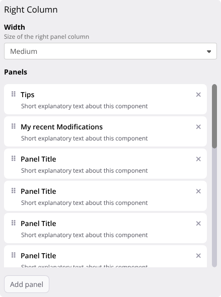
      5.3. A drag handle will appear when hovering over each panel. The entire panel remains draggable. And the cursor for the drag action will be a hand instead of the move icon.
      5.4. Minor CSS adjustments will be made to the accordion for visual improvements.
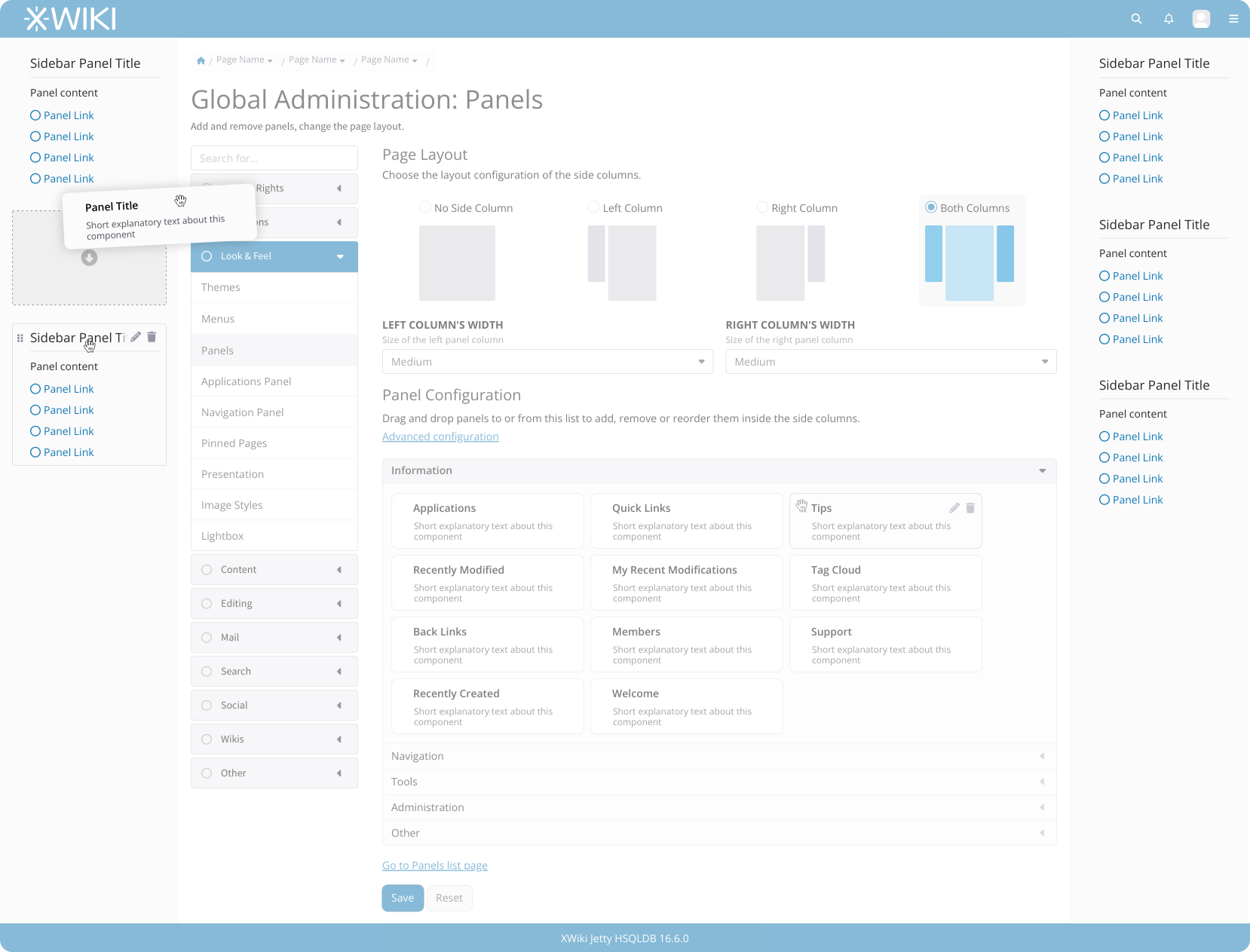
    • Panel drag-and-drop visual aid: When moving a panel, the interface becomes slightly transparent, highlighting valid drop zones to guide the user.
    • Hover feedback for valid drop zones: While hovering over a valid drop position, a box will appear at the new location of the panel. Currently, this is only indicated by spacing.

Mockups

Note: These mockups are from Penpot and almost all icons are a circular shape. This is for layout spacing purposes only, I am not proposing to change these icons.

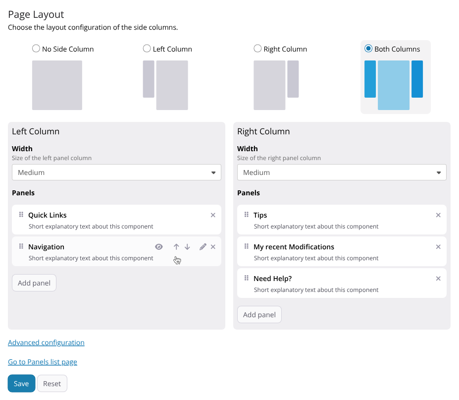
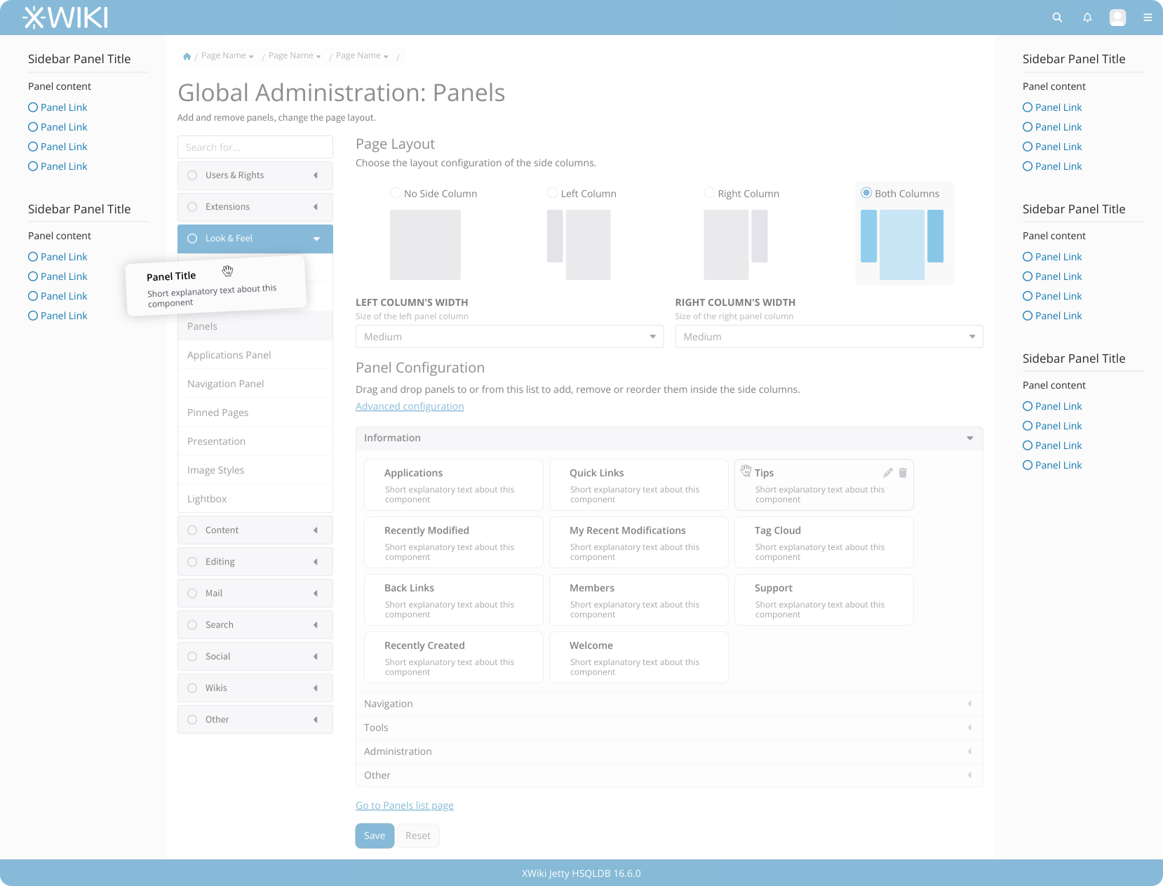
Below you can see the main layout changes. Here we have:

  • The unification of both tabs,
  • The radio button applied on layout selection
  • The proposed hover effects on the sidebar and also on the “Tips” panel from the accordion.
  • Width selection for each sidebar, side by side.
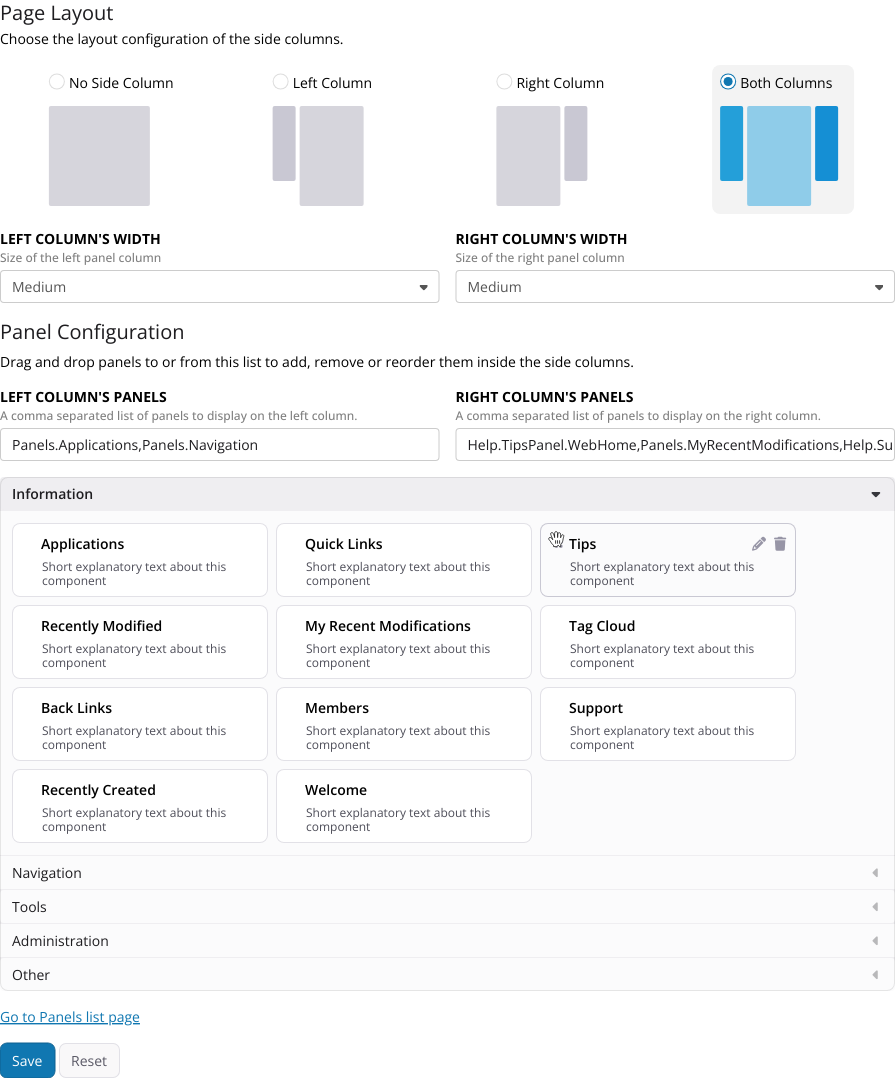
  • The “Advanced configuration” link that contains the current inputs for the comma separated list of panels.

Advanced Configuration

The “Advanced Configuration” link, under Panel Configuration will open the section containing the two text inputs “Panels displayed on the left” and “Panels displayed on the right” so we don’t remove the functionality.

It’s hidden by default, so we don’t lead the user into believing that these inputs are the only way of configuring the sidebars.

After clicking the “Advanced Configuration” link:

Drag and drop changes

When moving a panel, the interface becomes slightly transparent except for places where the user can drop a panel.

When near a drop point, a visual aid is shown indicating clearly what will happen on drop.

These are the main changes I’m suggesting, and I believe they would make this section of the Administration more intuitive and user-friendly. I’d really appreciate your feedback—do you think these points address the issues effectively, or do you have any additional thoughts or concerns?

Thank you all for your attention.

1 Like

I didn’t go through your whole proposal yet. I just noticed that you assumed we’d keep the drag and drop feature in there. I agree that in most cases we want to keep the UI features, but IMO this one should be at least questioned.

To me the drag and drop we have today in this section is a bit out of place. I do not think the benefits of drag and drop warant its implementation and maintenance here.

In order to understand this feature and why it was needed better, I dug a bit in the Git history:
first trace of this drag and drop feature I could find is XWIKI-481 : Added early version of the xwiki10B1 skin. · xwiki/xwiki-platform@495650e · GitHub (panelEditor.js).
I’m not sure if this was voted or not, I could not find any discussion around 2006 when querying panel drag and drop on our mailing list archive.
From what I could find so far, it was implemented because it was a fancy tech thing to do, without much of a UX discussion around it. @vmassol Do you know if there was a specific reason to have drag and drop here?


Do we need to keep this drag and drop feature as is?


Sorry for starting this topic a bit off-track. I’ll get back to you about the proposal itself soon,
Lucas C.

1 Like

+1, as far as I understand, the Panel List tab was just a more convenient UI to edit the list of panels.

+1. I only saw the elephant in the room, which is the drag and drop and the popup text, but completely missed this one (and it wasn’t reported by automated tools because it’s a semantic issue). Good catch :smiley:

+1, in the context of the whole page this makes sense, but I wouldn’t do this change by itself.

+1 On paper this is was a nice feature but it was too complex and heavy to maintain so at least in my opinion it was useless.

I misunderstood this at first, I thought you were talking about the description of controls. You’re talking about the handles and buttons on the panels in the columns.
+1, I like this idea. To go even further, I think we could make clear that those Panels became interactive elements even without hovering them. Putting them in a box would help convey this change in behavior. There’s no need to put all the controls, but a slight indication that “there’s something special here” would improve usability IMO.

+1

+1, I’m not sure how to make this slightly transparent effect but we can definitely come up with something. The easiest implementation will probably be to fake transparency by covering everything with a semi transparent panel with the same color as the background.

Why not put the column widths in this advanced configuration too? I don’t have a strong reason except that I think the main feature here that’d be useful for most usecases is to change the side contents and not to change the panel widths.


I agree that some improvements should be done for this UI.
Overall +1 for your proposal, but I’d like to discuss the few points mentioned above to be sure we don’t miss anything.

Thanks,
Lucas

1 Like

Hi.

I’m glad someone worked on this. It was and is one of those pages I always struggle(d).

I’m +1 for all your proposals. But I think that one thing could be more clear. It’s not really obvious to me that those example boxes (panels) could be dragged and dropped left or right. Maybe it could be done by wording? Something like “just drag and drop those panel boxes below to the left or right side (outside this administration page)”? Not the best english I fear.

2 Likes

Interesting, I wasn’t advocating for removing the feature. But it can be interesting to come up with a solution requiring less dexterity on the part of the user. I will give it some thought. Thanks for investigating this.

I’m not sure if I understand. You wouldn’t do this change for any reason in particular?

We can put the controls inside an ellipsis button (like the ‘more’ button on the page).

We could use the opacity css rule, but targeting what receives the opacity can indeed be tricky.

I feel that we would hide this feature too much. It’s the only way of changing the width, while the two text inputs for the content are not the only way of putting content inside the sidebar.

This goes hand-in-hand with what @CharpentierLucas said above about the drag and drop feature. Maybe we’ll need something better to customize the sidebars that don’t rely on drag and drop OR knowing each panel name (for the input boxes).

1 Like

If the width selector display side by side was the only change, I don’t think it would be an improvement. With all the other changes proposed, I agree with it. When I first read it, I was against the idea, but when I actually saw it in the prototype it looked better than without :slight_smile:

Ah, got it. Thanks for the clarification :wink:

Hi @tkrieck,

Thanks for working on this. I agree with @CharpentierLucas that drag & drop is not needed for adding the panels to the left / right columns. But I think drag & drop is still useful to reorder the panels inside the left / right column.

If we drop the panel preview then IMO the most natural / simple solution is to use a live data to list the panels. The columns I see are: Panel (for the panel title), Description, Category and Actions. The Actions column would have actions such as: edit, add to left, add to right. This has some advantages:

  • easy to filter / search for the panel you want to add
  • easy to access the panel page (link on the panel title)
  • easy to add the found panel to the left / right side using the Actions column

WDYT?

Thanks,
Marius

2 Likes

This is an interesting take and I think it can work. Especially, removing the need for a separate screen just to list these panels. I guess this defines my next step. I will adjust my proposal, try to use LiveData and rework the ordering of panels on the sidebars as well, to make it more accessible.

1 Like

FYI, the panel wizard was introduced in Loading... – 1.0 B2 – start of 2007.
We improved it multiple times since then, but I’m almost sure the exact features in this wizard have not been voted and the needs of XWiki users definitively changed since then. IMO it’s alright to change some of it to:

  1. Make it easier to use
  2. Make it more stable. Right now, a LOT of this wizard is hard coded, making it a small technical debt (small because it’s not a page seen by a lot of users and we don’t update it as regularly as we should to serve the best UX to admins).
1 Like

Hello Thiago and all.

Firstly thanks @tkrieck for proposal and XWiki devs for implementation of featur in latest XWiki since 17.3-RC.

I’d like to share some feedback regarding the panel management functionality in the Panels Application.

From a usability perspective, I find that allowing users to drag elements directly between the left and right panel columns from the Panels Administration section may not offer the best user experience. Given the current implementation, I expected that reordering or adjusting panel placement would only reflect in the Panels Administration content area—perhaps in a more visual, structured layout, similar to what we see in the Applications, Navigation Panel, or Pinned Pages sections.

As it stands, it’s not always clear where a panel ends up when dragging it into the middle area. For example, if I move an application and navitation panel into that area, the Panels displayed on the left field doesn’t include any input - result that panels were removed from left side. However, it might be confusing to users how to return panel back. Also, the Page Layout tab contains a lot of content, and it’s easy to miss the Save button at the bottom, leading to lost changes.

To improve this experience, I’d suggest introducing a new tab—Panel Layout—that visually separates the interface into three clear areas:

  1. Current left-side panels
  2. Current right-side panels
  3. A list of available panel names that can be added to either side

Additionally, the current documentation on Panels could use an update. It currently states:

On this tab you can see the list of available panels. You just have to drag & drop them to the panel column of your choice. And if you want to remove one of the panels, just drag & drop it from the panel column to the middle section. Again, you need to click the Save button at the end if you want to keep your changes.

However, this instruction also applies to the root Panel Layout tab now, and this may not be obvious to all users.

Hope you find my feedback useful.

1 Like

I’d like to clarify something.

@tkrieck was it your intent to remove the preview feature? I’m asking as it’s not expressed clearly in your original proposal. I see a mention from Marius saying that “IF” we’re ok to drop the preview then we could use a LD.

@tkrieck then you said you’d update the proposal (but I don’t think it’s been done, has it?). So for me we still need to agree about dropping the preview.

I think that the preview is nice (but it could very well be replaced by a static image provided by each panel too, the goal being to see how it’ll look like), and that we need to keep it, as, otherwise, I don’t see how to make the feature usable. Now, if we keep the drag and drop, then maybe it’s enough as a preview, idk. I’d like to have @tkrieck 's POV about dropping the preview.

Thx

Yes, sorry I didn’t make this very clear. But I am indeed advocating for dropping the preview, at least in its current form. There’s a brief explanation about it here:

To put this into more details, I’m talking about this situation:

This is a preview of the Quick Links panel currently on the default installation. As you can see, it doesn’t convey what a preview should offer, making it difficult to understand what is expected of me, as a user, to make this work. In my proposal the preview is substituted with a textual description of the panel.

Yes, I still need to update it.

I agree with you that having a proper preview would be good (as an image or mock content). But in their current iteration, I don’t think they work that well. Perhaps having them on demand via a “Preview” button, but for that we also need to have something meaningful to show.

Thanks

I’m over all positive towards all your proposals, but I think Lucas and Marius brought up a good point regarding the need to keep the drag & drop functionality.

If it’s decided to drop the drag & drop for adding panels, I like the idea proposed by Marius with the live data. To add to this idea, I’m not sure if it’s possible, but having some buttons that when clicked would move the panel up or down one position, would be nice.

1 Like

+1 for all your proposals! Just a doubt:

With the drag and drop, I don’t really understand why we would need to keep those fields.

Also, I’m not really in favour of dropping the drag and drop feature, I don’t really see the issue with it, or why we should remove it.

In the same way, I don’t see reasons to delete the preview feature, as it is quite useful imo. It could use some care on the side of UI/UX or removing some panels that we don’t think are useful any more, but I find it valuable overall.

1 Like

Hello everyone, after all your feedback I have tried to take a new approach to the proposal. In this new one I’ll try to retain some drag and drop functionality as well as the previews.

Two Column Structure

Instead of a single sidebar interface, we introduce two dedicated columns. Each column acts as a controller for its respective sidebar and houses both the width configurations and the panel management settings. We could also integrate the visibility inside these columns as well, but I like the nice images at the top of the current page :slight_smile:

Panel Preview Visibility

All previews are hidden by default to keep the workspace clean. Users can toggle a persistent preview for any panel by clicking the eye icon, allowing them to view content while they work.

Panel Controls Visibility

Each panel entry includes controls for preview, reordering, editing, and removal alongside a dedicated drag handle. The remove button and drag handle remain visible at all times, while the preview, reorder, and edit buttons appear only on hover to maintain a clean interface on desktop.

Reordering arrows are included to ensure the UI is fully keyboard accessible and to provide a quick alternative for users who prefer not to use drag and drop.

Add Panel Workflow

The add panel button manages the catalog of available panels for each sidebar. Clicking this button opens a list with a basic search filter for quick navigation. Users can add panels either via drag and drop or by clicking the plus icon.

I think the inner workings of the listing+filtering could be done by the card view of LiveData but the visuals should be customized to keep this list really compact (no headers, only name, one action and maybe the description).

Columns overflow

To keep the screen compact and prevent page length overflow, each sidebar will feature independent scrolling within a fixed height container.

Thanks for the feedback until now. If possible, I’d like to close this ASAP, so please let me know your thoughts.

Thanks!

1 Like

Hi Thiago,

Looks great!

For the panel width, you need to save (and reload?) in order to see the effect?

The two links at the end seem to be misplaced (are not well integrated with the rest of the UI). Everything before the Save button is part of the form. Are these two links part of the form? In the current implementation the “Go to Panels” link is after the Save button, which makes more sense to me. Does the user (admin) need to click on those links before saving? Maybe the “Go to Panels” could be “grouped” with the “Add panel” flow. Is the “Advanced configuration” link needed?

What about panels that don’t exist anymore? E.g. you configure a panel on the left column and then later uninstall the extension that provided that panel. We shouldn’t lose the config, i.e. if the user reinstalls the extension it should get the panel back. Moreover, when looking at the panel configuration the user should see that a given panel is configured, but it doesn’t exist anymore, so that they can take the appropriate action (e.g. remove the panel).

  • Is there enough space to show this inplace (after the “Add panel” button rather than in a modal or popover)? Can you show us a screenshot with both config columns and the “Add panel” expanded?
  • What happens with the “Add panel” button after you click on it to show the list of panels? It becomes disabled? If not, then maybe we need to improve its label to make it more clear that it’s a show/hide action.
  • What happens after you click on the ‘+’ sign or drag and drop? The panel disappears from the list? And is added back to the list when you remove it from the config?

Thanks,
Marius

Hi @mflorea

The current behaviour shouldn’t change, so it’s not necessary to save/reload the page.

I’ve updated the mockup so it appears after the save button.

They aren’t needed 90% of the time. “Advanced” should show the two fields with each sidebar panels name and order (pictured below). They exist currently in XS, seems like a shortcut for admins for copy/pasting, which is fine. But most regular users wouldn’t even know what to put in them.

If a panel was deleted, then it should disappear from the list, and any configured panel should also be removed from the sidebars. I find it quite odd to uninstall something only for it to still appear anywhere on the UI.

Regardless, the current behavior shouldn’t change from this proposal. If it’s really needed I can provide an error state for the panels in the list, communicating that a particular panel is not available anymore.

There should be enough space. In some contexts the horizontal space should wrap the contents, but that’s ok. IMO, it clutters the UI a bit.

It stays in focused mode, like the “more” button on the page menu. I called it “Add Panel” so it becomes a CTA for the task of adding panels and not a descriptor of the show/hide behavior of the list.

Yes, I can see that my earlier mockups are showing an improper scenario. I’ll make sure to update this on the proposal, but the panels should be removed from the pop up list.

Thanks for the feedback! Let me know if there’s something that needs more clarification

Thx for the new UI.

To be sure, the handle allows to move the panels to the left and right sides as we have now?

The UI is creative but it looks less usable/intuitive than before to me since we were able to see the panels in action, in the location where they will fit when saved, and with a preview. This is now replaced by a different UI showing the 2 columns but this is not “WYSIWYG” anymore (you need to guess how it’ll look like). I guess this solves the mobile use case but at the detriment of the desktop use case, no? (which could be solved with some left and right arrow buttons in the panels to place them left or right (+ up and down arrow buttons to move inside each column).

I also think the links look weird and not well integrtaed. What happens if you click the 1st link? To what page does it navigate to? If it doesn’t navigate, then I don’t think it should be a link. Wouldn’t it be better to have some indication that it is representing some folded options instead?

Re the “Go to panels list page”, could’t we have a link put on some sentence, like instead of writing “Choose the layout configuration of the side columns” we would write “Choose the layout configuration of the side columns containing the Panels” and then link to that page on the “Panels” word?

Thx!

Right, I forgot we have JavaScript code that updates the panel width live.

When we delete a page we don’t remove all the links that target that page. Moreover, it’s usually a good practice to keep (by default) the configuration when uninstalling a piece of software. So I’m not convinced it’s a good idea to automatically update the panels’ configuration when uninstalling or deleting a panel page. This doesn’t mean that the panel will still be visible to the user. The end user should simply see the panels that are available, but an administrator checking the panels’ configuration should be warned that a given panel that was added to one of the columns is not available anymore. It’s up to them to decide if they remove the missing panel from the configuration or fix the missing panel.

Thanks,
Marius