Hi everyone, I would like to propose some changes to the current layout of the extension manager. This post is a summary of the changes, and a bit more detail can be found on the proposal itself. https://design.xwiki.org/xwiki/bin/view/Proposal/ImprovementstotheExtensionManagerUI#HOptimizeLayoutforEfficientSpaceUtilizationandReadability
Addressing Current Issues
Background Color on Mouse Over
The current background color change upon mouse hover across the extension area can be misleading, as it suggests an interactive element even when none exists. Proposal: Remove the background color change on mouse over.
Differentiating Installed and Available Extensions
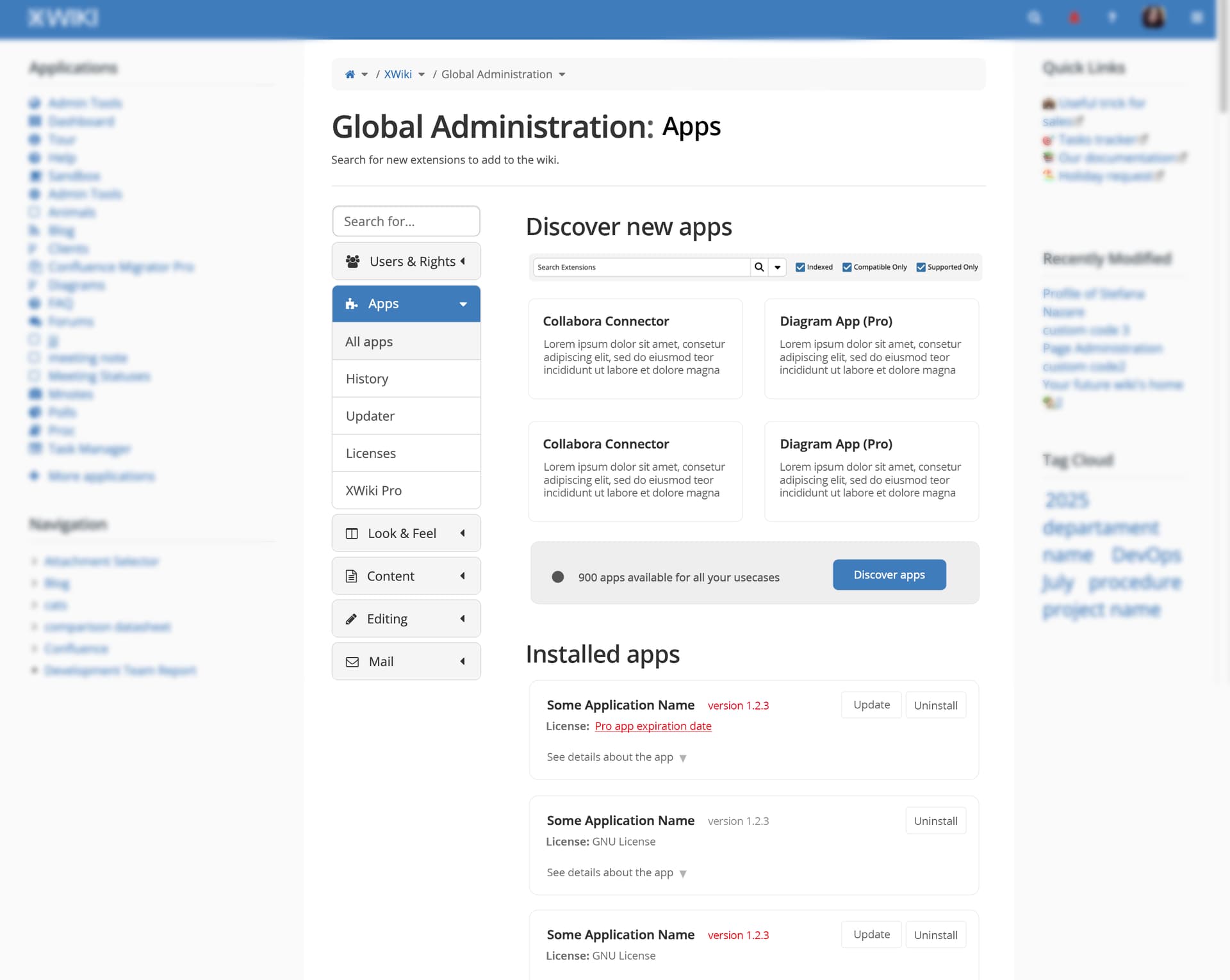
The simultaneous display of installed and available extensions can clutter the user interface. Proposal: Separate installed and available extensions into two distinct sections.
The installed extensions section would be the default view, featuring a primary button to “Discover New Extensions.” This dedicated button promotes visibility for exploring new extensions, while keeping the installed ones easily discoverable.
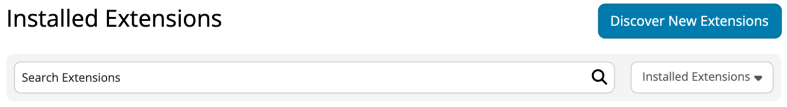
When in the installed extensions view, the search bar will be simplified, omitting filters such as “Indexed,” “Compatible Only,” and “Supported Only,” which are more relevant for new extension discovery.
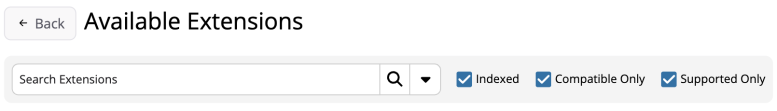
Activating “Discover New Extensions” will transition the user to a filtered view of available extensions, which is currently the default. This view will include the complete set of search filters and a back button to return to the installed extensions page.
Lack of Extension Voting
The current star rating system for extensions is largely ineffective, as most extensions have no votes, and even the most-voted extensions have minimal engagement (e.g., three votes).
Proposal: Eliminate the star rating system entirely.
Streamlining the Extension Installation Process
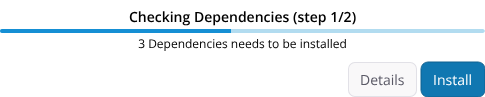
The current extension installation process involves multiple, often unclearly labeled steps, leading to a disjointed user experience.
Ideal Scenario (One-Click Install)
Proposal: Implement a single “Install” action that initiates and completes the process without requiring intermediate steps. A unified progress bar would display the entire installation progress (currently divided into two discrete steps). All necessary dependencies would be automatically installed. To enhance clarity, a title (e.g., “Checking dependencies” / “Installing”) would appear above the progress bar, describing the current step.

Alternative (Improved Multi-Step Process)
If a multi-step process remains necessary, we propose clear, action-oriented labeling for each step:
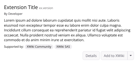
- “Install” → “Add to XWiki”: This label would indicate the initiation of the process, clarifying that no installation has occurred yet.
- “Continue” → “Install”: This step would clearly indicate the actual installation action. The progress bar would remain unified across these steps but would pause while awaiting user interaction (e.g., clicking the “Continue” button).
![]()


User Control and Interface Optimization
Progressive Disclosure for Technical Details
Excessive technical details are currently displayed by default during installation/uninstallation, potentially overwhelming non-technical users.
Proposal: Hide detailed technical information by default. This information would only be shown when user interaction is required, such as when the uninstallation process warns of page deletions. This aligns with the principle of progressive disclosure, presenting only essential information initially and allowing users to access further details if needed.
Cancellation of In-Progress Installations
Users are currently unable to cancel an installation once it has begun, limiting their control over the system.
Proposal: Provide a clearly visible “Cancel” button or option during the installation process. This empowers users with control and allows them to exit unintended or lengthy operations.
Standardizing Iconography
Inconsistent use of icons, deviating from the established IconTheme.
Proposal: Replace custom or non-standard icons with equivalents from the IconTheme wherever possible to ensure visual consistency.
Optimizing Layout for Space and Readability
The current layout utilizes space inefficiently, causing extension descriptions to truncate prematurely, particularly on smaller viewports. The search bar header can get improvements.
Proposal:
- Relocate the “Install” (Add to XWiki) and detail buttons to their own row.
- Remove the star ratings.
- Remove icons from extension titles, as most extensions use the same icon, diminishing their utility. A new layout for the header containing the search bar is also proposed, adapting its filters based on whether the user is in the “Installed Extensions” or “Available Extensions” section.
As always, I invite you to provide feedback on the proposed changes. Thank you very much!