Hello Thiago! Thanks a lot for your proposal! ![]()
Pros of current version
What I (surprisingly) liked about the current UI of the link dialog is how compact it is. Once you use it 1-3 times you get used to the fact that you have to click on an arrow to select different types of data.
Cons of current version
The things that I don’t like about the current one are:
- the arrow can seem like it doesn’t let the user choose through the types, but through something else
- there is no search icon and this makes the input feel not typeable in a way (for a long time I never typed in that input, I’ve only used the tree)
- pasting a link to a wiki page doesn’t get transformed into an internal page reference
- there are no types for images, videos that could enable the user to find info easier
- nothing informs the user that they can paste the page reference in the input field
Improving the UI
I feel we should still aim to have it pretty compact, letting us use it in other places where it should be, but it isn’t.
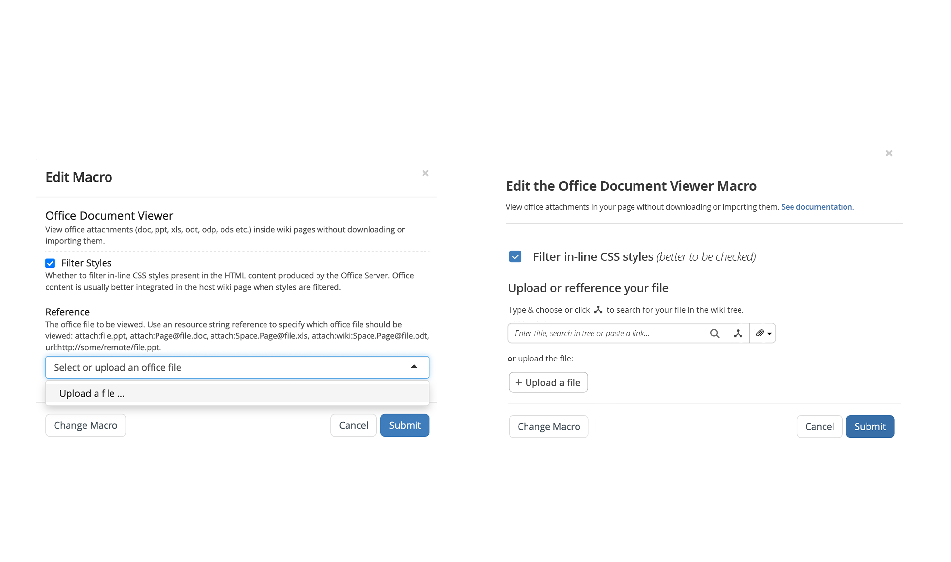
An example of a place like this is macro configurations.
Many times in these configurations, referencing one or multiple pages/attachments is needed, but ATM this can only be done by knowing the address/reference of that page/attachment. The UI of the link dialog could be repurposed in these configurations.
This is how I’d see the revamp. Ignore the fake tree icon, it should be something else, but I couldn’t find it (right now I’m using the branch icon):
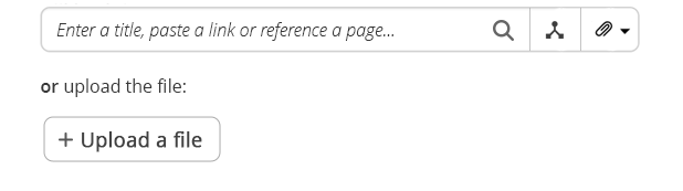
I agree that this UI is less transparent to the user than what your proposed, but I also think that once the user would do it a few times it would seem very straight forward. This UI is also easier to integrate visually in a possible revamp of macro configurations:
What do you think about this? It is possible I’m mistaken or maybe biased because of how familiar the UI has become to me. ![]()