Hi,
first thank you very much for your proposals! 
Like @MichaelHamann …
I toadly agree with all that have been proposed and discussed.
Thank you again.
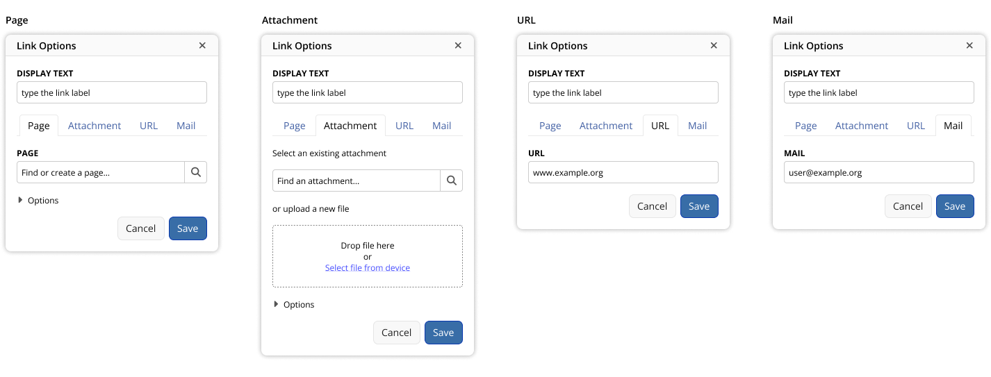
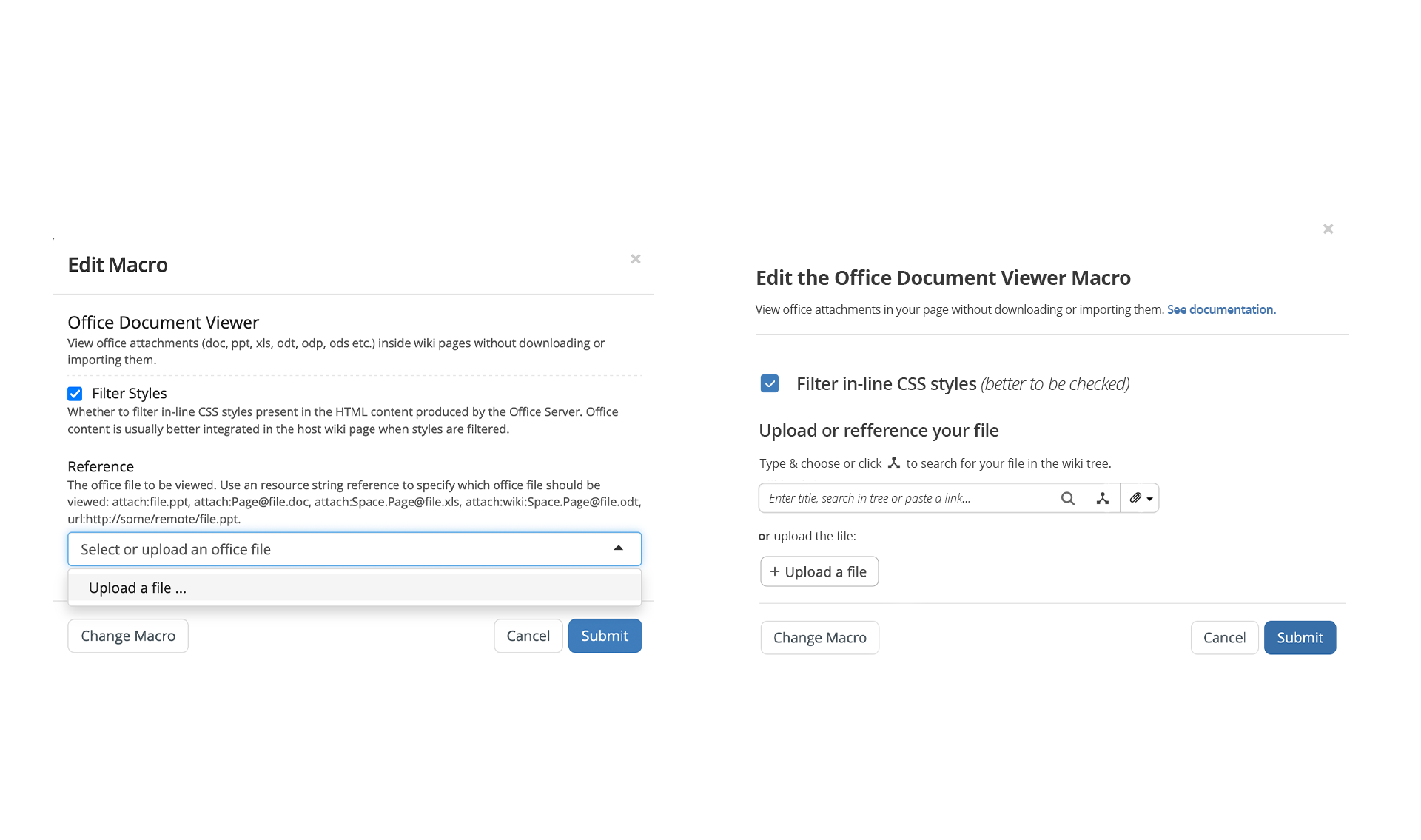
What I don’t agree on : the compact thing.
What the advantage of compact ?
If it make you click each time on two tiny things, to reach what can be reached with one click in a large zone (tab header…) ?
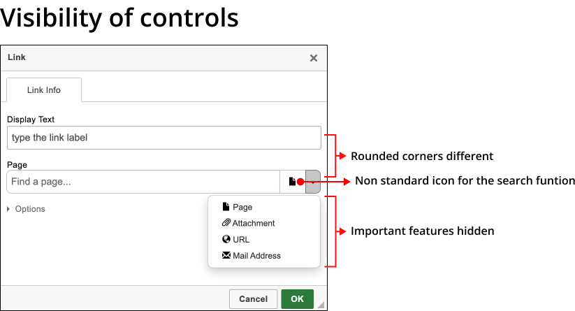
IMHO, the link dialog is made for people that know very well the tool, and work hard to write a page.
Your proposal is… refreshing.
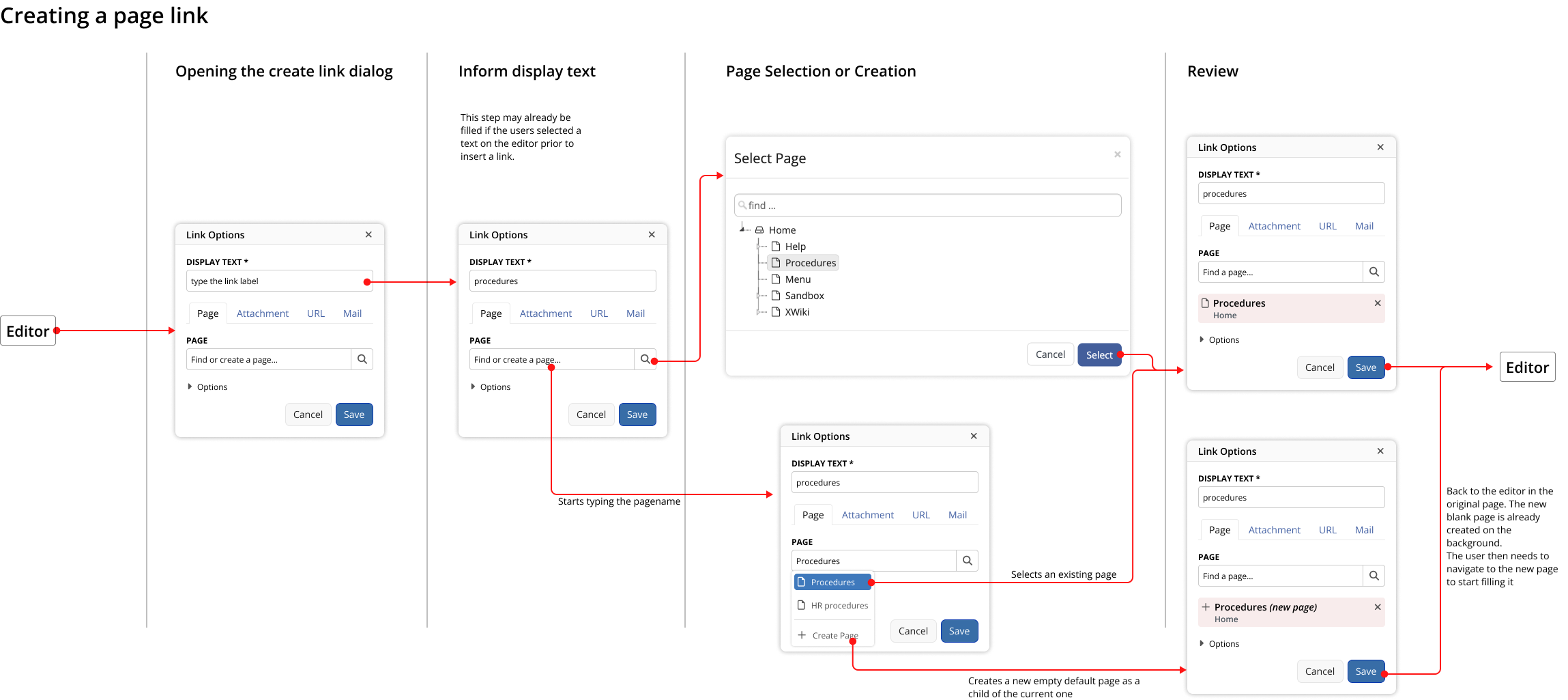
@MichaelHamann
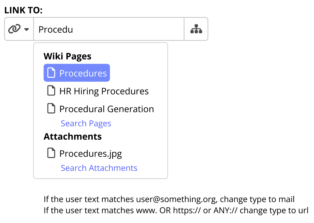
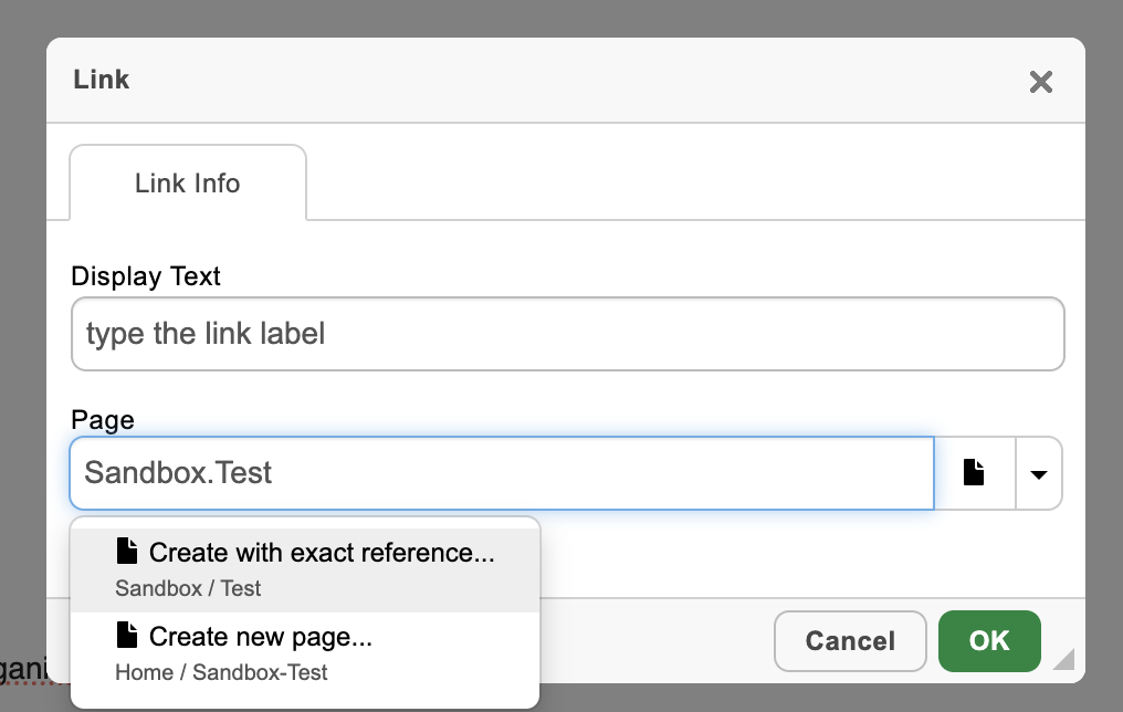
- It took me more than two years to find out that you can click on that “page” icon to open a page tree. I always thought that was just to show me the currently selected link type.
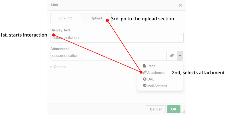
- It is quite hard to create a link to a new page using this dialog as you cannot select a parent page and a title like in the new page dialog.
Yes… same experience for me.
And a feeling of WTF each time I have to use it…
What most important, IMHO, is not only the interface, but the features.
=> I wish a link box that is modular and customizable, with some hooks that allow to plug in some usual features. 
(for Christmas ? … seems time to write the letter… 
 )
)
Something that would need some programming and technical customization, but with some plugs that make things more easy. (modular architecture).
“plugs” : I mean “des points d’entrées”. Some hook mechanism… and architecture that allow to provide another piece of code to make the job, for the custom feature.
Kind of feature :
The selection and typing of the link : to be able to change the plugin, and put our one.
With special feature, custom : provide some proposals, filter on some custom criteria, etc…
The addition of a tab,… that could be :
“link to pages about security” (on a dedicated other web site of the company),
or “link to FAQ items”, etc…
For custom needs.
Very important : being able to build the “title” attribute, or the “target” attribute, with some proposal that is built by programming. To provide a proposal that is “home made built”.
Example : the title is built with : the space name + the title of the page + a short summary of the first line of text. Or whatever custom way to build it.
Very important : being able to build the link with some additional feature, prebuilt for the user. The idea : make some links like the one you can have in Wikipedia : with the mouse over show a nice tooltip, with sumary of the article linked to.
So powerfull, for reading the content of a page… and have a peep on the linked page without going to this page …
Being able to provide the user with some tool to build these kind of links.
A tool that provides “the most easy way to build them”.
For pages of the wiki, as well as other external source of information (other website).
Usual use case : a company provide to the users of the XWiki platform and tool, … some dedicated link dialog, that aim directly and easily to another platform of the company (security procedures, internal product description tools, etc…)
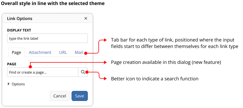
By the way, if some custom compact link dialog is available, then the platform admin, or may be even each user, could choose for the compact link dialog, or regular link dialog.
All this complexity of the additionnal feature is left to the customization and programming, on the customer side…
XWiki provide the modular architecture, and others do their customization.
Providing some nice link dialog features, as extension, is part of this global schema.
For the Connexion and Authentification feature of XWiki, there is some modular and pluggable feature, to offer the customization of how to make the identification and authentification of a user.
With LDAP, with SSO with Google, etc…
Both interface and process are customizable.
The same for the link dialog ?
Open the door to add some custom feature ?
with full programming (Velocity, Groovy, Java, Javascript,… ) use, … if needed.
XWiki is about organizing the information.
Making a link is a master, center feature of the platform/tools.
(2 years “to find out that you can click on that “page” icon to” ?
By one experimented user.  … seems there something to do, there…).
And… documentation of all this customization ability.
The only thing I could find is :
Add a new Link Type
And this extension documentation :
CKEditor Integration (XWiki.org)
extensions.xwiki.org › xwiki › bin › view › Extension
The way to customize the link dialog, now, is to rewrite the extension and make our own ?
Hope it helps…