Hi everyone,
This is a joint proposal from @pauline and me outlining a set of improvements to the XWiki.org homepage and website. The proposal is driven by five primary objectives:
-
Refresh the homepage layout
-
Increase legibility
-
Provide greater visibility for Cristal
-
Improve the onboarding experience
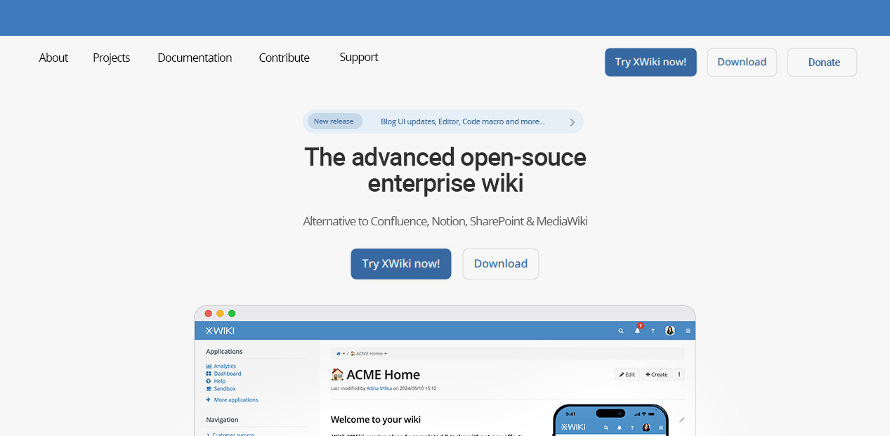
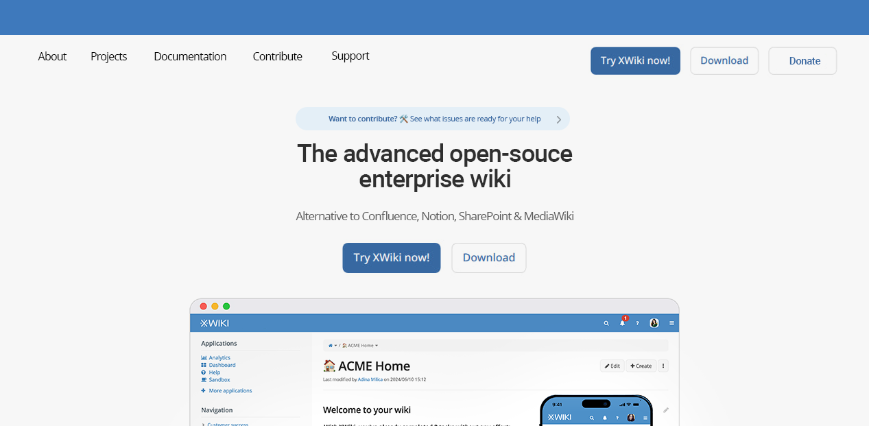
You can preview the proposal using the Penpot mockup available at the link below. It illustrates some of the concepts described in this message.
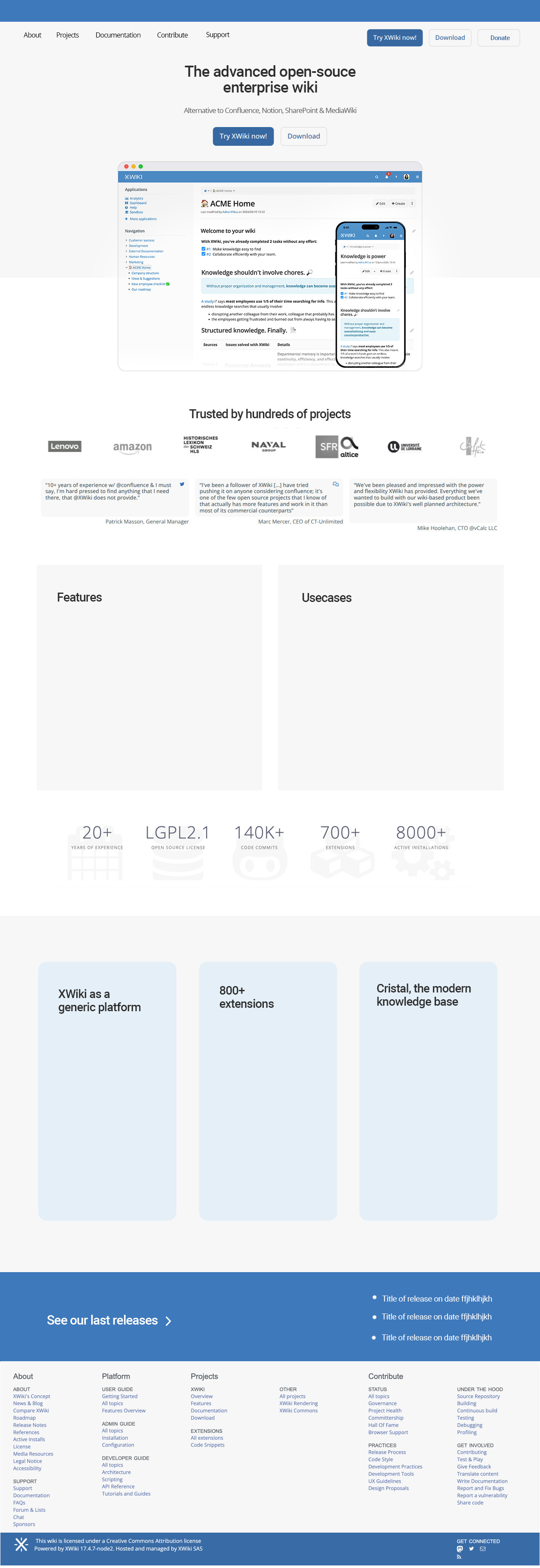
Updated Layout
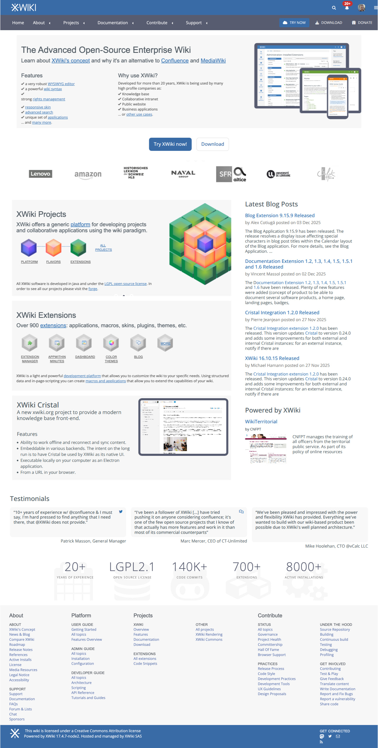
The current layout is compact and carries a high level of informational density. Our proposal aims to make the page more focused and easier to navigate by:
-
Splitting the existing banner into separate components
-
Organizing these components in a scroll-friendly structure
To fully view or engage with the current banner, users need to wait OR click in the banner buttons (dots), distributing the content vertically ensures better visibility. However, all information required for a user to have a basic understanding and try XWiki are still present in the first part of the webpage, before any scrolling is required.
To accommodate the new sections derived from the banner, we propose relocating the blog posts section, testimonials, and the “Powered By” area, listed in this order of priority, as illustrated below.
Regarding the Powered by area, sometimes some ancient projects show up here, could we restrict them a bit so only more recent or important ones are in the rotation?
Basic Layout
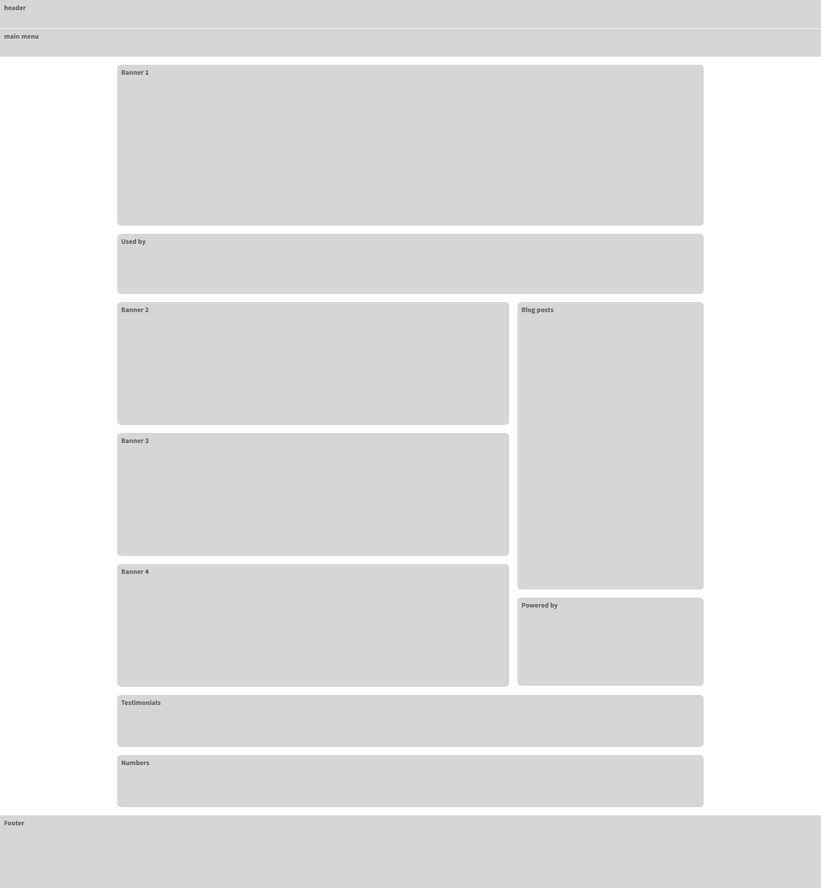
Desktop Mockup
Mobile version should also be done, of course. But I want to get your feedback on this proposal before going into the mobile route.
@amilica We’d very much welcome your feedback on the whole proposal, but also very specifically on the banners themselves. For me (Thiago), they are a bit too information heavy, what do you think?
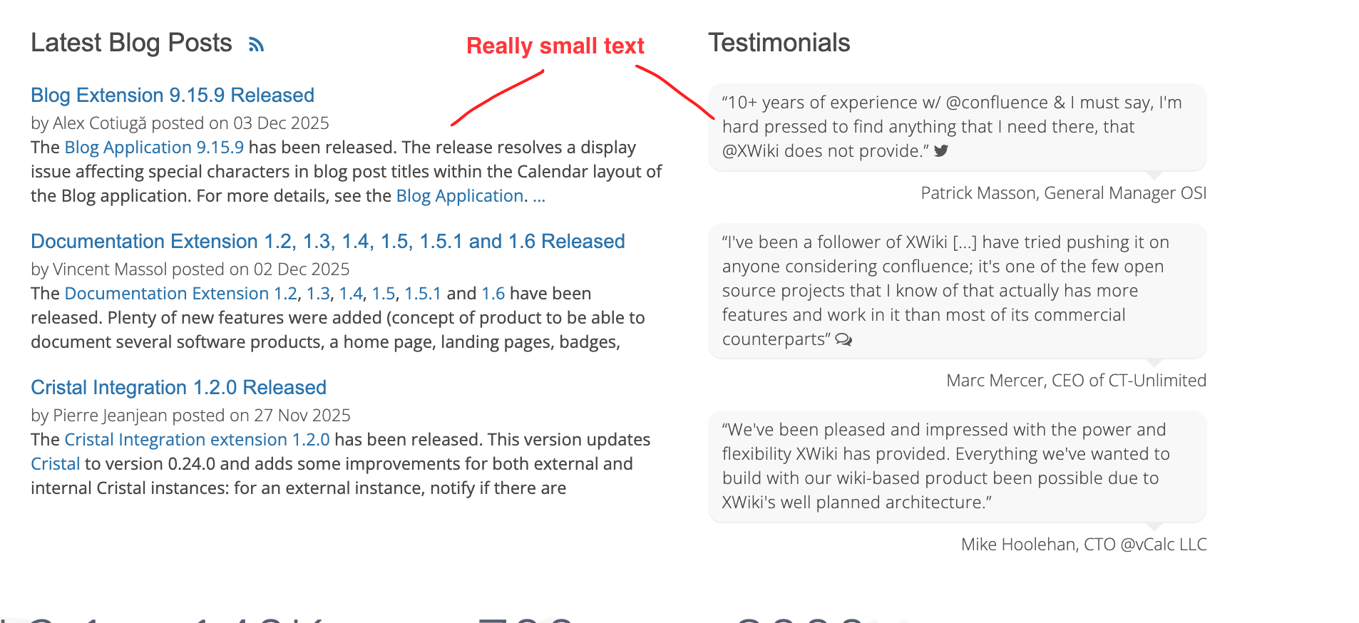
Enhanced Legibility
The current base font size of 14 px is fine, but many elements scale down proportionally to 12 px, which can reduce readability in several contexts. To address this, we propose increasing the base font size to 16 px to improve clarity and text comfort across the site.
Another option is to increase the font size only on specific places (like the latest blog posts and testimonials) but that would leave the rest of the site (internal pages) with the same legibility problem.
Context:
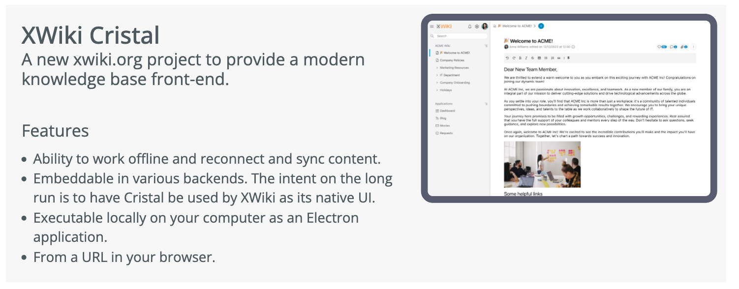
Increased Visibility for Cristal
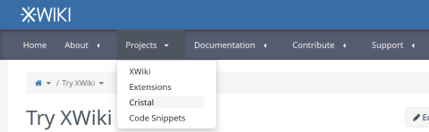
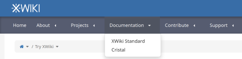
Cristal previously had its own dedicated website, the proposal is to incorporate its content directly into XWiki.org. To improve discoverability, the proposal includes adding Cristal-related entries to the homepage, the main menu, and the download page.
Main Menu
Update the main navigation to integrate Cristal. Here we are showing only the sub-items for the navigation items that need updates.
-
Home
-
About
-
Projects
-
XWiki
-
Extensions
-
Cristal
-
Code Snippets
-
-
Documentation
-
XWiki Standard
-
Cristal
-
-
Contribute
-
Support
Home Page
Create a section (banner previously) showing a bit of info about Cristal.
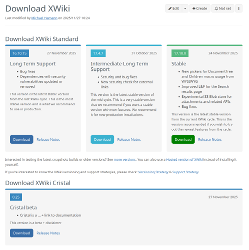
Download Page
-
Add a 4th section for “Download XWiki” card
-
Update order: Playground, XWiki Cloud, Download, mywiki.org
-
Shorten the cards content:
-
Try XWiki in Playground - limited trial, access to the sandbox only.
-
Try XWiki Cloud - full trial from XWiki SAS with all features (including Admin actions & Pro extensions)
-
Download XWiki - full and free acess to the whole project, [license link]
-
Account on MyXWiki.org - for non-profit organizations and individuals, no uptime or support warranty, no programming rights
-
-
Add Cristal in each card OR create a dedicated section for Cristal below.
Forge page
Add Cristal documentation link in the top level projects section.
Documentation
-
Create a top level page for Cristal documentation at https://www.xwiki.org/xwiki/bin/view/documentation/cristal/
-
Use the same documentation system as for XWiki documentation
-
Migrate User, admin and developer documentation for Cristal standalone in Cristal documentation
Open question: Where should the Cristal extension documentation go?
Improved Onboarding
At the moment, users need to explore the homepage a bit to locate the “Download” and “Try” options. To streamline onboarding, we suggest adding two prominent call-to-action buttons to the homepage. These CTAs would link to the same pages already available in the main menu but would offer clearer and more immediate entry points for new users.
That’s it for now, as always we’d appreciate any feedback on these items.
Thanks!