Proposed layout changes for the Attachment Upload in pages

This is related to the issue XWIKI-22363 and XWiki-22125.


Hey everyone, while researching improvements for XWIKI-22125 (by @rjakse) I noted that, while the issue is mainly about the upload complete indication, the whole area of attachments uploads inside pages could get a visual design and UX pass.

Context:

Upload status

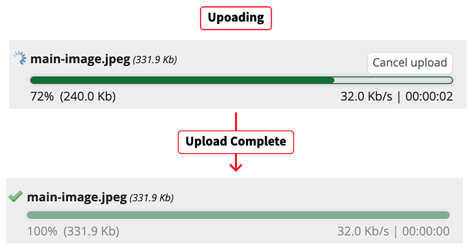
A very specific problem, noted by the issue XWIKI-22125 is that the visibility of the completed download in very subtle, so users can miss the fact that the upload was completed. Example in the sequence below:

Currently, there’s not a lot of visual feedback to the user about changes in the upload state (one icon and a change in the transparency of elements). My proposed changes for this component are to make it look like this:

What we gain here:

  • More modern and compact look.
  • Less technical information for simple users
    • Focus on the time remaining and percentage of the process

For advanced users
Now, I know that removing information indiscriminately can have a impact on more advanced users. So for these power users we can still have all the available information, but laid out a little differently

Completed upload

When finishing the upload, all the details and the progress bar should be gone. The fields that remain are:

  • filename
  • icon
  • upload message.

The removal of all the extra details should make it clear to the user that this file is no longer uploading while retaining its context.

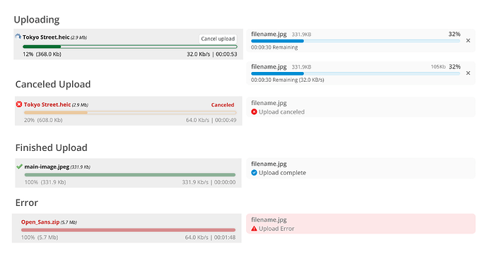
Following this same approach we would have all the status like below (the ones on the right are the reworked versions):

Upload Section title

We can also improve the overall layout for the whole list. Starting with the title itself, we have a “Section Title” and the standard OS “Choose Files” to indicate new files uploads.

Proposed change
To save up space, we can condense these two elements into one button, which will have a more descriptive label. Example below:

Hide Upload Status

Now, the final change I would like to propose is to the “Hide upload status” button at the end of the upload list. This button is somewhat hidden and, in my opinion, could have better functionality. In its current form, its only function is to hide the finished uploaded files list, effectively it’s a “clear list” button.

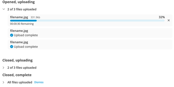
I propose to change this button into a collapsible panel, containing all uploads. This way the user can hide and show the list on demand and its title also functions as a counter for the remaining files to be uploaded, to provide an overview of the process. With a big list of files it can provide a more streamlined look, even if with a small list it may be not as important.

Different status for the file list panel

Note that at the end of the process, with all uploads completed or cancelled, we can provide a “Dismiss” link to hide the section.

Conclusion

Ok, so to wrap up this post. I know that I went a little further than the original Jira with my proposed changes, but not everything needs to be made at once of course.

Here are all the proposed changes in context:

So, I would like to know from you, what do you think of these changes. Do you have any suggestions moving forward with this?

Thank you all for reading!

2 Likes

Sounds good, I like it. Some thoughts as we’re touching this area and these improvements do not seem that difficult to combine with the design update:

  1. It would be nice if there was a way to pick the attachment name after picking the file.
  2. It would be nice if there was an obvious way to replace an existing attachment. At the moment, you need to have a file on disk that has the exactly same name as the attachment you want to replace.
1 Like

Hey Michael, do we have ongoing discussions or a design page about those features? Can you link me please so I can try to integrate them in this design?

Thanks!

I’m not aware of any, unfortunately. For the first option, I missed this from the start as I was used to this feature from DokuWiki where you can pick the file names after selecting the files (before uploading starts). For the second, it feels like an obvious usability issue that we need to instruct people that they can upload a new version of a file by uploading a file of the same name instead of having an obvious option for that in the UI. I wonder if these two could be the same feature where for every selected file you can either choose a file for which this should be a new version or choose a new name.

+0 from me on this part. The simplicity is nice for new users but I fear that we could lose information that is important for some users if we don’t proceed carefully with this change (see below).

Is that the same for advanced users? Some progress information could be useful to keep in view for some use cases (if we remove them completely IMO it would need to at least be mentionned).

+1, good idea!

+1 overall, small comment:

Shouldn’t it be a button? Semantically it does something and not gets you somewhere, so I’d advocate to use a HTML button. If that doesn’t throw the design off, I think it would be best to use a button style with it here.

Thank you for this proposal!
Lucas C.

1 Like

Thanks, I’ll take a look at DokuWiki to see how they do it and try to get something along those lines into here. Thanks for the heads up!

Another thing that I am thinking now, as an improvement, is to enable a drop section for files dragged from the desktop. It works on the wiki editor, but not on this list.

Note that 1. would help a bit with 2., but yeah, having a “Replace” action button on each existing attachment entry would be a nice QoL improvement!

Somewhat related: Loading... (but for the Attachment Selector macro, couldn’t find a jira for the page upload)

Note: This issue was made a bit less important when we introduced the ability to rename an attachment: https://www.xwiki.org/xwiki/bin/view/Documentation/UserGuide/Features/Attachments#HMovinganattachment

Related to replacement we also have: Loading...

it works if you drag on the file selector button but not elsewhere and users usually don’t realize this. So +1 for having a larger and visible zone for drag and drop.

1 Like

Hi! Thanks for working on this!

Just as a reminder: we also have the upload summary feature (disabled by default), so it would be nice to also include it in some screenshots to make sure it fits well with the new design :wink:

2 Likes

I don’t like adding an extra button as it makes the UI more complex to use/understand. But having a dialog popup when you upload an attachment with a name matching an existing one to either change the name or confirm that you want to add a new version of the same attachment would be good.

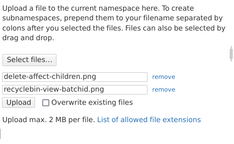
Here two screenshots of the UI in DokuWiki, first before selecting files:

image

And here after selecting two files:

image

As you can see, in DokuWiki, you explicitly need to select the checkbox to allow overwriting existing files to avoid that this happens by accident. Note that in DokuWiki, files are their own entities that are independent of pages, that’s why the text doesn’t talk about pages or attachments.

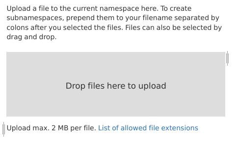
Regarding drap & drop, in DokuWiki the area around the “Select files” button becomes a drop area when you drag a file:

image

I’m not saying that the usability of DokuWiki is perfect, but it could certainly be an inspiration as it seems to have all the features that we’re looking for.

1 Like

Nice! I was not aware, so perhaps it can be just a CSS adjustment. I’ll take a closer looks, thanks!

You’re right, thanks for the heads up!

Thanks for these screenshots, it helps a lot!

From my POV it could be the same for both types of users, because after the upload is complete the details about that file are shown on the file list, above the new files section. Is there any particular field that you think would be interesting to keep here when completed.

It could be, but I feel it would grab too much attention for such a small feature. This is something that is in my mind for quite some time now for a proposal: Introduce a type of button of tertiary importance. Other design systems uses them for small interface elements and I think we could benefit from them as well. But I need to look into their accessibility and usability recommendations.

If the upload is cancelled / failed there won’t be anything in the file list :slight_smile: Knowing when your file upload failed can help advanced users understand why their upload did not get through.

:ok_hand: We do not need to keep visuals and semantics always aligned. We do have some buttons styled like links (and links styled like buttons) in our UI and it’s okay to add more as long as we have a clear reason behind it :slight_smile: .
Having a reliable design for tertirary buttons would be good :+1:

1 Like

Makes sense for failed uploads indeed. For canceled ones, maybe not so much, as it was a user decision after all. I will adjust the design with an error status :+1:

Hi! Nice proposals. If the upload section is to be revamped, maybe this one about units should be considered as well? Loading...

In the proposal mockups, I see that there’s something for cancelled uploads but nothing for failed uploads. Would failures be displayed as “Upload failed”?

It makes sense, yes. I’ve included the suggestion from this Jira in my image below.

Indeed, this status was missing from my proposal, I’ve updated it below.

New ones on the right side