Hello!
Context
After the fix for XWIKI-21492, a few buttons have displayed a weird behaviour: on hover their text would be underlined.
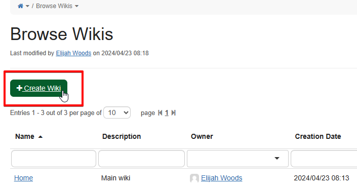
A.
B.
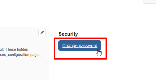
C.

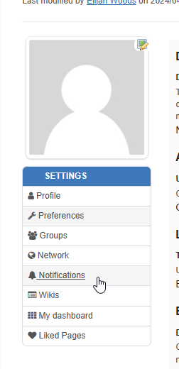
D.
Those screenshots are a courtesy of @ilie.andriuta who brought up the question ![]()
The reason why this happens is that those elements, even though they look like buttons, are anchors <a>. On XWiki, all anchors are underlined on hover.
Before the recent change, those had a custom style that made sure they wouldn’t be underlined even on hover. With the change, this custom style lost priority and is now overridden.
We could fix the change in style one way or another, but IMO this highlights a semantic issue with those buttons. The advantage of having an action link (link that looks like a button) over a button is that the user can right click it and open it in a new tab. We have some of those in the UI, and in most cases they are fine. However, we should still use buttons if the action does not need to be done in a new tab.
Proposal
Replace the action links A, B and C. This will be a regression feature-wise (no more creating a wiki in a new tab, disabling an account in a new tab or changing password in a new tab). This will be an improvement in the semantics and consistency of our UI.
Opinion
I think that in the cases of A, B and C it’s ok to lose this “New Tab” feature. However it’s not the case for D, opening a new profile section in a new tab is an important use case: I’m editing a preference and I want to check what I put in a preference in another section, I want to be able to open a tab with this other preference next to my editor easily.
Action links can be a bit tricky to deal with on multiple levels, and I’d rather have them used (in the XWiki standard flavor) only when a button is not enough.
Conclusion
What do you think of this proposal? Do you know of other action links that could be buttons like A, B and C?
Thank you in advance for your feedback!
Lucas C.
