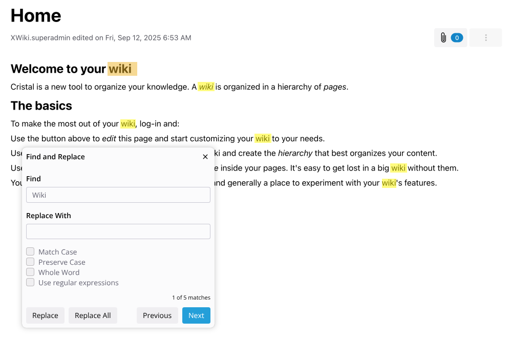
This came in the internal XS (XWiki SAS) chat as an improvement for Block Note editor, but it could be used to improve CK4 as well (I’m not sure if it’s worth it though).
The main points of the proposal are:
Parameters:
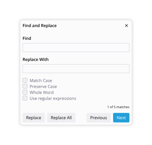
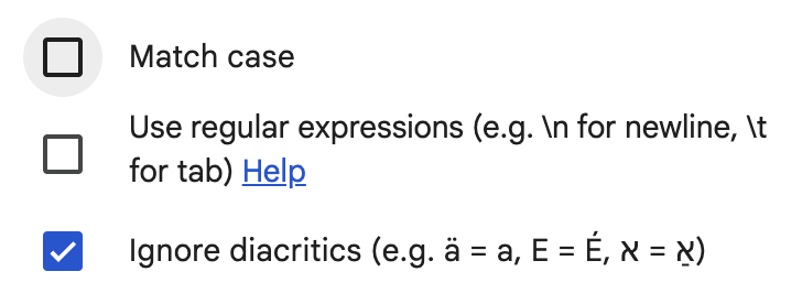
Standard toggles (Match Case, Whole Word, Regex) and preserve case option for smart replacements.
The search scope defaults to the whole file, but is restricted if some text is selected before actioning the feature.
Entry Points:
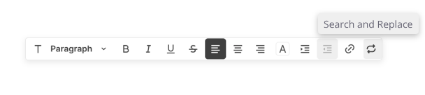
Adding buttons in the main and floating toolbar.
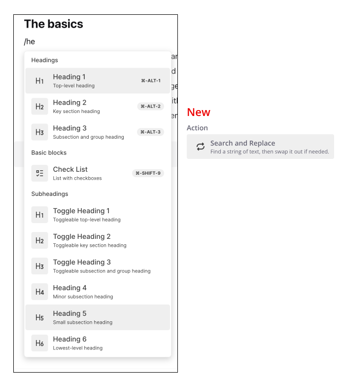
A slash command option.
Important UX details:
Live highlighting,
Auto-scrolling to keep active matches in view,
A live match counter
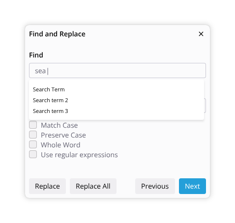
Dropdown search history.
Important: “Replace All” must register as a single undo action.
I know that this describes a quite standard Search and Replace feature, available in so many editors, but I think it would be good to get an agreement on it.
I’ll let this topic open through September to get feedback and plan on closing it by the end of the month.
Stupid question: Shouldn’t this feature be implemented by the blocknote developers since it’s a very basic feature? I guess we could send them your design
Yeah not worth it since we want to move away. Also I guess it already supports search/replace.
That’s the idea. In the XS chat it was noted (by @mflorea or @mleduc, I’m not sure) that it would be useful to have design discussed between us beforehand.
Thanks @tkrieck for your work on this. It seems very complete and would be a great starting point. Allow me to give some feedback from BlockNote perspective.
UX
For things we ship in BlockNote directly, by default we prefer to ship a bit more minimalistic design with less options. (we could do this in a way that it’s still customizable if needed). Specifically, I compared some different apps (GDocs, Notion, Slite) and notice the following patterns I would prefer:
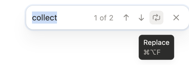
By default, show a search-box only. Replace mode can then be entered via a “replace button” or similar. See screenshots:
I suppose it depends on what you consider the main function: search or replace. What @YousefED proposed is more clean but requires more clicks/actions to perform the replace. If the goal is to override the search/find shortcut from the browser (e.g. Ctrl+F) then it makes sense to show a search popover that has an additional replace function. But if we were to expose a “Search & Replace” quick action then I’d expect the replace function to be visible right away. The popover could be configured to open with the replace collapsed on not, depending on the entry point though.
I agree we can drop some of the replace options, at least from a first version.
Seems like a good option, I mocked up the replace dialog directly.
I think they are important for large refactors of documents. Between the two I think Whole Word is more important though, and it could be even on by default. So searching for “car” would not match “carpet” for example.
I’ve updated the main proposal with the most recent discussions.
Added a section about keyboard shortcut.
Added a section describing the use of the quick entry UI as per @YousefED 's remarks
Changed the icon on the toolbar for a more traditional looking glass icon. The circular arrows are retained only for the replace feature.
From my POV:
The main dialog modal should be shown by clicking the icons / slash command
The quick entry UI should be entered by default when searching using a hotkey combination (e.g. cmd/ctrl + f).
From this UI there’s the replace icon that leads to the full featured modal as well.
I fear that if the quick entry UI is triggered via the icon or slash command, the UI may feel too unchanged, leading users to think the feature isn’t working. For power users I think it’s a good feature.
For clarity, this comes from a point of view that we will have a static toolbar visible at all times so features like this are clearly communicated by the UI.