In the last few years, I’ve seen more and more the idea of NOT making the disabled button grey, but to make it the “transparent” version of the button. Some sources that I’ve read about this on: 1 , 2 , 3 , 4
For the second idea, this is how I envision the states. Because we have many themes, dark & light ones, some (simple) equations need to be made to achieve good contrast. These “equations” mostly mean deciding how much we darken or lighten a color to preserve contrast and distinguishability.
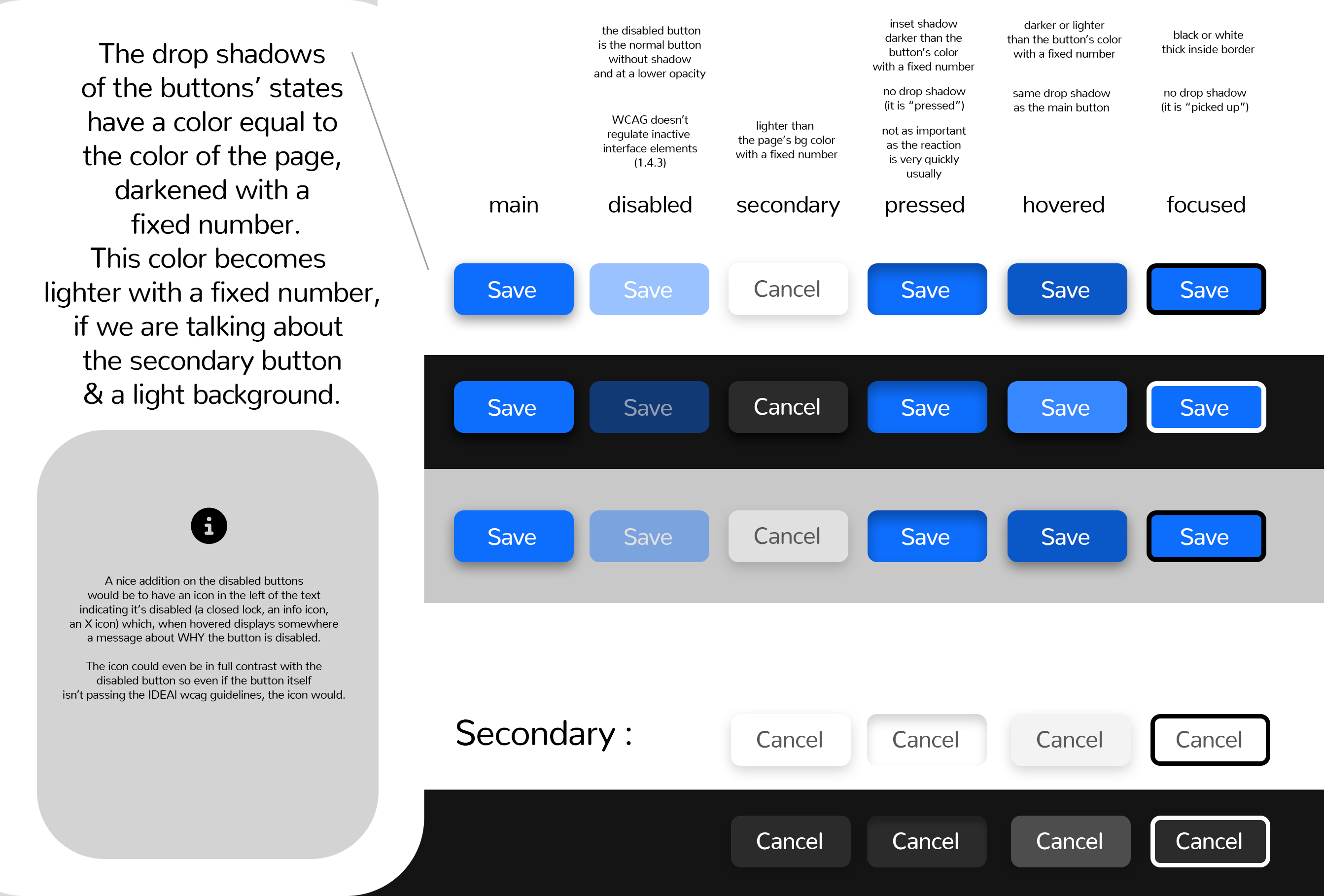
Button States (with shadows)
I’ve made this graphic containing the details of these states:
Quote around inactive interface elements:
Success Criterion (SC)
(…)
Incidental
Text or images of text that are part of an inactive user interface component, that are pure decoration, that are not visible to anyone, or that are part of a picture that contains significant other visual content, have no contrast requirement.
Let me know what do you think about this 