Shadows on buttons - Minimalist Skin 4

Hello everyone! :star_struck:

This time I’m back to talk about the drop shadows some buttons have in XS in their default state (the 4th issue in this proposal).

Especially when shadows are NOT soft, they tend to clutter the UI, at the same time dating the overall design.

With no shadows on buttons, we would get more into the modern flat design. The only problem with flat design is that sometimes elements (buttons, especially) don’t feel clickable to some users.

If we feel like our users would have trouble differentiating clickable elements from non-clickable, we can keep the shadow but make it blurrier (softer and more spread).

From my perspective, knowing that our users are pretty technical, I believe they wouldn’t have any trouble differentiating between a flat button and a button with soft shadow, if the contrast against the background is right.

Idea 1: No Shadows

Apart from having the advantage of having a more modern feel, we’d benefit from more choices in terms of background-colors for the buttons. Because of the current shadow, secondary buttons can’t really be full light gray because they would look “fuzzy” in combination with the shadow.

Bootstrap 5

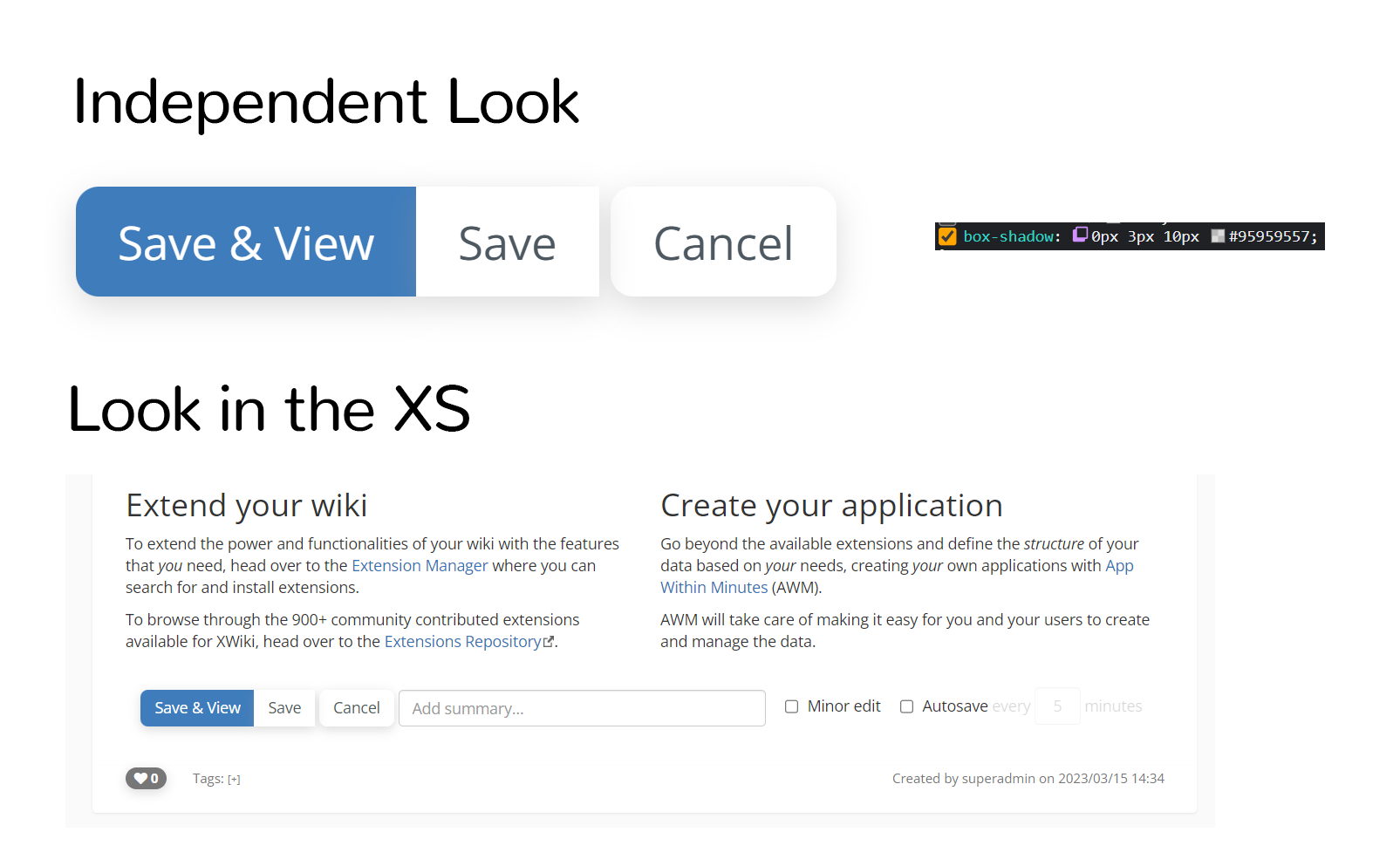
This approach would be the same approach Bootstrap 5 took with their buttons. Flat, no shadows:
image

Look in XS

This is how the XS buttons would look like if we progressively made the last changes talked until now (1, 2, 3) on the forum, including the lack of shadows which is proposed with this current discussion:

shadow on buttons

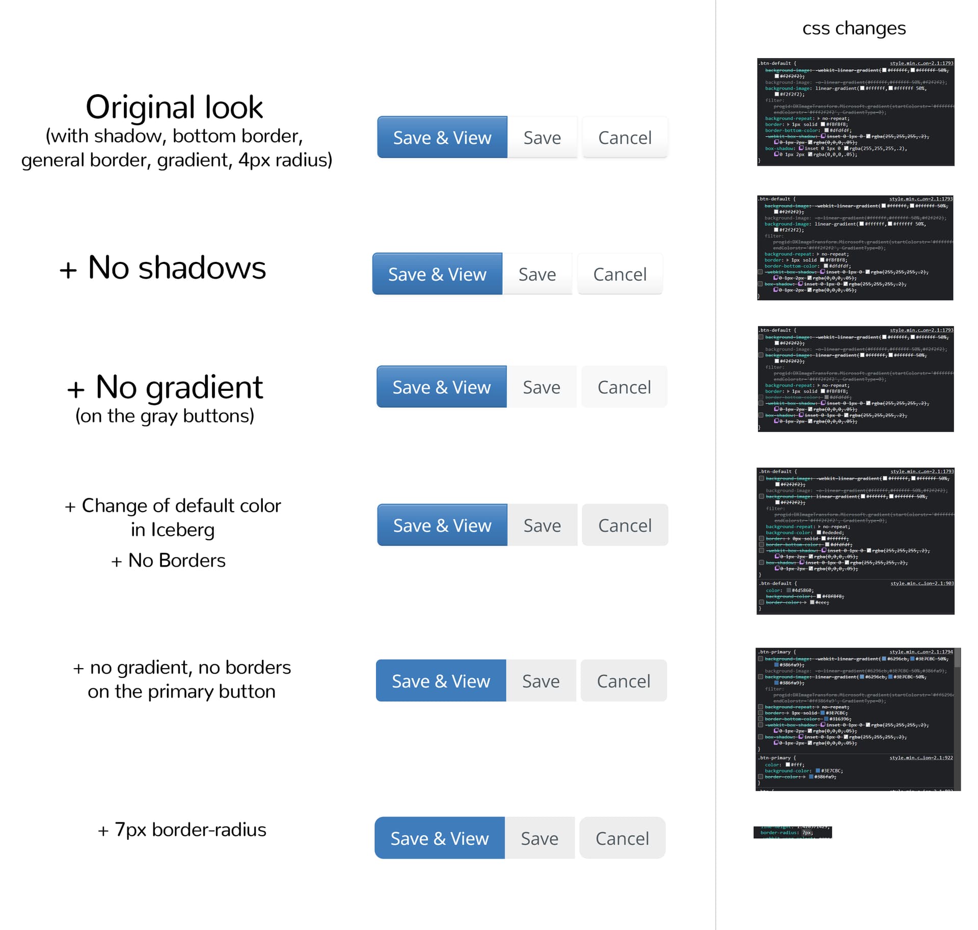
The image contains the minimal css changes.

Idea 2: Soft shadows on buttons

Shadows can make certain elements easier to find in a flat context and enhance the clickable feel of a button.

If we choose to go with a softer/ more spread shadow, with the same color on the main and secondary button, this is how it would look:

same shadow on buttons

The shadow is big enough to make the whole interior of the button “outlined”, so the button can just be by default in the background-color of the main content. Of course, this is easy to say for light backgrounds. In this case, we can even calculate the shadow’s color.

For dark backgrounds, the shadow either wouldn’t do much OR it would be not a shadow, but a glow. While the glow can be nice, it might not be the feel many organizations / companies would go for. This would imply the need of letting the user have or not have the shadow on buttons, which require time dedicated for this.

Another problem arises in the case of having the same color for shadows. The main button is in a much darker color than the secondary color. When applying soft shadows, we’ll obtain a weird effect: the secondary button will feel more important than the main button because of the contrast between the color of the button and the color of the shadow. The contrast is bigger in the case of the secondary button (at least in the example and in probably all light themes) which makes the shadow seem more pronounced, thus making the secondary button feel closer to the user.

This may mean that we’d need two separate shadows and that complicates more stuff.

Conclusion

I believe the right approach for this revamp is to go full flat style on buttons (idea 1) having in mind the limited time available on this and our focus on accessibility.

What do you think? :thinking:

Hi,

First of all the Save button should have round borders on the right :slight_smile: We just didn’t notice so far because the border radius was small. The hidden input following the last button in the group prevents the proper CSS styles from being applied. We can’t move the hidden input before because we’d have a problem with the first button in the group.
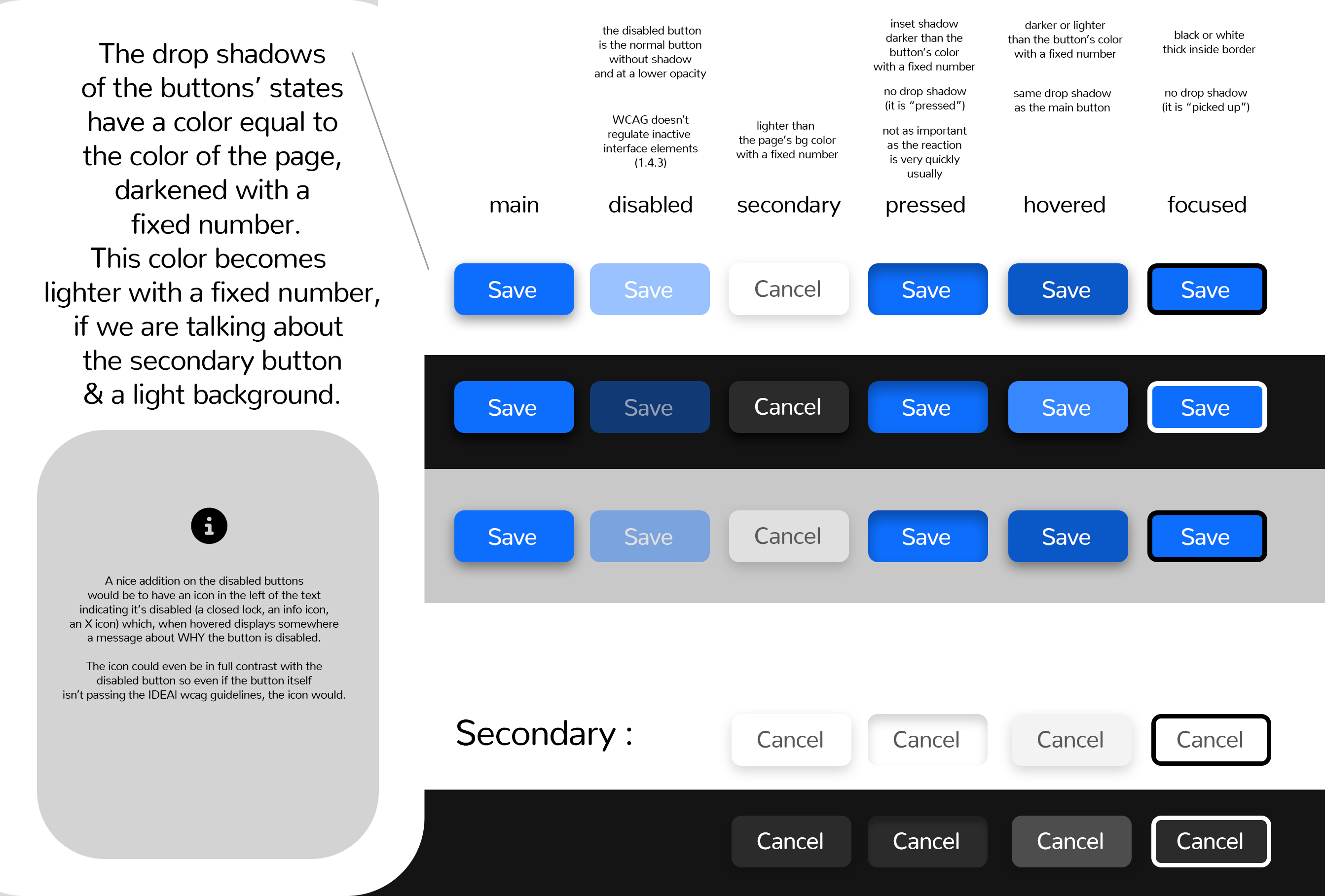
Then, we have to think also about button states: disabled, hovered, focused, pressed, etc. How do you propose to mark these states? I’m particularly worried about the disabled state in your first proposal because, at least for the secondary button on the Iceberg theme that grey background is too similar to what we often see on disabled buttons.

Visually, for me the second proposal looks better, but I understand that it poses problems on other color themes than Iceberg.

Thanks,
Marius

1 Like

I agree with @mflorea that we need to consider all button states.

Regarding the two proposed designs, for me the shadows look inconsistent when they are only applied on buttons but not on other input elements. In particular, the input next to the buttons for the summary looks quite different, maybe even disabled compared to the button with the shadow. Could you maybe a) try applying shadows to more elements and b) shows some more parts of XWiki’s UI with the shadows applied, ideally a screenshot of the full UI but also some details like the notifications dropdown?

I think this might need to be taken as an issue of its own. I’ll search if there is one already created. What does the hidden input do?

In my mind, after we decide most stuff related to buttons, we’d rethink if the Save & View button and Save button need to stay together in that place (I think they shouldn’t), make them rounded, increase just a bit the distance between them, take out the right and left padding from the panel they are in to be aligned with content, increase the space between these buttons and the summary input, maybe even rethink the summary input position.

Would be happy to tackle this part as well, but yea, certainly needs a proposal on its own. Will let you know when I post something abt this

In the last few years, I’ve seen more and more the idea of NOT making the disabled button grey, but to make it the “transparent” version of the button. Some sources that I’ve read about this on: 1 , 2 , 3 , 4

For the second idea, this is how I envision the states. Because we have many themes, dark & light ones, some (simple) equations need to be made to achieve good contrast. These “equations” mostly mean deciding how much we darken or lighten a color to preserve contrast and distinguishability.

Button States (with shadows)

I’ve made this graphic containing the details of these states:

buttons states

Quote around inactive interface elements:

Success Criterion (SC)

(…)

Incidental

Text or images of text that are part of an inactive user interface component, that are pure decoration, that are not visible to anyone, or that are part of a picture that contains significant other visual content, have no contrast requirement.

Let me know what do you think about this :blush:

Sounds good in general. I’d like to see a full screenshot of idea 1 on the home page in edit mode for example. I think in general all your proposal would benefit from showing full screenshots of XWiki so that the proposals can be seen in action with some context. That makes it simpler to visualize how it would look. Thanks a lot for the proposal.

1 Like

True, true. Thanks for the suggestion!

Here is how idea 1 would look in action, in edit mode on the home page:

look of simple buttons

Thanks. That looks good to me. Have you verified that there’s no WCAG contrast issue between the light grey buttons and the white background (for Iceberg at least)?

Since you brought up idea 2 and mentioned certain contexts where shadows could be better, do you have examples in XWiki where idea 1 wouldn’t look that good?

Yes, it’s a separate issue. The hidden input is needed in order to be able to have xclass properties that have the same name as one of the action buttons. See XWIKI-6936: Cannot save a class after creating a property named 'acti… · xwiki/xwiki-platform@d7562e6 · GitHub .

I like it. Good point about the “transparent” disabled buttons.

1 Like

Looking great!
I don’t like the transparent disabled buttons because they introduce unexpected contrast violations. With transparency, contrast always drops. For example, I took the transparent button on the second line (black background). The contrast was not enough to meet WCAG requirements → Colour Contrast Checker
I’d rather use an explicit color to convey this muted state (for text color, the .muted mixin works well). It’s easy to find or check contrast if you only use full colors. The issue with using semi-transparent elements is that we get a range of colors in the theme, that are not ‘really’ part of the theme, but a variation from two of its colors. E.g. the text color (white) is fine on this background (dark grey), but somewhere, an element uses transparency and now we have two new colors (light grey for text and grey for background) that were not part of the color theme and don’t have enough contrast.

The icon would make things better, I’m not sure it would look good though.

Mentioned in this article about accessibility of button states, it seems like there is a debate on whether this kind of contrast should be considered as a failure, it’s a difficult issue to solve for everyone.

-0 for transparent disabled buttons,


Except this, this change looks good to me +1

I checked the last combination of grey buttons in the original post picture ‘Look in XS’ (which seemed to me like the least contrasted in this picture), and it passes contrast requirements for WCAG :+1:

I totally understand your concern on the contrast violations of a “transparent look” button.

The only problem that I have with setting a fixed gray color on this disabled button is that the user is absolutely able to set the main button or another button to a variation of gray. Now we would have two buttons that look very similar and the user has to use his memory each time to differentiate between the two (or get frustrated in the process of trying to figure out why his button is not working).

I feel like the lock icon might be a good answer in both ideas (both the fixed gray background disabled button and the semi transparent button).

Here is how it would look for the “transparent” buttons:

lock icon on  disabled icons

While hovering on the lock icon a warning box is displayed beneath the disabled button stating why the action of the button is forbidden to the user.

What do you think?

I guess the disabled button could be a proposal in itself, but maybe we could find a solution in the context of this current discussion ^^

1 Like

At a quick glance, I don’t believe there are contexts in which buttons without shadows wouldn’t work. I will make that audit of elements I was talking about in the Rounded Corners discussion and maybe some case will arise.

There are definitely cases in which the lack of shadows would negatively affect other components (modals, notifications dropdown), but I don’t think buttons would be one of them. If we solve the issue with disabled buttons, no shadows buttons could be a good choice, too

There is a lot of places in the color theme where “if the user does X, it breaks this” already.

Note that AFAIK this kind of button is not found in a lot of places, except on WYSIWYG edit mode, see the fix we merged about this issue in the current theme at XWIKI-19145: Edit button must be unaccessible for keyboard while in edit mode by Sereza7 · Pull Request #2191 · xwiki/xwiki-platform · GitHub (solved XWIKI-20908 Disabled buttons lack contrast).

Looks good to me :+1:
Note that most buttons keep the same color for text and icons so far (with Font Awesome, because Silk doesn’t support color variations), but it makes sense to change this practice here since there isn’t enough contrast between the text and the background.

I think it’s a good solution :+1:
I don’t think it’s worth spending time to create another proposal, you described it pretty well here already and it’s a marginal change :slight_smile:

I’m not convinced by the lock icon. Can you point us to other places where this pattern is used? I see three problems:

  • some buttons have icons, in which case the icon represents the action (e.g. the pencil on Edit button); when you have such a button near a disabled button it’s not easy to know if the lock icon represents the button action (“to lock something”) or the disabled state. My guess is that most of the users will think that it represents the action.
  • disabled state can be toggled which leads to an annoying UI flickering (in some cases where the width is limited it could even shift the content down or move the button to a different “line”), if the button doesn’t have an icon already (which is common);
  • I don’t think the lock icon is a good representation for the “disabled” state; the lock icon is often used to mean “you’re not authorized to perform this action”, so related more to access rights

For these reasons I’m -0 for using the lock icon on disabled buttons.

Thanks,
Marius

1 Like

Hello @amilica , all,

For the disabled state it appears that Bootstrap 5 has a solution based on what appears to be lighter colors: Buttons · Bootstrap v5.0 . Is it something that we could reuse? (same for all the other button states).

Also, lock label is confusing for me as well, for the reason that @mflorea mentioned, it being a new pattern we haven’t used before.

Thanks,
Anca

For the original question, I am also for the no shadow choice, it looks good to me.

I would also want no border-radius (or less than the 7x, which looks too much to me), but I don’t know if this is the discussion here or not.

Thanks,
Anca

I see you already replied to Rounder corners everywhere - Minimalist Skin 3 - #13 by lucaa .

Yep, aware of this and already explored in a way this idea a bit earlier in the discussion, with @CharpentierLucas.

If we are talking light backgrounds with white text there is a contrast issue which fortunately or unfortunately is not documented as a requirement by WCAG (see 1.4.3) Even if a minimum color contrast is not required for inactive components, I think we should still strive to make every important element available for everyone using XWiki (and I consider disabled buttons important)

If we have black text and the background becomes lighter, sure, we don’t have contrast issues, but if the text remains as black as before, it will feel like a normal button or, worse, may feel even more important than the actual normal button.

1 Like

Oki, nice, thanks for your feedback!

Hi @amilica . About this, it’s not correct to assume that our users are technical. Our goal is to make a software that can be used by non technical users at all and that is the simplest to use for them. That’s very important to understand since the design we propose need to go in this direction.

More generally, we need XWiki to be as simple to use as possible by default for simple users but also offer advanced features for advanced users (see https://www.xwiki.org/xwiki/bin/view/Documentation/UserGuide/Features/PageEditing#HSimpleandAdvancededitingprofiles for the concept of simple and advanced users).