Hello all,
Currently, livedata actions are presented as an icon + a corresponding label
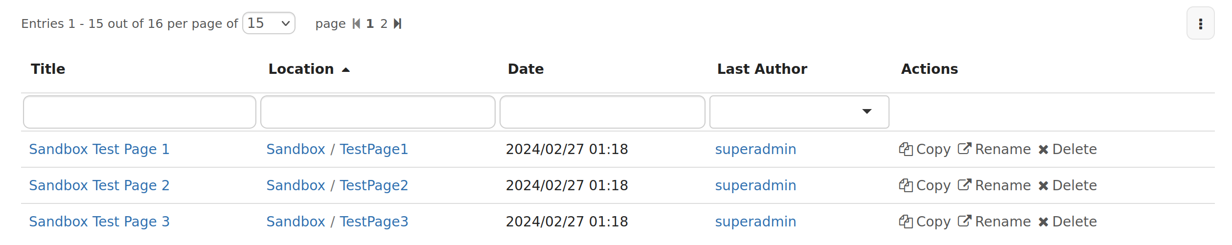
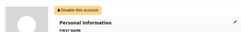
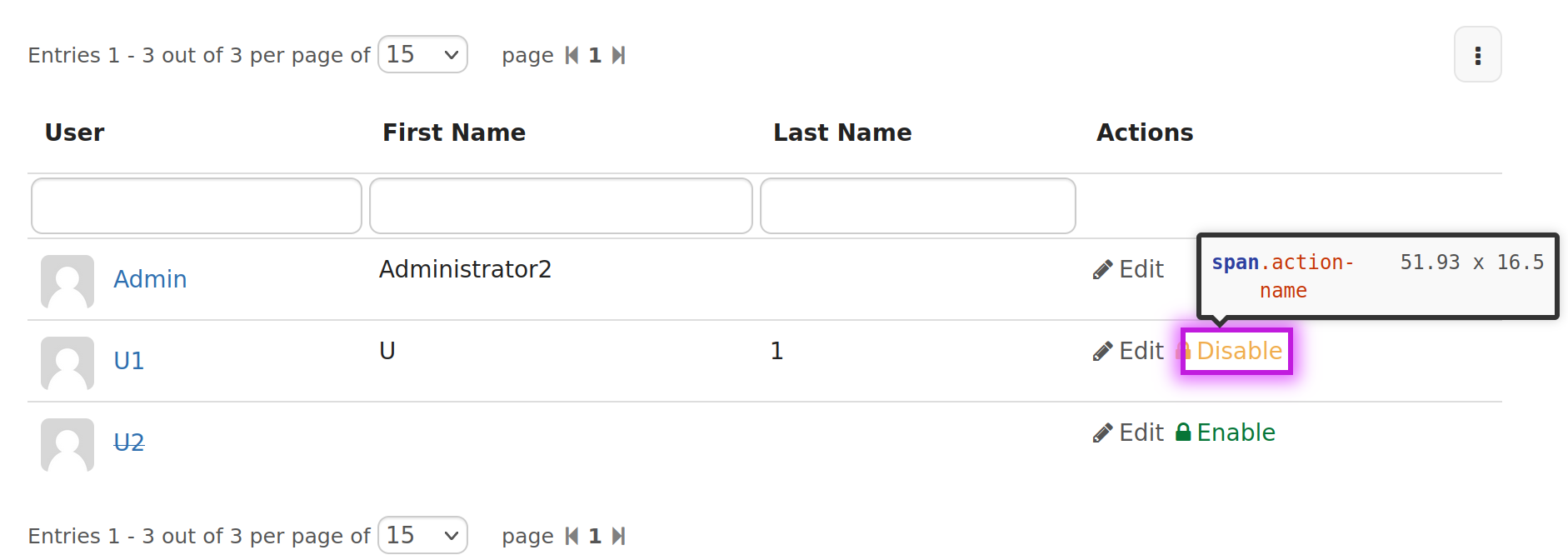
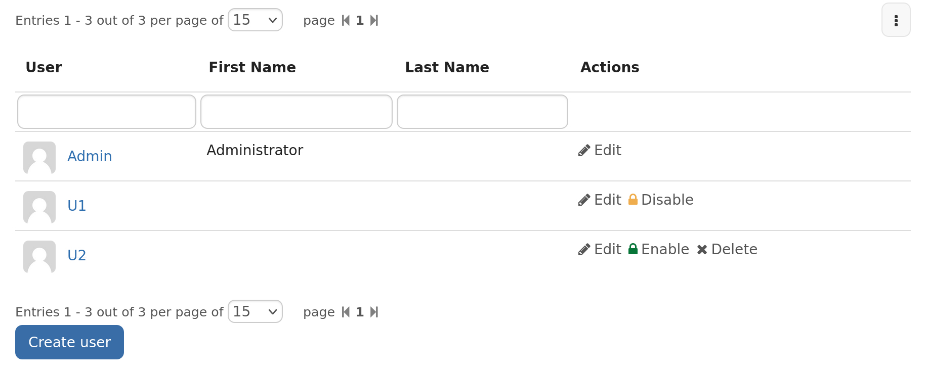
This leads to some limitations, for instance to migrate the users administration page, where some actions are represented by colored icons.
When migrating those to LD, I noticed that the labels, if of the same color as the icon, do not have a good contrast against the background.
A solution proposed by @CharpentierLucas is to style the actions as buttons instead of links.
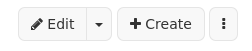
Here are a preview of what buttons could look like when presented as buttons:
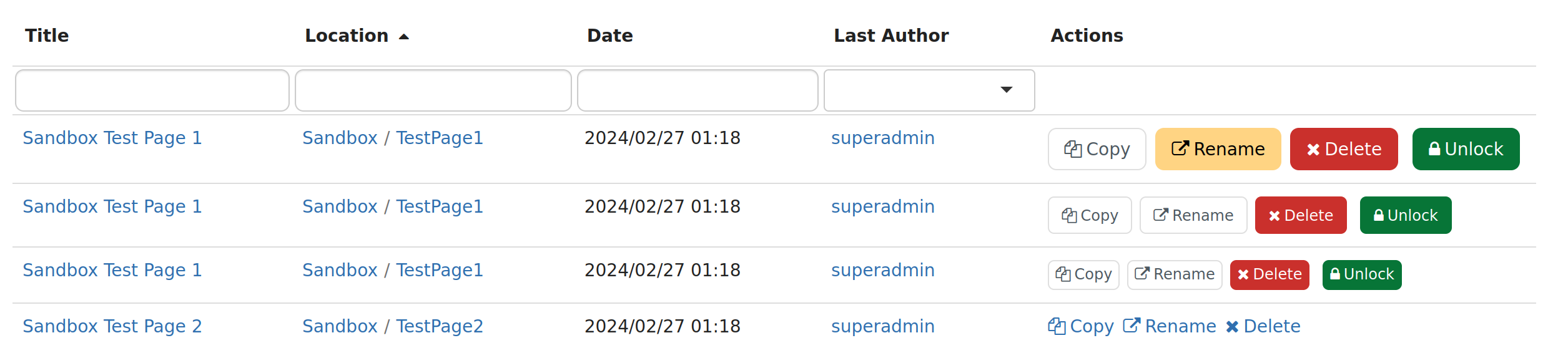
But, not that mixing buttons and links style is not always so pretty
Reminder, the configuration of an action currently looks like this
{
  "id": "copy",
  "name": "Copy",
  "description": "Copy entry",
  "icon": {
    "iconSetName": "Font Awesome",
    "cssClass": "fa fa-copy",
    "iconSetType": "FONT",
    "url": ""
  },
  "allowProperty": "doc.viewable",
  "urlProperty": "doc.copy_url"
}
Option 1: list of extra classes
Add a extraCssClasses property on the action configuration.
Pros:
- very easy to use
Cons:
- not portable, assuming we add
btn btn-default(bootstap 3), migrating to another design system will be a pain
Option 2: predetermined set of buttons
The idea is to have an optional botton property, with a closed set of possible values (default, warning, error, success, info, primary, secondary…), and to let server side handle the mapping to the current design system.
Pros:
- Flexible and anticipate the migration to another design system
Cons:
- We don’t really have a mechanism to adapt the result based on the current design system
But, if we centralize all the code related to button generation in a single place, which a closed set of choice. We’d only have this single piece of code to change to adapt to a new design system.
Conclusion
I’m +1 for option 2. WDYT? Let me know if you see another interesting option.
Bonus question: which should be the good button size? I’m -0 for the default size at it take too much horizontal space, +1 for sm or xs
Note: I’m not proposing to change the default style of actions, LD implementers are in charge of styling their buttons as they see fit.
 Examples given: