Hello everyone! I’m here to discuss the current default homepage of the product and the Playground. ![]()
Both of them offer some information about XWiki, but they don’t lead the user to take action or try out some commonly asked things.
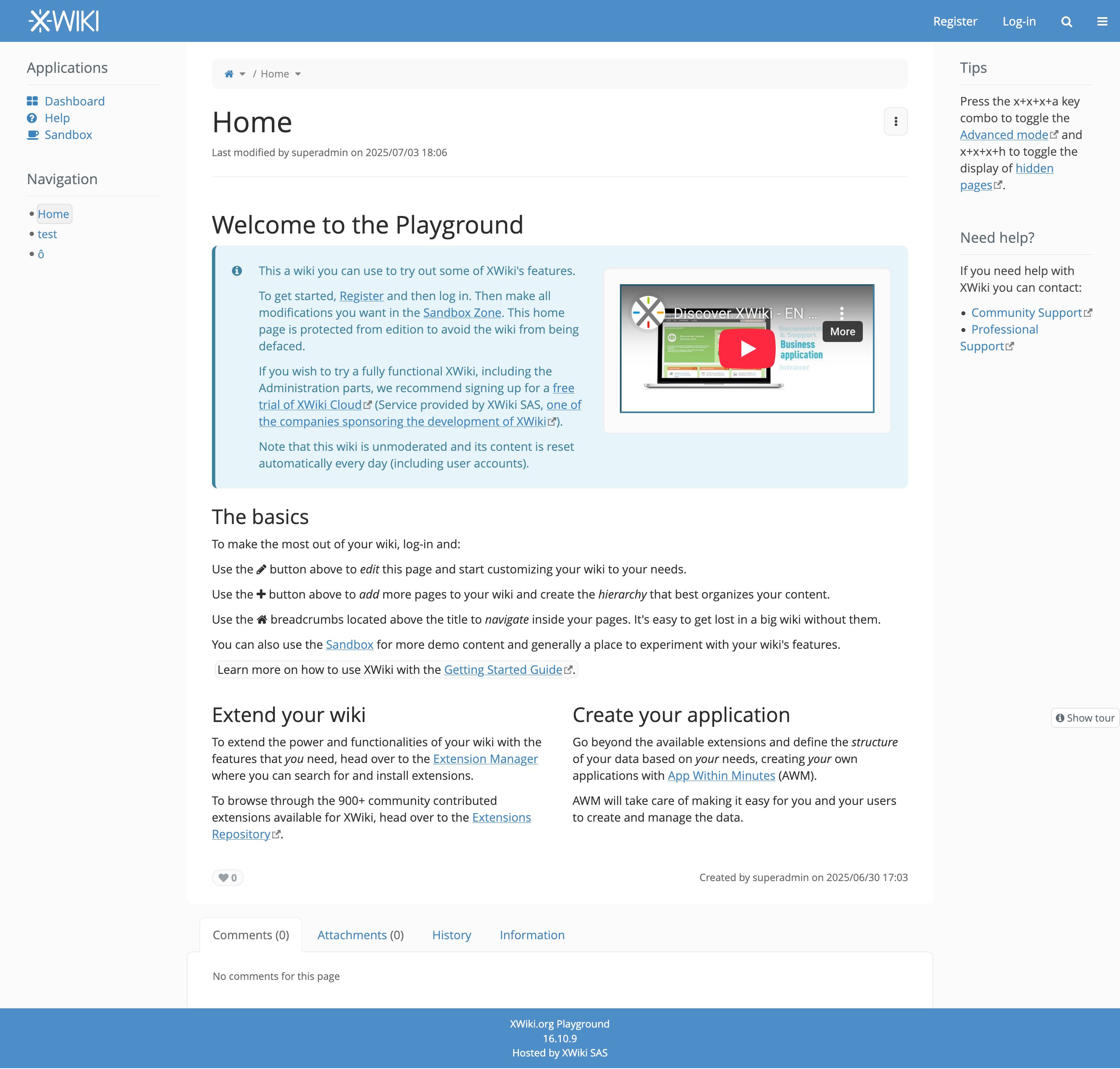
Playground Home Page
This is what a user sees first when entering the XWiki Playground.
Current look
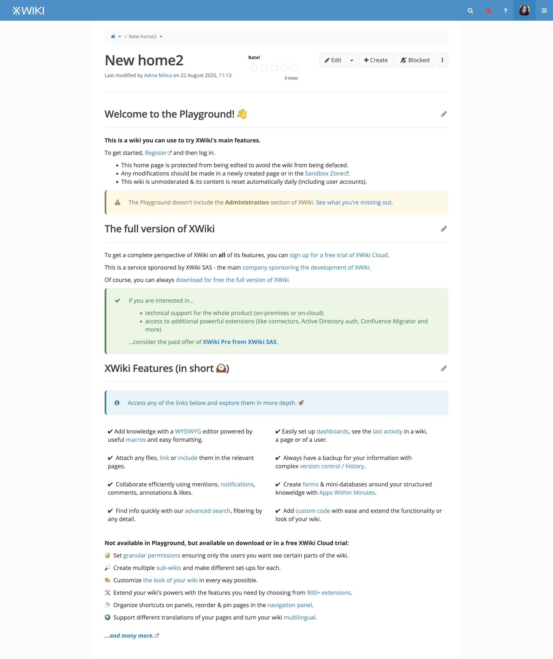
Redesign 
Changes
#1 The main point of my rewrite/restructure was to keep the content more digestible. That means breaking down big paragraphs into small items.
#2 We highlight the most important things about the Playground:
-
first box = it’s not a full trial
-
second box = there exists a full trial and a paid offer
-
third box = explore the features
#3 The XWiki Features section splits the most important features into 2:
-
the ones that can be tried out in Playground - main features non-admin related
-
the ones that cannot be tried out in Playground - most important from administration
We also include a link to see the full page of Features that we have on xwiki.org
#4 The links in the XWiki Features section can lead to xwiki.org documentation pages.
- Another idea would be to have light versions of those documentation pages directly in the Playground. Something easier to read, like a TL;DR.
#5 We use more emojis to make the pages more interesting visually and more friendly.
#6 The whole page uses more types of formatting, showcasing better what an XWiki page can look like.
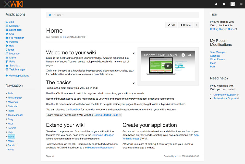
Product Home Page
This is what a user sees first when try out XWiki Cloud or after installing XWiki On-Premises
Current look
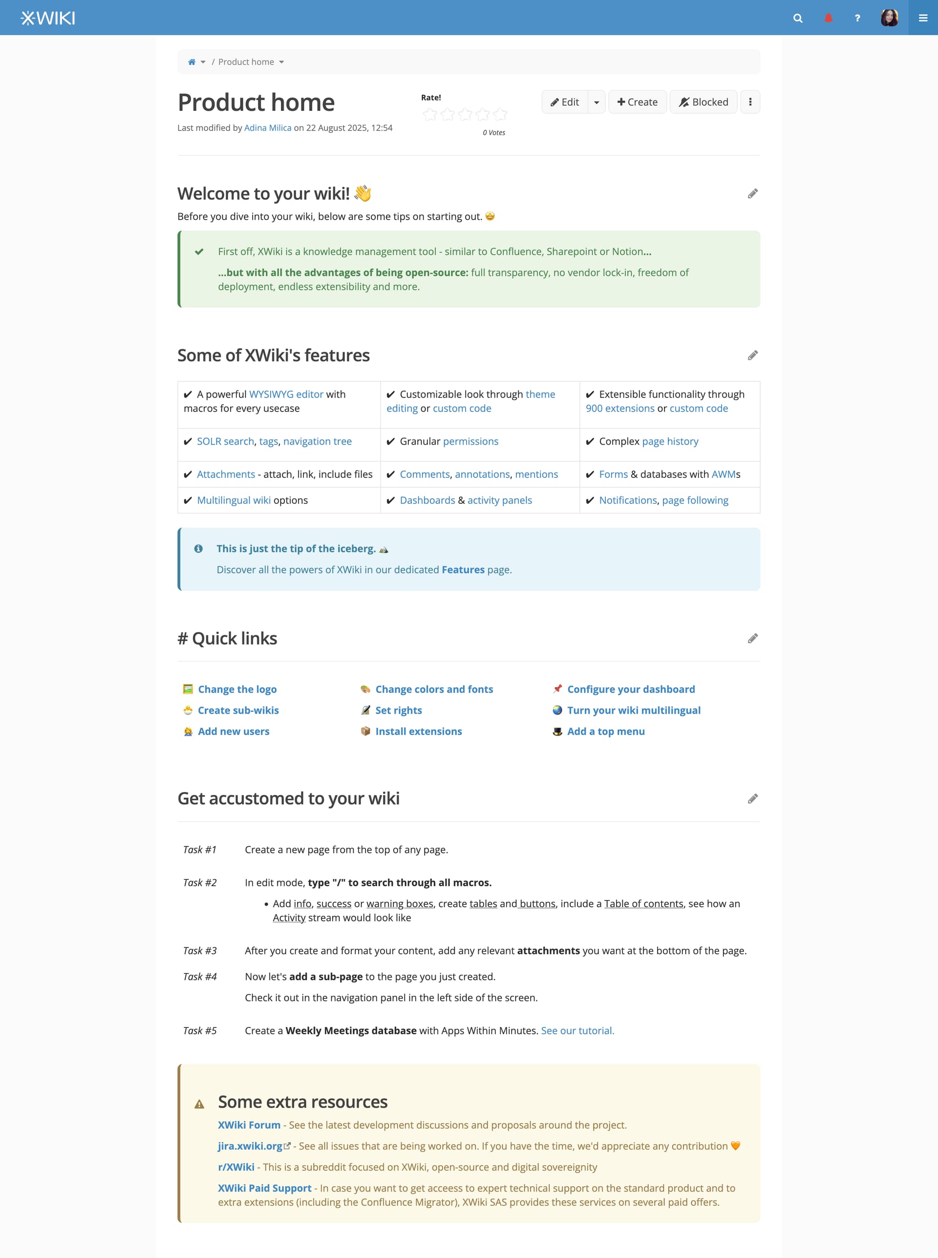
Redesign
Changes
#1 We introduce the user in the product and we also underline the product value from the perspective of being open source - add
#2 We add the main features of XWiki as concise as possible as the page is longer than the one of the Playground.
-
The links can lead to xwiki.org documentation, even though I’d very much like them to point to a shorter documentation directly in the product.
-
We also add a link to the the entire Features page where user can dive into other features.
#3 We create a Quick links section with the most important actions the user would like to discover. All of these links are relative links, leading to parts of the user’s specific instance.
#4 After these, we add a lists of quests / tasks for the user as a suggestion to try out certain basic features.
#5 At the end, we list our some important links.
What do you think about these changes? 