Hi everyone,
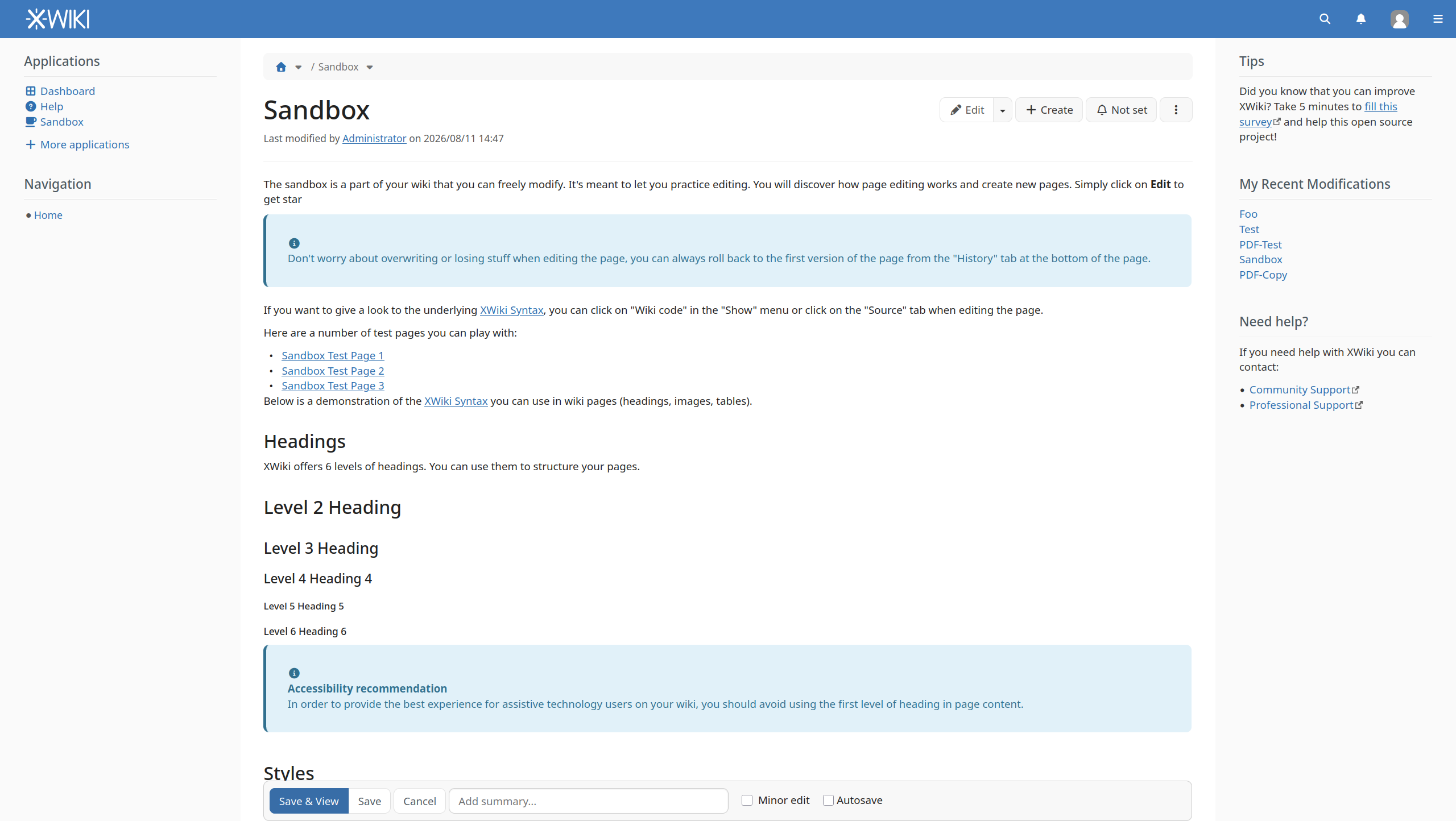
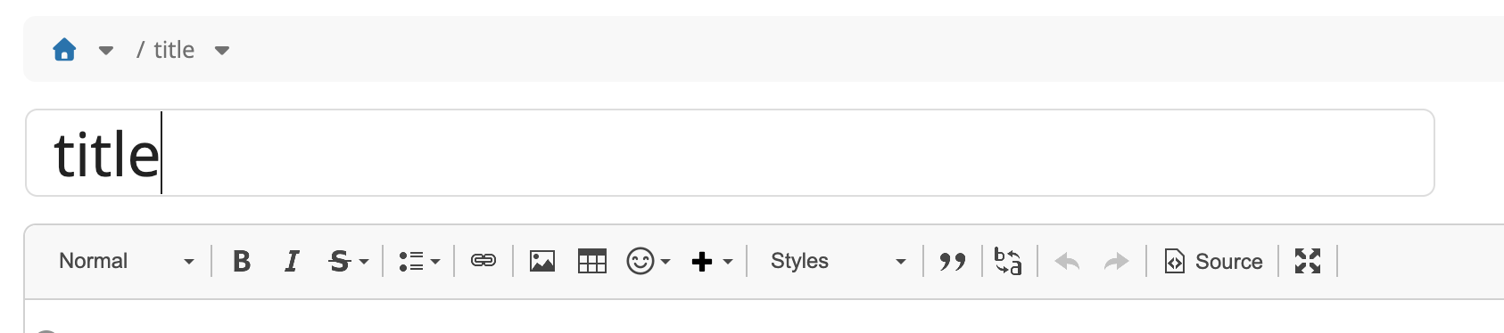
While integrating BlockNote editor, I took the liberty to make a small UI change to the standalone WYSIWYG edit mode: I removed the border around the title input, made the label visible only to screen readers and increased the text font-size so that the title appears as in view mode.
- before
- after
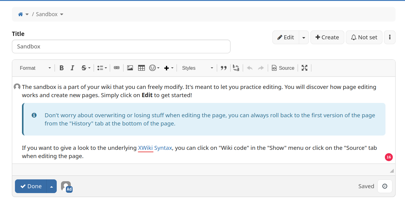
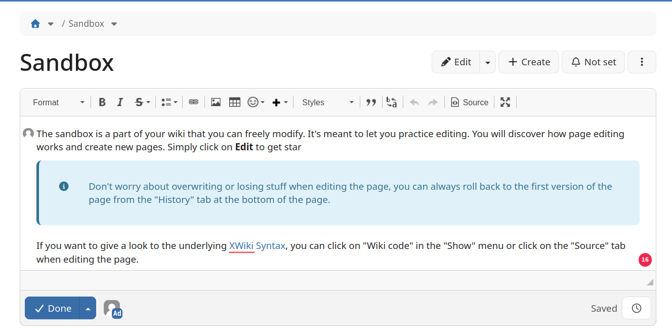
I did this for the following reasons:
- the content field already didn’t show a label, so it made sense to hide the label for the title field as well
- without the label, the title input looked strange to me though (with border and small font size)
- the inplace edit mode was already using the same style for the title input (no label, no border, increased font-size) as in view mode, so this change aligned the standalone WYSIWYG edit mode with the inplace edit mode
- the standalone WYSIWYG edit mode is currently used only for creating new wiki pages, but we’re planing to drop it and use the inplace edit mode instead, see XWIKI-19299 ; this change makes the future transition from standalone to inplace edit mode smoother; we could also switch the CKEditor style from iframe-based to iframe-less, to match the inplace edit mode, as a next step
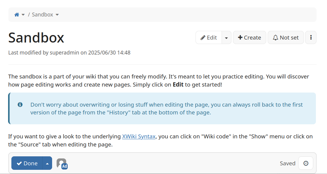
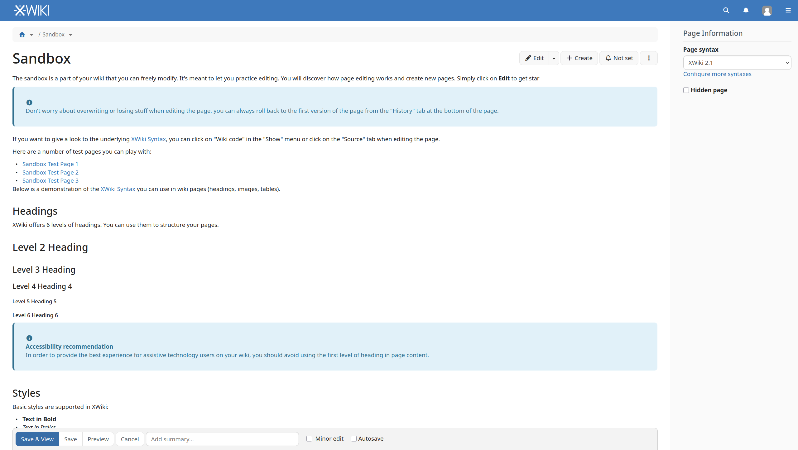
- make the BlockNote integration nicer; BlockNote doesn’t have (by default) an iframe-mode (border, fixed height, fixed toolbar) so it looks the same in standalone and inplace edit mode; this means that when BlockNote is used the standalone edit mode is already very similar to the inplace edit mode:
- Standalone
- Inplace
- Standalone
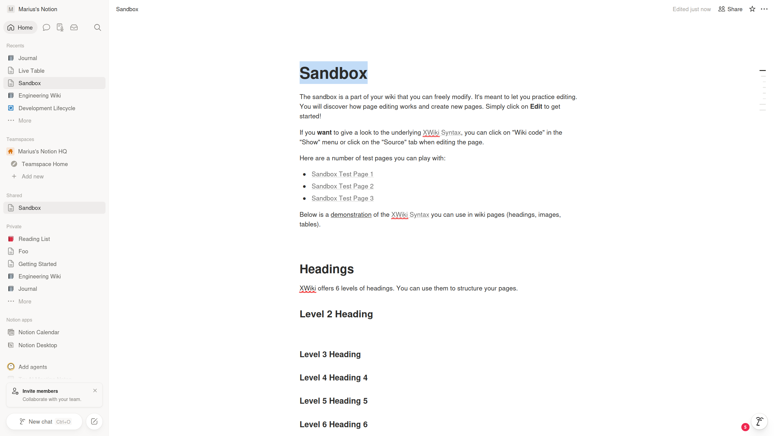
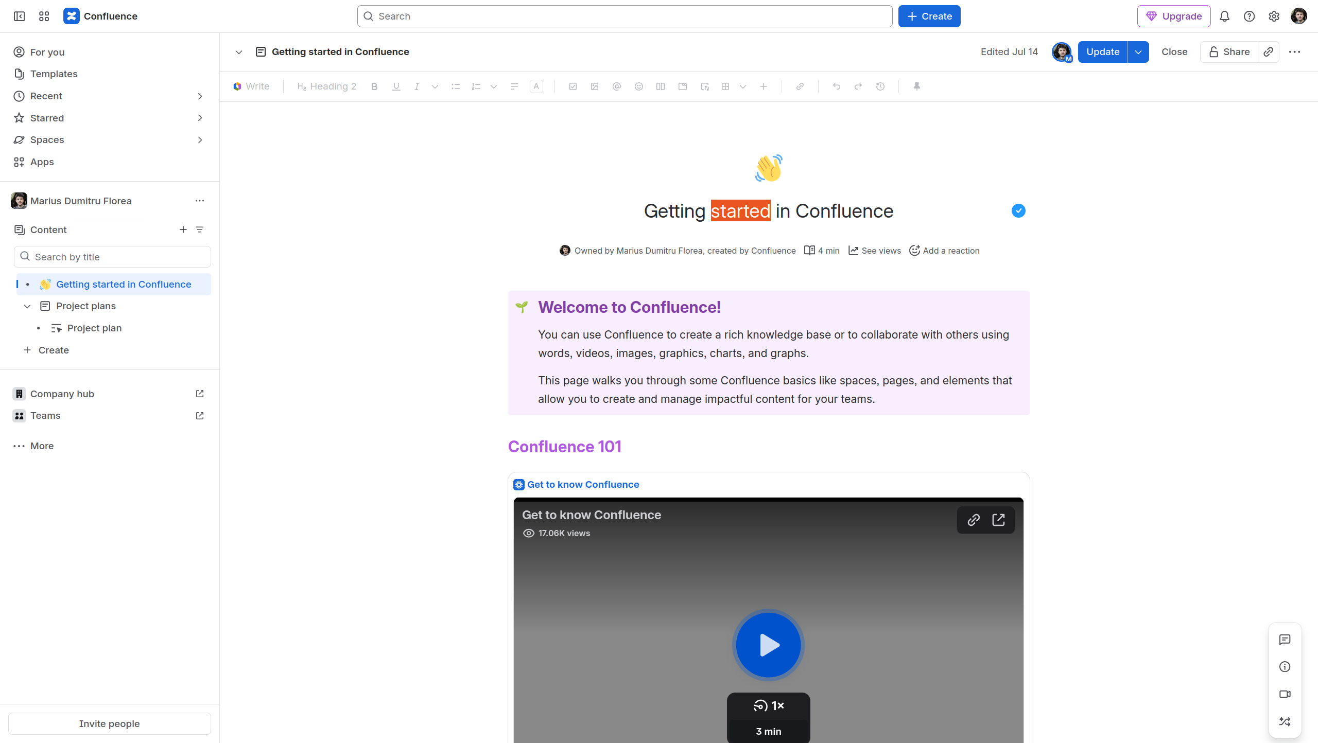
- Notion and Confluence style the document title similarly in edit mode (not as a text input but as being part of the edited content)
- Notion
- Confluence
- Notion
@ilie.andriuta noticed this change and reported it as a regression Loading... . Since @tkrieck seems to agree with him, I thought it would be good to see what others think of this change.
I see the following options:
- keep the change (my preference)
- add a border around the title, but only when CKEditor is used (style brought by CKEditor), @tkrieck preference I think
- revert the change
WDYT?
Thanks,
Marius
