Good afternoon!
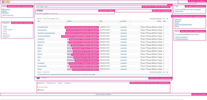
When working on XWIKI-20696: Accessibility best-practice: use landmarks in view pages (Jira issue & PR), we had a discussion with @MichaelHamann about the breadcrumb on document tables like the one in the Index of the wiki.
The Index page after the PR changes, with every landmark highlighted in a pink square
Where the issue arose:
A. We want landmarks on wiki pages. Breadcrumbs as they are very much fit the bill for being <nav> (a landmark role) elements.
B. We have one breadcrumb for every entry in document tables, to show location of the document.
C. From MDN web docs: " Landmark roles are intended to be used sparingly, to identify larger overall sections of the document. Using too many landmark roles can create “noise” in screen readers, making it difficult to understand the overall layout of the page."
A, B and C are not compatible together AFAIK.
The solutions:
- Let A off: we remove the landmarks from the breadcrumbs in tables.
- Let B off: we replace the breadcrumb in tables by another “simpler” element that just displays the location of the document, without links.
- Let C off: we ignore the recommendation on those pages and just go with a cluttered UI for screen reader users.
No solution is perfect here, and @MichaelHamann figured that we should ask on the forum to reach some consensus to close/merge this PR some day ![]()
My opinion:
-1 for 1. The breadcrumb ‘brick’ of UI should be the same whatever the place, making an exception for this seems like just bad UI practice.
+1 for 2. I think the visual UI looks already cluttered and there’s way too many interactive elements on the page. For me, we should fix this usability shortfall first. One issue of this would be to reduce possible interactions, which could be a slight regression on usability for power-user.
+0 for 3. This is the easiest choice, and the {{documents}} macro that generates such problematic tables are not on every page, it’s rare enough that we can manage a bit of user unfriendliness. It’s not a “hard” WCAG rule or break of ARIA and I think going against the recommendation here would make sense.
What do you think of those solutions?
Is there an easier solution that would conciliate all three requirements?
Thank you for your help!
Lucas Charpentier
