Hello!
In the context of XWIKI-20843, I had to think about the style of the Applications Panel drop-down toggle (see proposal for an idea of what this is).
The main idea in this PR is that we need to change its tag name from a to button.
This element had the behavior of a button but the presentation of an anchor.
I thought of a few possible options for style and I’d like to know which options would be more suited for this button:
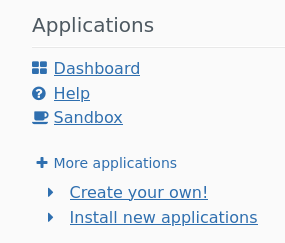
The ‘legacy’ presentation, where the button is an anchor lookalike
For reference, this screen was made with: border: 0;color: #2f6faf;box-shadow: none; background: transparent;.
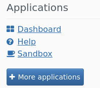
Using the default styles for bootstrap buttons
1.1 btn-default
1.2 btn-primary
1.X btn-success, btn-warning, btn-danger,…
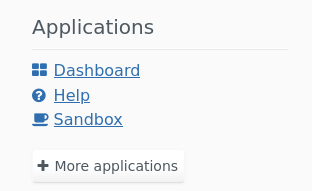
A default button with the same style as the document-menu buttons (Create, Edit, Translate, more actions)
For reference, this was made with background-color: #f8f8f8; background-image: none; border-color: #e5e5e5; box-shadow: none; color: #333333; text-shadow: none;.
Notes:
those screens are quickly put together prototypes, a couple things like padding might be off
Those were made with a user that had accessibility features turned on → the anchors are always underlined. For a default user this is not the case and 0. will be even more similar to a regular link.
-1 for 0. as this makes it not so clear for the user that they are not clicking on a link and that there is hidden content in there.
+1 for 2. but it comes with some LESSCSS.
+0 for 1.1 or 1.2 would be alright options too as they are the simplest to implement and maintain and do look like a button.
What option do you think is most suited for this element?
If you have another idea of how this element could be styled, don’t hesitate to share it!
I think there’s a problem with what we have now as it clutters the UI for some actions that are not used that often (creating a new app and installing an extension).
I’d like to brainstorm about ideas on how to make these 2 actions less visible.
I can think of one idea which is to introduce a small dropdown arrow (similar to the breadcrumb down arrow) just after the panel titles. They could be used to perform various operations:
Configure the panel (visible to admin users only)
List extra actions for the panel for actions that should be less visible. In this case there would 3 actions:
one to create a custom AWM app
one to install extensions (visible to admin users only)
It sounds like a good idea!
We already use carets for plenty of dropdown in the UI so this should not be too difficult for users to pick up.
For now, I’ll update the PR for XWIKI-20843 to implement the solution 2. presented above, as it was the one @MichaelHamann proposed on the PR, it looks good to me and it’s also the least eye-catching. I’ll create a ticket about the improvement you proposed and try to find some time soon to implement it.
I did a quick survey of the panels to see where the dropdown could be useful for a regular user (from the default flavor Admin Panel section):
Applications: (see above)
Members: view all members
Sibling: view more siblings
Overall panel content is quite simple, it’s usually already the bare minimum to make it work, a list of anchors or a sentence. I don’t think it would be worth the new UI only for the three uses mentioned above.
Being able to quickly access the panel configuration/edit could be really useful for admins though so
By the way, I thought about it a couple of weeks ago, but an action to access all tips and/or load a new tip from the Tips panel without reloading the whole page would be helpful to go through them exhaustively. It would also fit in the dropdown nicely.
I’m personally not fond of a button as I find it too visible.
BTW we need to decide if we’re ok to use ghost buttons too. AFAIK we’re not doing that ATM. The create/edit/etc buttons won’t work well here since the contrast will be too low without a border (see the other thread by Adina) so it’d need to be a ghost button I think.
I think we need a proposal on the forum first to decide if that’s something we want, before creating the jira (I mean you could always create it but you’d need to close it as won’t fix if we decide that it’s not a good idea in the end).
I don’t like it either and I don’t see the problem with using a link. A link can target a hidden section of a page using the document fragment identifier:
I’m not against using a button tag, but I don’t see why we need to style is as a button. We have other places where we have a “More” link, would this mean we have to replace those links with a button also?
The <a> HTML element (or anchor element), with its href attribute, creates a hyperlink to web pages, files, email addresses, locations in the same page, or anything else a URL can address.
The <button> HTML element is an interactive element activated by a user with a mouse, keyboard, finger, voice command, or other assistive technology. Once activated, it then performs an action, such as submitting a form or opening a dialog.
Here the element triggers an action (opens a dropdown), and doesn’t ‘move’ the user anywhere. I think a button here is more suited than an anchor, even though the anchor would probably the second best tag name for this situation
It just felt wrong to have style and meaning diverging (its a sizeable part of the accessibility work to harmonize them), but I understand and we’ll continue with an anchor style