Thanks for working on this.
I think this proposal is presenting some limitations that are important to discuss:
- I don’t see anything related to annotations in this proposal. How do we see the selected text of an annotation. How are user able to easily navigate between selected text and comments, etc.
- While the threaded UI looks nice, I feel like this is just a variation on the tree-based comments structure we already have on XWIki. I think it would be interesting to think of a way to flatten the messages while keeping track of which message is a reply to which. For instance what discuss is doing. One of the main pro of flattening thing is that it would also allow to introduce pagination on comments which we are missing on XWiki currently.
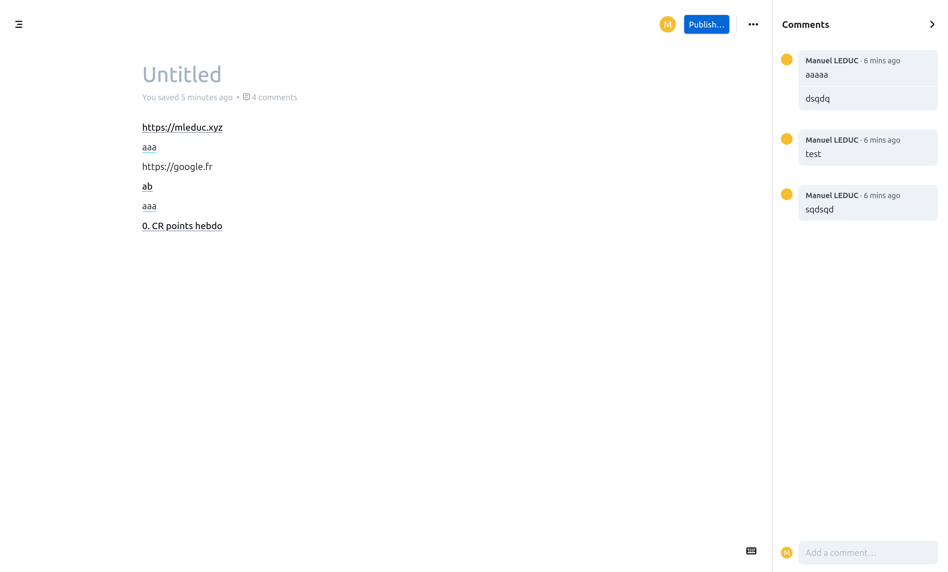
- Also, having the comment in a tab at the bottom is also not optimal as it does not allow users to both see the comments/annotations along with the text. This is why I think it would be useful to have weight pros and cons with the approach proposed by many knowledge managements software, with comments in an expandable right column (see screenshot below from outline, but it’s the same of others).
I know the points I raised above are not easy to answer, especially taking XWiki’s compatibility into account. Also, they are good question to answer for XWiki itself.
The rest of the proposal looks good!
+1
See my comments above.
+1
Annex screeshot