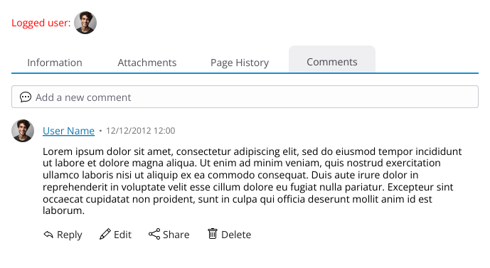
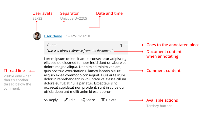
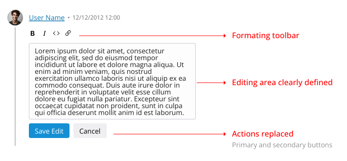
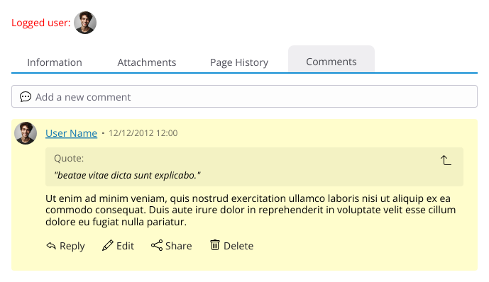
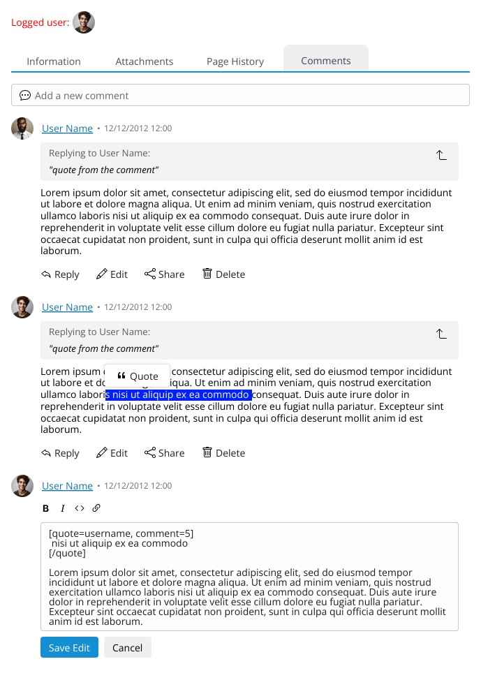
User Avatar: Displays the profile image of the commenter.
User Name: Shows the name of the user who made the comment.
Date and Time: Indicates when the comment was posted.
Edits should appear between parenthesis after the original date
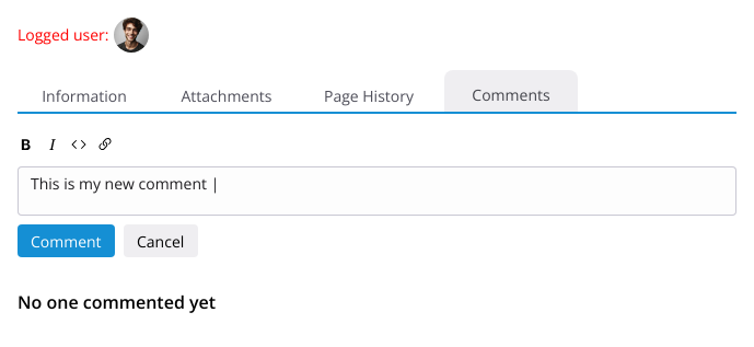
Comment Content: The text of the comment itself.
Action Bar: Displays different actions a user can take, depending on their permissions. These actions may include:
Reply
Edit
Share: This replaces the previous “link” action but functions the same way.
This might a personal bias, but I feel that, these days, the action “sharing” is more recognizable as an action that gives the user a link to be shared elsewhere that points to the intended location (a comment in our case)
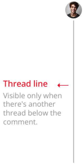
The thread line helps visually guide users through comment threads and nested replies. As an UI element it was heavily inspired by the comments section of Reddit.
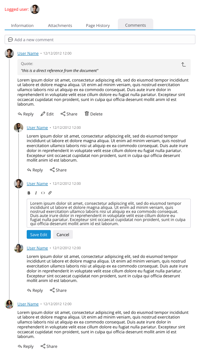
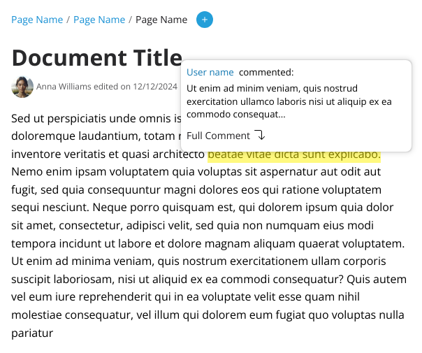
Full annotation
When navigating from the annotation itself (via the "Full comment"version) the background is in a yellowish shade serves to indicate to the user what is the annotated comment in case there’s a lot of them.
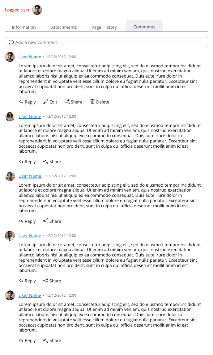
Edit 2: No threaded comments
In case we don’t go the thread line comments, like above, here an example of the comment section flattened, with replies and quotes. The quote syntax is just an example that I took from Discuss as an example.
I think this proposal is presenting some limitations that are important to discuss:
I don’t see anything related to annotations in this proposal. How do we see the selected text of an annotation. How are user able to easily navigate between selected text and comments, etc.
While the threaded UI looks nice, I feel like this is just a variation on the tree-based comments structure we already have on XWIki. I think it would be interesting to think of a way to flatten the messages while keeping track of which message is a reply to which. For instance what discuss is doing. One of the main pro of flattening thing is that it would also allow to introduce pagination on comments which we are missing on XWiki currently.
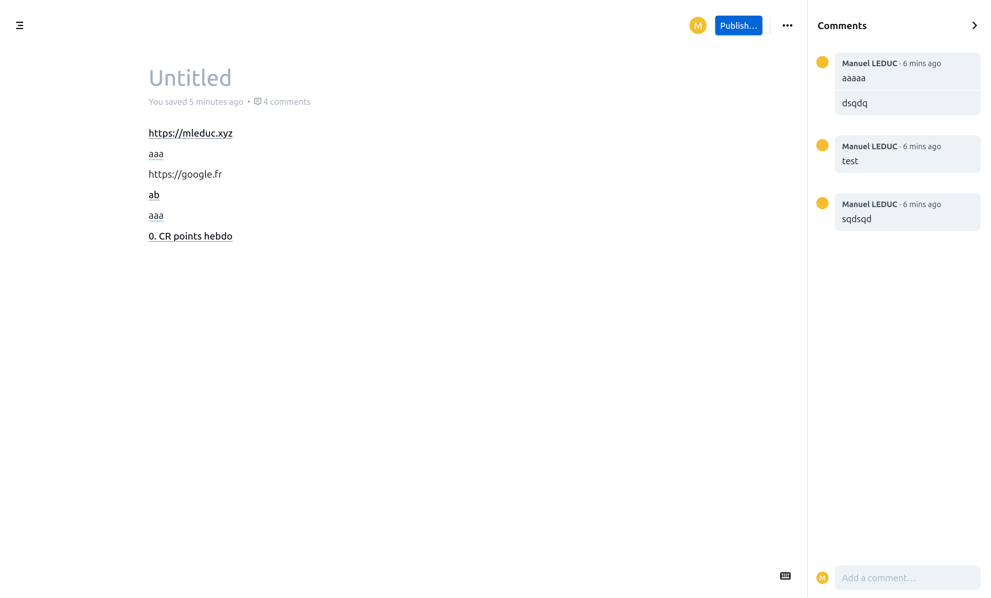
Also, having the comment in a tab at the bottom is also not optimal as it does not allow users to both see the comments/annotations along with the text. This is why I think it would be useful to have weight pros and cons with the approach proposed by many knowledge managements software, with comments in an expandable right column (see screenshot below from outline, but it’s the same of others).
I know the points I raised above are not easy to answer, especially taking XWiki’s compatibility into account. Also, they are good question to answer for XWiki itself.
The rest of the proposal looks good!
Hello!
Quick comment: Do you have a strategy for guest users / not logged in users?
In XWiki the UI for message gets a bit complex because plenty of strategies have been implemented for Admins to choose from. I think it’d be interesting to know what this UI would look like for a logged out user, assuming they can even see anything. The simple strategy that you might want to use at first is just assume that they won’t get here :D.
It is not, don’t worry. From my POV the UI will be exactly the same, except the action buttons will be removed. And if the permissions are set accordingly, the whole tab can be hidden.
It was not in MVP, so I didn’t give it much priority, but you can check the updated proposal.
And you are not wrong, it is a modification on it just with better visual cues.
We could go this way. The thing with this approach, at least from my POV, is to keep track of different threads that can happen naturally in a discussion. This is a difficulty I have with Discuss as well, mind you. Sometimes the discussion go on 3 different topics, and it’s hard to keep everything in mind if everyone is not very diligent with their quoted replies.
Was this featured missed from XWiki at some point? If it was, then maybe is a good point to go in this direction.
I agree on the sidebar / bottom bar, it was my initial proposal months ago. But it can be a problem when a content related right sidebar is present. You can follow prior discussions on it here
For sure, we mainly need to make sure that the comments design will not prevent us from adding annotations later.
Good point. So we’ll need to weight in:
ease of following threads (I don’t have trouble myself, but I get your point)
pagination
I’m +1 for “flat” and +0 for “tree”.
Related issue: Loading...
Actually, regarding this topic, I think there are two different aspects:
scaling: we shouldn’t load 100% of the messages
pagination: we should only present a selected set of messages at once
Scaling can be solved easily for both flat and tree, for flat by pagination, for tree by adding “load more” buttons at relevant places.
Pagination is only relevant for flat, so if we go with tree we can ignore it.
Good point, thanks for the pointer. In this case we can go with the design close to XWiki’s one that you added to the initial proposal.
Some more questions regarding the updated proposal for annotations.
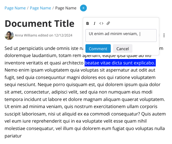
Does this mean we’ll need to introduce a “small” editor to fit this more limited space of the annotation popup?
I can’t find an issue, but I know the same was discussed for XWiki, where it would be interesting to have a more compact rich editor for the UIs.
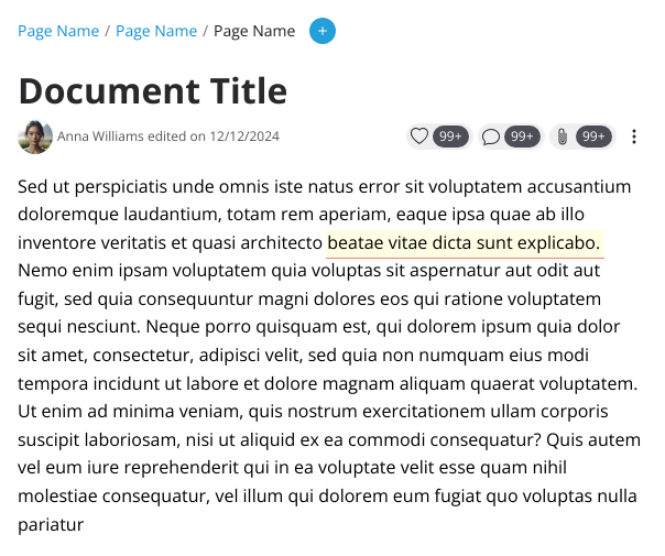
Looks good. I’m just wondering about accessibility (cc @CharpentierLucas). The contrast is probably a little low with between the highlight yellow color and the white background. But with the additional underline I guess it’s fine.
I will make a proposal with a flat layout as well, in case we go with this solution.
Yes, that would be ideal. It does not need to be as full featured as the main one (no macros, for example). A small editor with basic styling capabilities would be enough.
Edit: I made a section on the main proposal with the comments flatened so people can vote more easily.