Hi everyone, quick proposal about our labels and hints here.
Currently:
All labels are uppercase
All hints are very small
Because of these we have problems in legibility and this could be improved very easily.
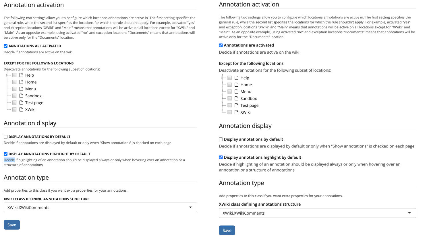
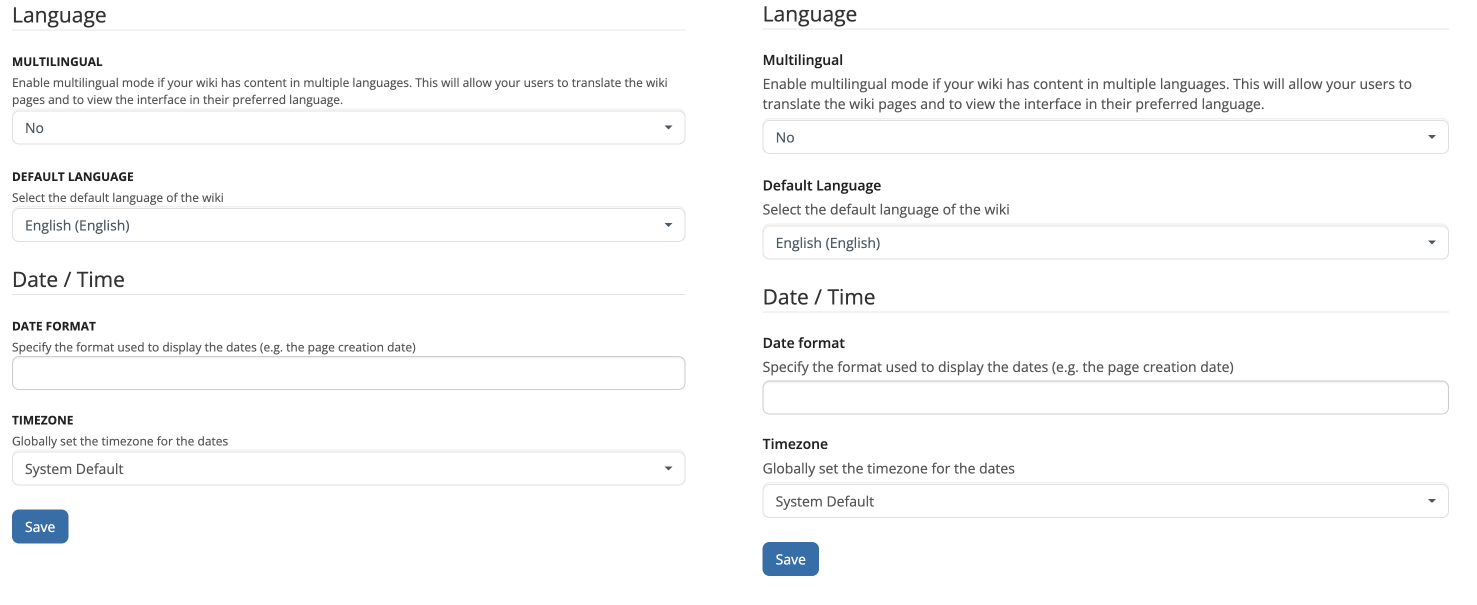
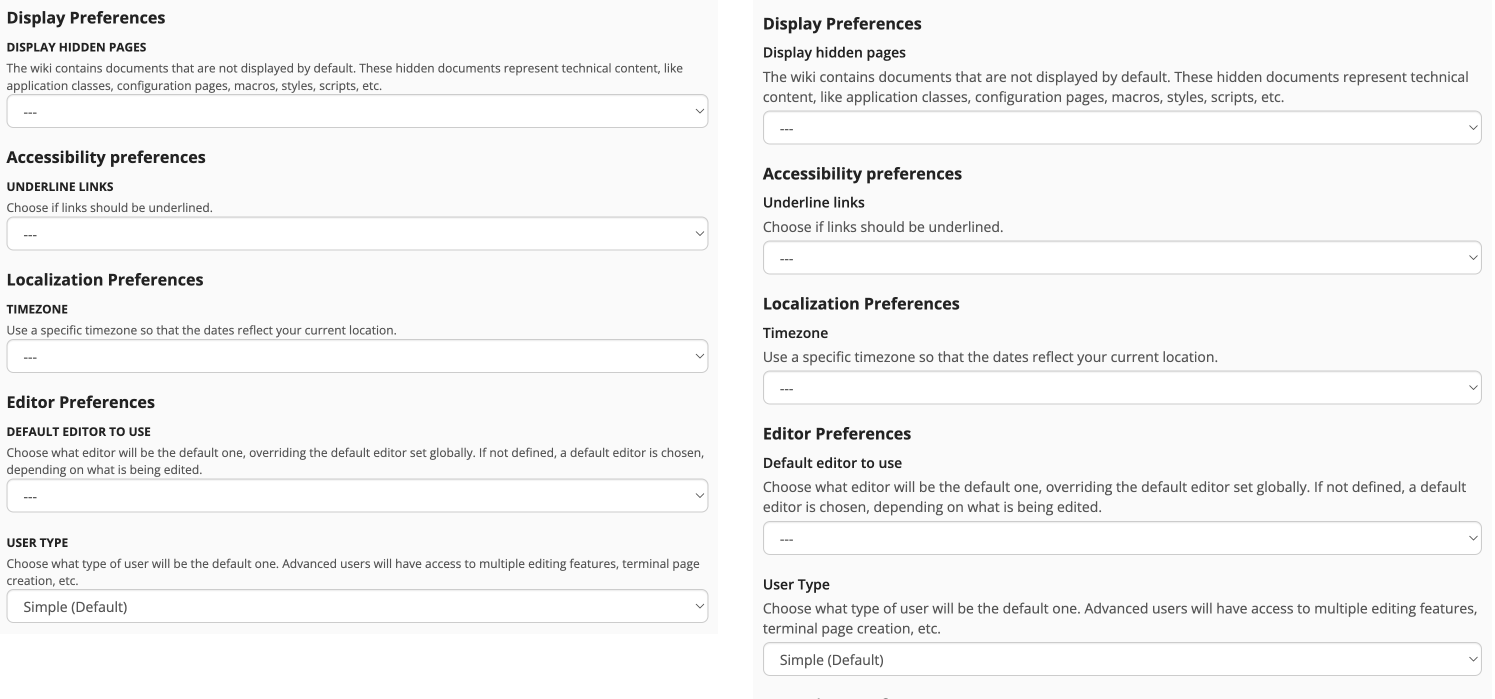
All caps text is not inherently bad, but it becomes bad when it is used in longer sentences, and we do have some longer labels throughout the interface (Example: "Display Annotations Highlight By Default"or “XWiki Class Defining Annotations Structure”). In these cases, legibility is affected.
The problem is aggravated when the default font is a serif one, like in the Journal theme color for example (see below).
My proposal is to make the labels lower case by default (by removing the text-transform property or at least changing it to capitalize). And also to increase the font size of the hints a bit (around 0.9em). The following screenshots show the before and after of these changes.
I’d really appreciate that. In my opinion, readability and information density should take priority in a wiki—this speaks against using uppercase in web design.
This is a common issue for me when creating AWMs—especially when changing the PrettyName in an uppercase label, only to spot a typo later in the live table.
I just created a small XWiki.StyleSheetExtension to experiment a bit, and for me, setting font-size: 1.1em without uppercase works much better than the default setting for labels. Even when a label is followed by a WYSIWYG field containing bold paragraphs, the difference between the label and the field content wasn’t clear at all before. With the new font size and without uppercase, it’s much easier to distinguish between them.
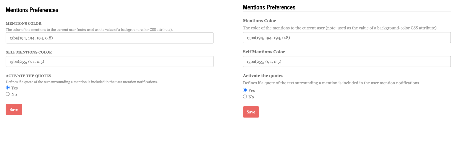
I’m worried that this will make the value less visible in some cases. For instance:
Here the value is more clear for me in the previous state. But I’m fine to increase the hint font size if this fixes an accessibility issue. Or maybe we can improve the way the value is presented.
For the best accessibility, the text size should adapt to user preferences defined in the browser. AFAIK, there’s no specific values needed for WCAG, people usually recommend 16px for regular text.
+1 . Is the font-weight enough to differentiate the labels from the values? I think the idea implemented by @CycleSEC would make things a bit clearer.
On this picture, it’s pretty difficult to figure out what is what (it was already the case tbh). What do you think about adding a marker next to the hint that doesn’t rely on text properties? Here are just a few ideas:
Put all the hints in an info box with the title Hint (probably too heavy, it adds a lot of boxes on the page, which is something we want to avoid, but at least it’s easy to figure out what is what)
Add a gray vertical line on the left of the hint block (a bit like it’s done in dark blue for info blocks today)
Add a Hint icon at the start of the hint, or just the Hint: word.
IMO there’s plenty of solutions possible to make these hints distinct without playing on text style. I’m sure we could find one that doesn’t bring too much focus to them