Bootstrap 3 already includes a tooltip component, I’m wondering if we shouldn’t use that. On the other hand, in Live Data, we’re using tippy, so no idea what would be the best option.
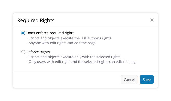
What I’m missing here is a description what happens when required rights are enforced, and I think that description should be visible before selecting any right. To me, one of the most important points is that with required rights enforced, scripts and objects don’t get more rights than selected. A suggestion for this text:
Don’t enforce required rights (legacy behavior)
Scripts and objects execute with all the last author’s rights
Anyone with edit right can edit the page
Enforce required rights
Scripts and objects execute only with the selected rights
Only users with edit right and the selected rights can edit the page
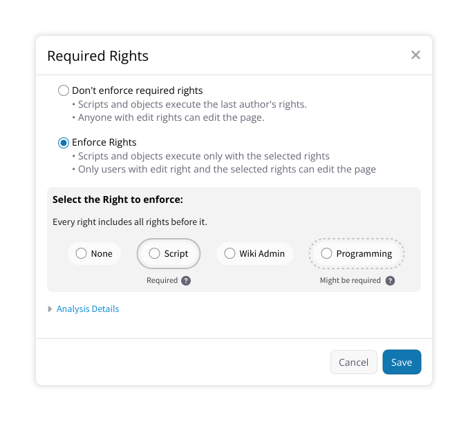
I would remove the “Current Rights” heading and add a hint “Every right includes all rights before it” below the “Select the right to enforce” heading.
I’m not sure if we still need the text at the end if we add all what I’ve suggested.
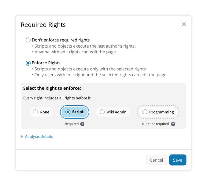
I really like this new design. I wonder if the gray values, in particular with this background, have enough contrast for accessibility, though. Do all of these colors exist in our color scheme?
I’m also not sure regarding the arrows, I personally don’t understand their meaning. I think I would either use a simple line as in a previous proposal or nothing at all.
For small screen widths, we might need to have an alternative where the different options are below each other. I’m wondering how we can ensure there that the “Required” text is perceived as belonging to the correct element. Maybe we could put it behind the element in that layout?
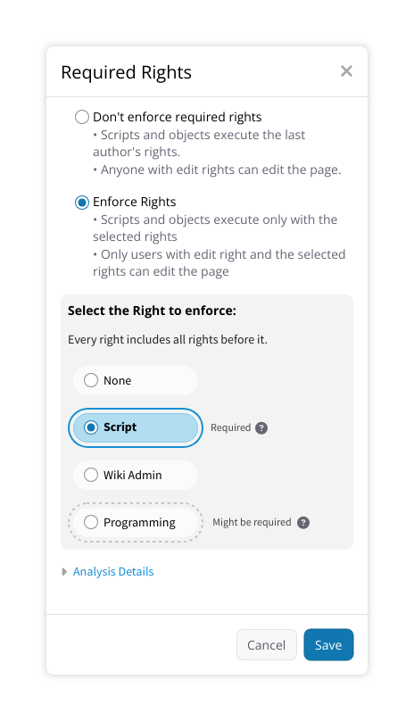
I like it. It gives the user more information about each choice and this also ensures that previous feedback stays consistent.
Probably not, as the effects are well explained before the choice is made.
Ok, I’ve added the hint back. But perhaps we’ll need a better term for “before” as per @vmassol feedback. On my side, I would refrain from using directions like left and right because this can introduce specificities for RTL languages.
They should exist yes, the gray background in particular should be the panel background color, the same from the breadcrumb also.
I’d introduce a CSS breakpoint to ensure that the requirements labels are beside each appropriate radio, this should also make space more evenly distributed in a portrait mobile screen.
Thank you very much for the updated design, I like it. I just noticed, though, that I think that we need a different hint for the case where no right is required, as to me, it seems weird to put “Required” next to “None”. Instead, we could put “Sufficient” or “Might be sufficient”, depending on whether there is any right that might be required. The explanation could be “The automated analysis couldn’t find anything in the document that requires a right” or “The automated analysis determined that the content might not need any rights. Review the analysis details below to verify if the analyzed content doesn’t require any right.”.