What's new UI Proposal & HTML, CSS code

Hello!

I’ve worked on the HTML & CSS of the What’s New feature and would appreciate a bit of feedback and help in deciding the best approach on this.

I’ve documented the 2 versions that I’ve worked on in this proposal.

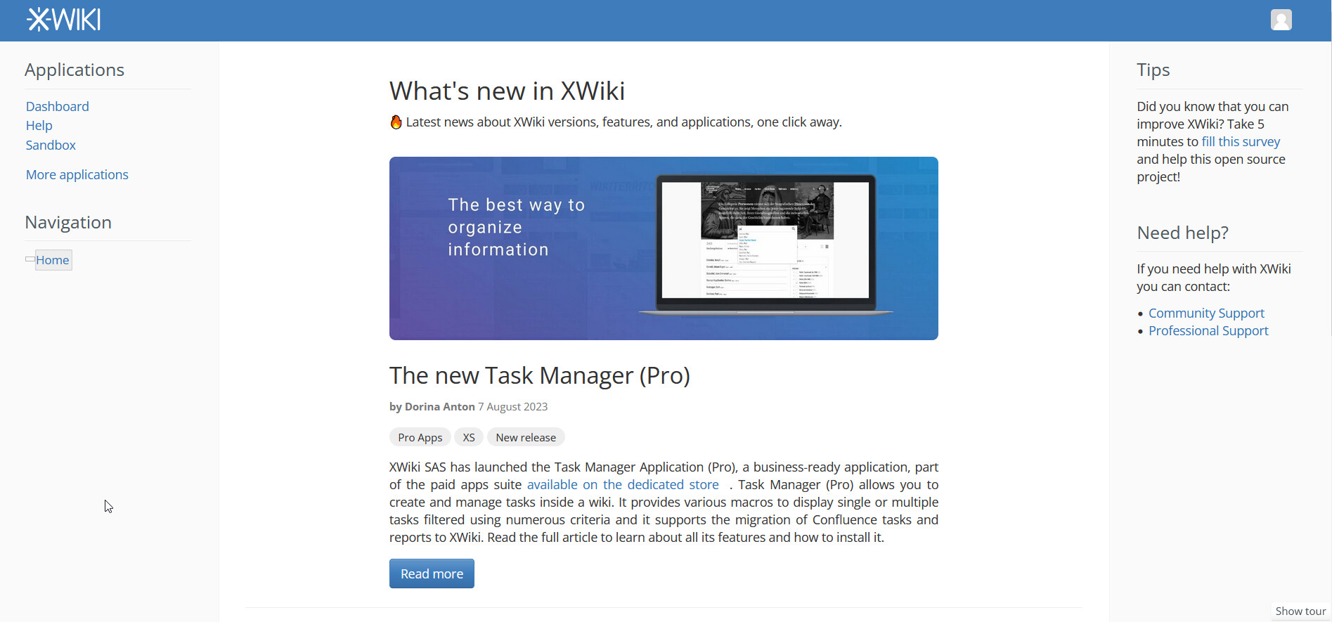
Version 1 look (big screen)

Pros: The image size is independent from the text size, making the image choice/design much easier.

Cons: We need pretty big spacing on the sides of the item just so we don’t have a very wide image and very little text. This spacing also means the page looks a bit weird if we add the breadcrumb that is aligned to the left side. Also, the image needs to be bigger so that might affect performance of the page a bit.

Observation: If we make the content of the what’s new section stretch on less than 8 columns, the image can become smaller.

image

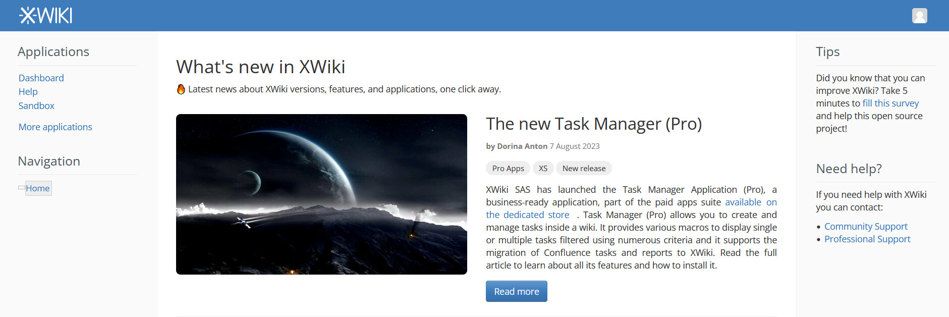
Version 2 look (big screen)

Pros: The image is smaller, looks like a normal wide news / articles section

Cons: The image need to always be as long as the content. While this is possible to do by html & css, the image will be deformed/cropped. This means either more fiddling with the upload of each image or more work on the design of each image. This will require more time resources.
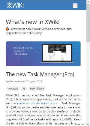
image

Small screen look

Both versions look the same on small screen or in a drawer menu:

image

As discussed by @vmassol in the #xwiki chat, it might be better to implement the drawer menu ( @CharpentierLucas will post a proposal on this) before we decide to further the implementation of any of the versions.

HTML on version 1

  <div class="row">
                    <div class="col-sm-2"><!-- 2 columns of space --></div>
                    <div class="col-sm-8 ">
                      <h1>What's new in XWiki</h1>
                      <p>&#128293 Latest news about XWiki versions, features, and applications, one click away.</p>
                      <br>
                    </div>
                    <div class="col-sm-2"><!-- 2 columns of space--></div></div>


                  <div class="row">
                    <div class="col-sm-2"><!-- 2 columns of space --></div>
                    <div class="col-sm-8 center-content">
                      <!-- image first, content second, one under another-->
                      <div class="center-content">
                        <img src="https://pbs.twimg.com/profile_banners/9454232/1672847853/1080x360" alt="Image" class="ïmg-responsive whatsnew-img">
                        <div>
                          <h2 style="margin-top: 0px;">The new Task Manager (Pro)</h2>
                          <div id="xdocAuthors" class="xdocCreation"><b>by Dorina Anton</b> 7 August 2023</div>

                          <span class="category-tag">Pro Apps</span>
                          <span class="category-tag">XS</span>
                          <span class="category-tag">New release</span>

                          <p style="text-align: justify;
                            text-justify: inter-word; ">
                            XWiki SAS has launched the Task Manager Application (Pro), a business-ready application,
                            part of the paid apps suite
                            <span class="wikiexternallink"><a href="http://extensions.xwiki.org">available on the
                            dedicated store</a></span>.
                            Task Manager (Pro) allows you to create and manage tasks inside a wiki. It provides various
                            macros to display single or multiple tasks filtered using numerous criteria and it supports the
                            migration of Confluence tasks and reports to XWiki. Read the full article to learn about all its
                            features and how to install it.
                          </p>

                          <button style="margin-top:5px;" class="btn btn-primary">Read more</button>
                        </div>
                      </div>
                    </div>

                    <div class="col-sm-2"><!-- 2 columns of space--></div></div>

                  <hr>

HTML on version 2

   <h1>What's new in XWiki</h1>
                  <p>&#128293 Latest news about XWiki versions, features, and applications, one click away.</p>

                  <div class="row">
                    <div class="col-sm-6">
                      <!-- image side -->
                      <div class="center-content">
                        <img src="https://wallpaperaccess.com/full/2386802.jpg" alt="Image" class="ïmg-responsive whatsnew-img">
                      </div>
                    </div>
                    <div class="col-sm-6">
                      <!-- content side -->
                      <h2 style="margin-top: 0px;">The new Task Manager (Pro)</h2>
                      <div id="xdocAuthors" class="xdocCreation"><b>by Dorina Anton</b> 7 August 2023</div>

                      <span class="category-tag">Pro Apps</span>
                      <span class="category-tag">XS</span>
                      <span class="category-tag">New release</span>

                      <p class="text-justify">
                        XWiki SAS has launched the Task Manager Application (Pro), a business-ready application, part of
                        the paid apps suite <span class="wikiexternallink"><a href="http://extensions.xwiki.org">available on the dedicated
                        store</a></span>. Task Manager (Pro) allows you to create and manage tasks inside a wiki. It provides various
                        macros to display single or multiple tasks filtered using numerous criteria and it supports the
                        migration of Confluence tasks and reports to XWiki. Read the full article to learn about all its
                        features and how to install it.
                      </p>

                      <button style="margin-top:5px;" class="btn btn-primary">Read more</button>
                    </div>
                  </div>

                  <hr>

New CSS classes added

.category-tag{
    margin-top:1.25rem; 
    margin-bottom:1.25rem;

    display: inline-block;
    min-width: 10px;
    padding: 5px 10px;
    font-size: 12px;

    line-height: 1;
    color: #333333;
    text-align: center;
    white-space: nowrap;
    vertical-align: middle;
    background-color: #eeeeee;
    border-radius: 999px;
}

.whatsnew-img{
    max-height: 300px;
    
    margin-bottom: 2.5rem;
    border-radius: 7px;

}


.center-content {
    display: flex;
    flex-direction: column;
    align-items: center;
    justify-content: center;
    height: 100%;
}

.text-justify{
    text-align: justify; text-justify: inter-word;
}

Default image, image examples have been added in the proposal.

What do you think about the look of the two versions, which do you prefer and what should I improve on the CSS or HTML? :thinking: Thanks! :blush:

Here is the proposal discussing a new implementation for the drawer.


Thanks for taking care of checking the contrast and meaning of the color variables :+1:
Looks good to me for the colors. You need to use colortheme variables though, see the comment on the CSS later in this post.

Wouldn’t there be an issue with the images on version 1 – small screen? As we can see on the screenshot, the pictures for version 1 are made to be viewed on a full sized screen and can be difficult to read on a small screen. If we use an alternative picture for the small screen, I have no problem with this.

I think the solution 2 would make having a clean responsive design easier, so I’d prefer it above solution 1.


About the HTML:

  • Note that an alt with value “Image” is useless, it should be more precise than that. Here is a use case where it would impact usability: “I’m on the move, in the countryside, and I can’t load pictures in a reasonable amount of time on my phone. So my browser decides to replace it with its alt, and it just shows me ‘Image’. I didn’t get any of the information conveyed by the image and there might as well not have been any alternative text.” I understand that this is a demo code but it seems important to understand that this default alt can’t stay like this.
  • See our codestyles for CSS, you should avoid inline styling (using the attribute ‘style’ in HTML). You should create a CSS class and put all style in your CSS :slight_smile: This practice makes debugging and fixing easier, since if you have a style issue later, you don’t have to read through your HTML, but just look at the CSS since it’s where all the styles are handled.

About the CSS:

  • Use colortheme variables (see code practices for CSS again): you could make it a LESS and use @headings-color and @xwiki-page-content-bg. This practices makes sure that there’s no issue when you change color theme (especially important for dark themes like ‘Darkly’).
  • For the category tag style, maybe it’d be nice to use the same style as what we have currently for page tags:
    image
    even if it means changing the current style for page tags.

Thank you for this proposal and have a good day!
Lucas C.

In the screenshot, I’ve used the twitter social media cover that we have currently (which is in the process of being updated, anyway), just as an example. The default image should only feature the logo and some elements. On the custom image of each article/news, if there will be any text, it will be much bigger. See example of custom images in the proposal.

Yes, of course, I’m aware of that. For each article, the image will have a relevant alternative text. I guess we could refresh a bit the default so it’s a bit more relevant even if somehow it’s not changed:

“Cover of the article containing elements related to knowledge organization and symbolic to the new changes made in XS”

For each image uploaded we should be pretty specific with the description especially when the image is not just decorative (for example, if we feature a screenshot from a new extension, the alt text should be even more descriptive than the default). I’ll add some requirements for alternative text in the proposal.

Okay, thanks a lot! The debugging aspect makes a lot of sense. I just thought it’s a bit weird to create a new css class only to be used once and it only having 1-2 lines of css code. I’ll modify this asap

Yep, thank you. I forgot to add them.

1 Like

Hi, thanks for the proposal.
So I have first a dumb question: the issue in both proposal is about the image globally, but will there be always an image for any new article in What’s new? I mean right now when we post something in the blog of xwiki.org there’s generally no images at all. I can see that there’s a section “Default image” in the design page, so it means there will be always a default image? Isn’t there a risk that it becomes repetitive to have always the same default image?

Besides that I think the proposal 2 is better in current UI of XWiki. And I’m not so sure it’s that much mandatory to have an image with same height than the text: I mean it might not look that weird if the text is a bit longer. Actually it might worth checking how it will look to alternate between short and long text with the design: again usually on the blog of xwiki.org the text is quite short.

I wonder if it wouldn’t make sense to make the design of What’s new consistent with the blog application as it is the very same kind of content and I think we should aim for consistency. The blog application currently supports several kinds of post layouts. If we don’t like them, it could make sense to improve them and then adopt one of the improved designs for What’s new.

Among the two choices, I prefer proposal 2 as the space around the content in proposal 1 just looks totally weird.

The idea was to try to make custom images for each article posted ( the XWiki SAS Marketing team would do this). Of course, there may be instances in which we might not be able to do that immediately and in those situations we have the default image as a fallback plan

I do agree it would be nice to update the Blog Application. The image post layout, for example, is the closest to the What’s new layout and we could definitely use What’s new for guidance when redesigning it.

There may be need to make certain changes because of the different functions that the blog has ( we have to include the edit, delete, link button and other stuff). If we are to revamp every layout we could even taking into consideration including in their UI easy signaling for their status (published, draft, unpublished, archived, etc.). These stuff would definitely add a new layer above the What’s new UI which is more simple, so we’d have kind of a different layout and structure.

So, yep, I’m 100% to update those for consistency and esthetics reasons.

Hello everyone,

I’ve been following the discussion on the “What’s New” UI proposals, and I must say, both versions have their merits. Version 1’s independence of image size from text is appealing, but the potential performance impact due to larger images is a concern. Version 2’s smaller image size and resemblance to a typical news section is attractive, but the need for images to match content length could be cumbersome.

Considering the points raised about responsiveness and image handling, I lean towards Version 2. It seems to offer a cleaner design that’s easier to manage on different screen sizes. However, I agree with the suggestions to improve consistency with the blog application and to utilize color theme variables for better adaptability.

One additional thought: have we considered a hybrid approach? Combining elements from both versions might provide a balanced solution that addresses the concerns raised.

Looking forward to seeing how this evolves!

Thanks for the feedback @ManuelSkye ! Are you using the What’s New feature? If so, do you like it? what could we do to improve it (not just visually)?

The current idea we have is to move the What’s New UI from being a template to being a drawer, see Loading...

Thanks