Hi everyone, I would like to talk to you about the onboarding process of XWiki.
Onboarding is one of the most important characteristics of a good product. Done well, it reduces friction, reduces cognitive load and, if done elegantly, users don’t even notice they are being guided.
XWiki provides two primary onboarding processes:
- First-Time Run — triggered on un-flavoured downloads, primarily for system administrators.
- First Time User Experience - handled by the Tour App, aimed at guiding end users through the interface.
This post focuses on the second process: the First Time User Experience. While the first-time run process is essential for admins, improving the Tour directly benefits daily users by helping them adopt XWiki faster and with less friction.
I will separate this proposal in two sections:
- General Issues, for improvements on all steps
- Step Specific Improvements, for specifics, as the name suggests.
General Issues
After analyzing the existing onboarding tour, some issues appeared that could be improved:
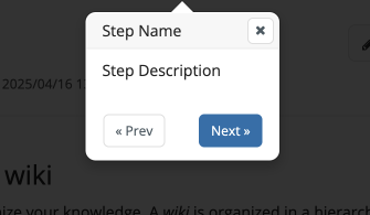
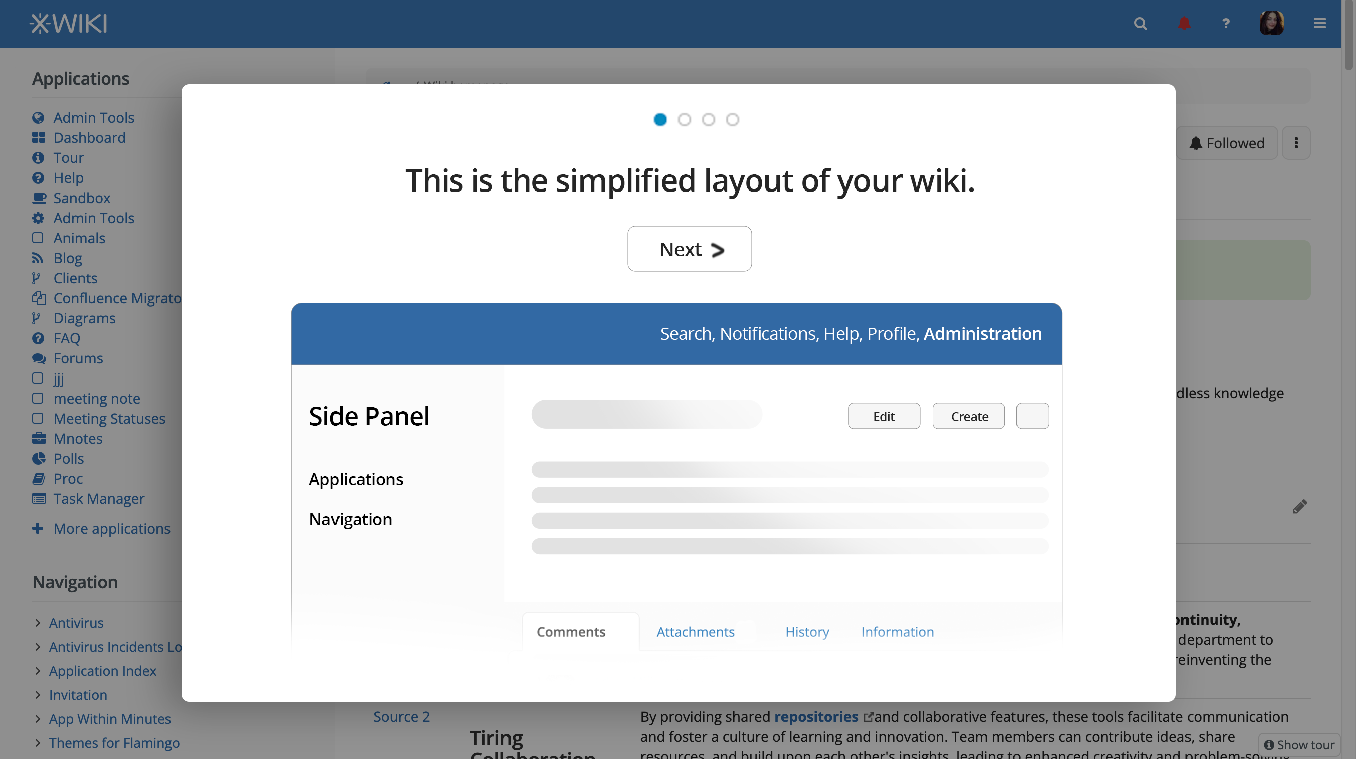
- Darkened Background Obscures Context
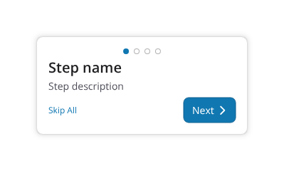
Users lose visual context of the interface beneath. There’s also a flicker when going from one step to the next. - No Progress Indicator
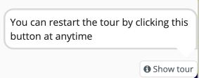
There’s no visual cue to show how many steps are in the tour or which one is currently being viewed. - Limited Exit Options
Users can only skip the tour by clicking the small “X” button, easy to miss, especially for first-time users.
Proposed solution
Here’s how we can make the Tour more appealing and easier to use:
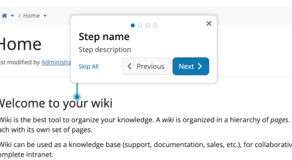
- Remove the blacked-out background to maintain context.
- Alternatively, if removing the black background is not possible, or undesired we could at least change it to white and make it more transparent so context is not lost.
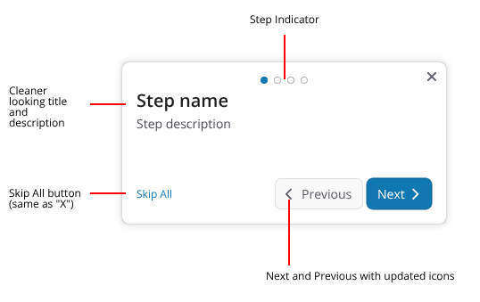
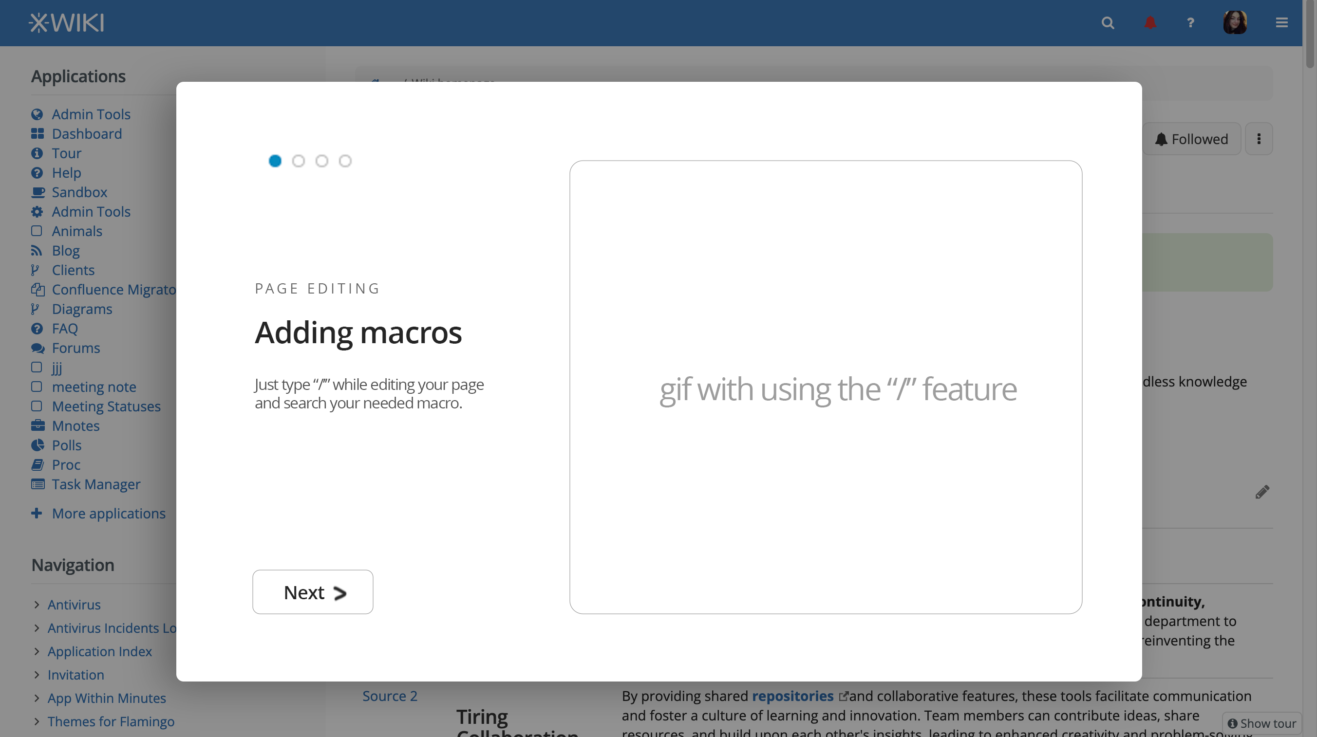
- Update the visual design add cleaner, sleeker UI elements.
- Add a dedicated “Skip All” button that’s prominent and clearly labeled, serving the same purpose as the X icon.
- Introduce a step indicator to provide a sense of progress and control.
Note: Currently, the Tour App uses bootstrap-tour — an open-source library that hasn’t seen maintenance in over 7 years. Could we migrate to, perhaps, to Intro.js or TourGuide.js?
Changes in context
Individual elements
Step Specific improvements
We can also modify a bit the steps in the default Tour:
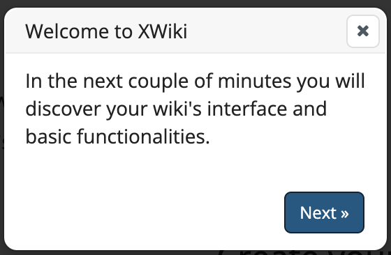
01 - Welcome to XWiki
IMO it could be removed as it’s not very specific and provides little useful information.
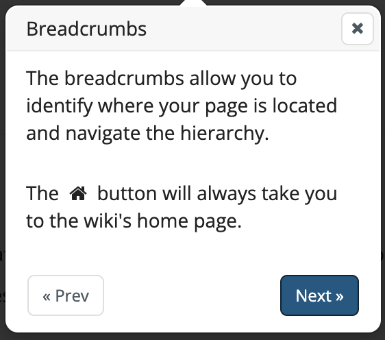
02 - Breadcrumb
Could be shortened to just the first paragraph, the home icon explanation feels unnecessary as it is a very common UX artifact
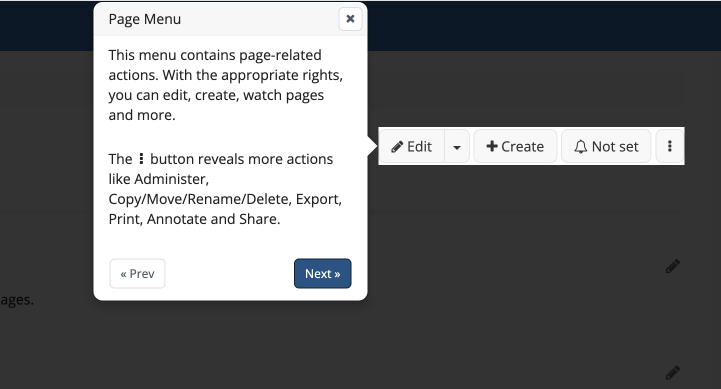
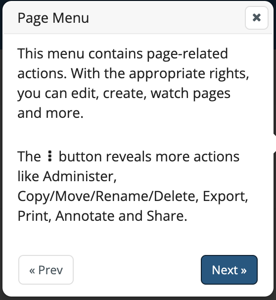
03 - Page menu
The same as before, could be shortened to just the first paragraph. Nowadays, the three-dot icon is also very common.
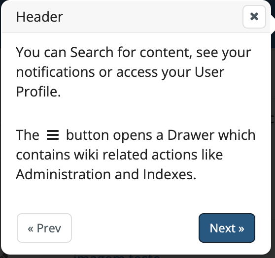
04 - Header
The same as before.
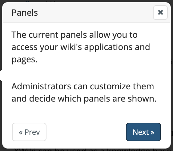
05 - Panels
Proposal for text: “Navigate through wiki pages and applications here”. The text targeting Administrator feels unnecessary as this is an end-user process.
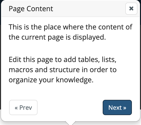
06 - Page content
Feels unnecessary, as it is the whole purpose of XWiki. Also, many users can’t edit pages, specially the home page on a wiki.
If you feel this step is necessary, then my proposal is to show it at the beginning of the process, not in the middle.
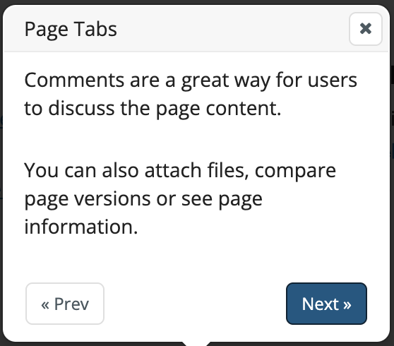
07 - Page tabs
Rename to: Auxiliary Information
Proposal for text: “Additional information for the page are shown here”. This is because comments might be disabled for established wikis with new users taking the tour.
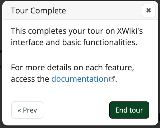
08 - Tour complete
Looks fine to me, it reinforces the end of the process and provides a link for more information.
So, to summarize, my proposal for the steps is to:
- Remove steps 1 and 6. Reducing to 6 steps, from 8
- Shorten the text on almost all steps.
Thank you all for reading, I welcome any feedback that you might have.
Thiago


 Using the Notifications area with a link to the RN page on