This proposal focuses on how the xproperties of the Documentation XClass from Proposal 4 are displayed in the user interface, with the goal of improving the visibility of the metadata.
As a result of Proposal 5: Location of documentation, in addition to the xproperties defined in Proposal 4, a new xproperty to indicate whether a page is intended for XS or for extensions not bundled in XS is needed. Like the other xproperties, this property will also be displayed in the user interface.
Proposal 16: The UI for the XProperties
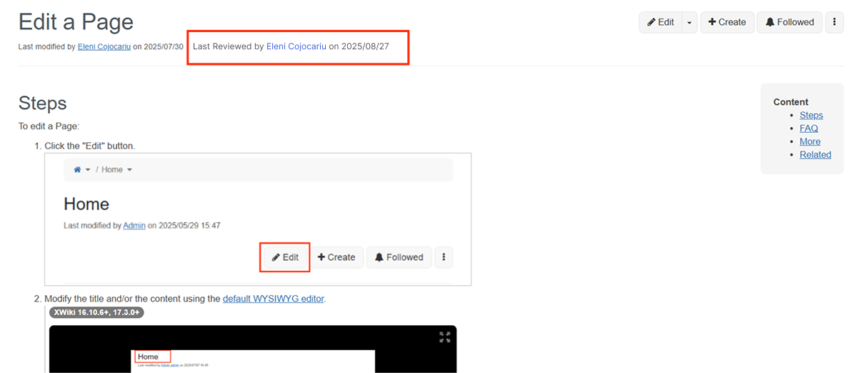
Option 1
The Last Reviewed Date and Last Reviewer will be displayed on the same line as the "Last modified by [Name] on [Date] " - Last Reviewed by [Name] on [Date]
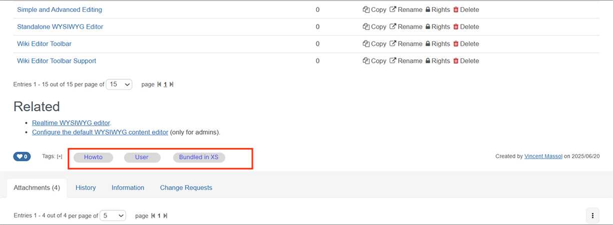
The type (Tutorial, Howto, Reference, Explanation) and the target (User, Admin, Dev) will be displayed as pills, aligned on same line where the tags are currently shown.
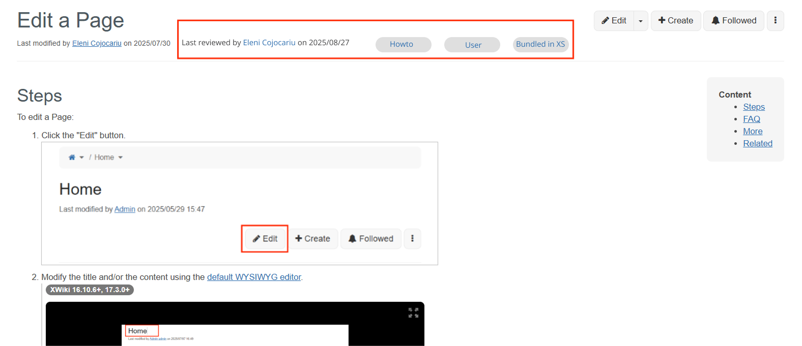
See the mockup below to get an idea of how it would look:
Display all the metadata (type, target, bundled or non-bundled in XS) in the top of the page, possibly on the same line with "Last modified by [Name] on [Date] " - Last Reviewed by [Name] on [Date].
Note: In the implementation, the Content Footer and After content header documentation pages could be used, they describe how the UI extension points are used to render content on the same line as the tags and immediately after the page header.
I’m +1 to have the labels displayed visibly like in option 2 (but maybe we need @tkrieck help to have a cool style ;))
For the last review text, I don’t feel like this is something standard readers need to care about.
I feel like the information tab is a better location.
I have a small preference for option 1 since that’s the most logical place IMO, with the tags. It’s less visible but that’s why we put tags there too (to be less visible and have the user focus on the content). But I can understand why we’d want to make them more visible too.
What is not mentioned, is whether they are clickable or not. I think we should make them clickable and redirect to the corresponding landing pages (landing pages for the types and landing pages for the target).
Favor for option 1, my concern is that the tag functionality means any auth user can freely add or remove them. Would it be feasible to either make tags predefined by default for specific page types (e.g. Howto, Configuration, etc.) or alternatively make them undeletable to general users?
I agree with Manuel’s ideas here, IMO, the last reviewed info is not primary to understanding what’s on the page and can be moved down.
On the other hand, the tags provide a quick context, without it at the top I think I could get confused at first.
E.g. there’s a How-to Edit a Page and a Tutorial Edit a Page. Except by scanning the content or scrolling to the bottom, with option 1 it’s not quick to differentiate them.
Those properties are quite a bit more important than tags for our documentation.
Overall I prefer option 2 but I think it would make sense to move the last reviewed info somewhere where it gets less user focus.
I would move the reviewer information below the “Created by” or inside the Information tab (as others suggested), because I’m not sure this information is important for the reader. Knowing if the page has been reviewed has some value, but I wouldn’t count on the readers to check the review date and compare it with the date when the page was last modified. We could also use another badge / label to indicate if the page has been reviewed since it was last modified, and show additional information on hover or click (popover).
If we’re going to use the tags area then we need to disable the tags, as Vincent suggested, including removing the “Tags: [+]” otherwise the readers (which are XWiki users most of the time) will confuse these with tags.
Regarding option 2, I don’t remember reading documention where the documentation type / target was so prominently displayed. Do you have some examples where this approach was used?
The pills and review information are auxiliary info for the main topic. Even the “reviewed by” info, I’d put it in the bottom of the page together with “created by” on a separate line.
The place for pills in opt 1 is nice since their functionality is a lot like tags. I’d just reduce them in padding a bit and use a smaller font. If they are actionable, even better.
Regarding option 2, how would all that info work in mobile? I feel that stacking them would create a big space between the document title and the beginning of the content.