@pdwalker yes, I agree. Could you create a jira issue about it? Thx
1 Like
@crw You’ll be glad to hear that this is now fixed in 10.11 with async rendering of Panels! ![]() Merry Christmas
Merry Christmas ![]()
AWESOME! I can’t wait to try it out. Thanks for the update and thanks for paying attention to these types of user issues.
This is not true actually. The panel is cached but the behavior of the tree itself did not changed.
That would explain why it does not appear to be much different. That panel really needs to create the illusion of being instantaneous (e.g., the data needs to be always pre-cached). I can only imagine you are testing that panel against a wiki with thousands or millions of pages, to have such aggressive lack-of-data-pre-caching.
To be honest, the biggest improvement was achieved by upgrading to a multi-core instance on AWS. Some aspect of XWiki (jvm, tomcat, or the code itself) does not like being run on a single core.
The panels itself is instant but now we need to add caching to the document tree trigger by this panel (and in other places too). I don’t think there has been any decision to not do caching, it’s just it’s current status and I totally agree it should be improved and I don’t think it would be hard.
There is indeed generally many things going on in parallel in XWiki (and in web servers in general but XWiki add its own stuff to the pool and is going to add more) and switching context is clearly something expensive which can indeed generally be reduced when the proc has several cores.
1366 х 768 resolution, forms do not fit vertically:
I think it is worthwhile to support Bootstrap Horizontal Form Layout.
Hi,
first of all, overall I think x-wiki is a great tool and a much needed one in the open source world. Thank you very much for your hard work!
We have a big confluence instance (11k+ users), trying to switch away from atlassian. With confluence as the “standard” in the back of our users heads, one major pain point is the overall UI/user experience of x-wiki.
As someone else already mentioned in this thread, the navigation is one example for this. There should be no need for it to rebuild itself on every click. It was ok back in the day, but it falls behind current webdesign standards. The navigation is a heavily used component, it should feel smooth and look good as this is an opportunity to win users over during they first moments of use.
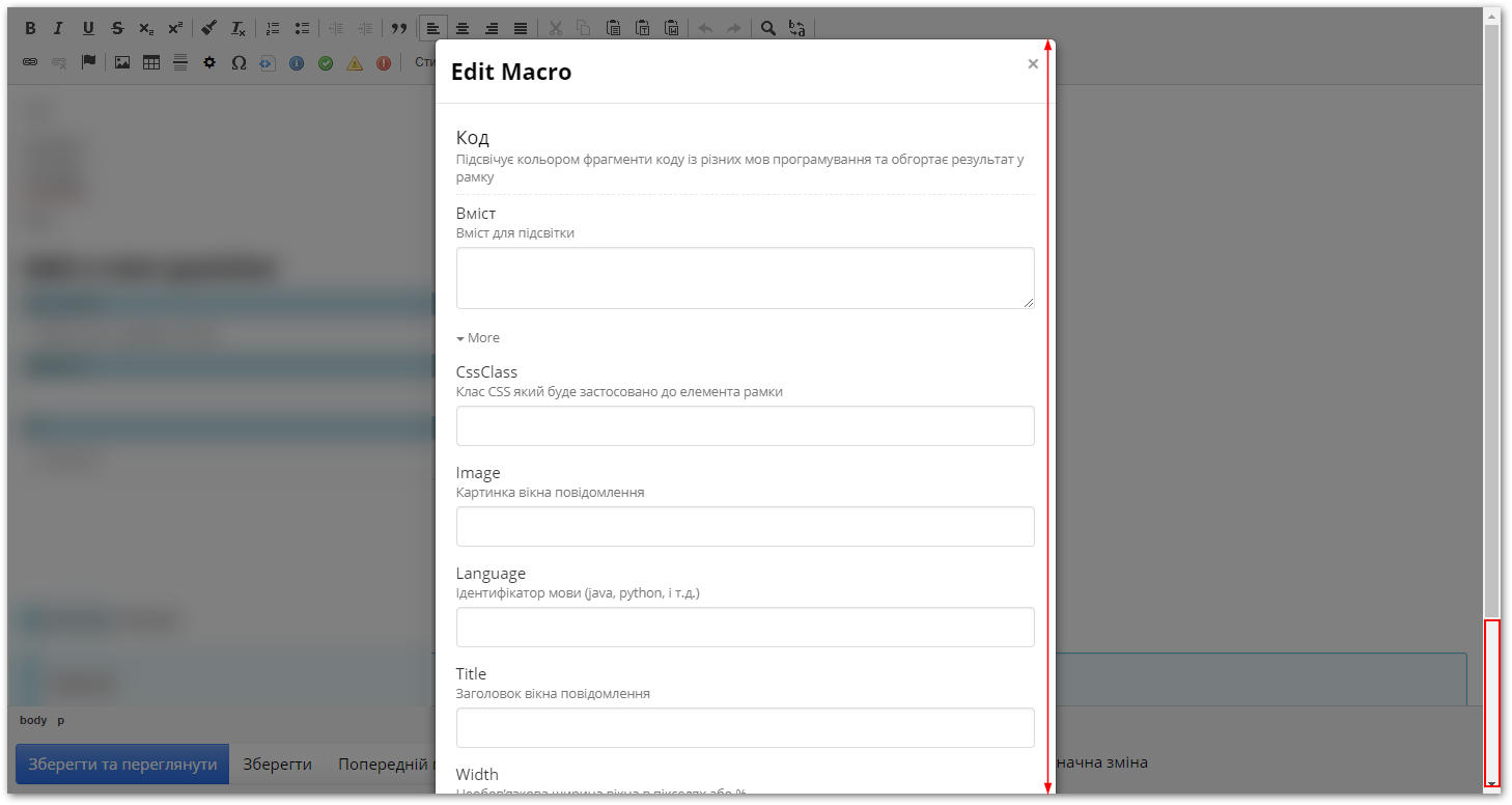
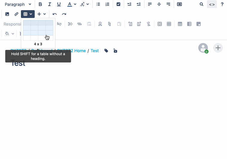
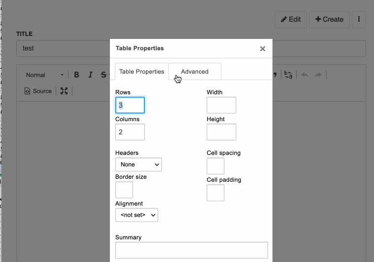
The navigation bar is a bit of a bummer, but the real problem for us is the WYSIWYG-editor. It looks and feels very dated. Everything is hidden away behind multiple popup windows filled with input fields. For example, creating a simple table in confluence takes two clicks (literally). Doing the same thing in x-wiki requires you to fill in a form, specifying row and column count by typing values into input fields etc…
I know this sounds like nitpicking, but it is a major problem when you try to convince people to switch over to x-wiki. They just stop after the first couple of minutes because x-wiki “feels so slow and dated”.
E.g. updating to CKEditor 5 could resolve some of those issues, but I am sure you are aware and there are reasons why you haven’t done so yet.
I know confluence is a commercial software and this is open source and it is silly to think that you can effortlessly replicate everything confluence offers. But still I think x-wiki would benefit greatly from a UI modernization. Wikijs - while having a lof of its own flaws - is a nice example showcasing what is possible even in open source.
When it feels and looks nice, people are much more willing to overlook “missing features” and actually can discover a lot of great features x-wiki offers.
Just my 2 cents.
1 Like
Thanks for your feedback! Let’s take point by point to see what we could/should improve.
Could you provide specific example of problems with the navigation and what you’d like to see it working?
There are several pieces helping navigate (8 to be precise), see https://www.xwiki.org/xwiki/bin/view/Documentation/UserGuide/Features/Navigate/
Could you explain which ones fall short and what, in your opinion, should be done to improve them?
Ok that’s good since it’s something specific that we could work on. cc @mflorea WDYT? Any idea? I haven’t tried CK5, does it help on this?
Do you have other examples about our usage of CKEditor that should be improved in your opinion?
Yes we’d like to upgrade but there’s a problem with our realtime. CK has changed the way we were plugging into it for realtime and they’re now providing RT too but their own through a subscription service. We need to figure out how we can still support our RT.
I don’t believe that OSS is behind commercial products, quite the opposite actually. What is true though is that Atlassian has a lot more engineers working on Confluence that there are devs working on XWiki. They used to indicate the team in their RN (for ex, see at bottom of Confluence 5.9 Release Notes | Confluence Data Center 8.9 | Atlassian Documentation). It’s like 50 devs vs 5-6. However and despite of this, we believe that there are plenty of features where XWiki is winning over Confluence and that we offer a competitive product. See also https://www.xwiki.org/xwiki/bin/view/Compare/XWiki-vs-Confluence/
So I’d really like that we identify what are the main pain points for you, with precise elements, so that we can discuss about the best way to tackle them. If we’re not precise, then it’s going to be hard to do anything. Please keep this discussion going, it’s good and we always need to get better.
Thanks
It takes exactly 2 clicks to insert a table in XWiki. It’s not required to fill any field from the table dialog: they either have a default value or they are not mandatory. You can simply click OK to use the defaults and then use the context menu to add more columns if needed. Rows can also be added while editing (either using the Tab character or with the context menu).
The fact that in Confluence and CKEditor 5 you can select quickly the number of rows and columns when inserting the table is nice for sure, but you don’t always know from the start how many columns and rows you’ll need so I don’t think it’s such a big issue to insert the table with the defaults and then add more columns and rows as you go. If you insert tens of tables per day, then yes it can be a pain.
We can of course implement a custom table plugin that does what Confluence and CKEditor 5 do, but is it worth the effort compared with the other things we have on the plate? I’m not sure.
Thought: If we’re considering moving to CK5, it would be a pity to do some custom work and throw it away not long after.
The “pain” with the table creation was mine too, but you get used to it very quickly. I did even install a plugin that did the same as Confluence and then dropped it as using that tiny dialog is easier. Only pain point here is when using “tab” to navigate, you can not use the first character to select the “Headers”, as like “f” will do something to the page and not select the “First Row” unfortunately …
I also installed Table Tools Toolbar | CKEditor.com and Table Selection | CKEditor.com where the later is unreliable some times. Love the TableToolBar though …
Part 1 (sorry, as a new user I can not embed multiple media in one post, so I have to split it up)
Hi vmassol and mflorea,
thank you that you took the time to reply! Of course it is up to you to decide where your time is best invested, all I can do is share my experience and nag a little bit.
So to make the examples I already provided a little bit more clear:
Navigation:
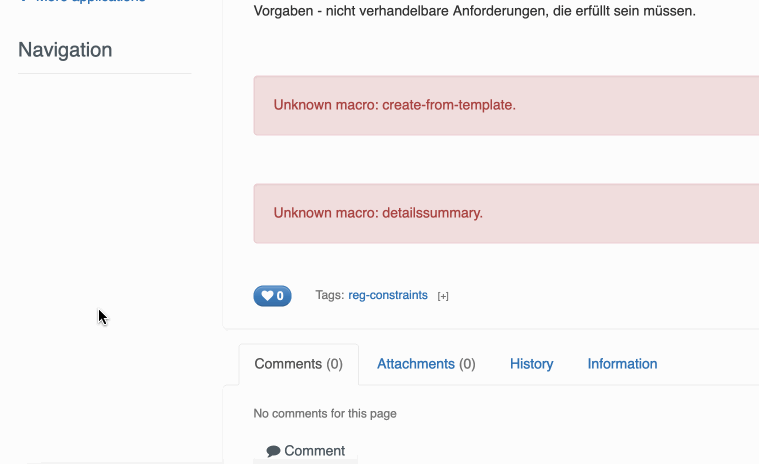
I am talking about the navigation on the left side, the one users use the most. It rebuilds itself way too often:
1 Like
Part 2:
You actually already have a very nice navigation. Unfortunately it is hidden away from the users and is meant for admins only:
It does not rebuild itself every time I navigate, has nice sliding effects, the font size is adequate and the whole thing simply feels good to use.
I am aware that “infinite” nesting is probably not completely solved with this design, but it is a very good example of an UI element that feels “modern”. The search field above the menu would also be a killer feature if it was usable in the context of our actual wiki content (or at least on the page titles). This would go even beyond what confluence can do.
Part 3: (I can not post the last part because only 3 in a row are allowed for a new user, so I have to wait for a reply)
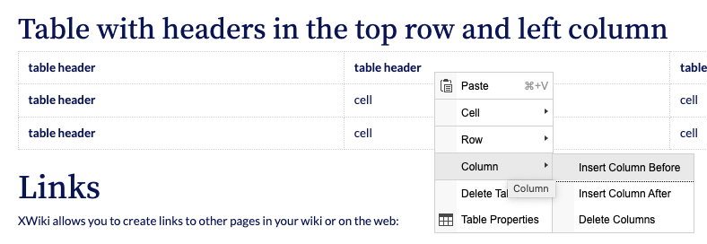
Table handling:
Yes, you can create a table with 2 clicks in xwiki, but only in the one case where you want one with the default amount of columns and rows. In every other case you have to go through loads of menus/submenus.
Here is an example of me handling a table in confluence:
Casually replying to give them more posts ^^
not to discount your concerns, but have you considered using the right click context menu for managing your tables, rather than moving back to the toolbar?
I almost never go to the toolbar when working with tables, once the table is created.
Last Part: (thanks rhaludir and pdwalker  , here goes another try)
Here is (nearly) the same thing in xwiki, I tried my best to make this somewhat comparable:
I left in one strange behaviour with one wrongly opened submenu not going away, which came up a couple of times during my tests. I left out confluence features which are not present in xwiki on the other hand.
So this is in no way bad or not functional, but it simply feels slow in comparison as it forces you to go through all those menus. All of this looks and feels like the windows xp era or some old java swing application, with all the sharp edges and things buried in context/submenus.
This was meant as an example, it is of course not all about tables.
Small and simple things like giving the menus and buttons some rounded corners here and there would go a long way. In my opinion xwiki needs a facelift in some places - especially parts visible and heavily used by the users like the WYSIWYG editor - to not look like 2012 (that is when CKEditor 4 actually was released, and it was not the shiniest thing back then to begin with). This would make selling this to a “spoiled userbase” (and partly upper management) a lot easier.
I know this is yet again not very specific, but hopefully I was able to explain myself a little better.
Hi @dknt ,
First of all, thanks a lot for your feedback. Even if we can’t fix all these issues you raised right away, at least it helps us know in which direction to go. Let’s take them one by one.
Yes, because when you tell the tree to open to a specific wiki page (e.g. the current wiki page) it makes a few asynchronous requests, after the current wiki page is loaded, to open all the tree nodes up to the target page. We can fix that by passing more information to the tree on page load, e.g. the open to path along with the sibling nodes for each path element. With this tree will open instantly, but the page load may be delayed a bit, depending on the size of the page hierarchy. A further step, but I’m not sure it’s needed, is to store the navigation tree data (JSON) on browser local storage so that on page load we can display it right away. The outdated information would be fixed with some asynchronous requests and merging.
The accordion you see in the administration doesn’t scale. It fits well for two levels, but it’s not suited for any number of levels. I don’t see how we could use it for the navigation panel, unless we go for a solution where we display only two levels of hierarchy at a time (and some link to go back up the tree, like cd ..)
Try https://www.xwiki.org/xwiki/bin/view/Documentation/UserGuide/Features/Navigate/#HJumpToPage .
You’re raising two issues here:
- not easy / fast to select the number of columns & rows when inserting a table
- This is a minor issue for me. As I said we could implement a custom table plugin for this, but I’m not sure it’s worth the effort.
- the context menu is slower and hidden compared to the tool bar
- We tried to reduce the number of buttons shown on the tool bar. I prefer simple toolbars with the most common features. I find context / floating tool bars (and context menus) better for more advanced features. The toolbar I see in your screenshot is too crowded for my taste. What we can do (and it wouldn’t be too complex) is to create a Balloon Toolbar | CKEditor 4 Documentation with the table features. This toolbar would be visible (floating) when the caret / selection is inside a table.
Thanks again,
Marius