Hello everyone! ![]() I started this discussion to identify all issues regarding the AWM (App Within Minutes) Creation Wizard and the whole process of it.
I started this discussion to identify all issues regarding the AWM (App Within Minutes) Creation Wizard and the whole process of it.
TL;DR
The wizard has quite a lot of issues, especially on Step 2 (adding the actual fields), which make the creation very slow and hard to understand. There are many obstacles for a new user.
- This discussion wants to only identify current issues.
- Another proposal (a link will be added here) will come to address these issues.
If you have any other issues with this process or feedback on these issues, please add them below in the replies!
Issues that concern every step of the wizard
#1 Progress Bar states not clear
The current step is green, but the blue ones look much more important than it, which makes a bit unclear along the way where the user is in the creation process.
#2 Next step and previous step are too far apart
Distance between targets increases effort (related to Fitt’s Law) - not critical, but still
#3 Strips of light gray make the UI feel fractured, thus building clutter
-
#4 Uses silk icons
- they are not mapped to our Icon set
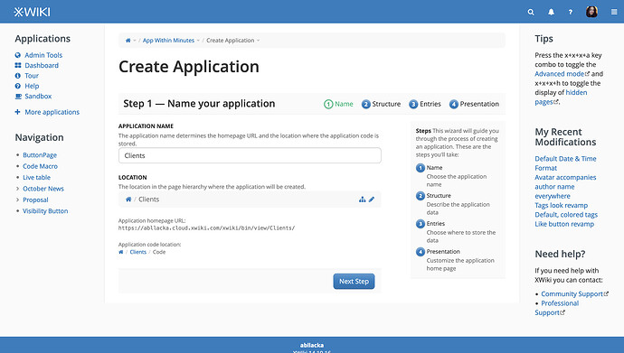
Wizard Step 1 - Issues
#1 The explanation in the right is unnecessary
The steps are presented pretty well and concise in the progress bar. No need to overwhelm the user with too much information from the beginning. Let’s stick to presenting it in chunks.
#2 No need to explain how the title of the application affects the link and location
The user will put the name they find most fitting for their data and afterwards reconfigure the location if they don’t want the default.
The idea is to make this process simple easy for a new user, let’s take out things that can be understood later or from the context.
#3 The complete link & path are not very interesting for a new user
They can be collapsed or hidden. This is to continue the process of simplification.
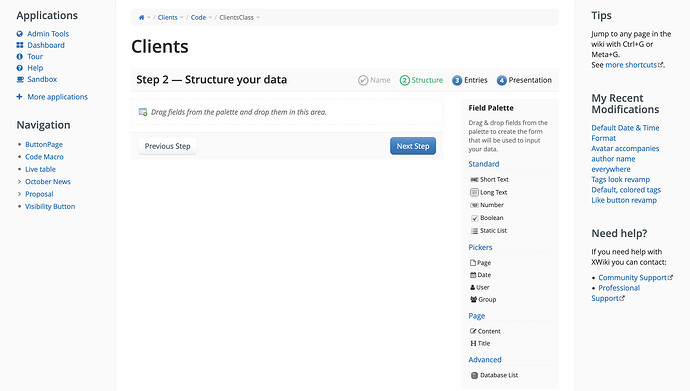
Wizard Step 2 - Issues
#1 Drag and drop is not necessary here, implying more effort than it should.
This effort is created by the distance between targets (related to Fitts’ Law) and repeated long movements of the mouse to achieve the task of adding a new field.
It also implies a slight learning curve even though it’s explained in the UI. Most software doesn’t use drag and drop for creating new fields/columns, but only for moving them. Creation is done by single clicks.
#2 Description of how to add fields is duplicated.
No need to clutter with the same info.
#3 Field types are not self-explainable or don't explain use case context.
A new user of XWiki can be confused fields like Static List, Content, Title, Database List.
-
Static List implies understanding the concept of static and dynamic and also the difference between this field and Database List.
-
Content can sound confusing if you don’t know already that every entry/record in an application/collection has a page associated to it.
-
Same with Title.
-
Database List is very confusing. It can imply to a technical user the idea of relational databases, but even that isn’t sure from the name.
#4 Field categories are not very clear or cohesive.
Pickers describes what kind of UI may be needed to interact with those kinds of fields.
Standard implies basic functionality but doesn’t include Date, which would be highly expected to be a standard field
Page is confusing because it doesn’t explain the idea of an entry/record having an associated page to it,
Advanced aliens new users even though Database Lists are very powerful fields.
#5 In this step, the user doesn't know about generic columns that are presented in Step 4.
The problem is that a user accostomed to no-code app builders or other software that has database builders may think he needs to add fields like the ones that are generic in XWiki.
This will cause functionality duplication and, thus, the need to go back from Step 4 to Step 2 to delete useless fields.
If he doesn’t delete them, then he’ll miss out on automated processes that make the applications/collections great in XWiki.
#6 Before selecting it, the field doesn't seem moveable, editable or deleteable.
-
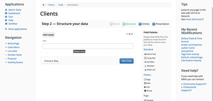
#7 It’s not intuitive that the field’s label is clickable and is an input field.
It took me a few tries before giving it a try and clicking on the label itself. I was very surprised that it actually worked
#8 Hint input is very confusing
…making this very important feature seem useless:
-
Its label doesn’t explain its functionality
-
It doesn’t have a placeholder text that could explain it.
-
The tooltip (Default value) seems to say that the null value or the empty field value is the default value, not that whatever the user inputs will become the default value for that field for a new entry.
#9 Inputs don't have a placeholder texts
….which makes them feel bugged or confusing
#10 Everything related to the Database List field is confusing
It is an extremely important feature, but it seems so complicated. There’s no list of avaliable live datas/ live tables to choose and connect to, the documentation doesn’t help.
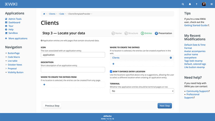
Wizard Issues - Step 3
#1 The information about entries being pages needed to be in Step 2
-
#2 Choosing an icon takes too much space in the UI
-
#3 The icon chosen for the entry is not showcased, just named
-
#4 The fields in this step need to be grouped a bit better
Especially the fields related to the paths/locations should’ve been one near the other one. I needed to look twice at them to realize they are NOT saying the same thing.
#5 There is no need to explain Icon and Description
they could be named General Entry Icon and General Entry Description. Their explanations clutters the UI for the sake of cohesiveness.
#6 The decision of having the pages terminal or not may slow down the process
New users may not know which is the best choice for them.
Even for users acostomed to XWiki, it is possible to not predict certain future needs of a application/collection from its start.
This option should only be available in the edit mode of the aplication/collection, not in the creation process.
#7 The terminal pages option ocuppies too much space for a binary field
-
Wizard Issues - Step 4
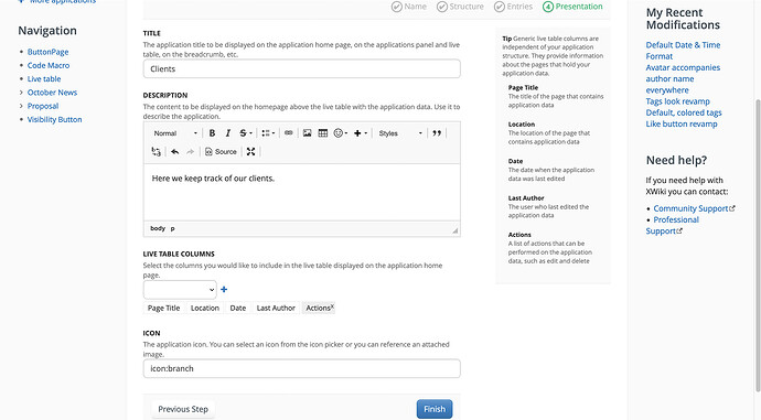
#1 There is no need to have a big explanation of application title and description.
Their labels can be reformulated to include the explanation.The explanations occupy valuable space.
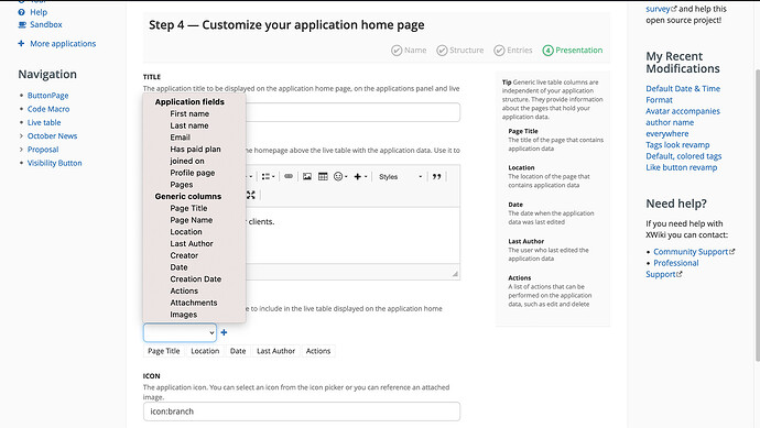
#2 The dropdown for live table columns doesn't have a placeholder text that explains what the user chooses.
-
#3 The dropdown (above) is not consistent with other dropdowns in XS
-
#4 The default live table columns don't include the user defined fields
The user needs to add them again, which is annoying.
The default ones are some of the generic ones, not even all of them.
#5 The icon chosen for the application is not showcased
-
