Batch Actions in Live Data

Hello everyone! I’m here to discuss with you batch selection & batch actions in live data. :star_struck:

Current situation


Currently, we don’t have an UI for batch actions for Live Data, nor for Live Table.

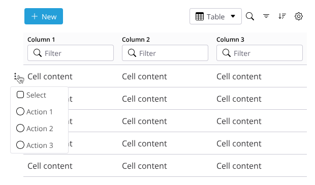
New Live Data Property - Enable batch selection


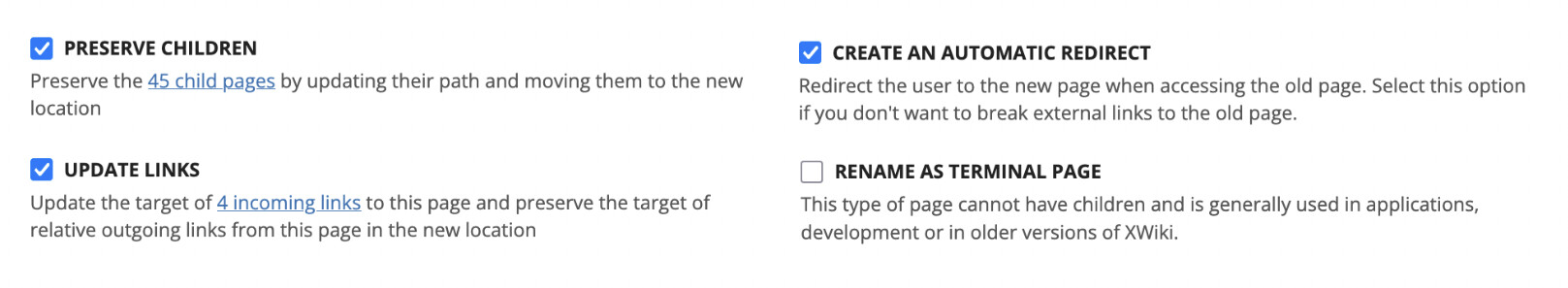
The user may not want all tables to have batch actions available, so we should add to Live Data a property to enable or disable batch actions.

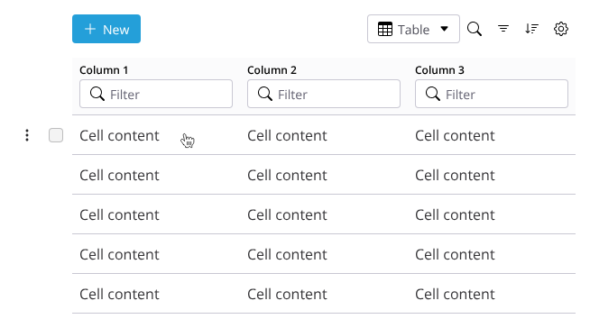
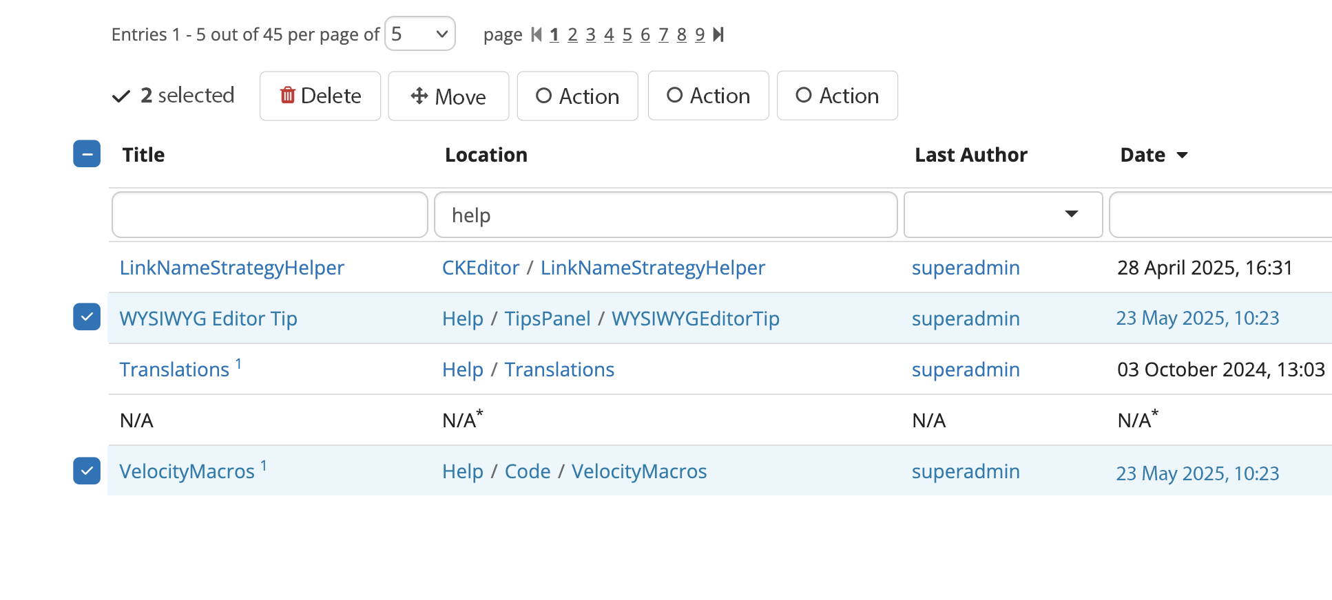
Enabling batch actions would add a column of checkboxes at the beginning of the table.

Design :star:


Initial state (non-selected)

The column of checkboxes is empty at first.

It will have as a header a 3-state checkbox.

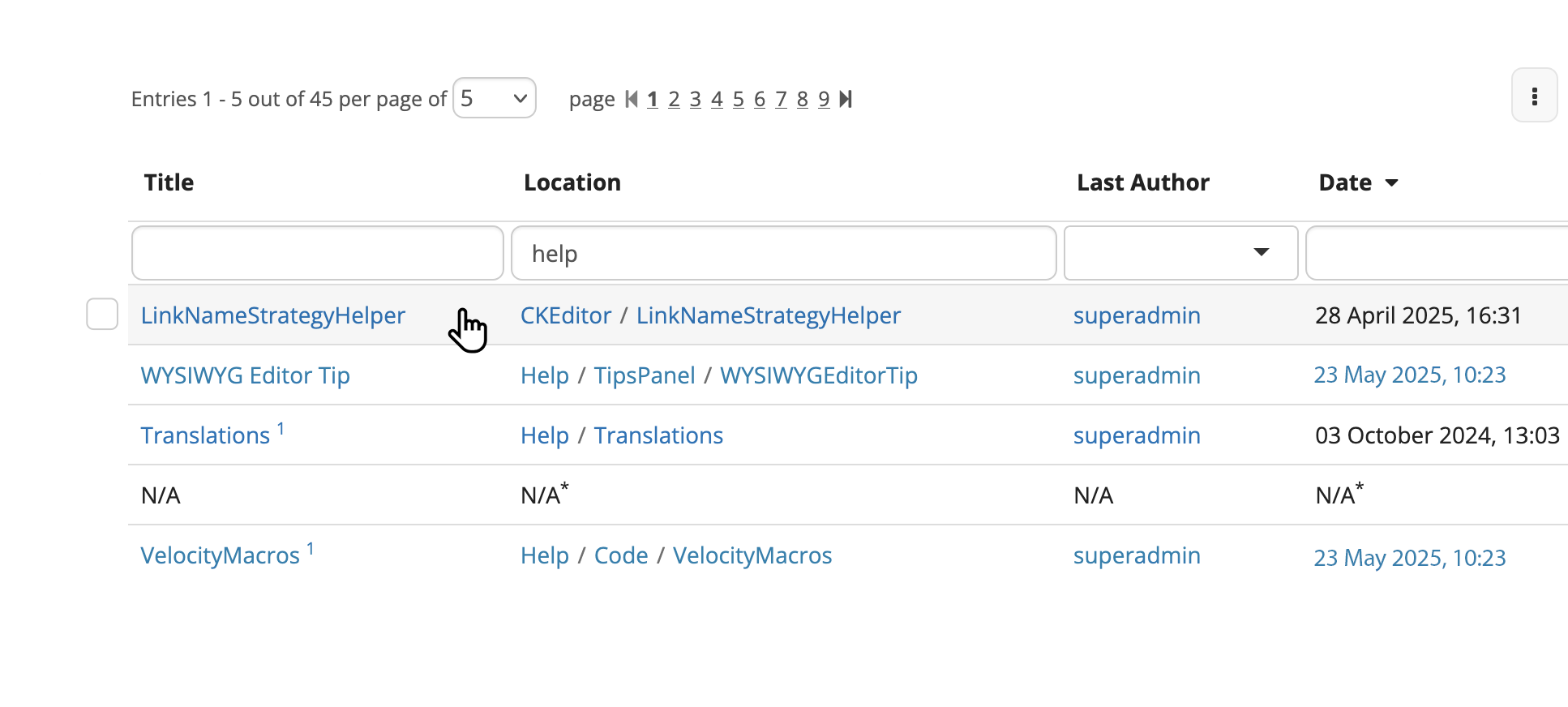
This column cannot be searched, filtered or sorted through.
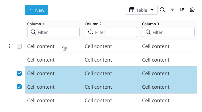
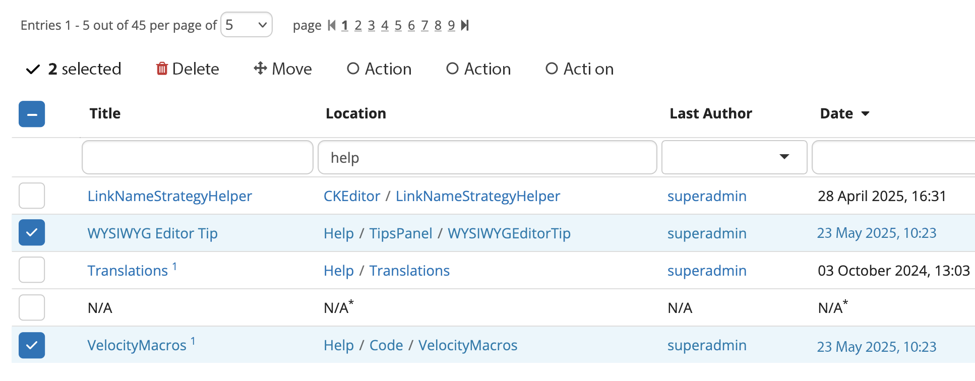
Selection state

Behavior of selection


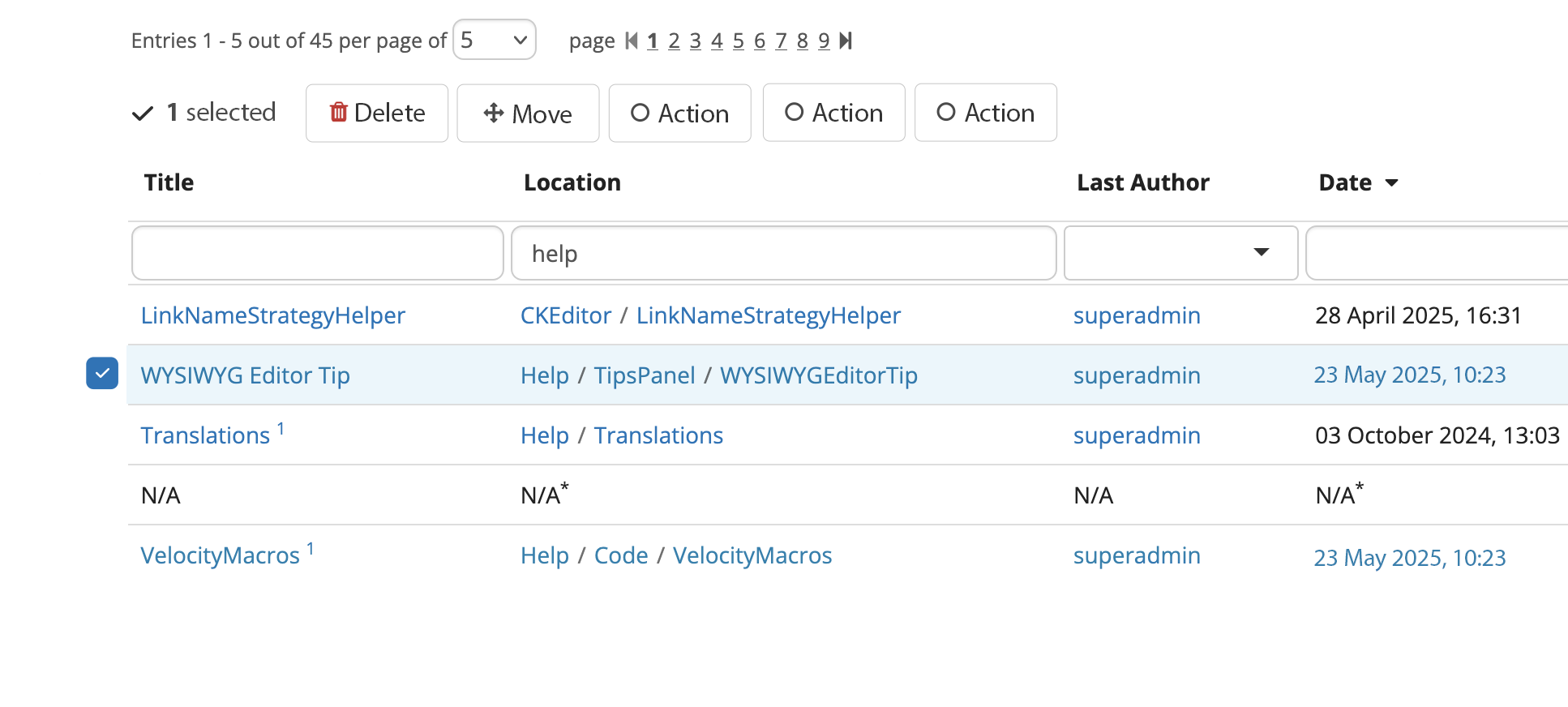
The header checkbox and all the items checkboxes function exactly how the Gmail checkboxes work, to keep a familiar UX pattern.

The selection of items is made at page level and filter/sort level. This means that if the user changes the page or inputs a search filter or adds a new sorting rule in any way, the checks made by the user are NOT kept after the query change.

This is pretty similar to how Gmail does it, except they preserve checkboxes state when going to another page, even though they allow batch actions only on the current page.

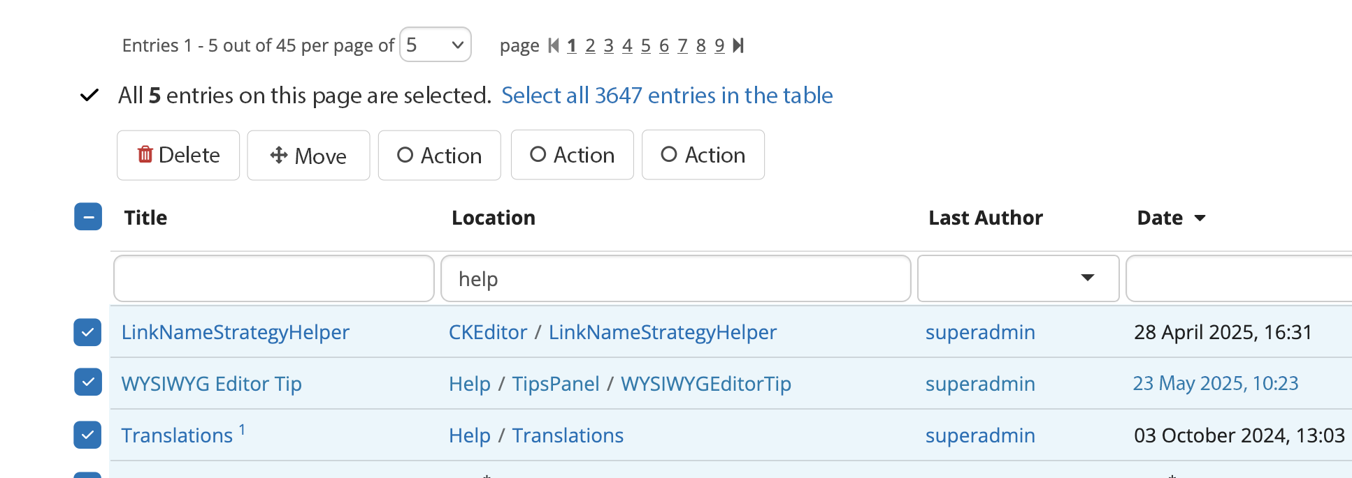
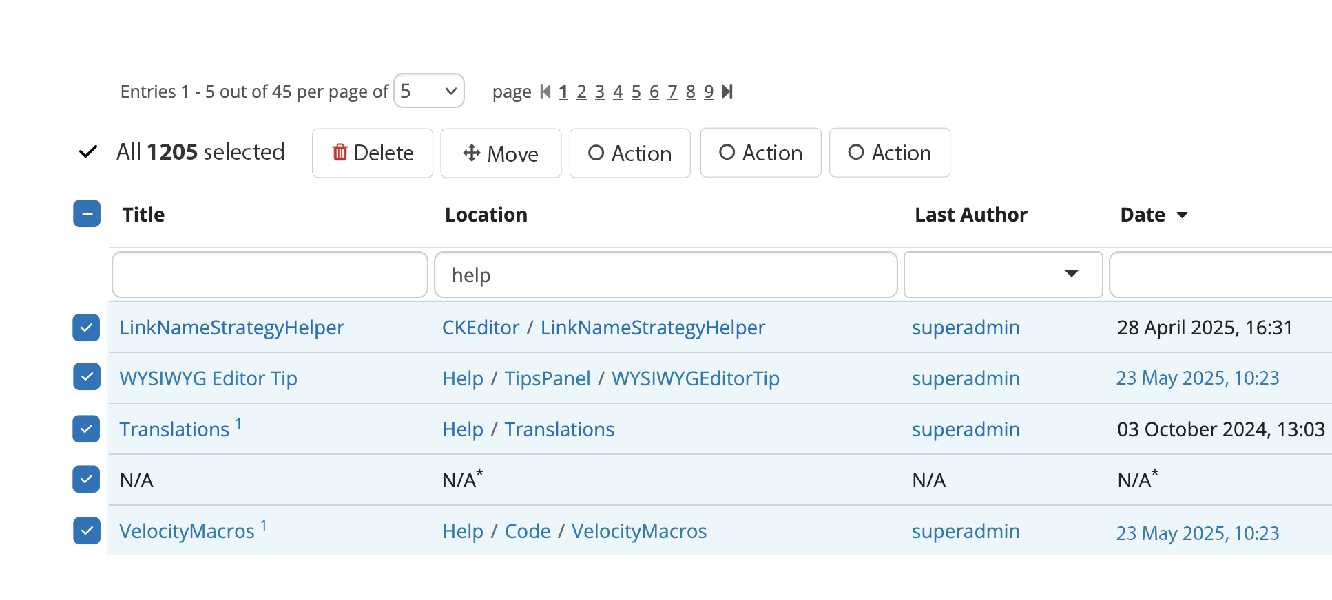
UI changes when selecting items


When selecting at least 1 item, the batch actions row gets visible below the row of pagination.

The table actions button (for filtering, sorting, etc.) gets hidden to keep the UI cleaner and the attention on the left side.

The number of selected items is signaled first, and then it’s followed immediately by the possible batch actions. We keep everything aligned to the left.

If the user navigates to another page after selection, the row of batch actions disappears and all checkboxes get reset to state 0 (unchecked).

We should also recolor the selected item’s row. See benefits in the proposal page.

This means:

  • changing the background color to the one of an info box
  • changing the text color to the info box’s text color, to ensure accessibility
  • preserve original border color

Design


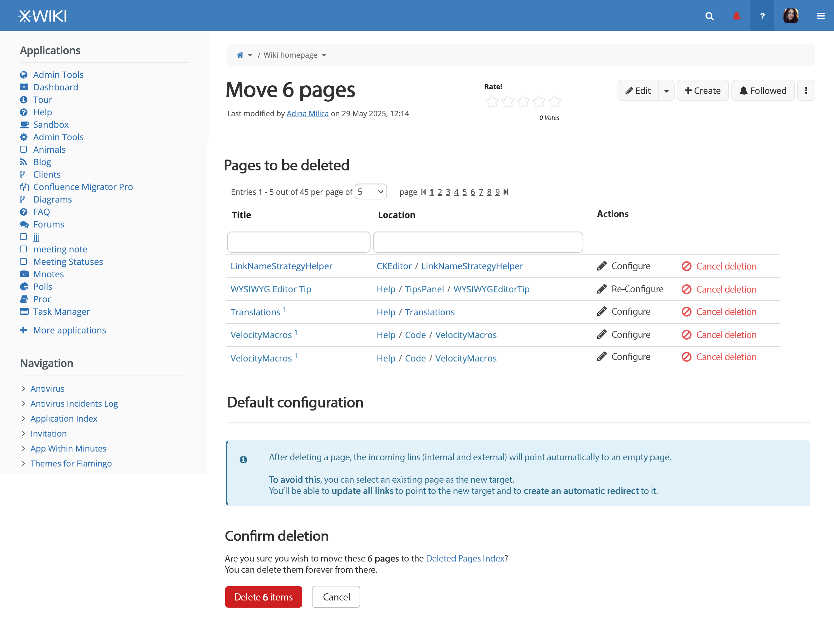
Batch Deletion screen


After selecting a number of items in a Live Data table, the user chooses Delete and is led to the following screen.

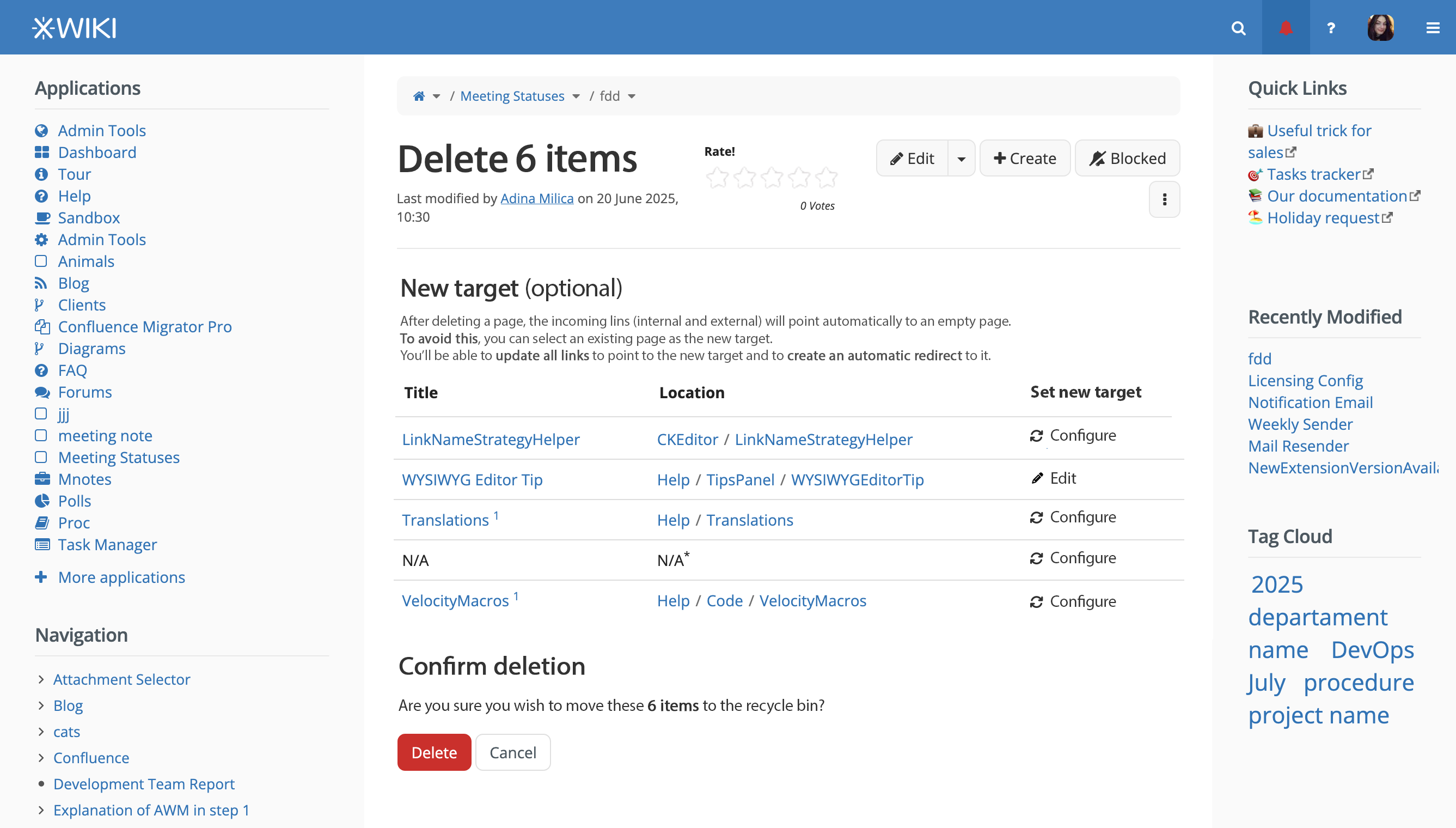
We need a separate screen and not just a confirmation modal because we should let the user select a new target for the deleted pages.

The screen mainly consists of a new live data table made with only the selected pages from the previous screen, with one action column.

That action column, Set new target, can have one of 2 actions available:

  • Configure - setting the actual new target, clicking it opens a modal you’ll see next
  • Edit - this action will appear only if the user already set the new target, enabling him to edit it. Clicking it leads to the same modal for Configure, just with fields filled in.

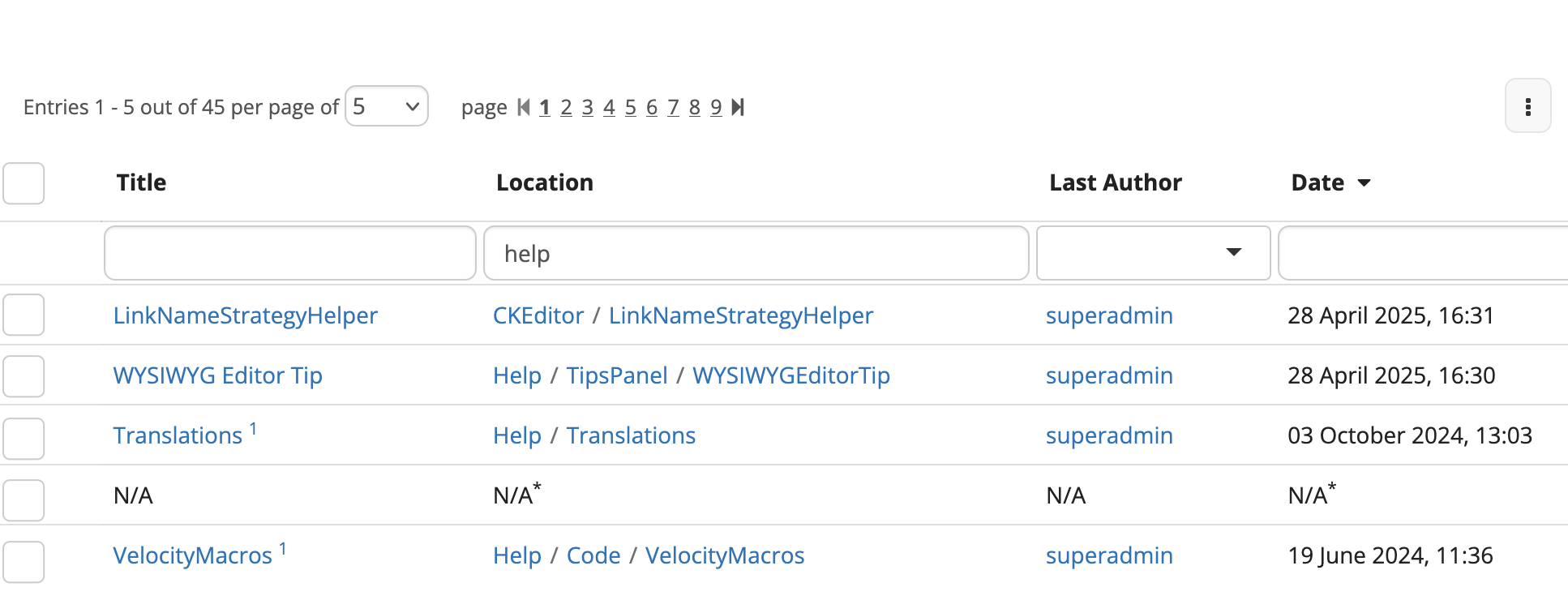
The live data table doesn’t need to be filterable, sortable, searchable and shouldn’t have pages.

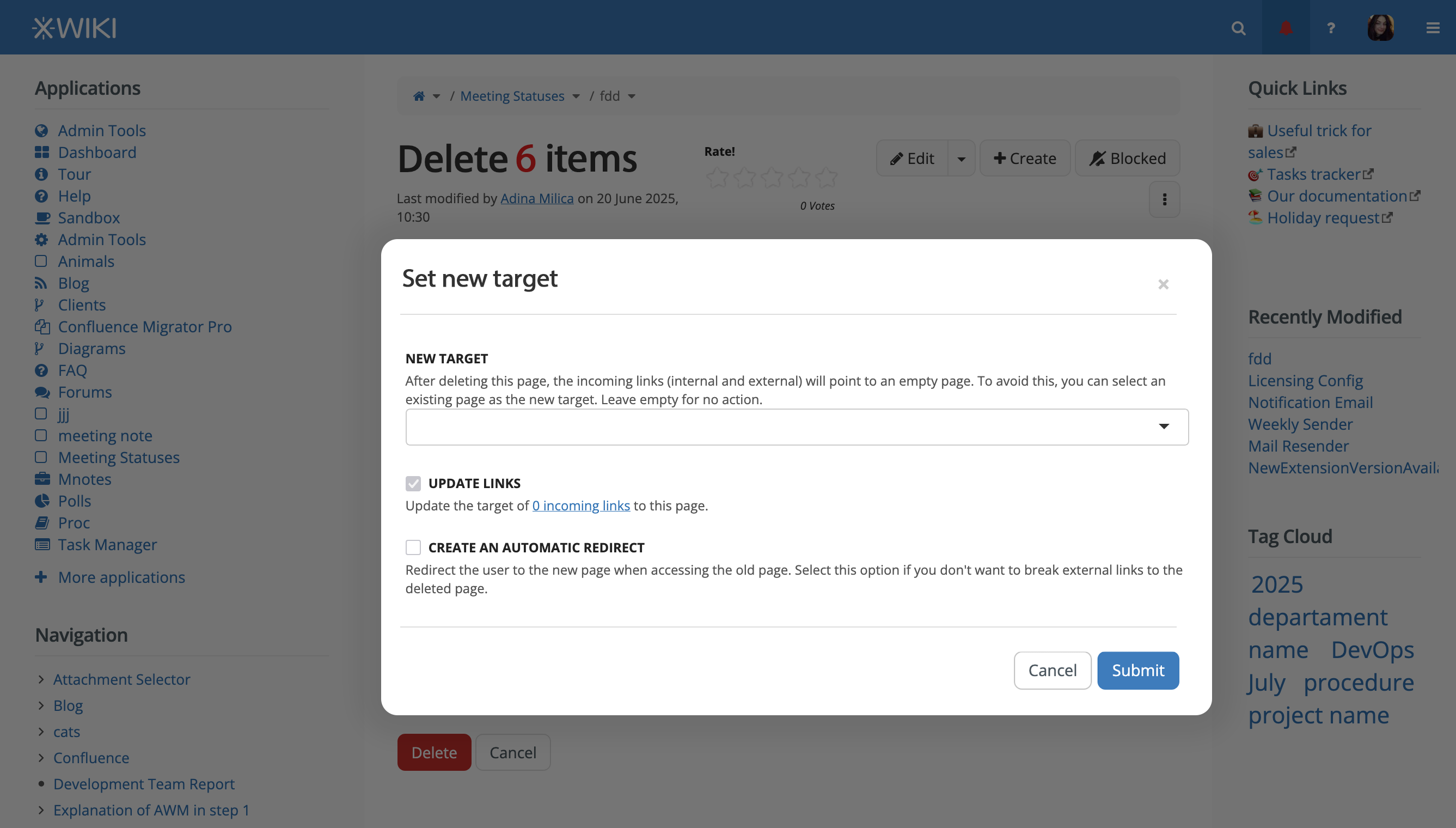
Set new target modal
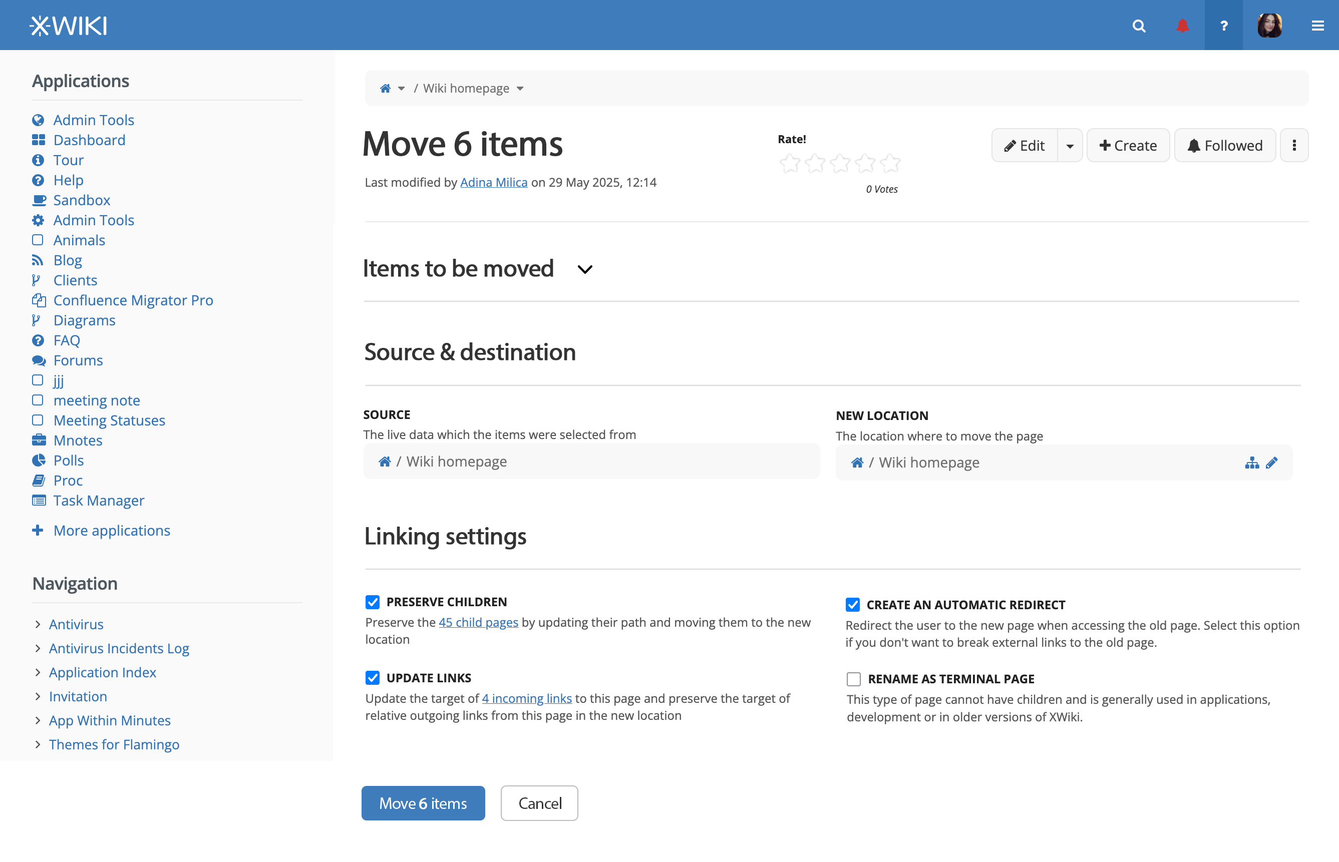
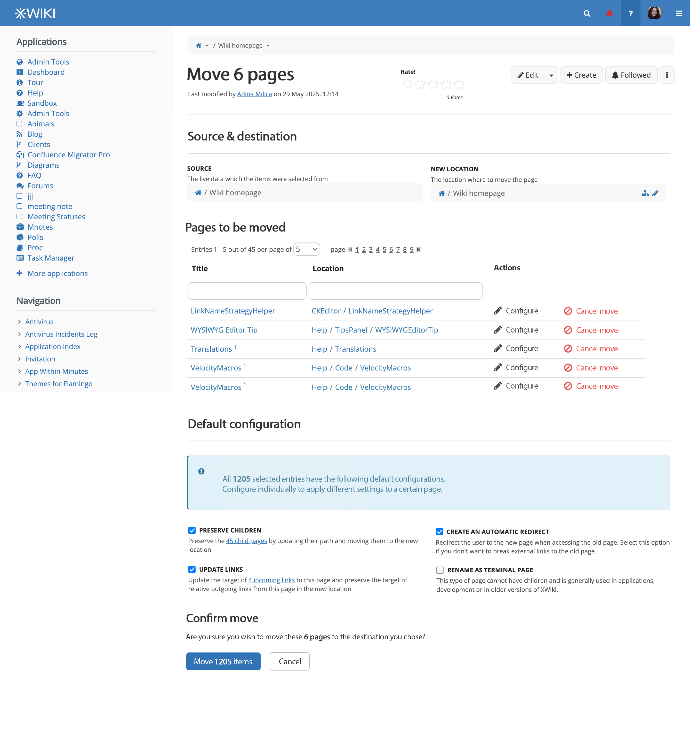
Batch Move Screen


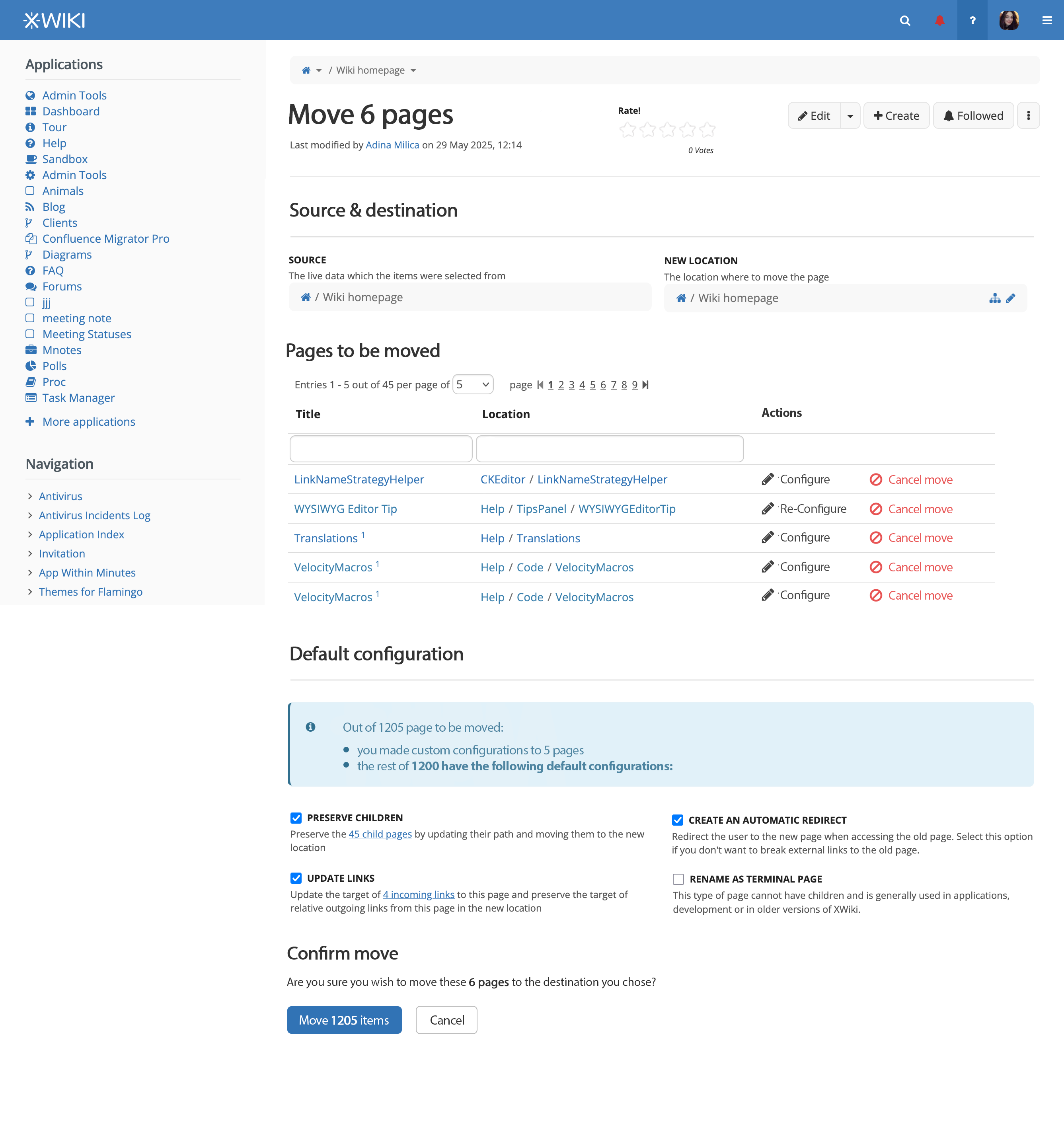
After selecting a number of items in a Live Data table, the user chooses Move and is led to the following screen.

In the Items to be moved section, if the user chooses to expand it, he will see all the selected items in a live data. This live data table doesn’t need to be filterable, sortable, searchable and shouldn’t have pages. There are no actions available for these items.

What do you think? :thinking:

2 Likes

Hi Adina,

thanks for working on this!

+1

I’m wondering if it would make sense to be able to sort it? e.g. to put every check items on top of the table for some reason?

I generally agree with this but IMO we should be careful to allow users to keep the selection when using the navigation back browsing capability: e.g. if a user forgot to select something and already selected an action, they should be able to browse back and select the missing page and then perform the action again.

Question: I guess the checkbox of the column should allow to immediately select/unselect every rows displayed in the table right? Do you think we should also have same mechanism than in Gmail to allow also selecting the rows once we clicked to select everything?

Also I’m a bit mixed about displaying the actions only when selecting a row, I’m wondering if the actions shouldn’t be visible but disabled by default? So that users don’t have to select something to know which actions are available?

Last comment also seeing your screenshots: IMO the rows that are not visible to current users because of lack of rights (N/A lines in the screenshots) shouldn’t be selectable at all for batch actions.

So this is not a live data, but a static table then. I’m ok with that, just wondering how it would work if we allow selecting all lines of the LD as I suggested above.

Since this table is also a summary of what has been selected IMO it would make sense to allow removing a line: e.g. a user made a mistake in a big selection and wants to delete the batch except a page, would be handy to be able to remove a line there and I don’t think it’s technically complex.

Also I would probably display in this table the number of incoming links for each page: it’s an interesting information to know if the new target should be configured.

I’m not sure why it’s not displayed by default? This UI is a confirmation UI so for me it makes sense that the user can quickly ensure they didn’t make a mistake. Also in this UI it’s not quite clear to me why the child pages links and incoming links would display since the count should be a total count about what’s been selected? Also “Rename as terminal page” is probably an option that should be independently selected for each page of the batch no? Doesn’t really make sense to have that globally? Same for auto redirect probably. Not quite clear to me why all those settings are not individual like you did for the delete UI with configure.

+1, we should assume the default use case is the simplest possible, which is a Live Data with only a few entries. In this use case, batch actions are unnecessary and would only bloat the UI.

Regarding the design of each action, shouldn’t we make them look like standard buttons? I think at least a border would help here. IMO it’s not immediately clear what is an action and what is not. The first icon+text “:heavy_check_mark: 2 Selected” looks very much like an action.

+1

Note for implementation: those checkboxes are custom styled. In order to do this correctly, one should hide the native checkbox and customize the style of their labels to make them look like what we want the checkbox to look like.

I don’t think it’s a NEED, it’s probably a SHOULD. I didn’t check but I doubt it wouldn’t be possible to open one dialog from another dialog (nesting them). But I agree that it’s a bad practice and it would be confusing to have this whole complex process into dialogs.

Shouldn’t we show at least some items by default to the user? It feels weird to me to have an empty expandable section at the top of the page. Maybe we should move this section somewhere else or make it less prominent in some other way?


From what I remember, disabled controls are a real headscratcher when it comes to usability/accessibility. One important thing is to make sure it’s easy to understand “How to enable the control” (and if the control, cannot be enabled, ofc it means it should have been hidden in the first place). AFAIK in order to do that we’d need an explicit label around the controls, something like: “Batch actions: These actions are currently disabled because no entry is selected.”
Here is one source that explains this in more detail: Disabled buttons don’t have to suck | by Justine Win | Justine Win Stories | Medium . Disabled buttons aren’t bad for accessibility per se, but IMO we should be careful adding any.

Sidenote: We should probably use the same pattern for the action column, when no item is selected. It looks very complicated and I am wondering why we couldn’t remove it altogether and just use the batch action on one selected item (one more click, but less clutter and UI appearing/disappearing).

+1


Thanks for advancing on this topic!
Lucas C.

thx for working on this!

I have a general question regarding how this proposal overlaps or complements the one at LiveData for Cristal . The later also tackles batch updates and since we want the LiveData component to be the same for Cristal and XS, we need proposals that are compatible and work the same.

Could you check this out with @tkrieck ?

I think we need consistency in term of L&F between a LD with an Action column (as we have now) and this batch action proposal. To reconcile both, I’m proposing that:

  • We allow a config option for LDs, to say that a LD has actions for it (like Edit, Delete, etc)
  • We have another config option for LDs, to say whether multiple selections are allowed or not.

If we have actions = true but multiple = false, we still display checkboxes on the left (but not the global checkbox to select all), and only allow the user to select a single row.

Technically we could imagine preserving backward compatibility, when an _actions column is defined, don’t display a new column but display the actions in the L&F defined in this proposal, for consistency.

So this means a single click on it selects ONLY the visible LD rows, and there’s some text displayed with a link to allow selecting ALL rows:

The table needs to be a LD for scalability.

General important remark re the move and delete proposed UIs: I’d like to have consistency between the single item delete or move UI and the batch deleteor move UI. Basically they need to be the same UI for me (with possibly some inir differences but at 90+% the same).

Could you update the proposal to have this consistency?

Thanks a lot!

This proposal complements mine. The one about LD in Cristal is more about the generic mechanisms that I am proposing LD to have. This one deals more with what happens after someone selected multiple entries, move and delete.

When talking to @amilica we made sure that both proposals have the same way of selecting multiple objects (but I still need to update mine to get the correct L&F of the selected row, as proposed here).

ok cool but I remember discussions there that I don’t see mentioned here. For example:

So does this mean we would have both the chexkbox + the kebab in front of each row for tables that allow batch actions? Seems a bit weird to me. Hence my comment and proposal above to merge the 2 concepts.

Also another question: I dont feel that tables that support batch actions should display checkboxes in front of each row, as this makes the tables heavy. As I mentioned in your proposal, we need to be able to have very lightweight UI for LD (similar to a normal static table). So I believe we need a mechanism to activate the selection of rows (and thus the appearance of the checkboxes). This could be located in the toolbar or appear when hovering over the table.

Thx

Yes, I did a mockup for this situation

Batch Editing and actions - hovering

We could show the checkboxes only on hover. This way, we don’t have to enable multi selection. Rows that already are selected retain the visible checkbox, but the unselected ones would not have it unless the mouse cursor is over the row.

Batch Editing and actions - selected

Regarding merging the two concepts, I am not sure if I understand it correctly, but I did a test including selection as one of the actions in the menu. It can work, but I don’t think is very efficient, as it requires two interactions to perform a selection.

Actions and select merged

Thanks for the feedback

That looks a bit problematic to me as it would mean increasing the left gutter size. On your screenshot we can see that it’s pretty large.

Right now the proposal mentions 2 separate UIs for actions:

  • An action bar above the table for batch actions
  • In an kebab menu on each row for single actions

What I was saying is that we should consider having a single way of doing actions, i.e. you consider that an action on a single row is the same as a batch action.

In other words, to perform an action on a row, you always select that row first and then click in the action to perform in the action bar above the table.

This would solve the consistency issue and also the gutter size mentioned above.

WDYT?

Thx

Yes, indeed. This is an issue that we’d have with this approach, we can reduce it a bit, but it’ll always be there.

Oh, I see what you mean now, thanks for clarifying. My only issue with this is that each action is a little less contextual, meaning that it can be a lot of back and forth on a tall table. To mitigate this, we could use a contextual menu accessed through right clicking, it’s not ideal since the menu would be hidden but available none the less.

What seems to be in agreement

#1 Add property to enable/disable batch actions

#2 The UI provides a way to select all items on the current page

  • Doing this will trigger a top banner “Do you want to select all 13,000 items in this table“ like in Gmail

#3 If the page is changed, the previous selection of items disappears

#4 If the sort or filter is changed, the previous selection of items disappears

#5 In the screens that follow the selection for confirming the deletion or move of pages, we make the table that displays the pages be a live data one (filterable, sortable) to allow for massive selections

To be added based on this discusion

Really great suggestions from @surli :


#6 If the user doesn’t have certain rights over a page (for example, he can’t view it), he shouldn’t be able to select it for a batch action.

  • we should think of what other standard rights would be included in this category (other than view) or if we should make this configurable.:warning::warning::warning::warning:
  • I vote for now that it isn’t configurable.

#7 If the user selects some pages and then performs a batch action, he will be led to another screen. He then realizes he forgot a page or several. He should be able to browse back to the previous page and the selection would still be preserved.

  • Considering this suggestion, would it also make sense to add the preservation of choices when navigating through pages of the live data table? WDYT? :warning::warning::warning::warning:

#8 We should have the possibility of removing a page from the selection in screens that confirm batch move or deletion.


Based both on @surli and @vmassol said:

#9 To make the Batch Move screen very similar to the Batch deletion screen. The pages to be moved would be shown by default (not collapsed) with available actions for each selected page. Rename as terminal page and Auto redirect should be available options in the configuration modal.


#10 Each action available on selection should look like a button (@CharpentierLucas suggestion)


#11 For ensuring good accessibility on batch actions, if they are hidden when nothing is selected, a message like “Batch actions: These actions are currently disabled because no entry is selected.” should be showcased. (@CharpentierLucas suggestion)


12 Based on @vmassol 's suggestion we introduce another config option (apart from the enabling/disabling of batch actions): the existence of actions


#13 Based on @vmassol and other platforms design patterns:
We shouldn’t display checkboxes in front of each row, but have a mechanism that shows the checkbox when an action is done by the user ( for example, hover or click on some other element)

  • we need to establish which is that action to be able to use it on mobile too

What I’m not sure about

# 12

I think I wouldn’t include this info in the table, but leave it in the modal that opens when clicking “Configure” to not add extra detail in the table. Let’s see what others think about this

Updated proposal based on above

Updated 3 dot button menu


I want this update as a mean to letting the user know that there are hidden actions behind the selection of an entry, but without making the UI more cluttered. This is around what @CharpentierLucas said, and it does feel important to the accessibility of the feature (and even just plain usability). I’m just not sure if it’s enough though. :warning::warning::warning:

Initial live data - No item selected - Checkbox on hover


On mobile :warning::warning::warning:


The selection of an entry cannot be done through hover on mobile, obviously.

We could go 2 routes here:

  • The selection of one item is done through long press (2 seconds press)
  • Only on mobile, all checkboxes get shown at the left of the table (similar to the initial proposal)

One item is selected


Two items get selected - global checkbox appears


All entries on current table page selected


All entries in table selected

Initial batch move screen - all have default config


Clicking “Configure“ in batch move screen

A modal opens with the following choices, rendered either in standard macro-like layout (vertical) or on 2 columns (as they are currently).

Batch move screen - entries have been given custom configs

The messaging in the “Default configuration“ changes

For any entry that has been configured, the action’s name is changed to “Re-configure“. I think it indicates past edition better than the change from “Configure“ to “Edit“ as it was in the initial version of the proposal

Batch Deletion

I will update the proposal page with what I just wrote and the visuals I provided.

Question to respond to and feedback

Anything that is marked with :warning::warning::warning: is a discussion to be had about the details of implementation

Please, if you any time, don’t hesitate to provide feedback on these conclusions :face_holding_back_tears:

@tkrieck , @vmassol , @surli , @CharpentierLucas + anyone that stumbles upon this proposal and wants to provide ideas, thank you!

1 Like

Thanks @amilica

I think in your summary of what was discussed, you missed the backward-compatibility topic about the _actions column tat I’ve mentioned (see https://extensions.xwiki.org/xwiki/bin/view/Extension/Livetable%20Macro#HAllacceptedvalues-2 ).

Why can’t the user select all the filtered elements? Or does the user need to hover over the table heading to see the global checkbox? It’s not clear to me what you’re proposing.

Why is the global checkbox not a tick when all the entires are selected?

I think it’s not clear to me what the “new location” means. Could you explain?

I would also add a column in the LD for each page to display its new location. The pages from the LD can be from anywhere in the wiki so maybe the default should be to compute the relative difference between the location of the LD and a new location, and apply that relative difference to all pages? I’m not sure that make sense but I think the user needs to be able to adjust/set the new location for each page that is being moved.

What about batch rename (ie changing the title)?

Ironically, I think your LD is not using the new batch action mechanism as it’s displaying an Actions column (_actions), while it should use the new mechanism proposed :slight_smile:

Bad title, it should be “Delete 6 pages”.

BTW I don’t think we should put the numbers in the titles since when you exclude some pages from the LD, the title won’t be recomputed/redisplayed.

I don’t see where we specify the new target for each deleted page. Maybe inside the “Configure” dialog?

Also, it’s not consistent with the move UI which shows the default options in the Default Configuration section.

I also think it would be nicer to display in the LD the new target locations for pages that have one set.

Thanks!