While Bootstrap 5 chose to go full flat style on every UI component, as well as dropdowns, I believe shadows should stay when it comes to modals, dropdowns and pop-ups because they should feel like they go a level up from the level the rest of the UI is at.
Can you point out the visual differences we are expected to see?
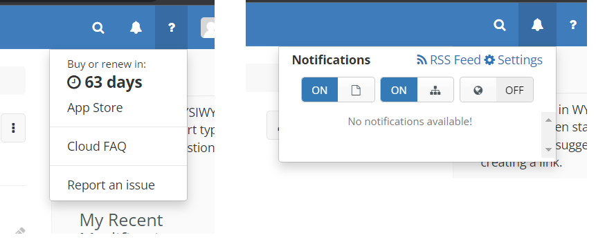
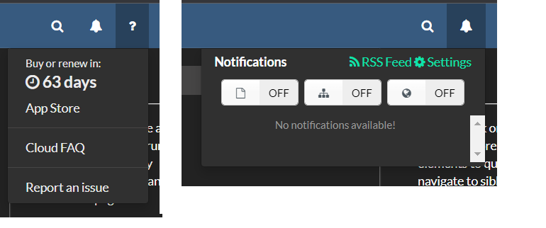
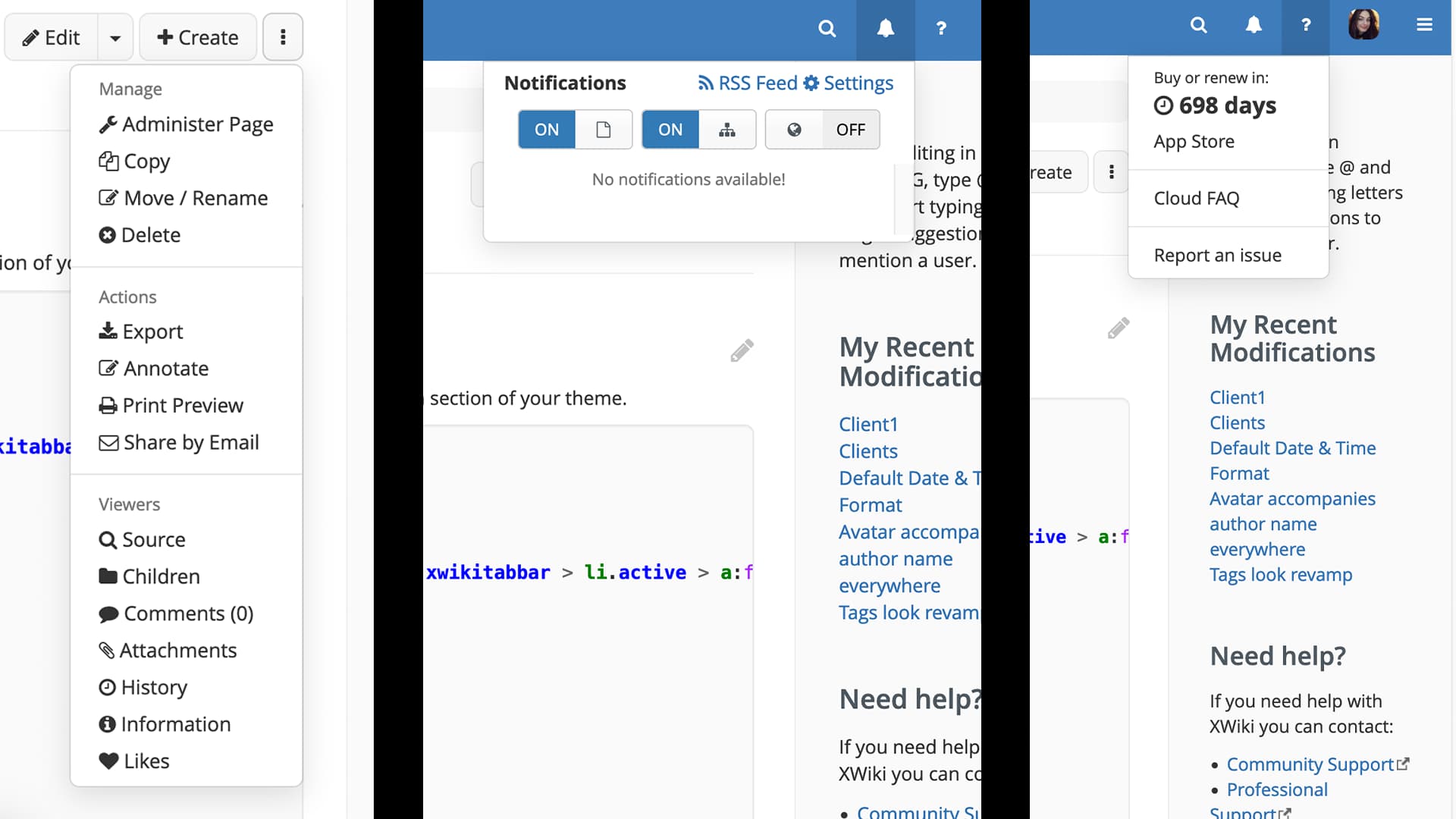
I could see the border being removed, and the shadow being slightly “larger”, bother changes are very subtle change for the light theme, and can’t be seen with a dark them.
The changes are pretty subtle, yes. Compared to the other stuff I’ve posted, this change is not as impactful, for sure. I thought: if we can do easy small & quick improvements to the UI, why not do them?
Personally, I always disliked the border on the dropdown menu and never seen its purpose (maybe I’m missing something and there actually is a purpose).
I think I’m -0 for this change. When looking on the screenshot I slightly prefer the old version with the border and a bit less shadow, I do like the clear separation of the box it makes. On the proposal I feel it’s less separated against the white background.
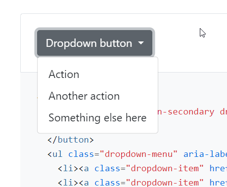
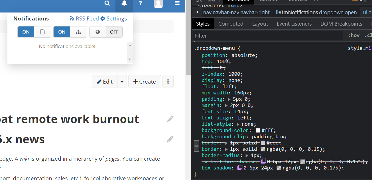
Actually I just noticed that your proposal concerns all dropdowns but the screenshot only shows the effect on notification dropdown. It would be nice to see what happens for the “More action” menu dropdown for example. Or the advanced edit dropdown.
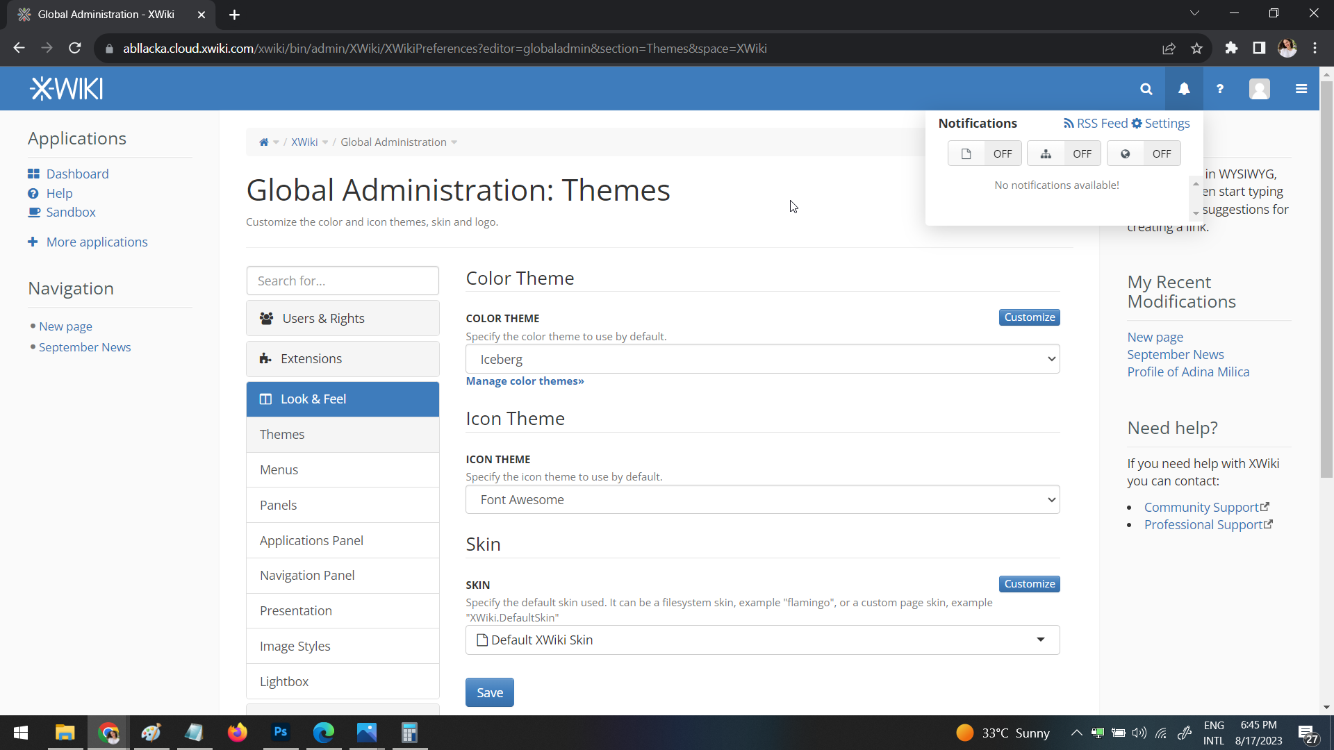
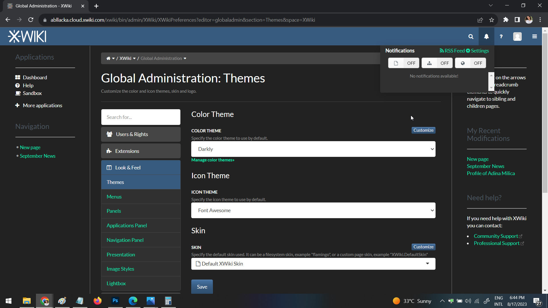
I just manually tried removing the border from the edit dropdown and this looks weird to me as the buttons still have borders which creates quite an inconsistency. Could you maybe provide a screenshot with your exact proposed changes? To me, what Bootstrap 5 proposes would look a lot more consistent as these dropdowns are basically a list of buttons.
Now, notifications are different and I wouldn’t object to removing the border from the dropdowns that are launched from the top bar. So +0 for removing the border from the dropdowns that expand from the top bar but -0 for removing the border from other dropdowns that are launched from buttons like the “More Actions” dropdown.
Thank you for working on this and sorry for the delay in reply!
While I like the look of the dropdown coming from the navbar without borders, I think it’s more important to stay cohesive (especially in the context of bordered buttons). Based on the feedback provided by others here, I think the only improvement than can be done right now is making the shadows a little lighter and blurrier, but still keeping the borders as they are.
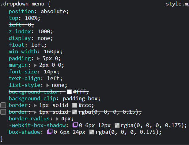
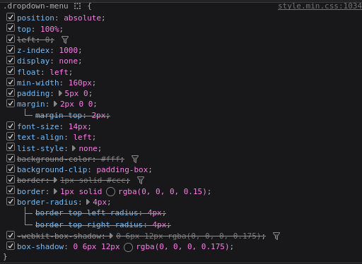
I modified the following properties of the dropdown-menu class as:
-webkit-box-shadow: 0 6px 20px rgba(0, 0, 0, 0.12);
box-shadow: 0 6px 20px rgba(0, 0, 0, 0.12);
A preview (the change is minimal, but I think it looks slightly better):