Division between panels & main content | Issues & New looks

Hello everyone! :blush:

We are reaching conclusions to the main sub-proposals on the minimalist skin proposal, so I thought of discussing a bigger change as well.

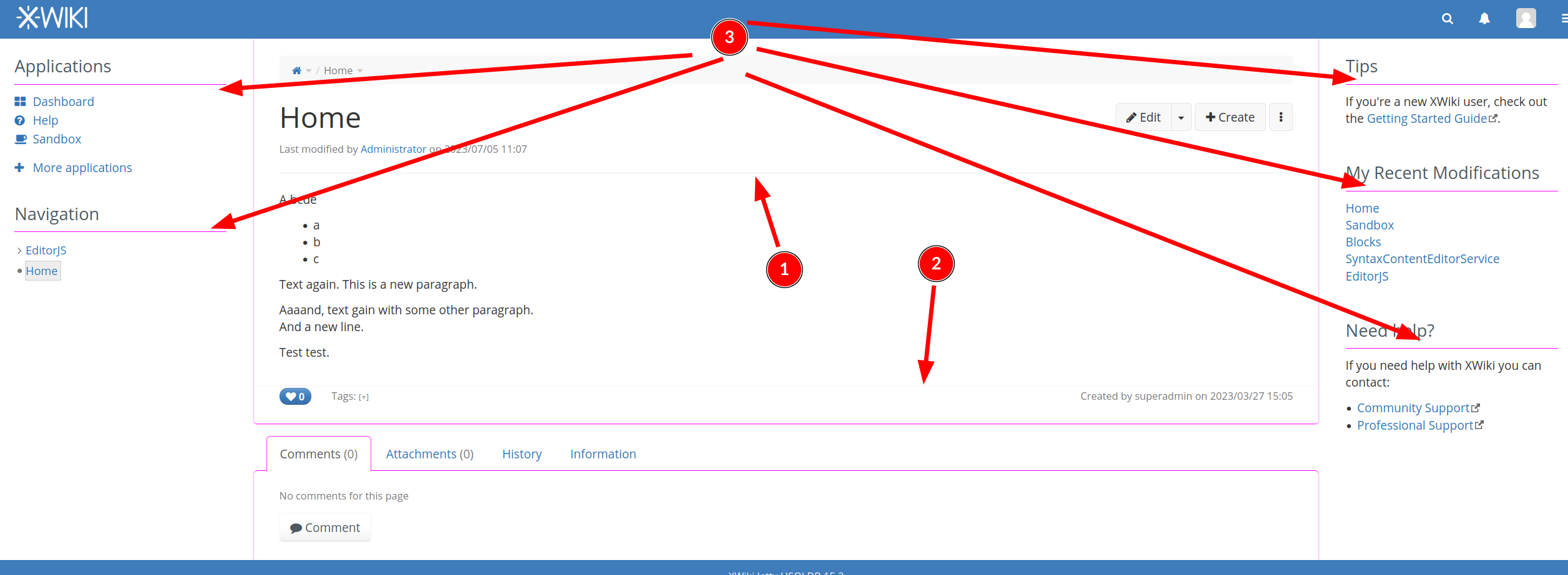
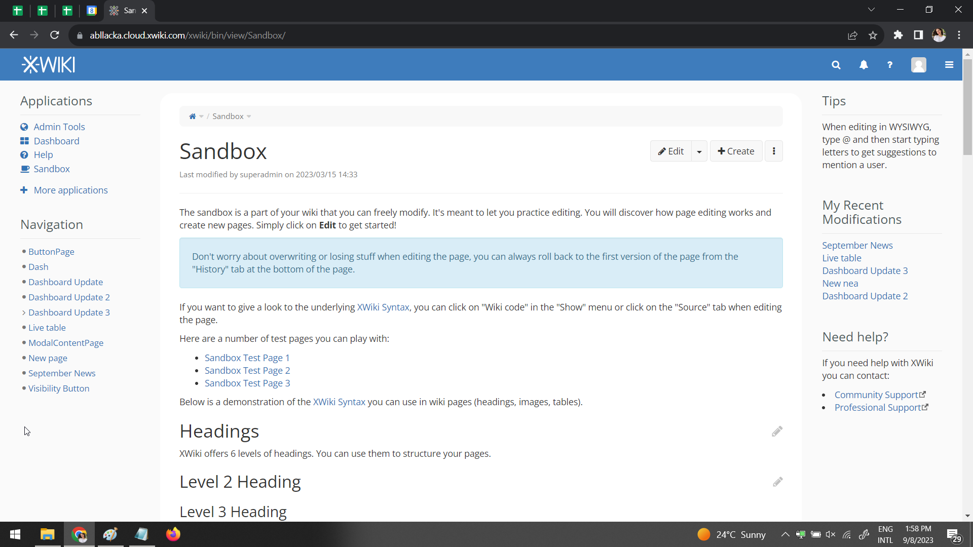
What I wanted to discuss today was an update on the current division between the panels and the main content.

Recap of sub-proposals

Skip if you know about them. :sweat_smile:

As a recap, the proposals discussed on the forum to the moment are:

Current division

current division

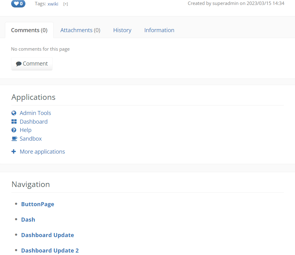
The main content is divided from the panels column with what seems to be slim a borderā€¦ but is not a border, but a very small shadow. This shadow actually affects more than the main content area.

The same border-shadow problem affects docextrapanes:

image

Issues related to this division

These issues were found and documented by @lucaa and @Jsd . Solving them will improve the overall look of the XS and make the customization of the instance easier:

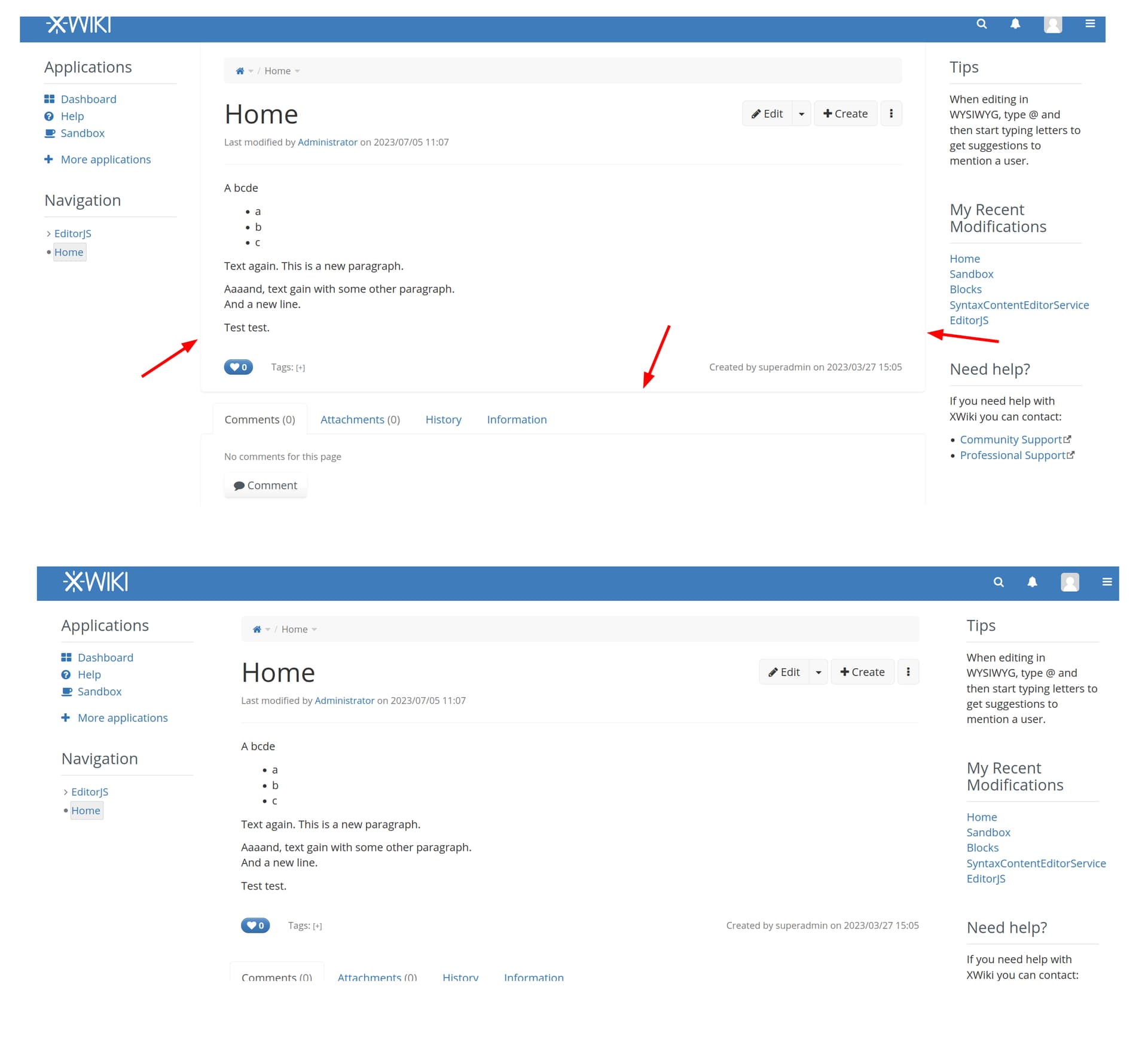
1. Borders of the docextrapanes focused tab are hardcoded to grey

  • Top: how it is
  • Bottom: how it was expected to be

image

2. Borders around the docextrapanes look fuzzy

  • Top: how it is
  • Bottom: how it was expected to be
    ++ The border should be equal on all sides, even in the expected side, the border does not look equal

image

3. Unify the horizontal lines separators in the skin, style and colors and make them available in the color theme

  • Solution after experimenting proposed by @lucaa : splitting the color variable xwiki-border-color (the variable that affects these elements) in 2 variables, one for the separator and one for the borders looks fine.

image

4. ā€œBorderā€ of the page content area in edit mode is not of the same color as in view mode
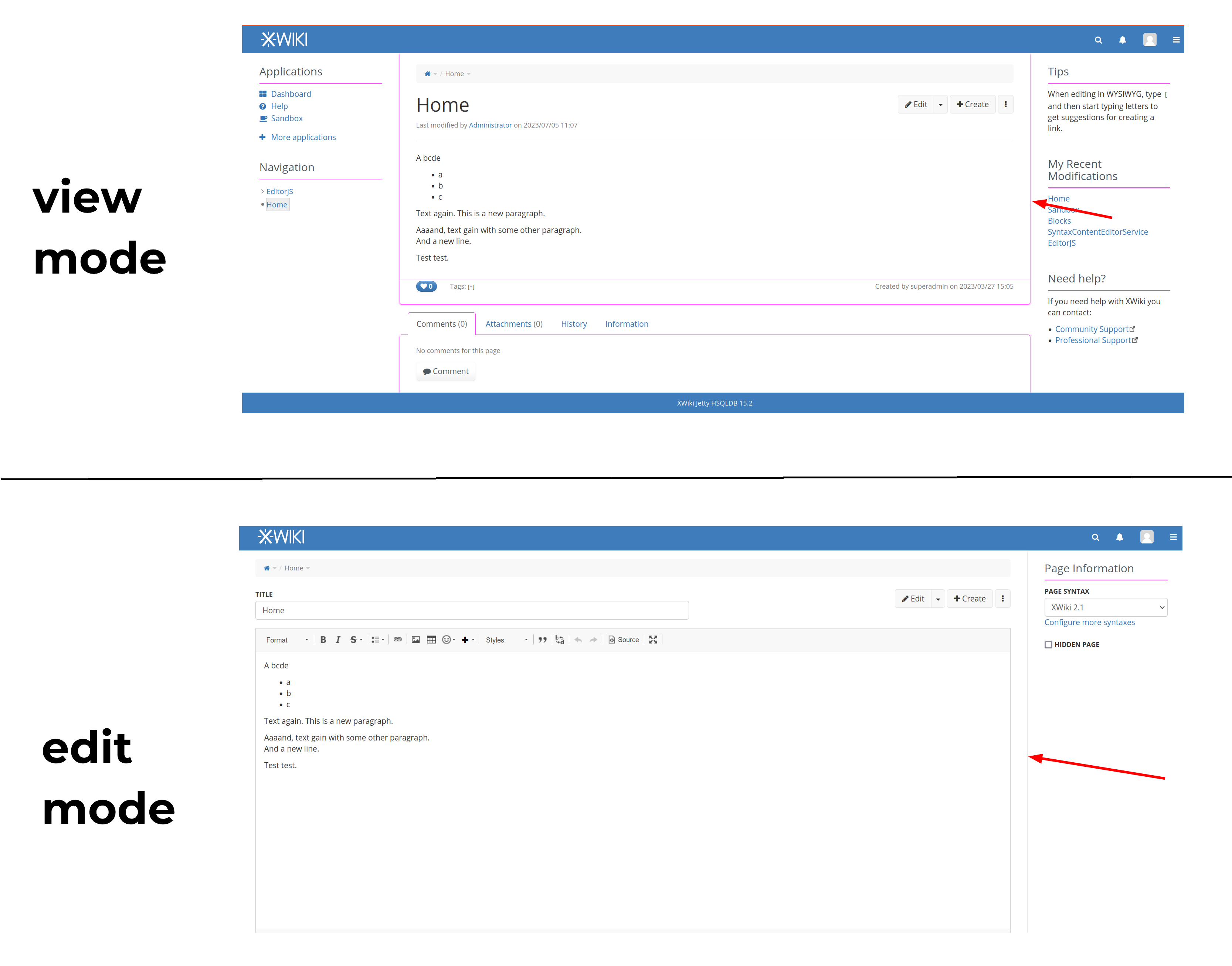
image

5. Main content area in view mode still has borders when the body background and the page content background are of the same color

  • Top: how it is
  • Bottom: how it was expected

image

6. Drop the panel-default-text color from the color theme and use the content colors for all panel content, to facilitate contrast

A probably not popular opinion: Personally, I believe panels shouldnā€™t have a separate background, but I understand that people may feel the need of extra customization at the expense of losing a bit of focus from the main content area. As Iā€™ve said before in another proposal, we should always try to converge the vision of the user to the this area. Thus, my opinion is not aligned with the solution presented in this issue, but I want to see what you guys think, maybe Iā€™m not keeping something in mind.

7. Panel background color from the color theme is not kept for the edit mode panels, which can break contrast

image

New look ideas

Idea 1: If it simplifies the work on the above issues in any way, Iā€™d vote to redesign the section after the main content area. Iā€™ve always found the footer & then the comments area a bit weird and like they could be more nicely structured. The redesign would include making sure thereā€™s no weird borders, no fixed colors, etc. It would also mean to encourage collaboration a bit more than it does already.

Idea 2:
The goal would be to differentiate ourselves a bit from other knowledge organization softwares that are heavily following the Notion esthetic AND to create a visual point of focus on the document.

  • No background for panels, as Iā€™ve stated above, on issue 6.
  • No borders for the main content or a much softer, more subtle shadow
  • Large rounded corners on main content (14px -20px)
  • Margin-top on main content area to isolate fully the content from the entire wiki (aligned with the headings of the panels)

No shadow:

image

Subtle shadow:

image

What do you think about all of these? :thinking:

Iā€™m not a fan of moving the content further down and introducing a rounded border above the content. For me, this moves the content too much down in particular related to the panels. What we also need to consider is the responsive mode that is triggered relatively early and moves the panels below the content.

For the rest, could you please clarify what youā€™re actually proposing? From what I understand youā€™re primarily listing issues but it is not clear to me what youā€™re proposing to fix them.

Iā€™m not against removing the special background color from the panels, I think in particular in responsive mode it looks strange. One idea from me as a non-designer would be to basically apply what youā€™re proposing for the main content to the panels (and then maybe also to the main content): Make their background white with rounded corners and with a margin to the main content. Something like this:

image

Note that Iā€™ve here also separated the breadcrumbs from the main content which is optional but would make sense if we remove them from the main content area as part of XWIKI-18838. The screenshot is with white background color and 8px border radius on the panel and the breadcrumbs. Also, I took the box-shadow of the main content and applied it also to the panels but this is optional, we could also use a border or nothing at all, but in the latter case the contrast would be very low. Note that to separate the breadcrumbs you need the changes from XWIKI-18838 that remove the breadcrumbs from the main content container, this is currently causing other breakages that I prevented here by reverting some style changes so probably not so easy to reproduce.

In my opinion, this also looks much better in responsive mode (though we should make it consistent that in this case there is no gray space on the left and right of the panels and also vertical spacing could be more consistent):

image

2 Likes

For comparison, here a screenshot with the same modifications but without shadows:

image

I agree with Michael on this one, itā€™s not really clear what the question or proposal isā€¦

Basically, on this topic we have 2 dimensions:

  • there are the issues of the product that make it difficult to achieve some coherent and contrast safe looks in a color theme that a color theme designer would make;
  • then, there are changes that can be proposed for the standard Color theme (that would be using the fixes above), in order to improve the look of the standard color theme.

Iā€™m not sure we need to discuss much on the fixes themselves, we may need to vote on their objectives - what are they trying to allow the color theme designer to achieve - and then we can discuss the changes that we may want to do in the default color theme.
@amilica you could also decide to add other issues on the list of fixes that need to be made in order to be able to achieve something easily - because you think itā€™s needed (for the general case) or because you need it for the changes of the default color theme that you propose.

In this optic, lemme take the issues I reported one by one and detail what functional objective theyā€™re targeting, to check that we agree on those (I assume you want to do that):

The objective is to be able to easily change that border color from the color themeā€™s advanced section, or drop it altogether (by setting it transparent).

The objective is to be able to set that border to any other color than grey (e.g. an accent color) and have it look good when doing so.

The objective is to be able to have more control on all the lines that appear on the UI, being able to make some disappear or being able to use anything than grey for them (e.g. some accent color). While having one var for each border / separator would be the most flexible, itā€™s a bit too much so having just 2 ā€œcategoriesā€ of vars (and especially no hardcoded color) looks like the next best thing.

The objective is to be able to have a unified handling of edit mode & view mode when the screen layout is comparable (and in this case it is). Today itā€™s a bit of a mess, containers are already not at all the same ones (which makes that rules are very hard to follow), but that is hard to change, so what we can change is making sure that variables for similar things on the screen are the same in the code, so that visually we can handle this easier in a unified manner.

The objective is to be able to achieve a mono-color background for the whole screen (white, dark, but other mono-color should work too).

The objective is to align the tool with the reality and the rule, to prevent contrast errors from being created by the user when configuring their color theme.
@amilica Iā€™m not sure what you donā€™t agree with here.
This issue is about removing the possibility to set a ā€œforeground colorā€ for the panels, because today that color would not be followed anyway: the way that the platform is built makes that youā€™ll have links (at least) in the panels and the links will not be colored with the panels foreground color but with the @link-color set for the content area. This foreground color will be replaced with a ā€œprincipleā€ or ā€œruleā€ (in the sense of rule to follow not in the sense of CSS rule) that will say that, as a creator of color theme, you need to be aware that content colors (body text, links, etc) will be used for panels and thus make sure to choose a background color for panels that is contrasting well with them.
Then, this issue does not actually impose anything about the actual background color that panels would be using in a color theme or another, that would still be the choice of the designer of the color theme (as it is today), including none (transparent). So if you want panels to not have a separate background, set colors that blend or transparent. Or maybe I didnā€™t understand what you meant by ā€œpanels shouldnā€™t have a separate backgroundā€.
If the concern is about why allowing background color of the panels to be set in the first place as it has no value: the reason for that is to allow the color theme designer to actually set the panels background to be perfectly equal to the content background (or close enough), to align it with the principle that weā€™re proposing. If weā€™re removing this possibility, then the XWiki platform would need to compute a background color for the panels (from the other vars of the theme) for which weā€™d be able to always ensure contrast with page content foreground items (text, links). I am not sure how weā€™d be able to do thatā€¦

This is merely about making sure that the promise we make about contrast for the panels in the item above (6) is actually kept :smiley: .

Thanks,
Anca

Now, about these proposals.

Iā€™m not sure it can simplify things enough, but it might. However, I expect a new proposal to take a lot of time and energy to discuss and agree, as well as introducing new, unknown issues (as this is how problem-solving goes, as soon as you make a new solution you replace the problems of the old solution you had with new problems of the new solution you have - thinking that the new solution would be perfect is optimistic and itā€™s exactly the kind of thinking that makes you have more problems in the new solution than in the old one :grin: ).
Because of this time it would take to validate, I think it may not necessarily be a good idea at this point, or at least not without having discussed in detail what are the functional objectives we want to achieve (what do we want to allow color theme designers to do).

-1 for adding an extra padding / margin on top. The problem with having all sorts of different background colors all over the place is that you need to pad them between eachother so that they look good. The problem with that is that as soon as you want mono-color background, all those paddings are not removed automatically (at least in the current XWiki impl) and thus they become waisted space (in addition to it looking not that great). We already have this problem for the spacing between content and panel, letā€™s try to avoid making it worse.
For item 5. above, I mentioned the objective to be allowing to achieve mono-color background. Thus, letā€™s audit all the changes we propose against that as well, if we agree itā€™s an objective. I, for one, have seen this many times on XWiki (monocolor background) - and also manually hacked the CSS to remove the annoying shadows of issue 5 :slight_smile: - so to me this is an objective.

Thanks,
Anca

Also, there is another objective for items 1, 2 and 3 from the list above:

  • allow to easily have a ā€œborderedā€ look of the whole wiki, with a strong border (accent color or dark color).

These 3 items together would allow to easily set a color, that would then be used for all borders - content area but also docextra panes - and possibly other places in the wiki.

I have worked on some fixes, havenā€™t had the time to document them here properly, but here I am!

General changes around the doc extra panes

This concerns:

  • the small line that exists on the sides of the active tab
  • no border below the tab
  • hard coded gray on active tab
  • changing from box-shadow to border on main panels
  • more space for docFooter
  • improving doc extra panes in responsive mode
  • Making side panels align & visually match with the doc extra panes in responsive mode

Small lines on the sides of the active tab

Untitled (1)

/* Getting rid of the small line that appears on the sides of the tabs */

.xwikitabbar>li {
    float: left;
   margin-bottom: 0;
}

No border below the tab

/* No border below the tab */

.xwikitabbar {
    border-bottom: none;
    margin: 0;
}

Active tab border color

/* Solves the issue related to active tab 
not having the same color as the @xwiki-border-color
because it was hard-coded. */

.xwikitabbar>li.active>a,
.xwikitabbar>li.active>a:hover,
.xwikitabbar>li.active>a:focus {    
    border: 1px solid @xwiki-border-color;
    border-bottom-color: transparent;
}

From fuzzy borders to real borders

/* Changing from box-shadow usage to border usage. 
Solves the issues of fuzzy borders. */

#mainContentArea,
#xdocFooter,
#docextrapanes {
    box-shadow: none;
		border-left: 1px solid @xwiki-border-color;
    border-right: 1px solid @xwiki-border-color;
}

More space and border-bottom

/* Set more space for xDocFooter and set the border-bottom color for it*/

#xdocFooter {
    margin-bottom: 15px;
    border-bottom: 1px solid @xwiki-border-color;
}

Also, making the active tab text bold

.xwikitabbar > li.active > a, .xwikitabbar > li.active > a:hover, .xwikitabbar > li.active > a:focus{
font-weight:600;
}

Side panels & docExtraPanes alignment & look in responsive mode

/* Improving the way the doc extra panes look in responsive mode:
- adding a border-bottom
- having the border-radius on the bottom corners of the panel */

@media only screen and (max-width:768px) {
  #docextrapanes{
border-bottom: 1px solid @xwiki-border-color;
border-bottom-left-radius: @border-radius-base;
border-bottom-right-radius: @border-radius-base;
	}
}

/* Making side panels align with the doc extra panes in responsive mode. 
The other way around wouldn't be ideal because the information in doc extra panes needs to strech as
strech as much as possible for easy readability. */

/* Also making all panels in responsive mode match the page bg color
and have a border, same with doc extra panes and the main content */

@media only screen and (max-width:768px) {

#body.panel-left-width-Small #leftPanels, #body.panel-right-width-Small #rightPanels,

#body.panel-left-width-Medium #leftPanels, #body.panel-right-width-Medium #rightPanels,

#body.panel-left-width-Large #leftPanels, #body.panel-right-width-Large #rightPanels,

#leftPanels, #rightPanels {
padding-right:0px;
padding-left:0px;
}

.panel{
padding:15px;
background-color: @xwiki-page-content-bg;
border:1px solid @xwiki-border-color;
}

}

This is how they would look after the last 2 code snippets:

Untitled

Panel titles changes - getting rid of the line below them

/* In the context of headings getting bold we can rely on the boldness to be
enough of a visual indicator that panel titles are indeed titles.
 
Getting rid of the line below panel titles will get rid of another visual element,
thus decluttering the interface. 

Becuase we don't have the line below the panel title, we can make the title
be closer to its content, taking advantage of the law of proximity. */

h1.xwikipaneltitle{
border-bottom: none;
box-shadow: none;
margin: 5px 16px 5px;
}

If not eliminating the line, improving it

/* Making the line/border under the panel titles an actual border not a shadow.
I still believe we should get rid of the line, as stated previously. */

h1.xwikipaneltitle{
border-bottom: 1px solid @xwiki-border-color;
box-shadow: none;
}

Introducing new horizonal line color variable

/* By default this new variable (@xwiki-hr-color) will take the color of @xwiki-border-color,
but the user may feel the need to change it sepearately, that's why we created it. */

@xwiki-hr-color: @xwiki-border-color;

hr {
border-top: 1px solid @xwiki-hr-color;
}

Border in edit mode doesnā€™t match view mode

/* Changing shadow into border on edit mode*/

#xwikieditor .main {
 box-shadow: none;
    border-right: 1px solid @xwiki-border-color;
}

@media only screen and (max-width:768px) {
#xwikieditor .main {
border-left: 1px solid @xwiki-border-color;
    border-bottom: 1px solid @xwiki-border-color;
}
}

Some of these code snippets solve issues 1, 2, 3 ,4, 5 and make use of @MichaelHamann 's idea on the look of panels in responsive mode.

You can see everything in action in my public instance :star_struck:

You can also get the code to add it to your instance and try it out.

Iā€™ve read everything you wrote and itā€™s very helpful! Thanks a lot, Anca!

Iā€™ve added some of my fixes that Iā€™ve worked on in the reply before this one. If you have the time, it would be helpful to have your opinion on the fixesā€™ coverage of issues 1,2,3,4,5

On the other ones, I have to work a bit more, but Iā€™ll come back on them

The best thing about this separation of the breadcrumb is the usage of the content-color as the background of the breadrumbs, which is not the case today and which poses contrast problems as well - iirc the breadcrumb (path) visual is something that we use both for location of a page - e.g. when displaying it in AllDocs in the page content on page content background - and for the page breadcrumbs which are displayed on their own background, with configurable color. When we set ā€œnavigationā€ colors in the color theme I think it applies to both, which, because of the different background, create some issues.

Another good thing about this is that it may push us towards properly creating a stack of rows on the page, where the breadcrumb is a row followed by title + actions as another row and doc content as another row. As far as I remember this is not the case today - breadcrumbs are either not a proper row or not a proper column, which would also be nice to have.

Now, about how it looks, Iā€™m not sure I am 100% of a fan, for the same padding / margin reason that I expressed above for @amilicaā€™s proposal: on a monocolor background there is a lot of empty spaceā€¦
I need to think a little about what would be the best principle that we could adopt between:

  • a stack of blocks without paddings / borders between them - and whoever wants to add that padding should do it inside of the content of the blocks
  • a stack of blocks padded, which would kinda hint strongly towards a contrast between a sort of ā€œcanvasā€ where blocks are set and the blocks themselves. Should anyone want to change this principle, they need to remove the paddings themselves.

Proposal for 3. Unify the horizontal lines separators in the skin, style and colors and make them available in the color theme: