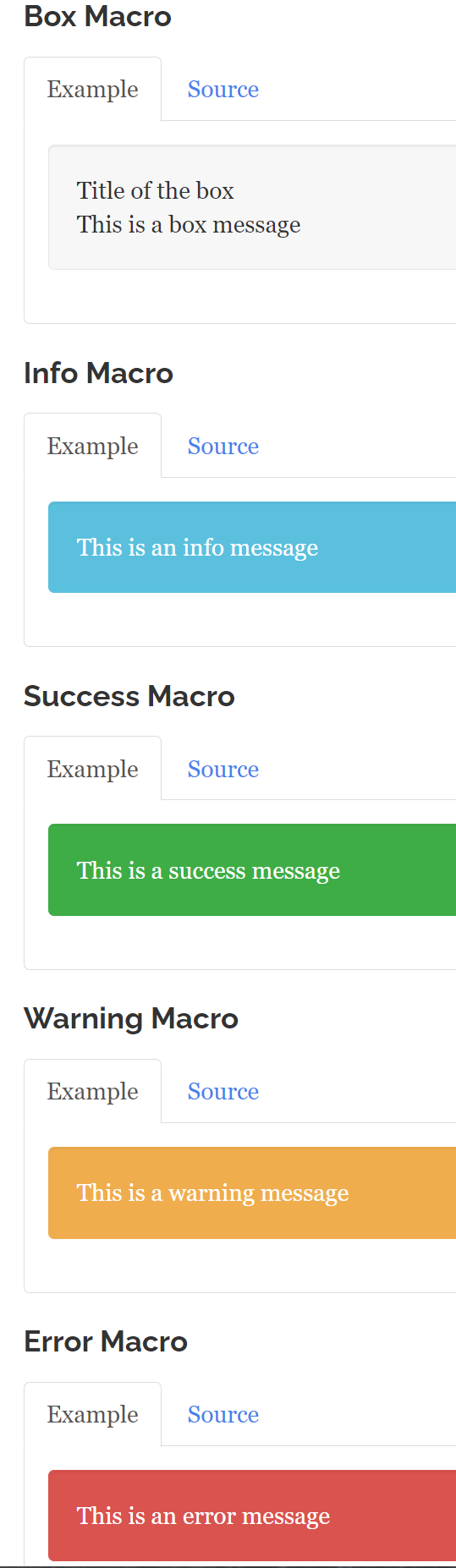
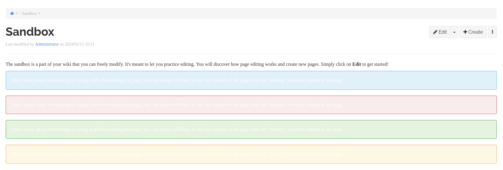
Upon moving from XWiki LTS 14.10.20 to 15.10.5 (also on 15.10.6) notice the following problems with the Box macros Styles Colors changed to a lighter background color; now the default font color (white) is truly unreadable. For example, the “Box” help page (found at Help\Macro\Box) and throughout wherever the Box macros are used, see following:
Hi!
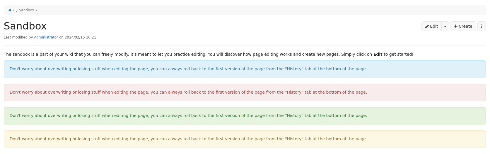
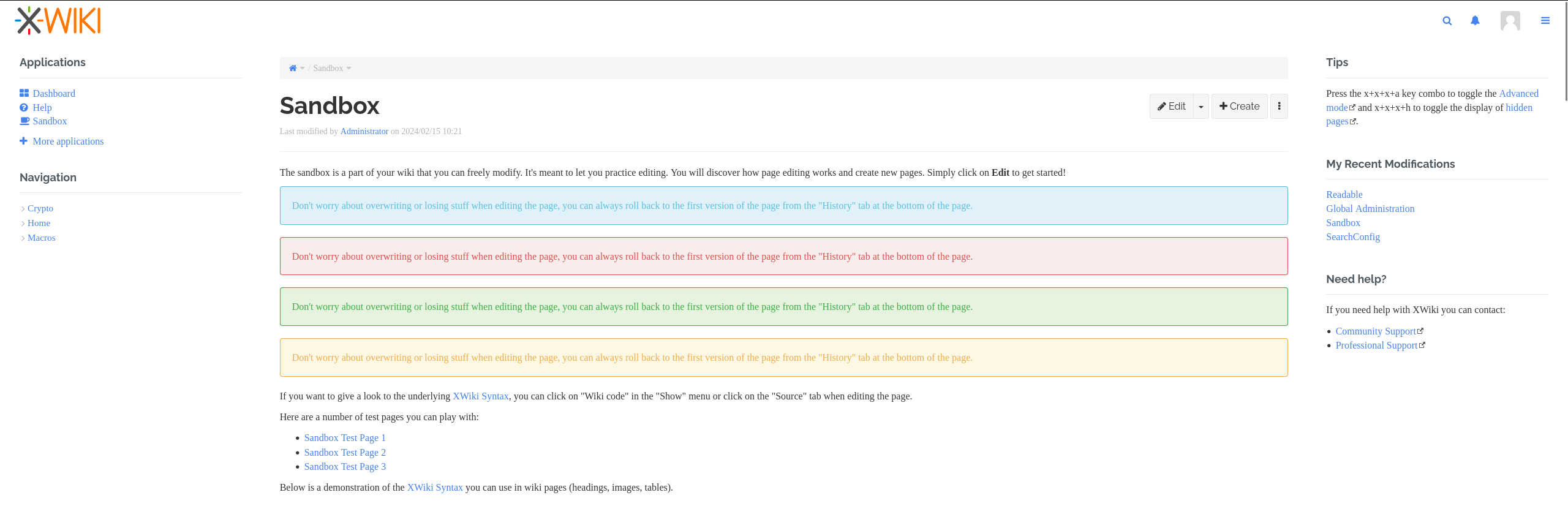
I just checked with a fresh 15.10.7-SNAPSHOT default flavor distribution, and I could not reproduce your bug. As far as I know, the text color inside the boxes should be dark.
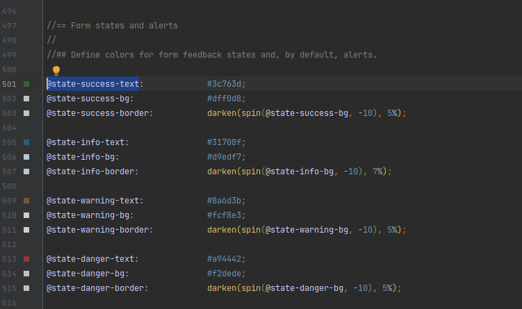
I searched it down, and they come from the @state-success-text bootstrap variables. Those should be set up by default in bootstrap itself, as far as I could see XWiki default flavor doesn’t manipulate them.
Starting in cycle 15, we try to provide better accessibility for XWiki, and one of those aspect is to update colors to ensure enough contrast on all elements. As a rule of thumb, the new defaults (in the Iceberg colorhteme at least) most of the time use dark font color on a light background.
Here, the font color is anomalous.
I can’t really help you more with the info you provided so far. I think this comes from a customization in a SSX or your color theme advanced section.
If @TKutch hasn’t made any change when upgrading to the LTS, then it’s still a problem on our side that he gets something broken. It means we’ve broken backward compatibility. Was this known and documented in the RN? ofc if OTH he made changes after upgrading then it could be his fault but it doesn’t seems so from his message
@TKutch We’re thinking that you could have changed the colors in your wikis after taking your first screenshot and that the color changes was not caused by the upgrade. Is that possible?
I looked at it further.
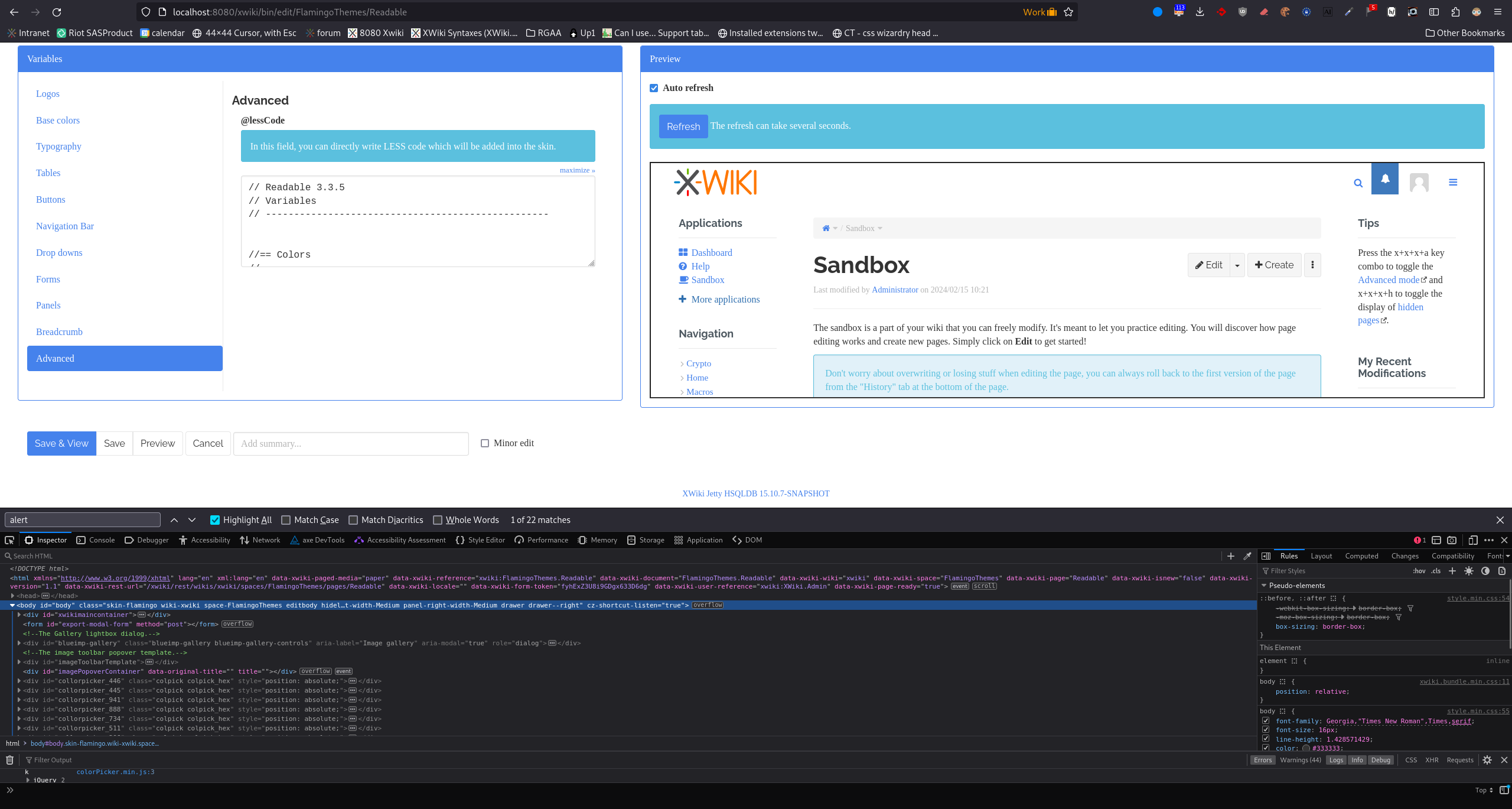
In the background, Readable has some funky color variable mappings. Some of it interacted poorly with an update of the boxes color (which was made considering the bootstrap variables, and standard colortheme variables in mind). I didn’t test this colortheme when applying this change.
There’s two ways to solve this:
Add a bit more custom mapping in Readable to get back to what those boxes used to look like. No change in the UI, but we keep some jank mappings which can break again on an update later on if not taken into consideration carefully on every update.
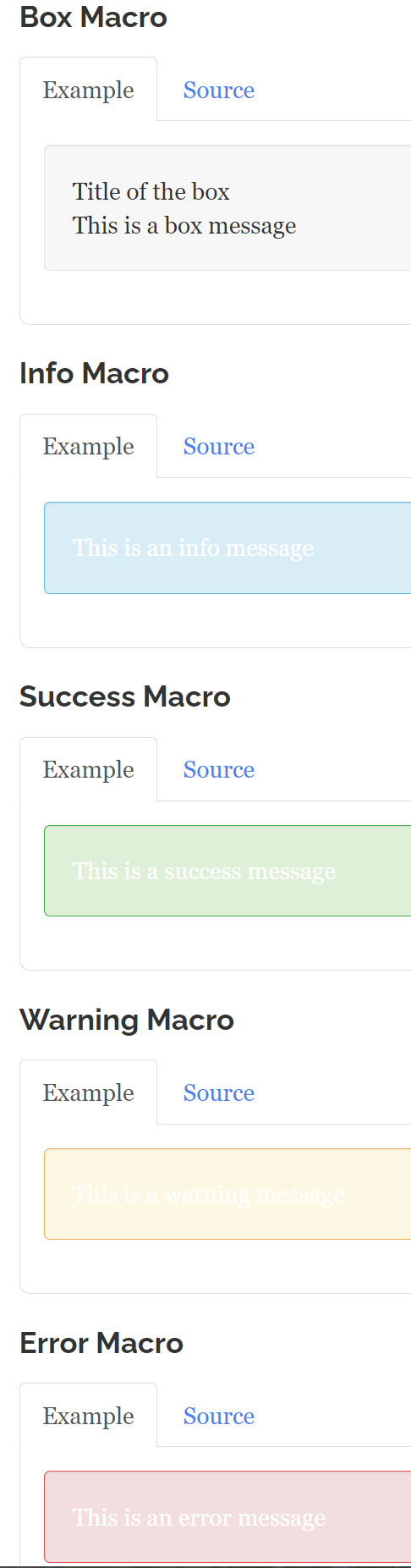
Remove custom mapping for alerts from the Readable code (and similar colorthemes if any). I like this solution because this reduces technical debt, but this also changes the way the boxes look, to give them an appearance that’s more standard. This could be considered a regression if the appearance of those boxes is important to the color theme. Here’s what it would look like:
Note that contrast here is better than the bugged screenshots, but not up to web accessibility standards.
Remove custom mappings and update some of the standard Readable colortheme variables to match the style I didn’t look into it yet, should be possible but would take more time to make sure nothing else breaks… ). As far as I can see, the Readable color theme is just an empty color theme with a bunch of custom LESS so far, it would be good to update it to align it with basic color theme colors…
@TKutch I would be interested to know your opinion on the changes proposed in 2.
If you’re okay with it, I’ll push a quick fix with solution 2. and open a ticket so that eventually we move on to solution 3. If you’re not okay with solution 2, I’ll spend time on solution 3. but it’ll probably have complications and the fix will unlikely come as soon.
From what I found thus far at my site (TKutch.com), changing only to the new Box color standard would be acceptable, thus making “Readable” readable again. I’m not locked into the old Box colors.
I normally only update my site using the LTS releases but I understand this fix most likely won’t be prompting a new version until something else more pressing arises. So just let me know what and how to patch this once you have a solution that will integrate nicely upon next upgrade.