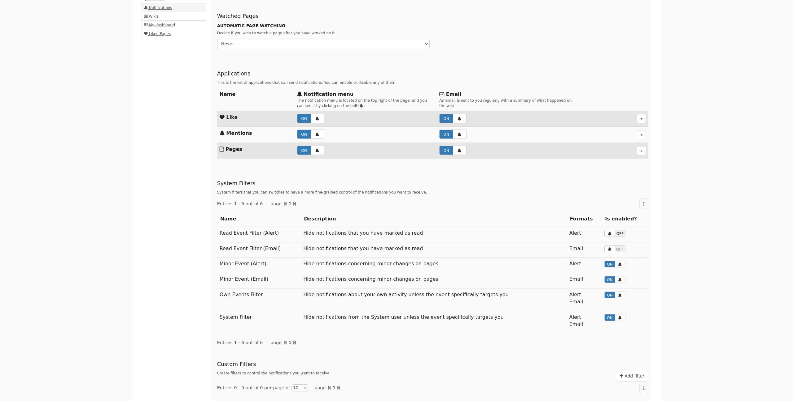
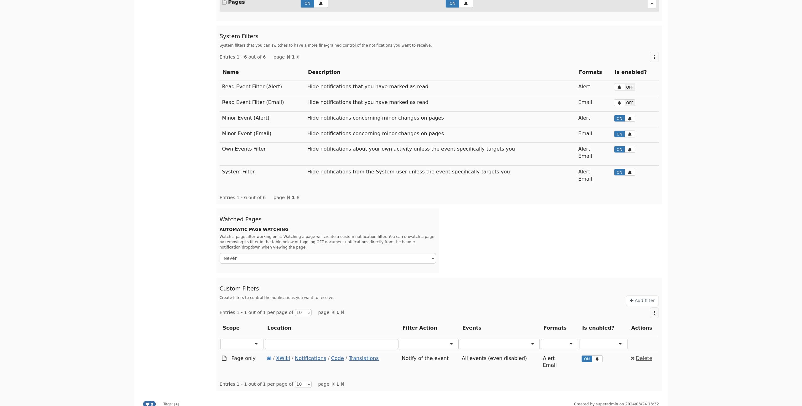
Hi! In order to solve XWIKI-18884: Inconsistent vocabulary and ordering of the “autowatch” feature in the user notification preferences we should consider moving around the autowatch user preference in the Notifications sheet. This can be a large change for user experience since they’ll need to scroll past the Applications section and System Filters table to get access to the autowatch feature. Moreover, this breaks user habits/expectations. On the plus side, this would make it easier for new users to understand that the autowatch feature and the custom filters are strongly related concepts.
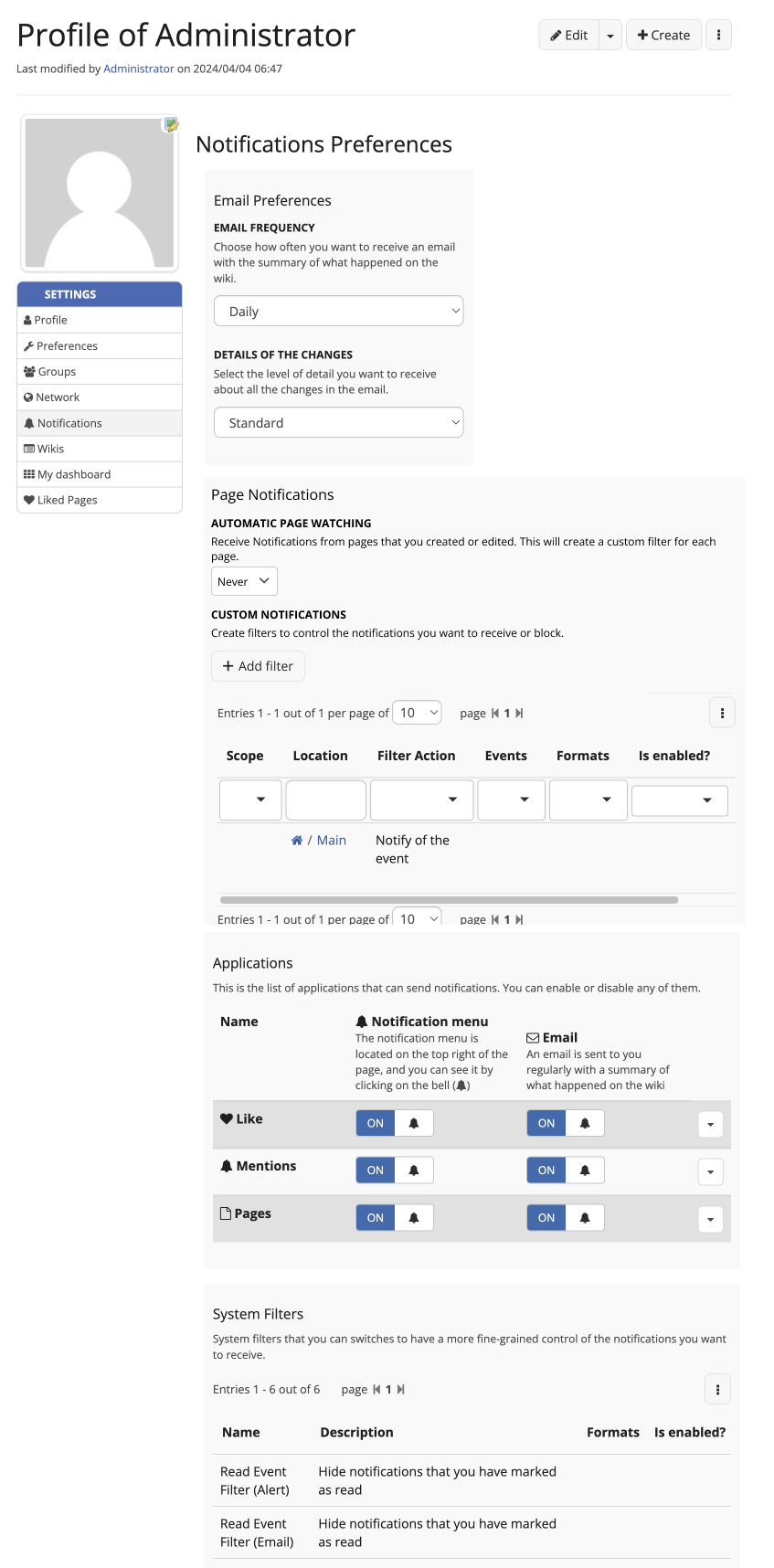
Here is a before/after with a prototype of changes:
Hi thanks for checking this.
Honestly I’m not a big fan of this specific move. I think I’d prefer that we rework it globally: maybe we need 2 pages of settings for notifications, one for types and one for watched pages? Now I’m not strongly against it so +0.
Would be nice to have @tkrieck opinion on this
Hey Lucas! Thanks for working on this and for the proposal.
It seems to me that both options are about user-controled notifications from pages, so I would mix these two options together and leave them at the current location on the page.
The upside of this change is that the user keeps a quick preference like auto watch in a prominent space on the page and you keep related options together. However, the downside of this is that the sections “Applications” and “System Filters” could be pushed down. It’s not a big downside for me personally, but I would like to hear from you also.
Another issue is that the space required for the table of the Custom Filters is quite large. I have a Jira about the design of the LD component, but I didn’t work on it yet.
We could name this integrated section as “Page Notifications” or something like that to keep it more on point about its use.
About the help text, I liked the link between two sections and its relation, but I feel the text is too extensive, perhaps we could reduce it a little bit.
I’m fine with moving system filters to the bottom of the settings as they’re not used a lot. Now I’m not sure it’s such a great idea to display the custom filters before the application settings as those are much easier to understand / manipulate for the users, than the custom filters.
I still think we could split this into two tabs maybe.
We discussed a similar subject a bit in Shortcut settings position. IMO the preference menu already has a lot of items and it can easily become too much if we add more. Right now there’s 8 items (already more than Miller’s Law | Laws of UX …) so adding a ninth comes with a non negligible UX drawback.
Note that we could use the opportunity to implement subsections in this menu (similiarly the administration one).