Hello everyone, so this post will be lengthy because I had a great deal of catching up to do ;-). Please, let me know if you think that this type of content is better suited posted on other platforms.
I’ve done some mockups that could be used for the new button discussed in previous posts and also, a new idea that I would like to present to you at the end.
Disclaimers
- These are mockups only, no code has been written. There could be minor differences when everything is mapped to available LESS variables and Bootstrap components;
- A proposed icon for custom notification in one of the screens is from Font Awesome 6.
- It goes without saying, but none of these ideas are set in stone, and all is open for discussion
- These mockups are for the Follow action only, I will make another proposal and topic to show potential revamps to the Notifications dropdown currently implemented.
Current idea: ‘Follow’ icon on the button bar
In my opinion, a dropdown would fit better in this solution if we can do complex layouts inside of it.
A dropdown does not interrupt the flow of the user when exploring the interface. A modal on the other hand, by its very nature, will obscure and lock the information behind it until the user decides what to do. If a complex drop down isn’t available, then a Dialog is acceptable.
Mockups
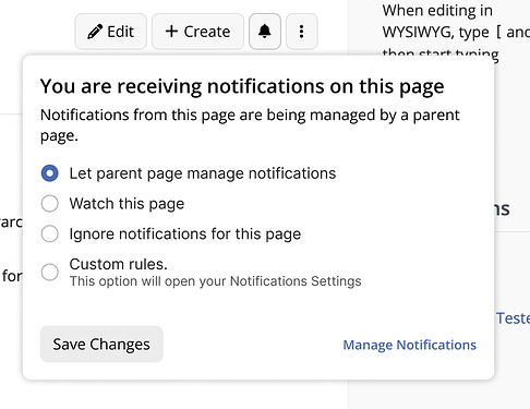
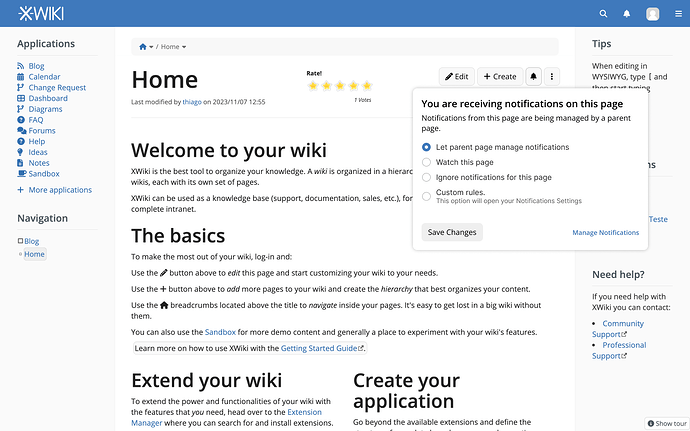
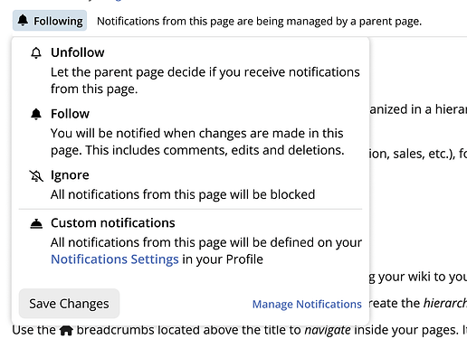
New button on the button bar showing the current follow status
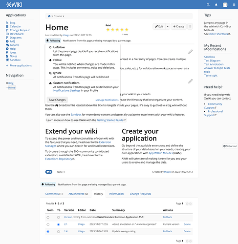
Clicking the button opens a dropdown OR a dialog showing the detailed explanation for the currently selected option and controls to change the behavior. The Manage Notifications link should open the users profile in the notification section
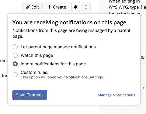
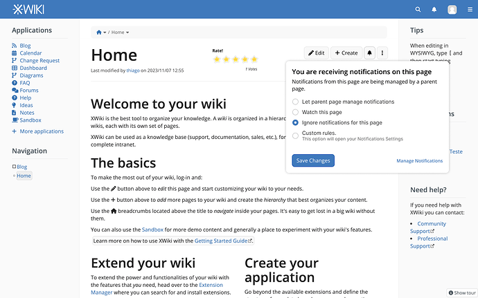
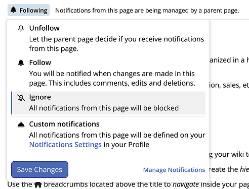
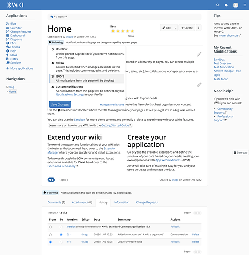
Changing the selected option enables the save button. Note that the status text remains the same as we didn’t save yet.
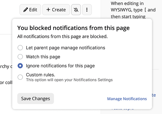
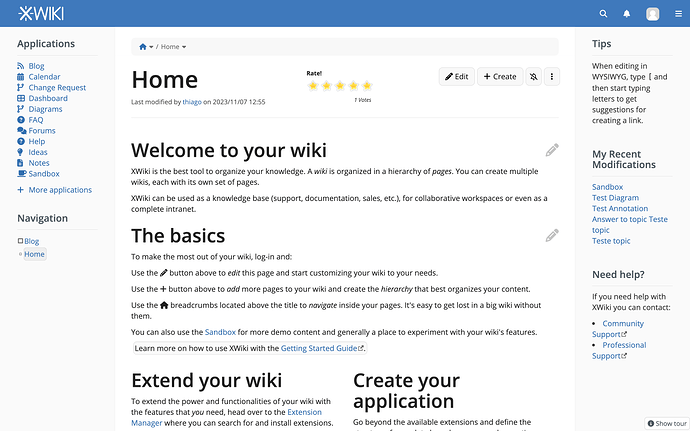
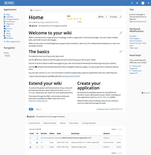
After saving, the new status is updated on the button bar
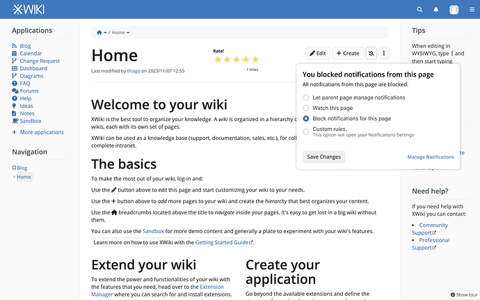
Checking the details and options saved
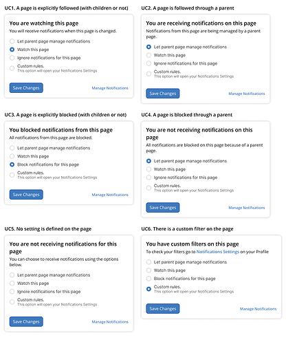
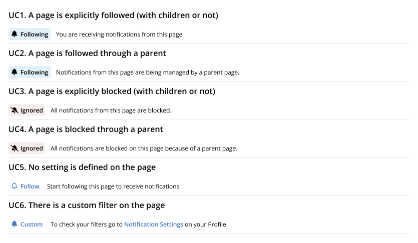
Mapping the dialog options to the UCs described
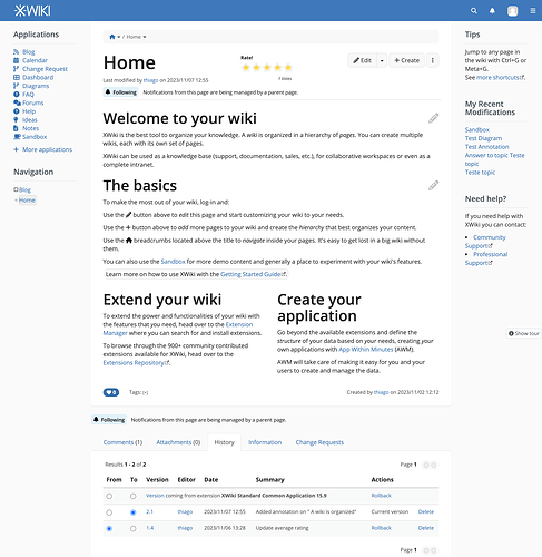
Fullscreen views for context
Another approach
Another idea is to have a “Follow Strip” (name to be refined) below the modified date on the article Header. This proposal come directly from this forum, as you can see at the bottom of each topic;
Applying the same idea to XWiki:
The main advantage in this version is to have the status button and the detailed description always visible to the user, in a position in line with page content and close to another area that shows update info (modified by).
Mockups
Clicking the button should show the available quick options and the custom notification that sends the user to his profile to make a custom filter. Important the icon for custom notifications is from Font Awesome 6, so we should have this package available in case we choose to proceed with this icon. In my opinion, it is a good representation of something custom, but of course we can discuss this.
Selecting an option should enable the save button
Button and detailed description updated;
The same component could be used at the end of each page. After reading all content, the user can engage in ‘follow’ actions without scrolling to the top.
Mapping the options to the UCs
Fullscreen views
–FIN–
Congratulations, you’ve made it to the end =)

