Complete redesign of notification watch buttons

Hi everyone,

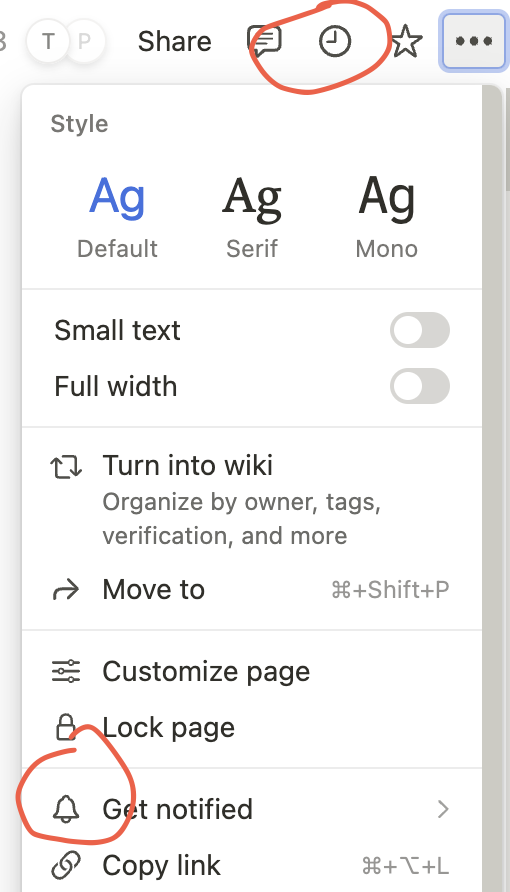
we discussed a lot with @lucaa about the watch buttons of notifications:
image

and we’d like to propose a solution as replacement for them.

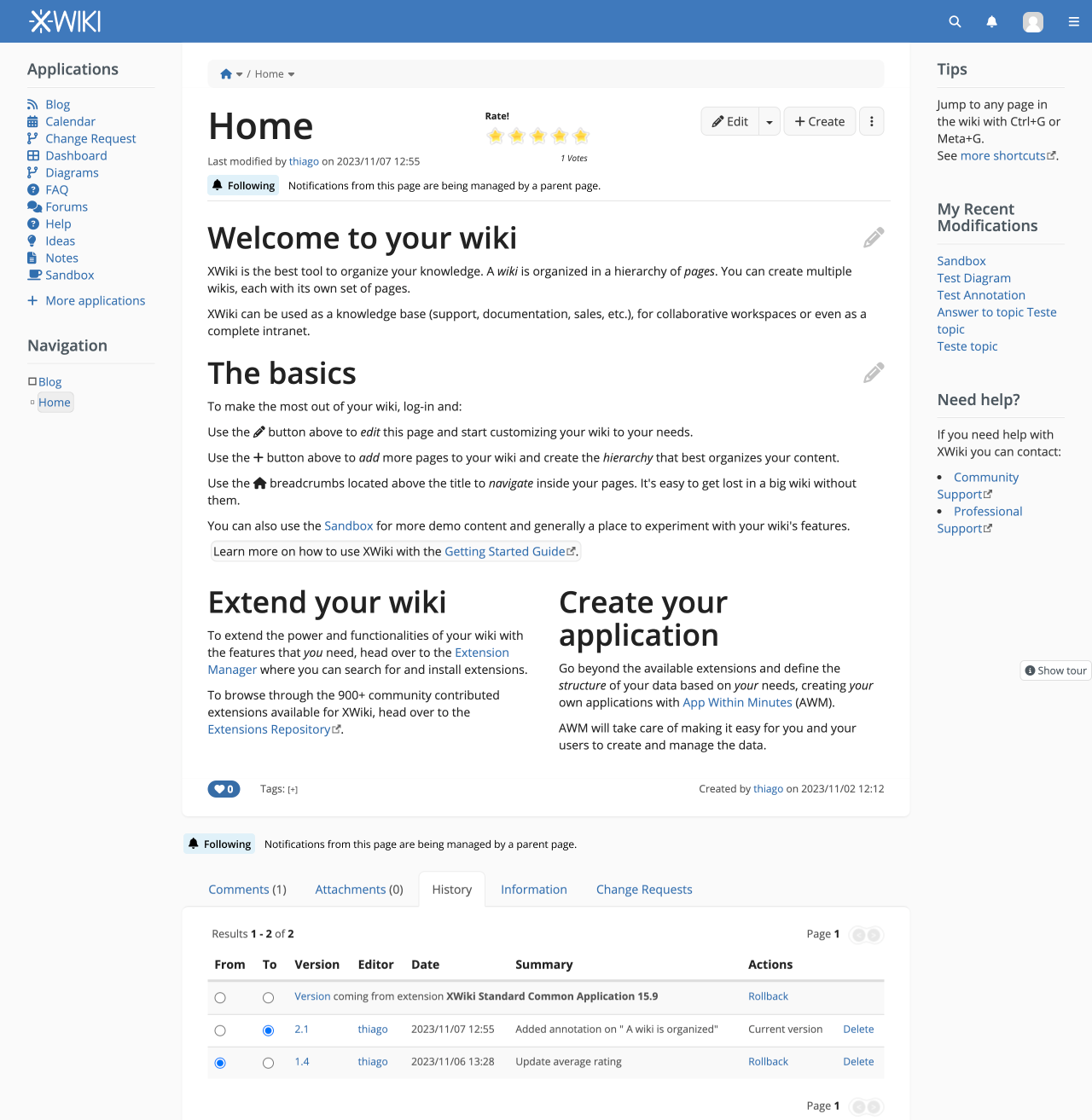
So, the problem we have with those buttons, is that they have two purposes: they both display a state, and allow to perform an action. And by mixing both the state and the action in the same place, they are doing it wrong. I recently tried to improve the situation by allowing the button to have a third state, but it’s just making thing almost more confusing.

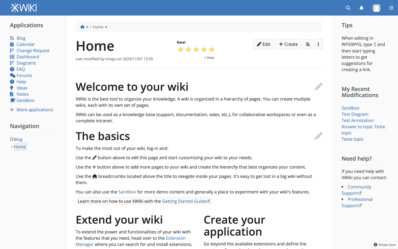
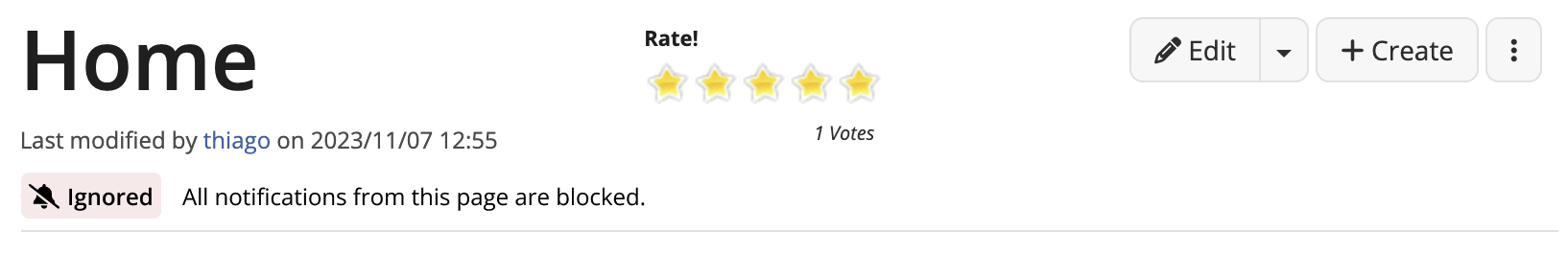
To give a simple example, right now in 15.5, by default nothing is watched for new users, so the buttons are all off, and users are only able to click to watch a page. If they started to receive mentions on a space, they just cannot block notifications through this UI.

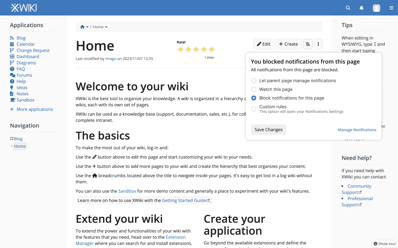
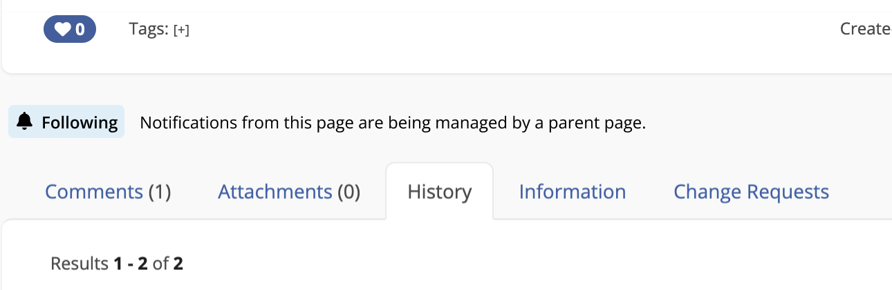
Another problem we have with this UI, is that it’s quite hidden, and not consistent: those buttons concerns the current page, but they are displayed in a notification menu which displays notifications for the whole wiki, not just for the current page. And you have to be aware, that watching a page is provided in that menu: by instinct, you might want to perform the same action through the more action menu of the current page, for example.

So the solution we come up with is about:

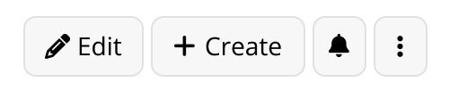
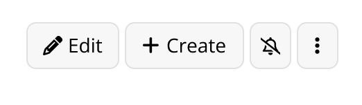
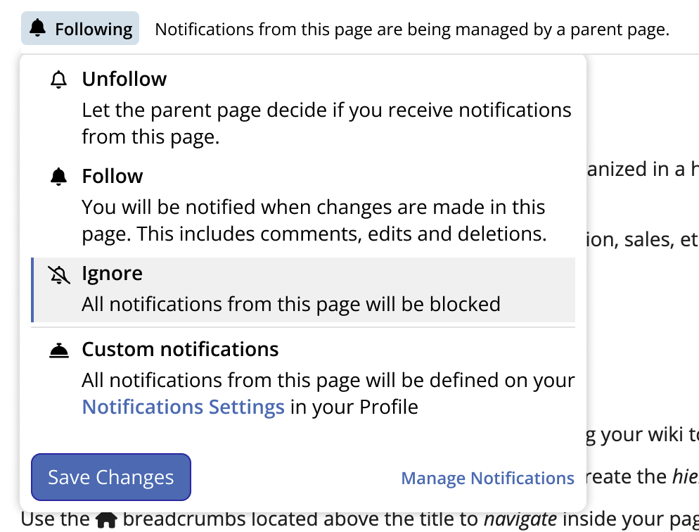
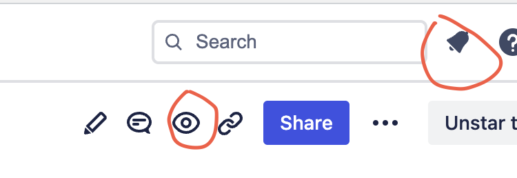
  • removing those watch buttons in the notification area
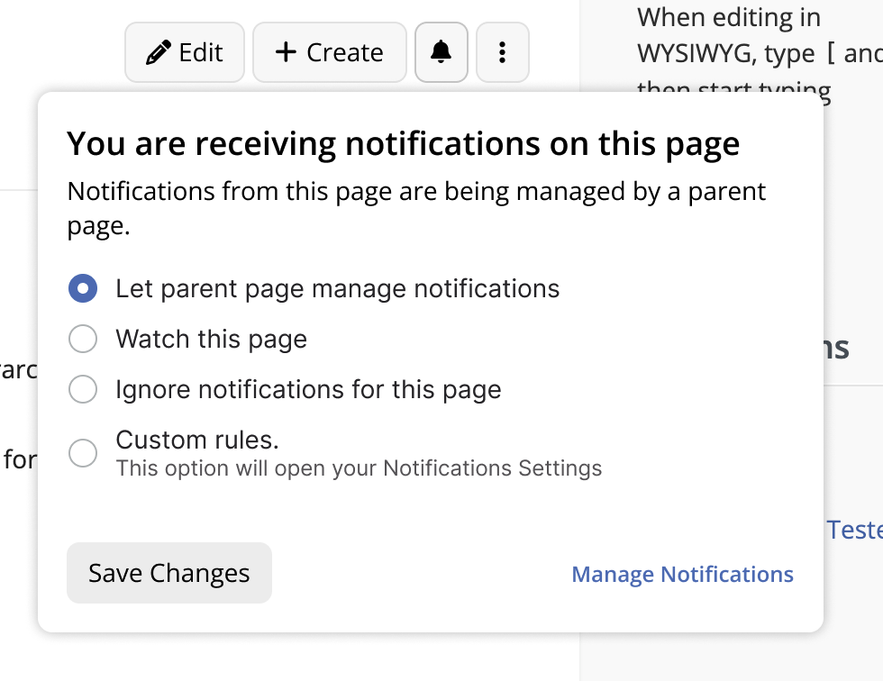
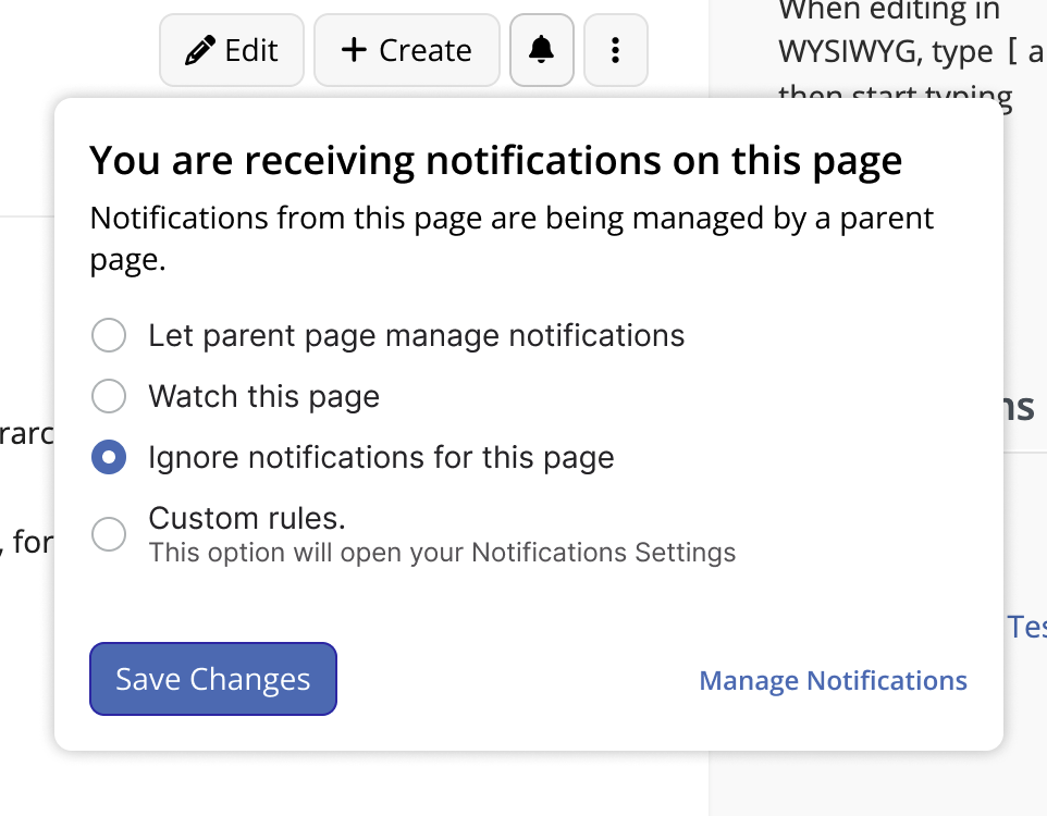
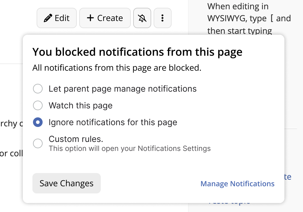
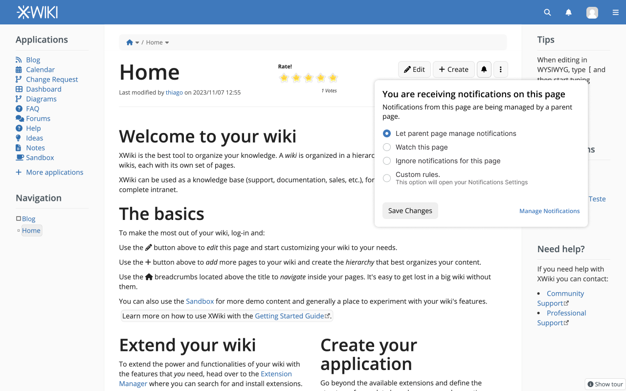
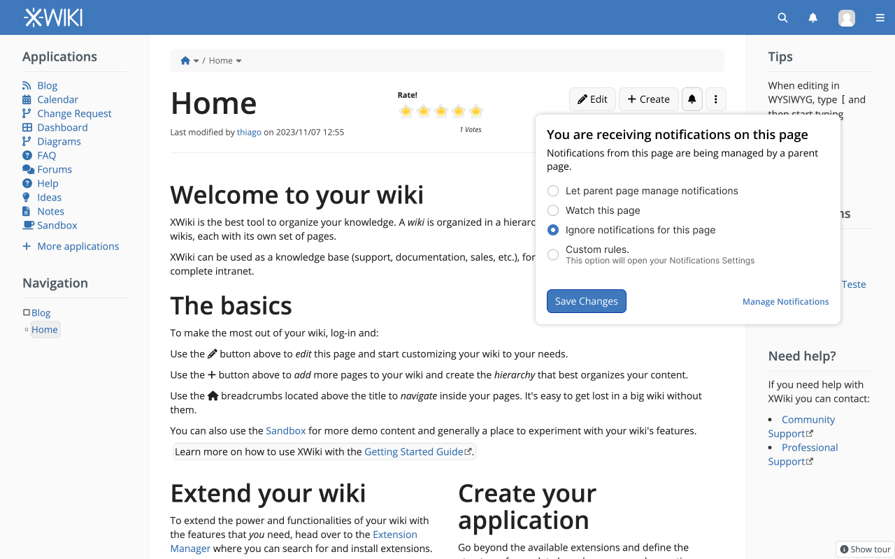
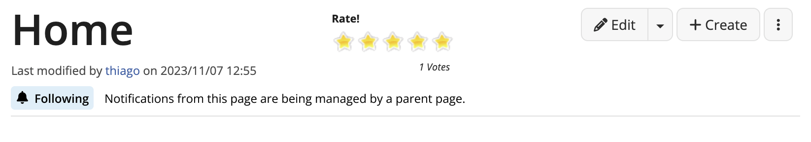
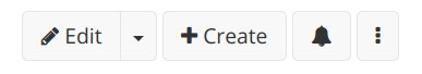
  • provide a notification icon (showing current state of the page regarding notifications), next to the create/edit button directly in the page content header, as in:
    image
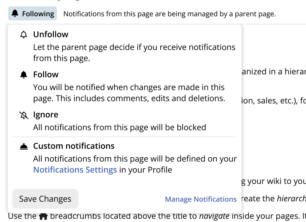
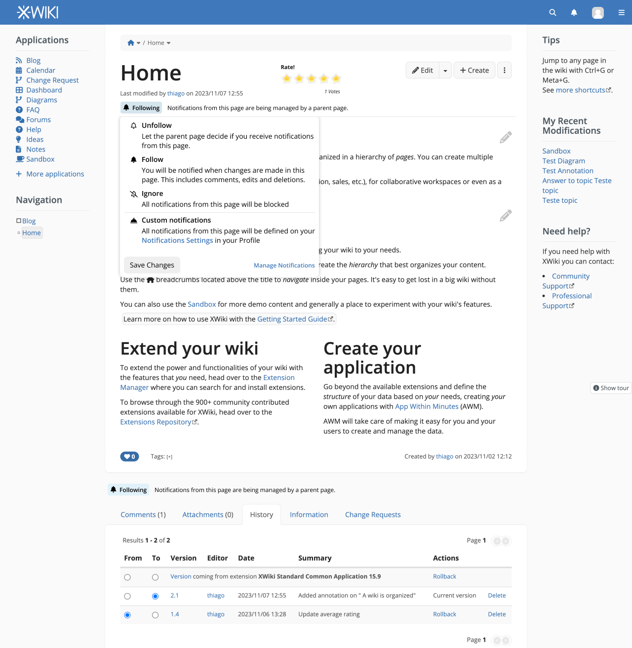
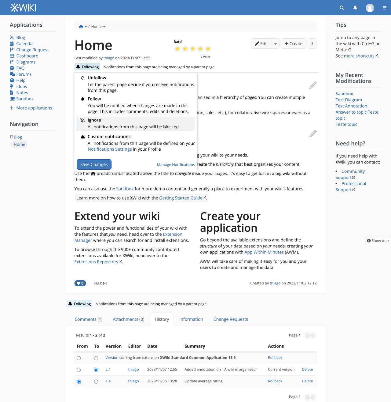
  • open a modal when clicking on that button, providing more information to the user about the current state of that page (if it’s watched or not, directly or not, etc), and allowing to perform different actions (follow the page, unfollow it, block it, etc)

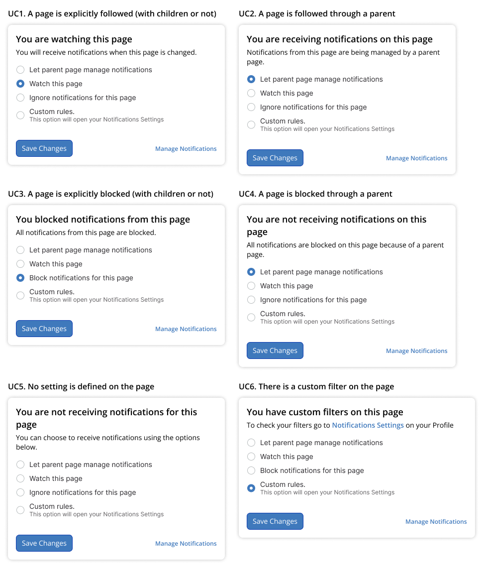
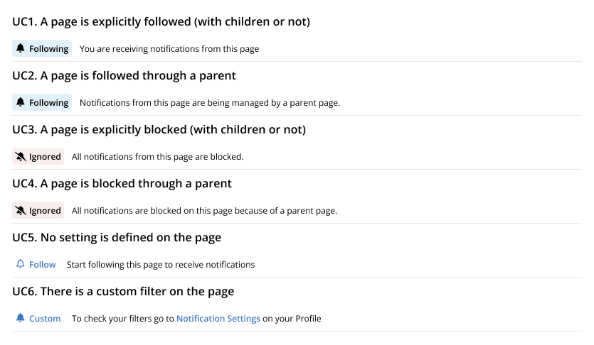
We started to work on the different icons to provide for illustrating the state of the page, the text to display, and also the various actions that should be available in the modal. All that is available in the dedicated design page (Notifications - Watch buttons (Proposal.Notificationwatchbuttons) - XWiki) but it’s still a bit a work in progress.

Right now my proposal is only about the principle: I’d like to know if everyone would be ok on performing the solution proposed, i.e. the icon + the modal instead of the watch buttons.

If we agree on that, I’ll open new proposals to have your opinions for the icons and usecases, don’t hesitate to also discuss it directly in the design page.

Thanks

Hello all,

I obviously agree with this, as I helped propose it.
I just wanted to highlight a couple of benefits that we see for this proposal.

First of all, as a base of this change, we discussed with @surli about how we’d need to change the control of watched pages (display of current state and actions) and unfortunately it’s not getting any simpler / we didn’t find a way to simplify it while still keeping it in any way useful. The most simple version is to remove either display or actions and move them to the user profile. While this is an option, it will hinder usage of notifications.

With this in mind, here are the benefits I see for the proposal we made:

  • the notifications dropdown is already rather crowded with the notifications themselves, having the control of watched pages in it is adding more complexity, so we need a new place for it
  • the content menu, while far from the notifications list itself, is much more appropriate as the state + actions will apply to the current page, not globally, so they need to be in the page menu instead of global menu, like all other page actions
  • having a button that illustrates current state through an icon is both small and information-conveying and quite enough to incite users to go further (by clicking the button)
  • full state description & actions in a modal instead of directly on the UI gives us a lot of freedom when it comes to the complexity of the actions we want to present, the explanations that go with them, even allows to implement a wizard if we need to, etc.

Hope this helps,
Anca

Definitely +1 to go away from the three state buttons!
The idea looks good, an alternative is to have it as a new tab in the bottom pane, but it would make the feature more difficult to discover.

PS: I think having the bell alone without a label is a usability issue (@CharpentierLucas to confirm this :slight_smile:)

I tried looking at them to make them more accessible, but since a three state button is non standard, it needed a lot of work semantically and I didn’t work on it yet. :+1: to replace them with a clearer alternative

I think that it might feel inconsistent here: all buttons in this bar open dropdown menus (advanced edit modes, more actions), and not modals, so it might feel untidy to use.
I understand the advantage for a modal (more space to write down the exact behavior of actions), but I think it might be helpful for some users to have a dropdown because even if it has less details about the actions, it also has less distance → less time (Fitt’s law). Maybe having two presentations for regular and advanced users allows for the best compromise. Using a UI based on the user type here wouldn’t be too unexpected since there is already some user dependant UI (edit modes dropdown, and content of the moreactions dropdown). It’s not a critical point. I reckon it takes time to implement two UIs and it can come later as an improvement.

For accessibility, we need to make sure to include a text alternative (visible or not).

Using icons by themselves can be a roadblock for some users. However it’s pretty common and in some cases the pros outweight the cons. For power users and users used to web conventions, the bell will be easy to understand. For less tech-abled users, they might not recognize the bell or not tie it with the concept of notification. I think that in this case, not using a visible label is correct, since “Notification” is a really long word. Maybe we can show the label only if the “extra accessibility” parameter has been turned ON in the user preferences.

Here is a talk about ageism, and more specifically, a few minutes on how some older people understand the “gear” icon. I already shared it a couple times, but I found that this part makes it really easy to understand the kind of issues a user can run in with icon only buttons.

.

Thank you for this proposal,
Lucas C.

That’s not really true: I mean, by default for simple users create and edit buttons just redirect you to a new page, there’s no dropdown menu. The dropdown menu is there only if you’re advanced and you click on the arrow. Here the button would act more or less as if you’d expose “Export” action from the “More actions” menu as a top action button next to create / edit. So I don’t really see an inconsistency here.

Ok, the plan anyway was to have a title on the button, so that the state of the button can be read and not only guessed from the icon.

I agree with @surli here, the modal is used also for the export options (and not a sub-sub-menu), so it’s as if we had a notification option in the “more actions” menu that would open a modal. I think we even discussed with @surli about making the notification a submenu in the More actions menu, and I really don’t remember why we decided to not go for that one but for a separate button. In any case, this would be easy to change, technically, if needed, as we will use a UIX.

I also wanted to apply this for the export options, it didn’t go through, we went for a modal. So, again, we fall on the same comparison with the export options…

I don’t think we should go in this area and it would be the first time we do so, honestly. Having additional option / command for advanced users is something we’ve done before but having the same options in a different UI we didn’t. If we decide to show more information to some users (advanced vs simple) then it would make sense, but I don’t think we have a reason to show more information to advanced than to simple (more actions yes, but not more information).

@surli had explored different options for this icon (see the design page) but I insisted for it to be bell-based so that the user recognizes and associates the bell of this menu with the bell from the navbar that displays notifications, to have more chances of figuring out what it does, before they hover it to see the title.

Thanks for the feedback!

Actually, I have nothing against using a dropdown menu if it turns out that we manage to express the current state & options to change it with small sentences in a small space that fits in a dropdown.

Basically when this bell button is actioned, we’d need to be able to do 2 things:

  • display, in more detail, a description of the current state of the notifications settings for the current page;
  • propose actions to change that state - I think we’d be somewhere around 1-4 actions to propose. The actions being a little complex, we may need a name + an explanation for each of them.

So we went for a modal because it’s the UI that gives the most freedom for this: a dropdown is rather small and constrictive (displaying a state that is not actionable next to actions may not be that easy to make happen in a dropdown); we wanted to fix the current problem we have which is that we’re cramming up a lot of information in a very small amount of space, so we went the biggest. If it could fit in a smaller space we can discuss, but I wouldn’t want to make that constraint from the start.

I would be interested to know why you chose this option over the submenu :slight_smile: I agree that the notification is an important aspect to manage on a page, but I think it’s way more complex of an action than ‘Edit’, ‘Create’ or ‘Translate’. Proof is, we can’t fit the UI for its parameters in a dropdown. From my understanding, actions with complex parameters such as ‘Export’ are kept in a submenu so far. Why would the toggler for notifications be in another place? I think this question describes better what I tried to explain with vague words earlier ^^’

I agree that a dropdown is not a solution for simple users. My idea here was to display less information to the advanced user, since we can assume they already understand how each action works (or at least they understand how to get more info about this). With an advanced user, you could almost put a set of icons for each actions with a short description of the current state and call it a day. That’s why I think it could fit in a dropdown without too much constraint.

But this point is secondary and should not slow down the progress on these changes. We can discuss it later in another topic about potential improvements :slight_smile: .

Thank you for your answers!
Lucas C.

I ended up answering to this exact question, in my latest comment.

I meant: Why chose the independant button over a submenu item for the toggler?

From what I understood, your last comment was about the modal vs dropdown question.

My recollection is that we assumed it would make the feature hard to discover for new users, and that it would be too hidden for old users who would look to the switch buttons under the bell menu.
The idea is that when you start registering on a wiki you don’t get any notification anymore, so you need to be able to easily start following page. So putting that action in the “more action” menu would be too much of a hide to our taste. At least, that’s what I remember from the discussions we had.

Also I think we checked a bit how notions was presenting that feature, and also took inspiration from Github with the “watch” button on the repositories.

1 Like

@CharpentierLucas Yes, you’re right, I read too quickly your question.

There was definitely some inspiration from other platforms as @surli said (git*** (hub or lab or both)), but I don’t remember much more else on my side…

Sounds good! :+1:
Thank you for the explanation, it makes more sense to me now :slight_smile:

By the way, “Watch” is a good text alternative which could be added next to the bell in the button.

Well there’s a vocabulary section on the design page, we’re thinking about not keeping “Watch” verb but use “Follow” instead :slight_smile:

1 Like

Ok so without further comments on that I consider that there’s an agreement on getting rid of the watch buttons. I also consider there’s an agreement on starting to replace them with a button + a modal for now, knowing that the button could be moved to the more actions menu later.
For now I don’t retain the idea of having a dropdown instead of a modal as I’m afraid it wouldn’t be enough space to give all info we want to the users.

So instead of opening another proposal for that, I will proceed and work on implementing what’s on the design page, so using the bells icon for the button and implementing the actions defined in those usecases.

The idea to move directly on implem is that I might need new APIs for the UCs and I don’t want to spend more time waiting for feedback, but don’t hesitate to discuss all that here.

Hello everyone, so this post will be lengthy because I had a great deal of catching up to do ;-). Please, let me know if you think that this type of content is better suited posted on other platforms.

I’ve done some mockups that could be used for the new button discussed in previous posts and also, a new idea that I would like to present to you at the end.

Disclaimers

  • These are mockups only, no code has been written. There could be minor differences when everything is mapped to available LESS variables and Bootstrap components;
  • A proposed icon for custom notification in one of the screens is from Font Awesome 6.
  • It goes without saying, but none of these ideas are set in stone, and all is open for discussion
  • These mockups are for the Follow action only, I will make another proposal and topic to show potential revamps to the Notifications dropdown currently implemented.

Current idea: ‘Follow’ icon on the button bar

In my opinion, a dropdown would fit better in this solution if we can do complex layouts inside of it.

A dropdown does not interrupt the flow of the user when exploring the interface. A modal on the other hand, by its very nature, will obscure and lock the information behind it until the user decides what to do. If a complex drop down isn’t available, then a Dialog is acceptable.

Mockups

New button on the button bar showing the current follow status

Screenshot 2023-11-13 at 09.41.02

Clicking the button opens a dropdown OR a dialog showing the detailed explanation for the currently selected option and controls to change the behavior. The Manage Notifications link should open the users profile in the notification section

Screenshot 2023-11-13 at 08.31.00

Changing the selected option enables the save button. Note that the status text remains the same as we didn’t save yet.

Screenshot 2023-11-13 at 08.31.07

After saving, the new status is updated on the button bar

Screenshot 2023-11-13 at 09.43.15

Checking the details and options saved

Screenshot 2023-11-13 at 10.30.07

Mapping the dialog options to the UCs described

Version A

Fullscreen views for context

01-Version A
02-Version A - Current Status
03-Version A - Action
04-Version A - New State
05-Version A - New State details

Another approach

Another idea is to have a “Follow Strip” (name to be refined) below the modified date on the article Header. This proposal come directly from this forum, as you can see at the bottom of each topic;

Screenshot 2023-11-13 at 09.20.36

Applying the same idea to XWiki:

Screenshot 2023-11-13 at 08.31.40

The main advantage in this version is to have the status button and the detailed description always visible to the user, in a position in line with page content and close to another area that shows update info (modified by).

Mockups

Clicking the button should show the available quick options and the custom notification that sends the user to his profile to make a custom filter. Important the icon for custom notifications is from Font Awesome 6, so we should have this package available in case we choose to proceed with this icon. In my opinion, it is a good representation of something custom, but of course we can discuss this.

Screenshot 2023-11-13 at 08.31.48


Selecting an option should enable the save button

Screenshot 2023-11-13 at 08.32.00


Button and detailed description updated;

Screenshot 2023-11-13 at 08.32.08

The same component could be used at the end of each page. After reading all content, the user can engage in ‘follow’ actions without scrolling to the top.

Screenshot 2023-11-13 at 10.13.06

Mapping the options to the UCs

Version B

Fullscreen views

01 - Version B - Resting
02 - Version B - Action
03 - Version B - Action
04 - Version B - New state


–FIN–
Congratulations, you’ve made it to the end =)

1 Like

Thanks @tkrieck for your first proposal! Keep them coming.

Not sure I understand this point:

  • What we have is already a dropdown and not a modal
  • Your 2 proposals are moving the location of the notification settings but you didn’t mention why you’re proposing to move them.

Generally speaking, my main comment is that we have some guidelines we’re trying to following and which can be summarized as (note that these guidelines can be revisited if you think they’re not the best!):

  • Try to make the UI the simplest possible, this means with the least amount of visible controls.
    • Both of your proposals add new controls trhat don’t exist and make the UI more complex than what currently exists in this regards IMO.
  • Hide actions that are not needed all the time. For example this is why the page action menu has only 3 buttons: Edit, Create and “…” (all the secondary actions are under “…”).
    • If you want to move the notifications settings to the page actions (first proposal), then I think it would make sense to move it under that menu. However, I don’t know if it would make it discoverable enough or easy-to-use enough vs what we have ATM (which, I agree, is ideally not the best place for a page action).
  • Use the minimum space for the generic UI and the max space for the page content
    • Your proposal 2 introduces a new line and reduces the place for the content. I personally find this too visible and obstructive.

I also find it confusing to see 2 bell icons in the UI.

Thanks

Hi @vmassol, thank you for the feedback.

Regarding the icon, indeed, having two actions for the same actions is not optimal. I have done some benchmark using Confluence and Notion and yes, they use different icons;

Confluence:

  • Bell: Notification Center
  • Eye: Notification Config

Screenshot 2023-11-13 at 11.41.34

Notion:

  • Clock: Notification Center (updates)
  • Bell: Notification Config (on a dropdown)

Screenshot 2023-11-13 at 11.43.16

The reasons of moving the notifications settings was being discussed before my post. As stated by @surli regarding his prior discussions with @lucaa. For migrating users this can be helpful as well, as it is an interface pattern of Confluence and Notion (as shown in the screenshots above).

The first proposal on my post is just mockups of the idea that was being discussed before on the topic, to help visualize the concept.

My proposal, the second one, the interface would have more elements to it, my reason is to have a more “conversational” approach. When the user has a setting that’s making him receive notifications, but he is not aware of. For example, when a parent page is controlling those notifications.

One idea to help with spacing, is to present just the “follow” button when there are no other notifications rules for the page. In this version I also positioned the follow button besides “Last modified by” to keep the content area intact. The complete description could be shown on hover, but I would like an opinion regarding accessibility for that.

Screenshot 2023-11-13 at 11.56.31

BTW there’s also a small inconsistency in this proposal: the page actions have an icon + a text (see Edit and Create), while your proposal adds a bell icon only (no text).

When I replied to Thiago, I hadn’t seen that he was just putting in a mockup what was already being discussed, my bad. So I still have some questions:

  1. Is it worth it to make the UI more complex by adding one more button visible 100% of the time? I agree that the notification setup action is probably better placed in the page menu but OTOH it’s going to add one more icon.

  2. We would probably need consistency and have an icon + text for notification setup action.

  3. Do we really need that action to be always visible or should it go under “…”?

Thanks

Hello @tkrieck , welcome to the dream forum!

Indeed. We proposed a dialog for having the most possible room available, as the options would require many explanations and be complex to explain. If a complex dropdown allows us to have all this while not blocking the flow of the user, fine with me.

Also, a modal would easily allow to move the bell button in another menu (e.g. under the More actions menu, as @vmassol suggest below) with no change in the code / UI whatsoever. A dropdown will need to be updated if the menu notification option is itself in a dropdown.

I didn’t read in detail all the UIs proposed for all cases.

For the icon, note that we’d need a 4 states icon (I can only see 2 in your examples above, we need the other 2).

While it’s looking good, I would say it takes too much room on the page itself (it would be a dedicated row only for this feature). Since this feature is only a setting (it does not provide any content information about the page but only shows the state of a setting), I wouldn’t give it that much room on the screen.
This forum is a conversational tool, to me, which makes notifications rather important. The wiki is a knowledge share tool (which sometime may need conversational features but not always).

This choice was on purpose, in order to make it obvious for the user that the 2 things presented on the UI are about the same thing.
I must admit that it’s not clear to me, from these other tools that use different icons, whether the 2 actions do the same thing - whether “watching” a page will only handle the notifications about that page or concerns something more than notifications.
In any case, if we need to change one of them, I may want to change the bell icon from the navbar :D. The bell icon in the navbar was initially just setting the watch state of a page in XWiki, and only when we added instantaneous notifications we decided to also put the list of notifications in it, so its initial purpose was config.

Now, to answer @vmassol’s feedback about the initial proposal:

There is, indeed. The objective was to not take too much space with it. Also note that the icon is not decorative here, it should change when the state of the watch of the page changes. So it’s as if it was “text” (meaning that it holds information), but it’s very compact.

Initially we wanted to remove it from the notification menu (the current bell) because that bell is already incredibly crowded and the current watch state of the current page was becoming more complex. Now, since we thought of a compact way of displaying the current state with actions available on click, we could move it back to the top menu but it’s still too crowded up there. Now, But as you said, it’s better placed in the page menu.

As I said above, I’m not 100% sure we do. The icon is holding information, it’s not just an icon, so it’s as if it would be just text without an icon :slight_smile: . It is a menu that is different from the other menus up there, the question is whether we accept that or not. I don’t have a problem with a different menu being placed along the other menus on the page content menubar.

It’s perfectly possible to move it under …, as I said above, but then we can’t have a dropdown anymore for setting the settings. If we do so, we also need to decide whether we want the same principle (of displaying the state in the icon + label of the button) or just have an accessor button and have the state displayed in the modal.

Actually, if I’m not wrong, this is one of the first cases when we have such a menu for a page in XWiki: a menu that gives access to changing a setting of a page. Regardless of where we put this menu, the question I would ask here before anything is whether we agree that we want a button that shows the state of the current setting while giving access to changing it on click or we want to stick to our current types of menus that give access to the information & setting.
I’m very much for having a state-displaying button for handling watched pages, regardless of where we put it. To me, this kind of button may or may not have a text.

I hope this answers the questions,
Anca