Hello! ![]() Some more feedback on Cristal in coming…
Some more feedback on Cristal in coming… ![]()
If I see that the discussion gets too focused on any of the following, I will start separate discussions for the respective issues.
Here is what this feedback covers:
- Spacing between paragraphs - CSS
- User, Pretty Name - low-hanging fruit
- Table Notes & Issues - bug? + low-medium improvement
- Escaping a macro - low-hanging fruit
- List item spacing - CSS
- Link menu waiting time - CSS
- Quote UI - CSS
- Empty lines not preserved - bug?
- Added spacing in view mode - bug?
- Just jump in edit mode, no more button - big change, started separate discussion
- Toggle headings, UX change - maybe big change, started separate discussion
- Code block confusing behaviour - bug + small change? separate discussion
#1 Spacing between paragraphs
The page’s content needs to have more whitespace/breathing space so the structure is clearer.
I would increase the margin-top of any heading so there’s a clearer distinction between sections. Notion seems to make that margin = 2 * an enter’s created space (this is just an approximation, but seems right).
#2 User - Pretty Name
I shouldn’t appear as XWiki.AdinaMilica, I should appear as Adina Milica with my name linked to afuture profile page.
#3 Table Notes & Issues
Full-width by default | When adding a table to the page, the table should appear by default in full-width in edit mode. I assume that most people would expect this.
Bug? Even when trying to make the table full width, it doesn’t stay that way oce saved. Ths cells resize to fit content, it seems like.
Bordered The default look for tables should be bordered (in view mode too)
#4 Escaping a macro
Like in Notion, after any macro, there should be an automatic line available so the user can exit macros without any issues.
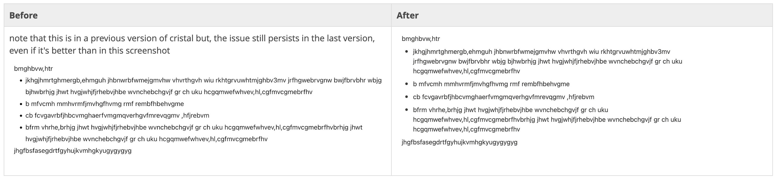
#5 List item spacing
Every list item should have a bit more margin-bottom than it has so the delimitation between items is more clear. Notion does the same (just a few pixels make a difference) with padding-top and padding-bottom. See Cristal in the first pic and Notion in the second.
In the last version of Cristal this spacing is better, but can be made a bit more obvious.
#6 Link Hovering
Waiting time I think the waiting time on the menu that opens when hovering on a link is too small. It should just stay on the screen while the user hovers on the link.
#7 Quote UI
I’d like a bit more vertical padding and margin top/bottom to the quote macro.
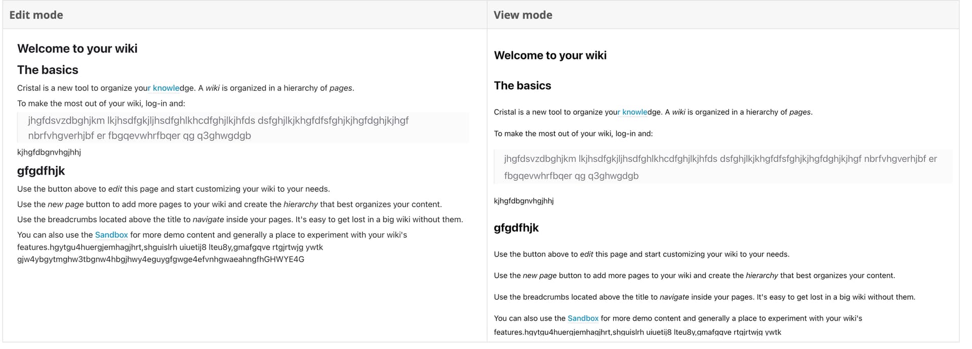
#8 Empty lines in edit mode
Empty lines in edit mode should be preserved in view mode. I always found this weird in XWiki and now in Cristal.
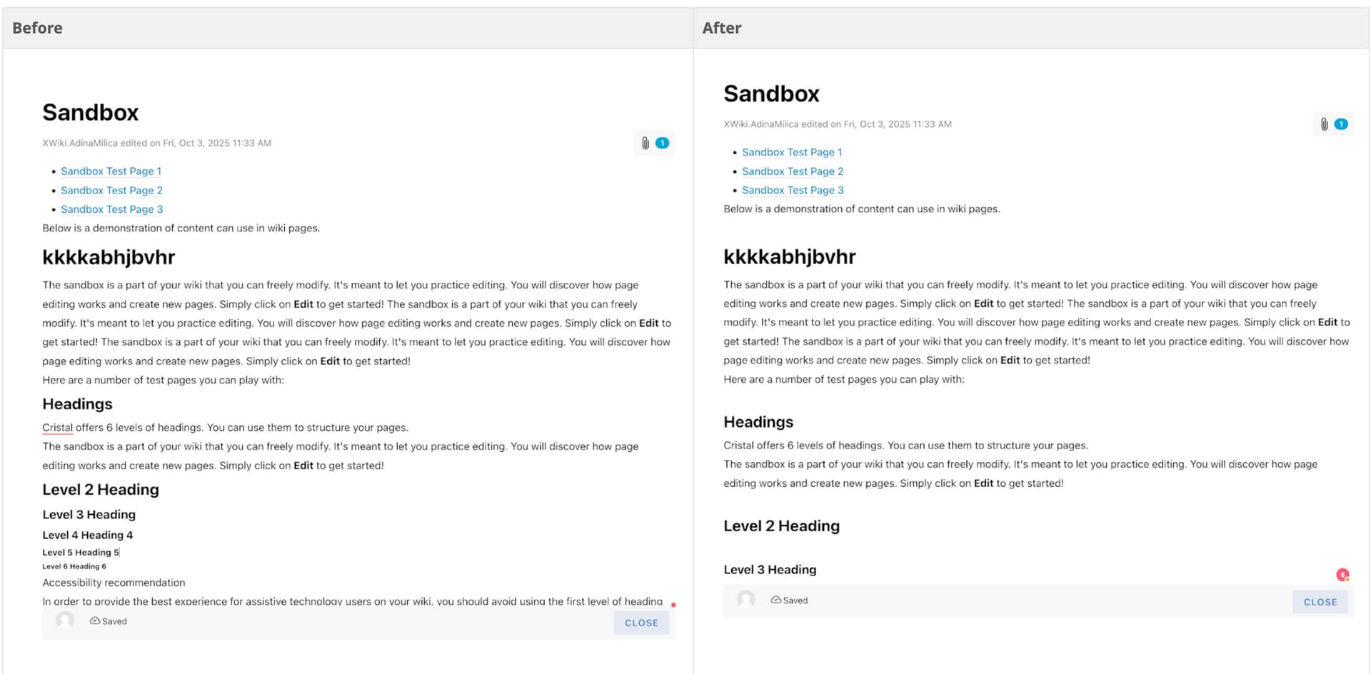
#9 Spacing added in view mode (Shoelace)
In edit mode there is a certain spacing which is far smaller than in view mode.
It should be consistent in every mode.
#10 Toggle Headings - UX change
I will link this to a separate discussion.
#11 Just jump in edit mode, no more button 
I will link this to a separate discussion.
12 Code block - confusing behaviour
I will link this to a separate discussion.