Hello! ![]() A part of my tasks these last couple of weeks were dedicated to reviewing Cristal’s current state and the proposals that are going to be implemented.
A part of my tasks these last couple of weeks were dedicated to reviewing Cristal’s current state and the proposals that are going to be implemented.
This first discussion is around my feedback on the Navigation Menu of Cristal.
See all notes in this design page.
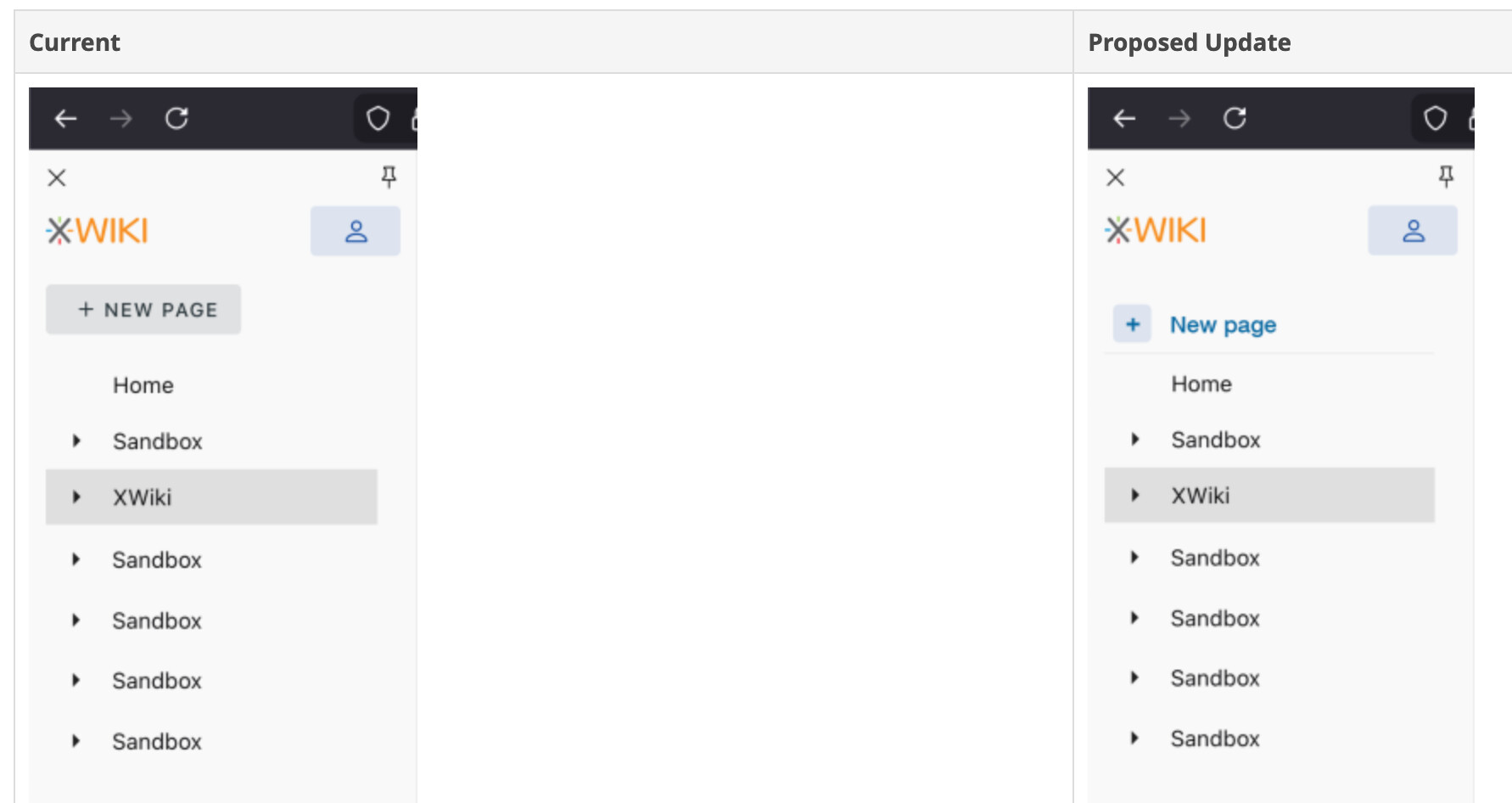
New Page button is highlighted too much in the navigation menu
The new page button is a very normal/expected feature, it doesn’t need to be that highlighted. Most people that use Notion or Confluence or just general knowledge management tools know the button is usually in the left side bar. It is not the same case as XWiki.
Vuetify specific: Because of how it’s styled, the button seems to have some correlation with the current page, as they have the same height and background.
Font-size (in the nav menu, but also in general)
The font-size in the navigation menu feels slightly too big. On my Mac, on 90% viewport size, it looks right, but on 100%, slightly too big. Maybe this is subjective, I’d be interested to see what others think.
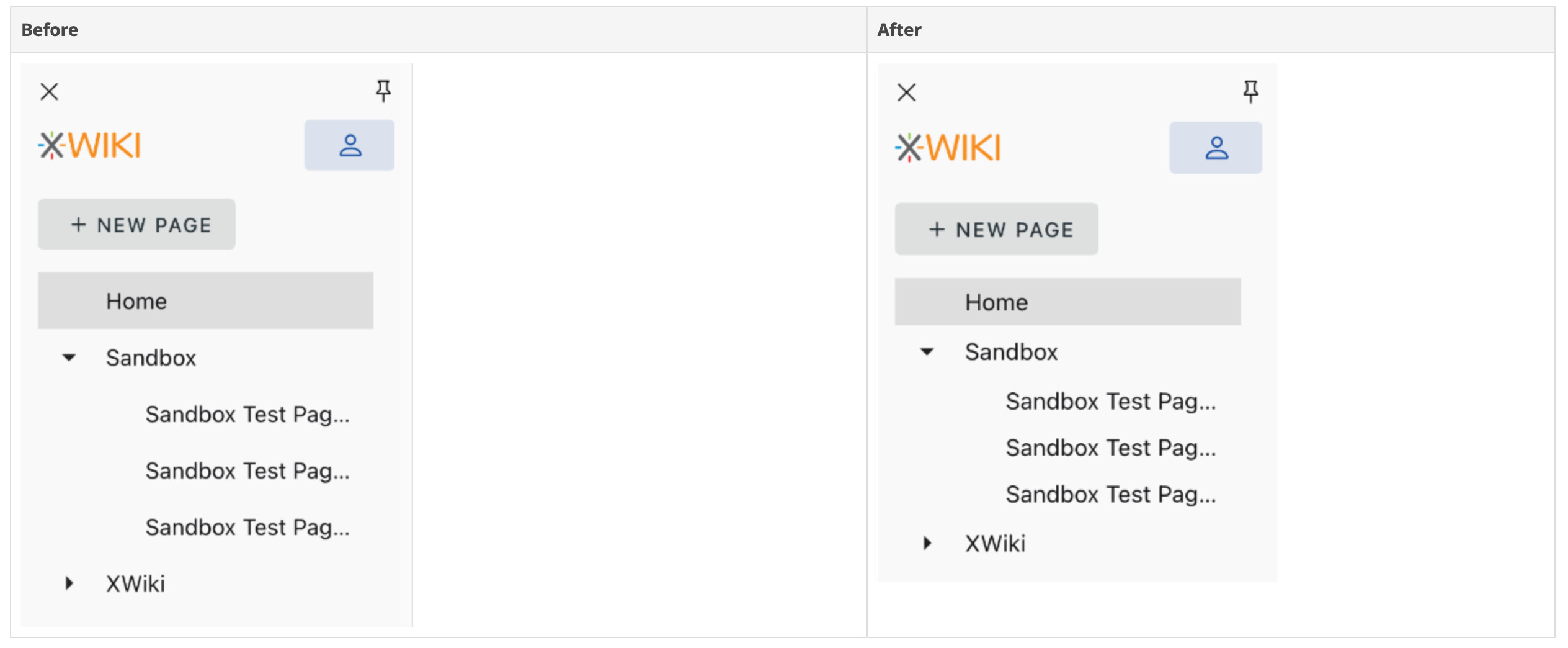
Menu items line height (On Vuetify config)
The distance between pages in the nav menu seems a bit big. When deleting the following css code, the UI seemed better:
.v-list-item--density-compact.v-list-item--one-line { min-height: 40px; }
Navigation Menu Movement
When I open the navigation bar, it should push the content to the right, not cover it. I’ve expected this behaviour from the first time, and it still bugs me a little bit every time I try Cristal. It just doesn’t feel as smooth as it could.
Contrast & Hierarchy
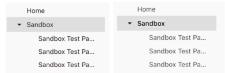
I would encourage a higher contrast between selected parent page and child page. Something like what Notion does.
See a quick before and after I did: