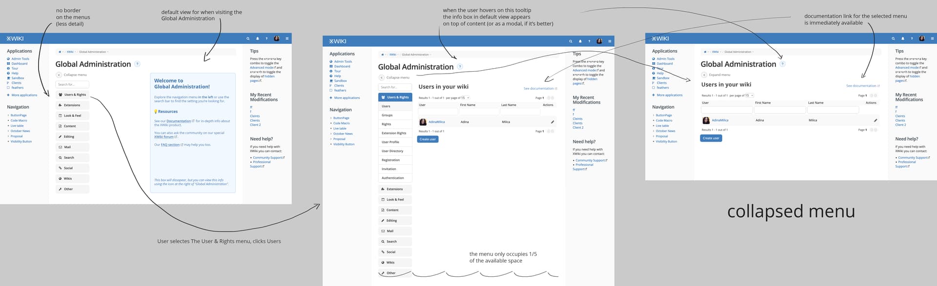
It’s not about responsiveness but about the space it takes on the screen and the fact that the more elements you add the more cumbersome it is.
What I also don’t like is the submenus shown in the page content. I think it’s cumbersome to fold/unfold an entry.
Overall I feel that the current menu is a better UI that is easier to understand and navigate. The downside is that it takes more horizontal space but ATM I haven’t seen a proposal where I thought to myself that the tradeoff was better. It’s good to have more horizontal space but not at the expense of usability.
I’ve never liked option 1! For the same reason mentioned above. I don’t understand at all the need to have the submenus in the main content area since there’s a menu on the left. You loose everything! Both screen estate and usability.
What I said I like the best so far is option 1, but without the extra menu in the content area (what I call the submenus), which is what we have now basically but with a difference: directly navigate to a subsection and display its content, ie no special home page for the Admin UI.
I currently really don’t like the accordions used for the submenus, in the main content area.
One alternative that wasn’t shown I think, is the ability to somehow fold/hide the current menu when you’re on a topic, with the ability to hover over (or something like this) to unfold/unhide it and navigate to some other section.
I also want to mention that when I talked to you about improving the Admin UI, it was mostly about changing/removing the main content area (which currently duplicates what’s in the menu and should be removed IMO), more than other changes (I find the current menu to be really nice and usable).
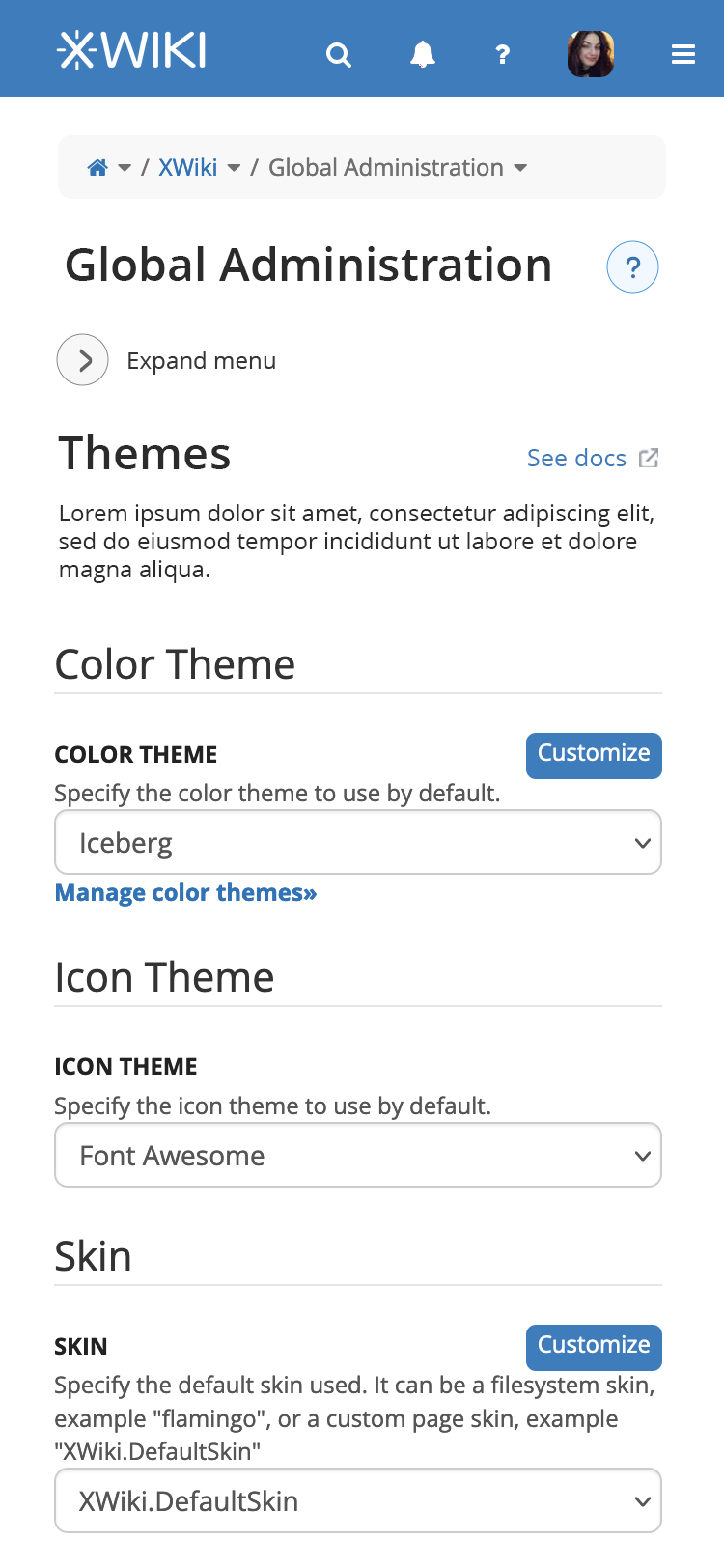
the friendly/expanded title of the sub-section gets rendered above the actual content. Why?
to improve visual hierarchy
to make very clear which sub-section is clicked (the current way this is shown in the menu is not ideal. The most prominent element is the main section, not the sub-section clicked)
there is an easily available link to documentation for the specific section
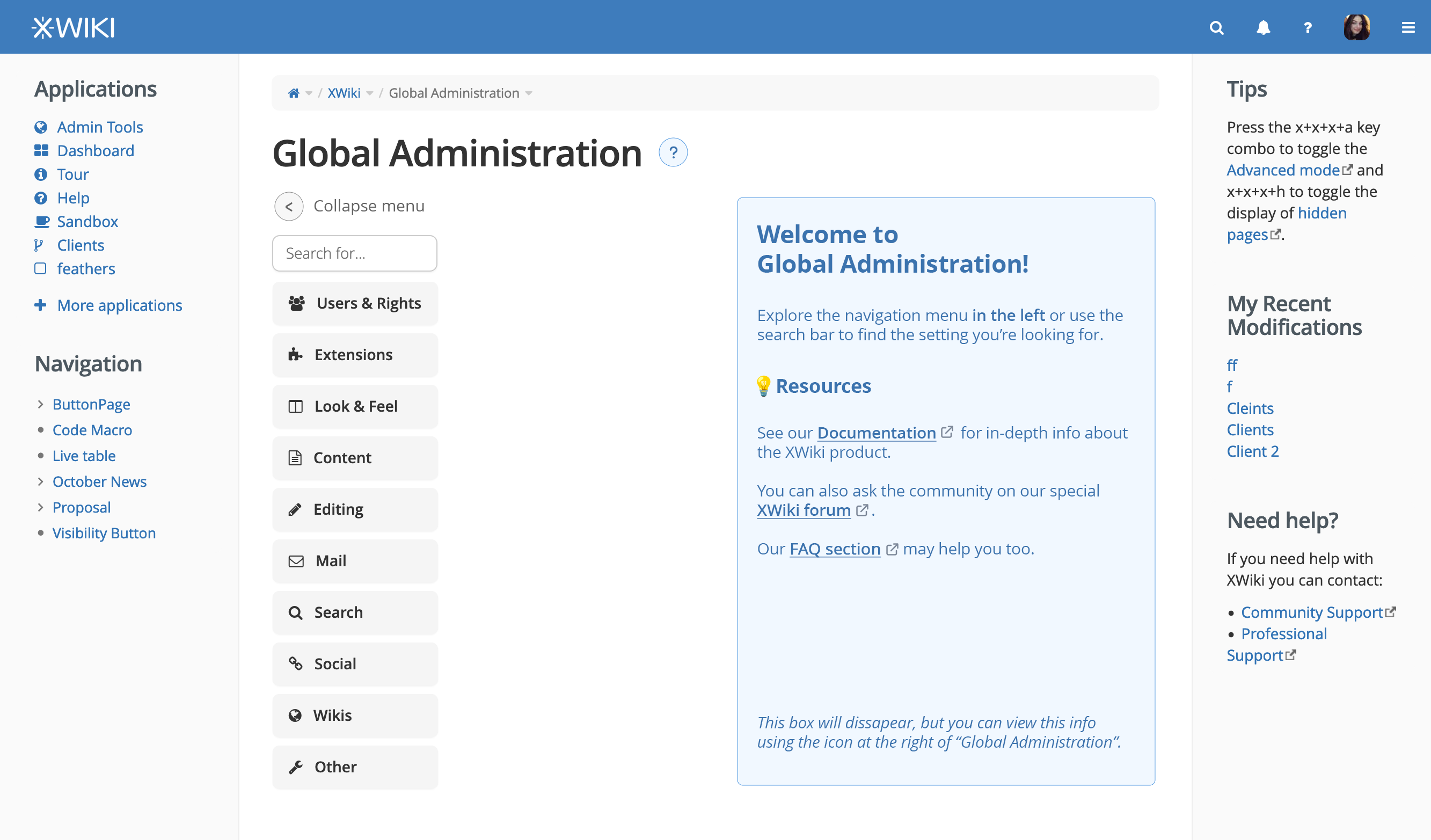
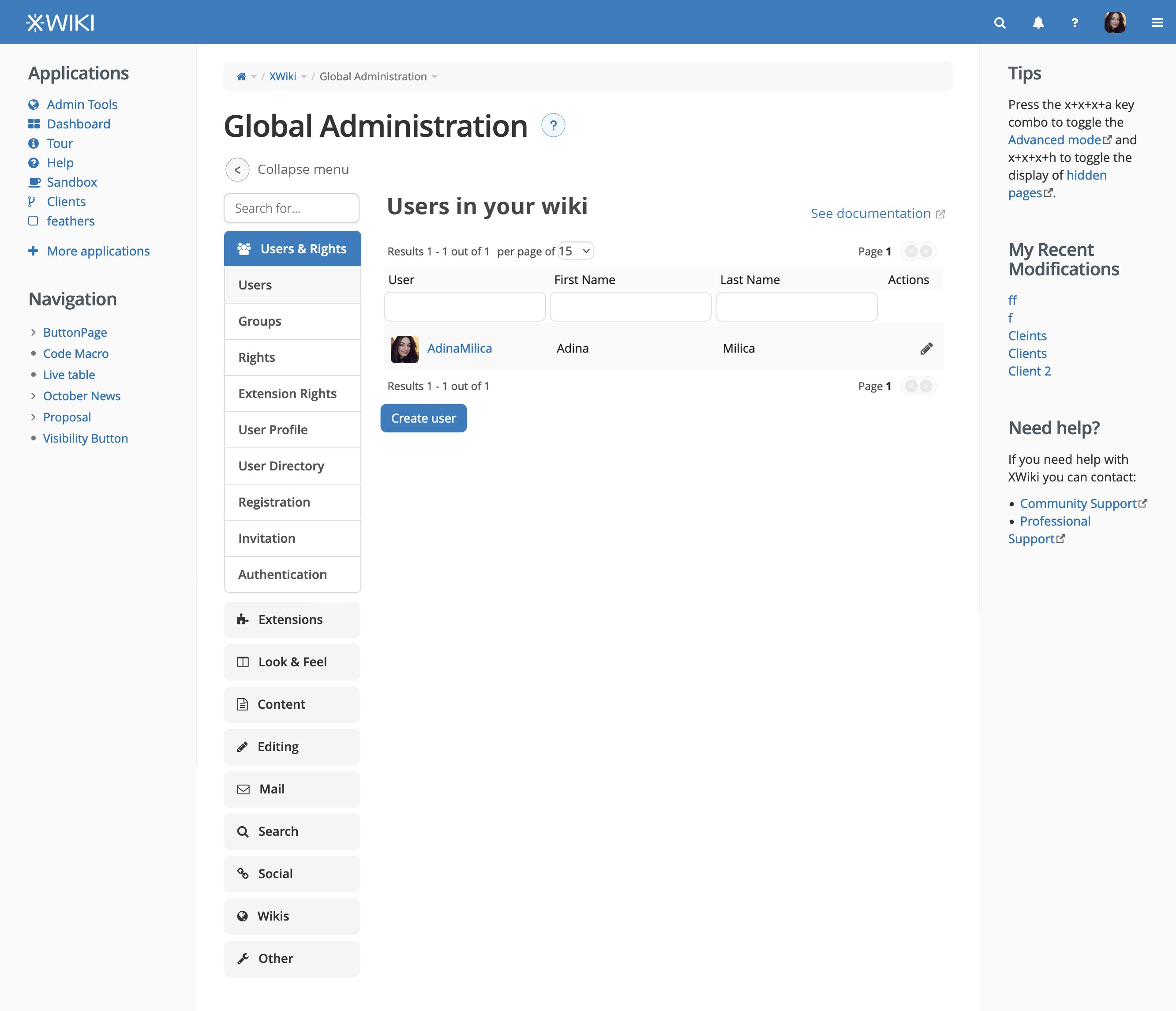
the menu can be collapsed
if the user hovers over the icon besides “Global Adminstration”, a tooltip will appear on top of the content with the info box from default box
the sub-sections in the menu have a border unlike the main sections
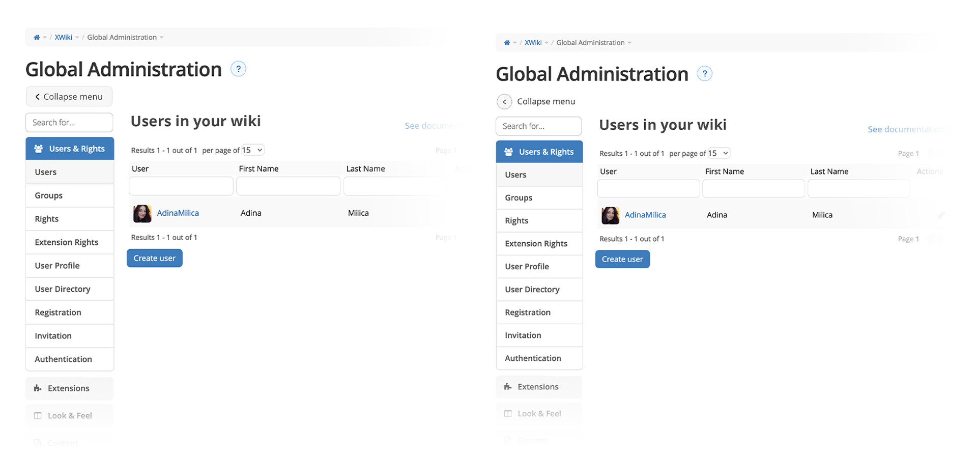
User collapses the menu
note: the chevron needed to be reversed in the mock-up (will update the final proposal on the design wiki)
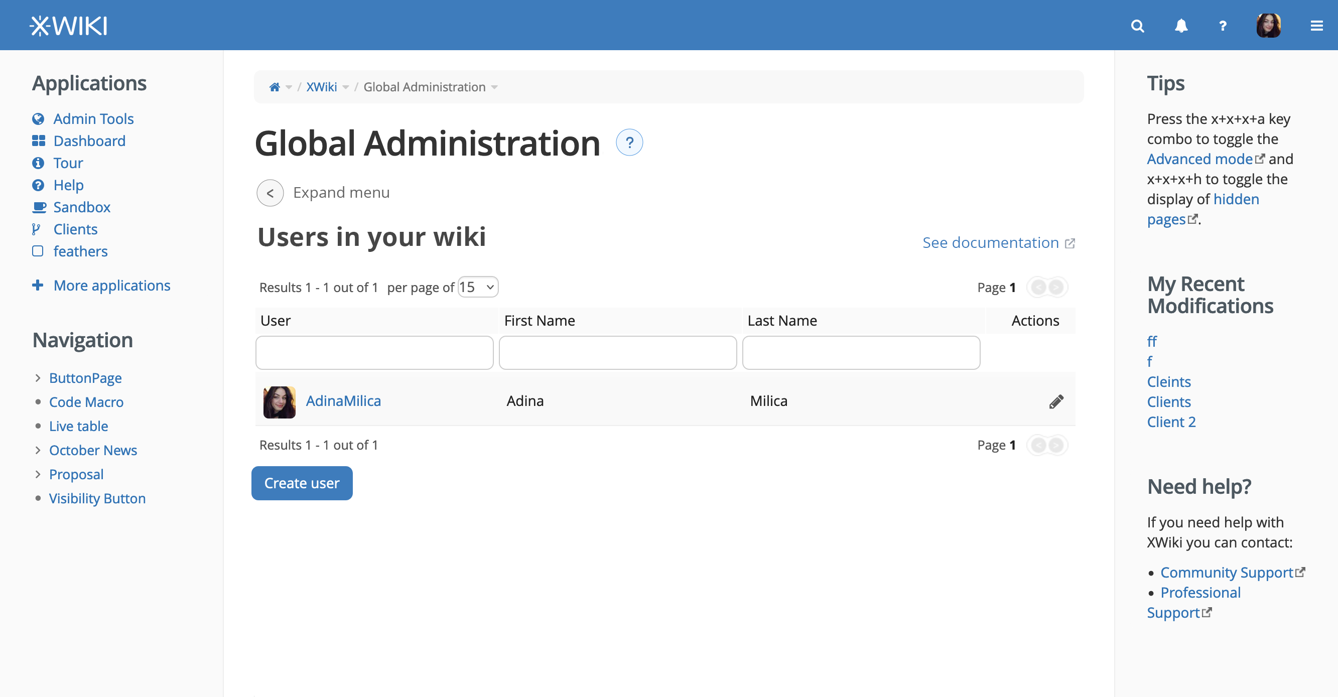
doesn’t duplicate the content (as the current version does)
it enables to view the content in a larger space if the user wants that
makes product information easier to access
doesn’t change a lot of things
the changes are not very hard to implement
the menu look can be updated based on CSS (probably even just from Advanced Customization)
the state of the menu (collapsed or not) doesn’t need to be retained if the page is reloaded, so the collapse button essentially just hides the menu and resets the width of the content to take the whole available space (and reverse)
the tooltip is… a tooltip, so hopefully it doesn’t imply any difficulties (if we don’t like tooltips, we can always go with a modal appearing if the user clicks the icon)
the title of the sub-section and the documentation link need to be rendered based on the sub-section clicked, but, as we only have a limited number of subsections, it’s just a static list of info.
What do you think?
Thanks a lot for reading this and let me know your thoughts on this version!
I’d really want to get a decision on this proposal until the end of the month. ^^
At least that will let admins know about new releases (of XWiki and extensions). My only hesitation is that this info is already available in the what’s new feature (but not just admin news there, even if currently most news are admin news).
I’d point to the Administration Guide instead of general documentation.
I think we need to discuss more globally your idea of putting question mark icons after the title (and doc link to the right of level 2 headings) since this is not something we’re doing elsewhere AFAIK and if we want to go in this direction, we need to generalize it (for example, in user profiles view just to name one other place).
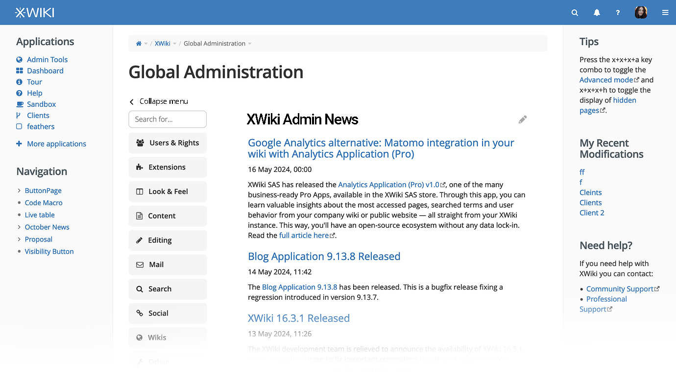
If I understand correctly, when clicking a section (like “Users & Rights”), the “Welcome to Global Administration” box will appear or remain, right? And users need to click a subsection to see the content change.
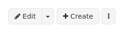
For the style used for the expand/collapse button. IMO we should use standard button styles, i.e. rounded corners and default colors. Nothing prevents us from putting the text into the button itself, to get a final style similar to the page create button:
The tooltip is displayed on hover but we should also give a way to display it for keyboard only users (or any user that can’t hover, like a touchscreen user). This is a detail that might come only for implementation but I figured it’s still important to mentation. This activation could be on focus or when pressing enter (“clicking” the button with the keyboard).
From what I remember one idea for Loading... was to create a Panel and just put this panel in the drawer. We could use a similar panel in the GA Home Page. We can probably use the time spent to make a panel for both
From what I experienced, our current navigation in the administration is not easy to discover for users. New users I watched were using the icons in the main part of the screen, not the menu on the left. Maybe removing the entries in the main part helps to put focus on the navigation, but I’m not sure. Maybe this kind of UI pattern is not obvious/well known enough? In that same direction, I’m wondering if that “Collapse menu” link is discoverable enough and if users will easily find how to expand the menu again. Also, this link seems to take quite some vertical space also for the main content. How would this collapse menu button work on mobile?
The white space left of the “info box” and the white space inside the info box looks quite strange. How would this white space change depending on the screen size?
Also, I’m missing the use of common design system. For example, you suggest removing a shadow from the search bar. In my opinion, we should keep this consistent with all other inputs in XWiki - we could change them, but then we need to change all of them. Same for the placeholder. XWiki needs to have a consistent look and feel to be recognizable as one application and not a mix of many independently designed components.
This is not true. Extensions can add their own subsections. We need a proposal how the documentation link should be provided.
I’m back on this, sorry for the big delay. There is a lot to read so if you are not tagged in these following lines, you can skip to the end where I’ve made the conclusions (TLDR).
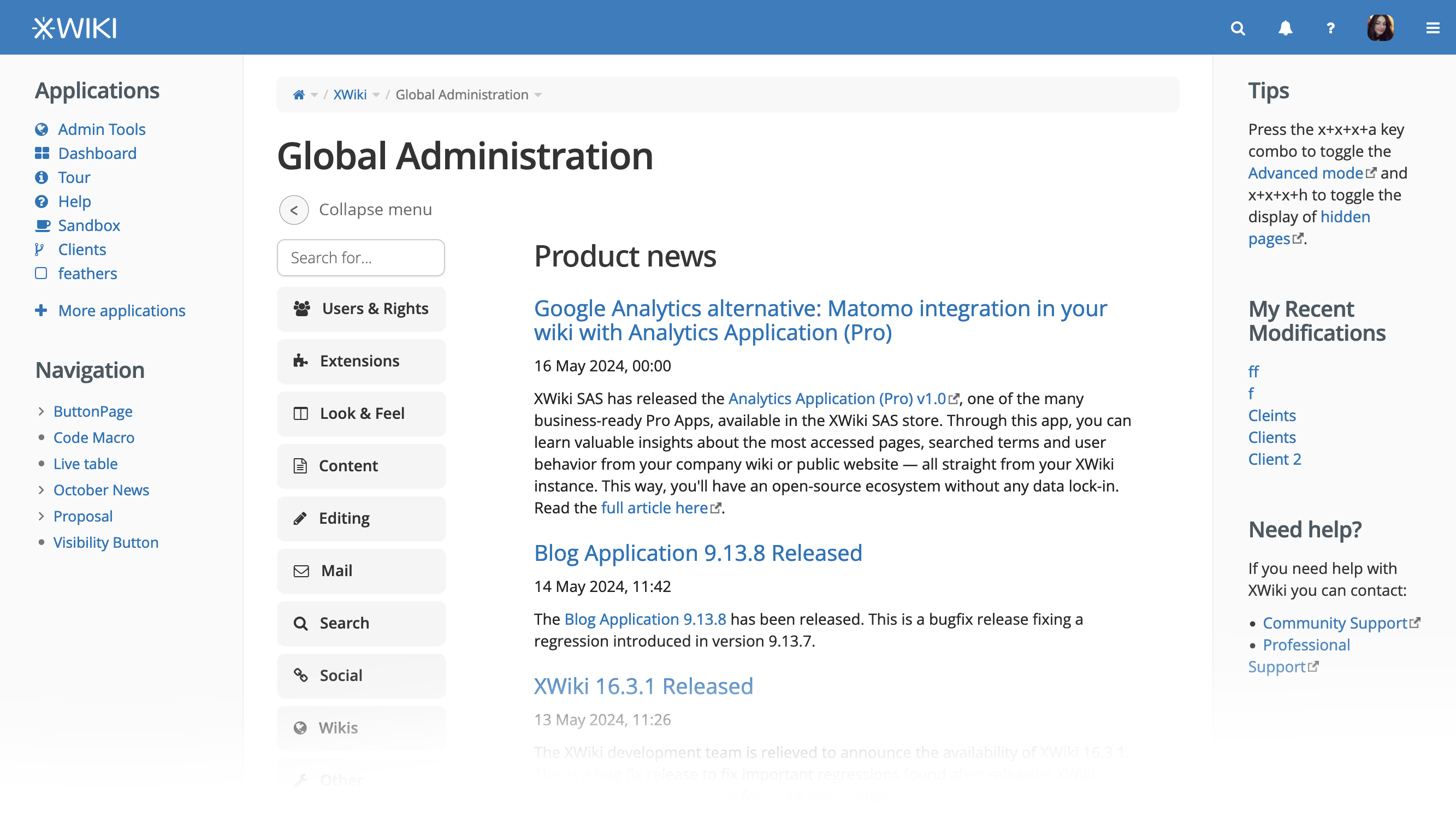
What useful info to have on the GA home?
It is a good idea even though the info would be, at the moment, duplicated. For me GA is a much more visible place than the the What’s new section and, so, it makes sense to have some news in GA too.
Another idea would be to let this area of the page be editable and the admin can configure with any macros or quick info he wants to remember.
For example, if he has Admin Tools Pro or Analytics Pro, maybe he wants to see a combo of some macros from these Pro Apps. He can even create a mini admin dashboard on the homepage of the GA with the things he searches most for.
This idea is probably more complicated to implement, I imagine, and may not be that worth it.
Thus I think it’s a good idea to either stick with the info box or with the What’s new section.
Links to documentation
good call
Separate sub-proposal no.1
I will keep this part of the proposal as a separate small proposal. I think we can work on the main improvements without this part and then come back on them.
Behaviour of clicking on section (not sub-section)
We can go on 2 routes here:
yes, clicking a section will open the Welcome to GA box, clicking a subsection reveals content
no, clicking a section doesn’t do anything (other than expanding subsections in the menu), only clicking a subsection changes the main content
I would go more on the second version because I think it might become annoying to see Welcome to GA (or whatever we choose to show on default) every time you’re navigating towards something.
Collapse menu button style
If I understand correctly, you’re reffering to the button that expands/collapses the side menu, right?
I’m okay with having the circle icon button have the same style with the buttons you’ve showed, but…
I think, visually, it’s much better to have the label of the button outside of the button. This is because:
as a circle, it stands out in comparison to the other shapes in the UI
as a circle, it doesn’t occupy as much space in the whole UI, making it more feel more light
as a circle icon button, it will feel familiar to people that used to “single chevrons mean expanding/collapsing, NOT go back or forward”
I agree that, at the moment, new users probably use the main content navigation as it is more obvious visually (bigger, more coloured).
In its absence, users will adapt (they always do), especially because the white space lets the eye focus on one thing at a time.
This UI pattern is similar to a lot of System Settings menu UI or File Explorer / Finder, I doubt it is not understood by users.
UX of collapse menu
Regarding discoverability: if we make it more coloured or generally more perceivable (by size, shape), it will take focus from main content and make the UI feel more cluttered.
You can see a few lines up how the collapse menu button looks if it’s rectangular (in reply to Lucas). Personally, I think the round one works better for the arguments I listed.
Regarding knowing how to expand again: if they collapsed the menu, they will instinctually check the same place for expanding it.
If you think it would help, we can make the expand icon of the button not a chevron, but a menu icon. The collapse icon would still be a chevron. This is not a common UI pattern and could cause confusion for users used to having an opposite-direction chevron for expanding.
Vertical space on mobile
Our biggest problem on mobile is that the menu takes the whole vertical space available.
I’d actually propose to have the menu collapsed by default on mobile as it makes getting to the actual content a pain. (this would probably be the easiest way to save vertical space on mobile, though not the ideal solution which is much more work)
While it is slightly strange, it lets the UI breathe, letting each component be easily perceived.
On a tablet, the space between the side menu and the box would just become smaller.
On a phone, the box would occupy the whole screen and after it, there would come the menu.
Sub-proposal no. 2
Agreed. My proposal ideally would affect all inputs and placeholders. Will make smaller separate one.
Sub-proposal no. 3
Ah, yea, I missed this issue. I will add it as a sub-proposal.
Conclusions / final proposals (TLDR)
we’ll only have one menu, the side bar menu
in the menu, clicking on a section (not a sub-section) does the following:
either opens the homepage of the GA
either does nothing (waiting for the user to click a sub-section and display the main content)
the sidebar menu will be collapsable
the collapse/expand button will either be
a chevron in a square (light gray colored) or
a normal button similar to the Create page button
the default main area when visiting the GA will be:
a new textarea xpropriety to the XWiki.XWikiPreferences xclass in which by default we have what’s new articles, but can be populated with any macro the admin wants
when showing articles, the tile of the section to XWiki Admin News
an info box with all the useful links or
if we go with option 1 (the info box), the link to the documentation will be the one to the Administration Guide, not the general documentation
on the mobile version, the menu should be by default collapsed when selecting a sub-section (as right now it occupies A LOT of vertical space)
input field style and placeholder text style will be discussed separately
“See documentation” on the same line with the title of the subsection will be discussed separately (as it also concerns other parts of the UI)
the link to the documentation is not that simple to extract so we need to make a proposal for the technical implementation
the tooltip with the question mark besides Glabal Administration must be discussed separately (as it also concerns other parts of the UI)
for the tooltip to be accessible, activation could be made:
Most of the time, those expanding carets do not come in a box of their own, so we don’t have much to compare with. However the box is always shown on focus. It would be nice to keep the shape consistent between those buttons. Personally I think fully round buttons (this goes for the help button too) do not match our current style, from what I know we use rectangles even for icon only buttons. Examples:
top-right navigation bar, all the items are rectangles.
The section editing pencil has no background but a rectangle area
The only controls I can think of that are circles in our UI would be : avatar picture that’s clickable to access the profile; livetable page change buttons, hard coded images that we should replace with livedata soon.
I don’t think the menu toggler needs to stand out from the UI that much, and usually we use colors to manage user focus instead of shapes.
Not including the text inside of the button would mean that it’s just left floating next to it, it would be more difficult for the user to understand that both are related. This is a small drawback of the “circle” solution. Personally I still like having a readable label for every button. I understand the drawbacks and don’t have a strong opinion about this choice.
Thanks for your time spent on this revamp!
Lucas C.
I don’t see how this could work since the user needs to decide what admin section they want to open, so the menu should NOT be collapsed by default so that users choose the section to open. IMO this is more important than displaying some info box or what’s new info, which are secondary information compared to the menu which is the primary goal of the admin UI.
Now, when selecting a subsection, we could decide to fold the menu by default on mobile.
That’s a very good idea and I don’t think it would be too hard to implement. We could take the content to display from the content of the XWiki.XWikiPreferences page. Editing this page is currently not easy as the view mode redirects to the admin action but we could either remove it or give special documentation on how to edit it. An alternative would be to add a new textarea xproperty to the XWiki.XWikiPreferences xclass for the content to display and make it editable from the Admin UI, in an existing or new section. This is probably the easiest/best.
I think it has more added value than showing some infobox which is not really useful. And with the ability to change the content to display, admin users could display whatever they want.
I wouldn’t name it “Product News” though since we would only display admin news and it’s not necessarily product news. Maybe simply “XWiki News” or “XWiki News for Adminisrators” or “XWiki Administrator News”.
Yes, I didn’t put it as I wasn’t sure it was ok to use diminutives. But if you and others think it’s ok, then it’s good for me (with uppercase “N” for “news” ;)).
Hello! To formalize a conclusion this based on overall agreement:
Definitions
Section - example: Users
Subsection - example: Users > Rights
Proposal agreed upon
we’ll only have one menu, the sidebar menu
in the menu, clicking on a section (not a sub-section) does nothing. Only clicking a sub-section displays the content of that sub-section.
the sidebar menu will be collapsable
the collapse/expand button will be a normal button similar to the Create page button or a text-icon-only button (I’d prefer this, UI wise)
on mobile, the menu should be by default collapsed when selecting a sub-section (as right now it occupies A LOT of vertical space)
the default main area when visiting the GA will be a new textarea xpropriety to the XWiki.XWikiPreferences xclass containing What’s new articles. The admins can edited how they want and pupulate with other macros, links, etc. The title of this section is XWiki Admin News.
