Proposal of templates for the administration section

Hello everyone,

I’d like to present a proposal for the Cristal administration section, anticipating upcoming user creation features. This initial proposal outlines administrative features and their user interface.
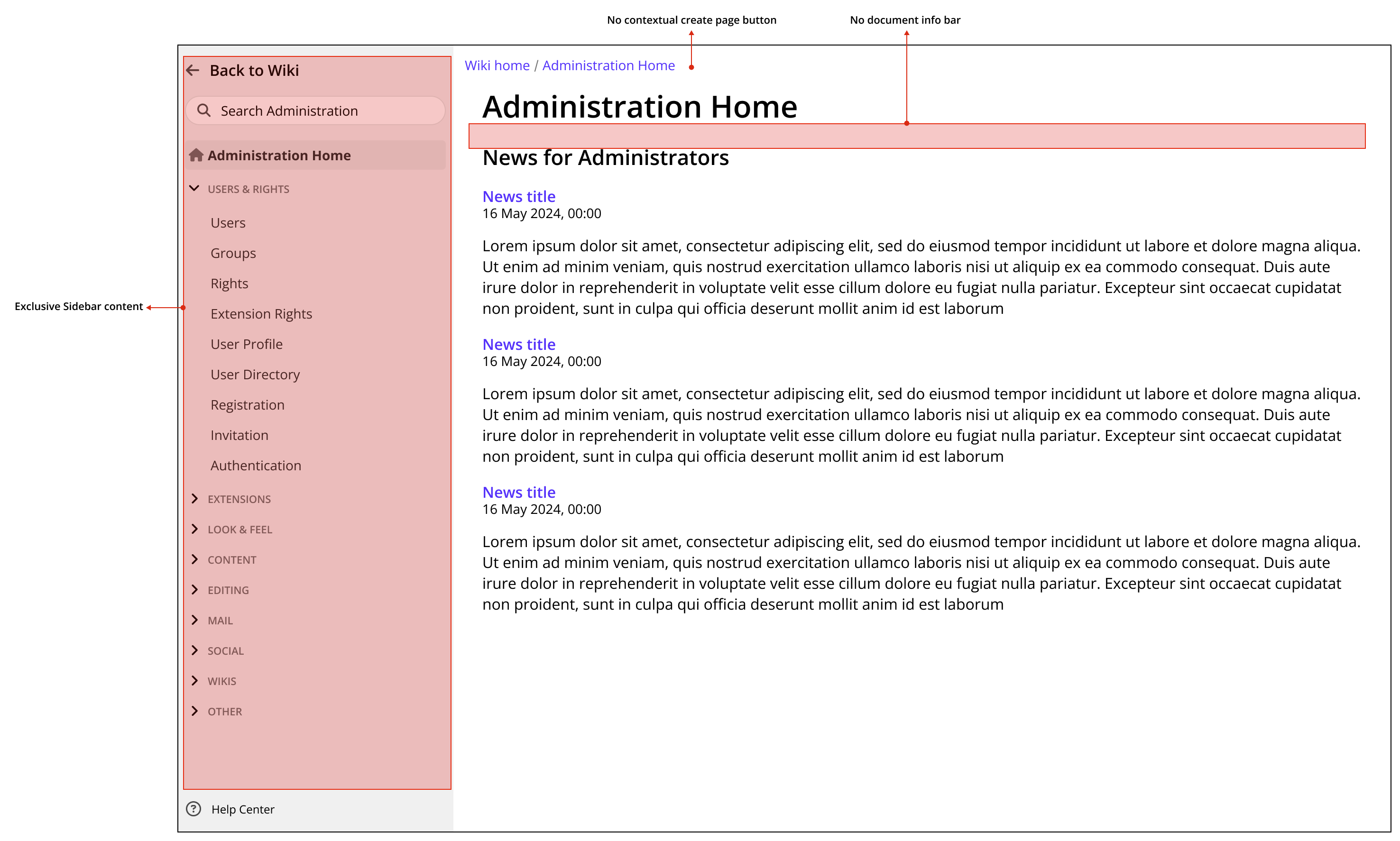
Access and Layout

The admin section will be accessible via the cog icon in the top sidebar, replacing the backend selection functionality, which will be relocated within the admin area.

Screenshot 2024-06-27 at 14.02.00

Upon entering the admin section, users will encounter a distinct layout from regular Cristal pages. This serves to maintain focus on administrative tasks and subtly distinguish these pages as special. Key differences include:

  • A sidebar exclusive to admin pages.
  • The removal of the “Create Page” button from the breadcrumb.
  • The absence of the info bar prevalent on regular content pages.

Same image, without markings

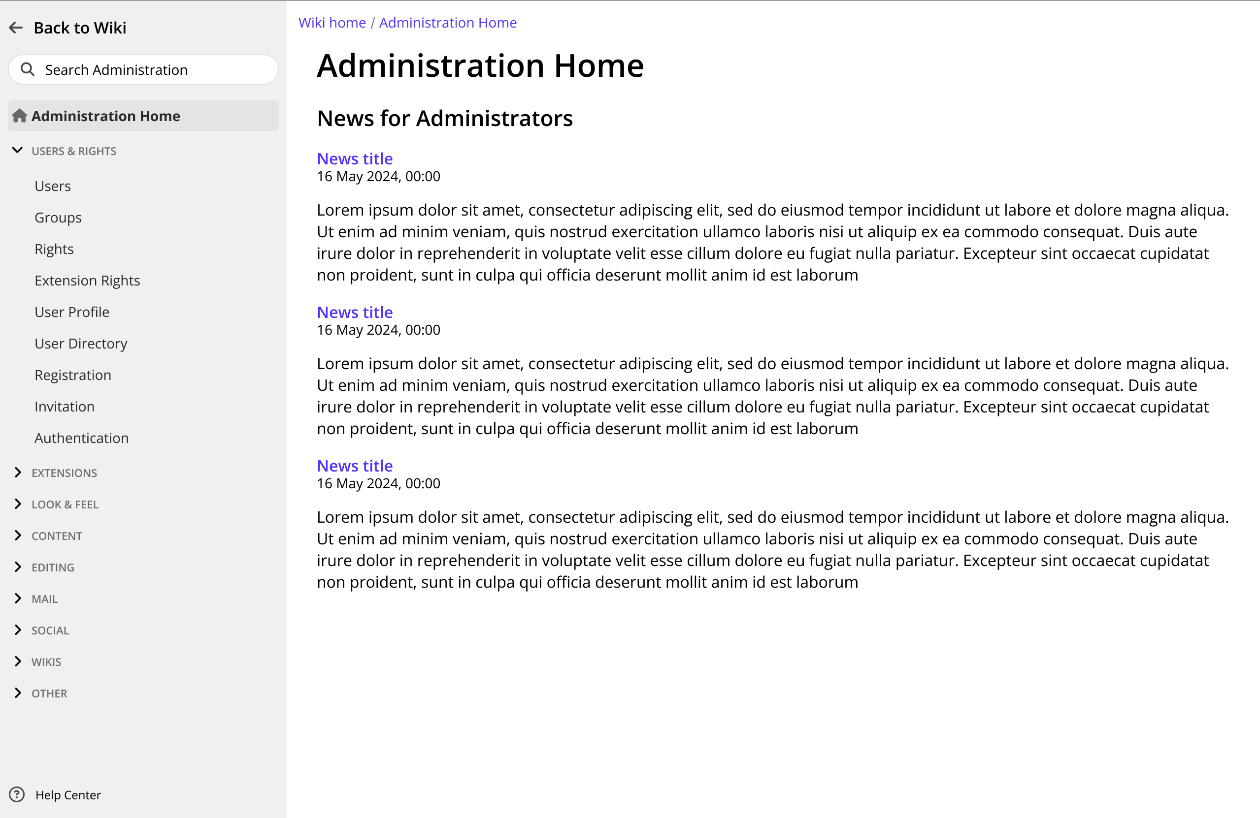
Home Page: News for Administrators

The proposed home page for the admin section is a “News for Administrators” section, mirroring the feature proposed for XS by @amilica. This serves as a centralized hub for updates relevant to administrators.

Alternative: If a news section isn’t deemed suitable, the first accessible admin page (e.g., “Users”) will open by default, eliminating the need for a dedicated “Administration Home.”

Navigation

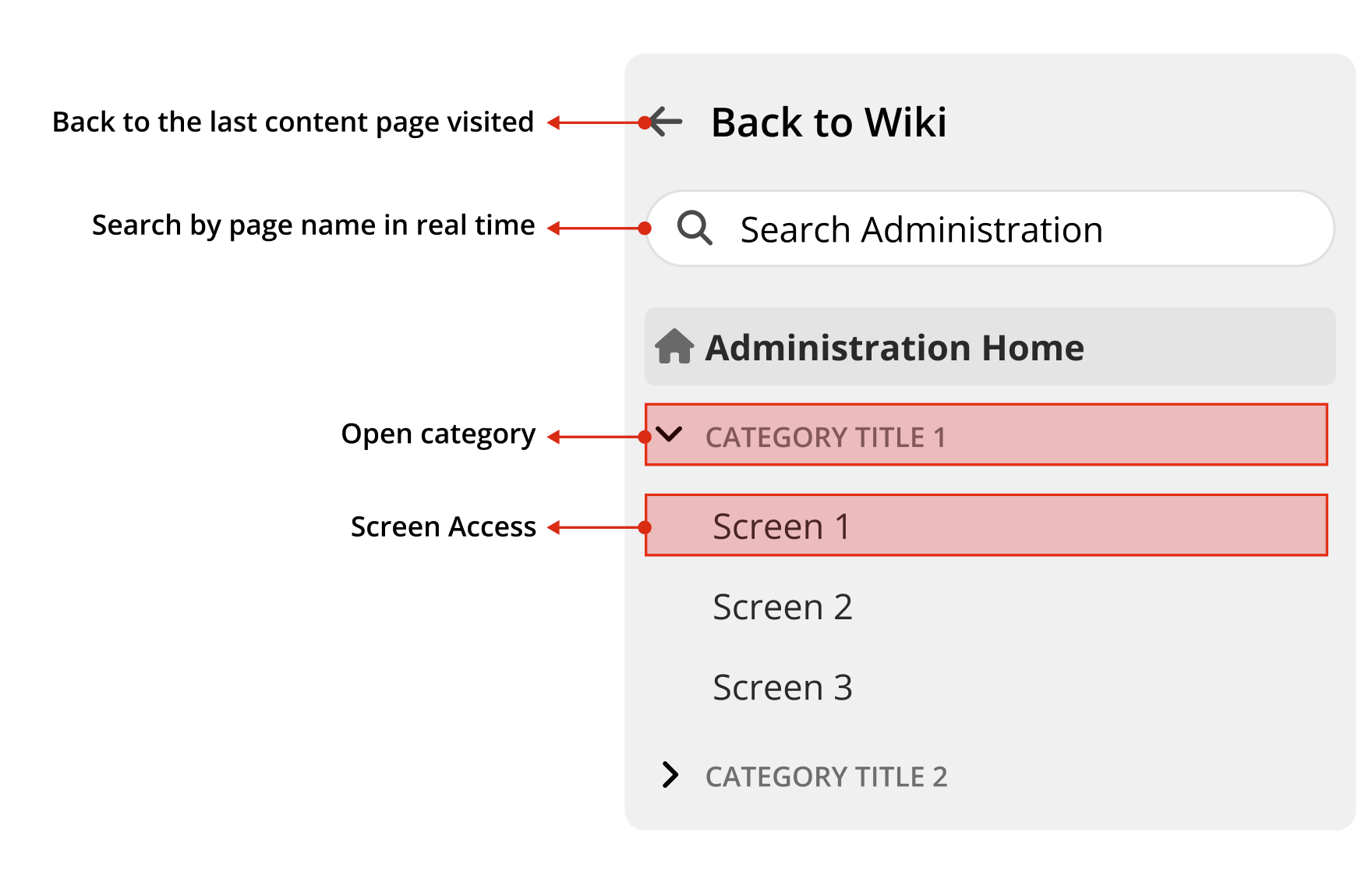
Due to the potentially extensive nature of admin pages, a “Back to Wiki” button will be placed at the top of the sidebar, providing the sole means for admins to return to regular content. This button will replace the logo, user avatar, and other options.

Search Functionality

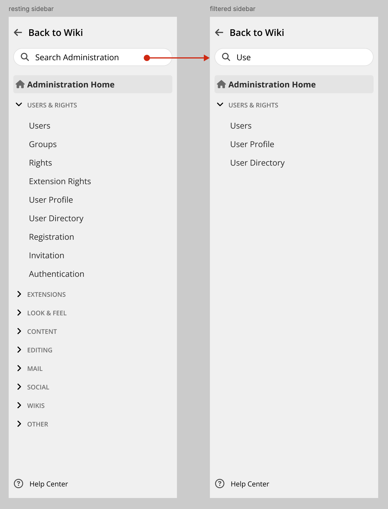
To enhance navigation within the admin section, a dedicated search feature will be implemented in the sidebar. This will be a simplified search, likely powered by JavaScript, to filter pages by name as users type. The search input will be automatically focused when entering the admin section.

Note: This search is distinct from the regular page search and serves as a quick filter for admin pages only.

Feedback

Now I would like to know from you. Please let me know your opinions and feelings on the current proposal, and more specifically on the following aspects:

  1. Layout Distinction: Do you agree with using a different layout for admin and regular pages?
  2. Search Feature: Is an exclusive filter/search feature for admin pages beneficial?
  3. Home Page: Should we include a “News for Administrators” home page or prioritize displaying the first accessible admin page?

Thank you all for your time and consideration.

Hi, thanks for working on this!

+1

I’m mixed on this one: I do think the search feature is useful in admin but IMO filtering only on page name is probably not enough. The administration pages might contain a lot of different things and it’s probably useful if it could do a search in those. e.g. for “captcha” you have a dedicated admin page, but you can also enable it in the Registration admin page, which might be a bit “hidden” for new admins.

Now I’m not sure it would be easy to implement a real search only for admin, I’m only answering from a pure UX point of view here.

I think I would implement a dashboard for the admin home page: by default the dashboard would incluse the news for administrator, and maybe some kind of security widget. But we’d allow admins to edit that dashboard to put different things and/or reorder them.

1 Like

+1 for a different layout than regular pages but I’m not sure if we should remove the top level bar (logo, and wiki-wide actions). It frees up a bit of vertical space but that cannot be the real reason as otherwise we would remove it on all pages. I have the feeling it removes consistency and makes it harder on UX if you need to navigate from the admin UI to some place linked from the drawer for example.

We do need search. It works great in XWiki. BTW the search is not just on page names in XWiki (it’s page + title, and it might also be on section names and/or property names). Can be checked with Marius. +1 to keep the same for Cristal.

See the discussion on the forum where there are several ideas. I think an editable dashboard is interesting (a default dashboard could contain a single gadget with the admin news).

Thanks for working on this!

This is a detail and probably not worth if difficult to implement: it would be good to highlight “new” items in this list. This is a lot of text, and if there isn’t anything distinctive, as an admin I’d probably just skim over it and miss actual news ^^` Assuming I’m interested in those news, 9 times out of 10, the top item is not new and I’d lose 20 seconds scanning it every day. This means that forming the habit of reading news would be difficult/feel unrewarding.
Something distinctive could also be different enough hero pictures for each news item, but AFAIK it makes creating news items more difficult and we probably don’t want that.

Note that this could be seen as an accessibility issue if implemented poorly. It’s not a hard WCAG violation. It’s often recommended to not manipulate focus, except in very rare cases where the user can expect it. E.g. after getting on the login page, the user can expect the focused input to be the username field. Here, it doesn’t seem to me like it’d be obvious: I click on a button to access the Admin center, I am now on an input that asks me for some text. I have no very trustworthy source, but there’s some more info about this topic on Accessibility Tips: Be Cautious When Using Autofocus.

+1 Note that if at any point you need to use some specific elements in both layout (e.g. a top bar), make sure to have the elements in the same places and with the same content :slight_smile: Consistency of UI makes it way faster to navigate for assistive technologies users.

+1


Thanks for spending time on this proposal!
Lucas C.

Those are good points, a more in depth search can work best indeed. I will change the proposal based on this.

I like the idea of a dashboard, but right now, besides the news, I don’t know any other type of information to put on it. It’s not a big problem since we can think and implement these widgets separately. Again, I will update the proposal with something along these lines. Thanks!

This can be mitigated with the Widgets idea from @surli, this list can be very small on a widget and, with a date of publishing it’d quicker to check if something is indeed new. But a “new” indication wouldn’t hurt.

Thanks all for your replies