Hey there! ![]() I’m here to discuss some improvements that we could do to the profile page of any user to:
I’m here to discuss some improvements that we could do to the profile page of any user to:
- make it more easily scannable (experience)
- make it look more cohesive with the Global Admin Improvements (cohesion)
- make it look cleaner, more modern (aesthetics)
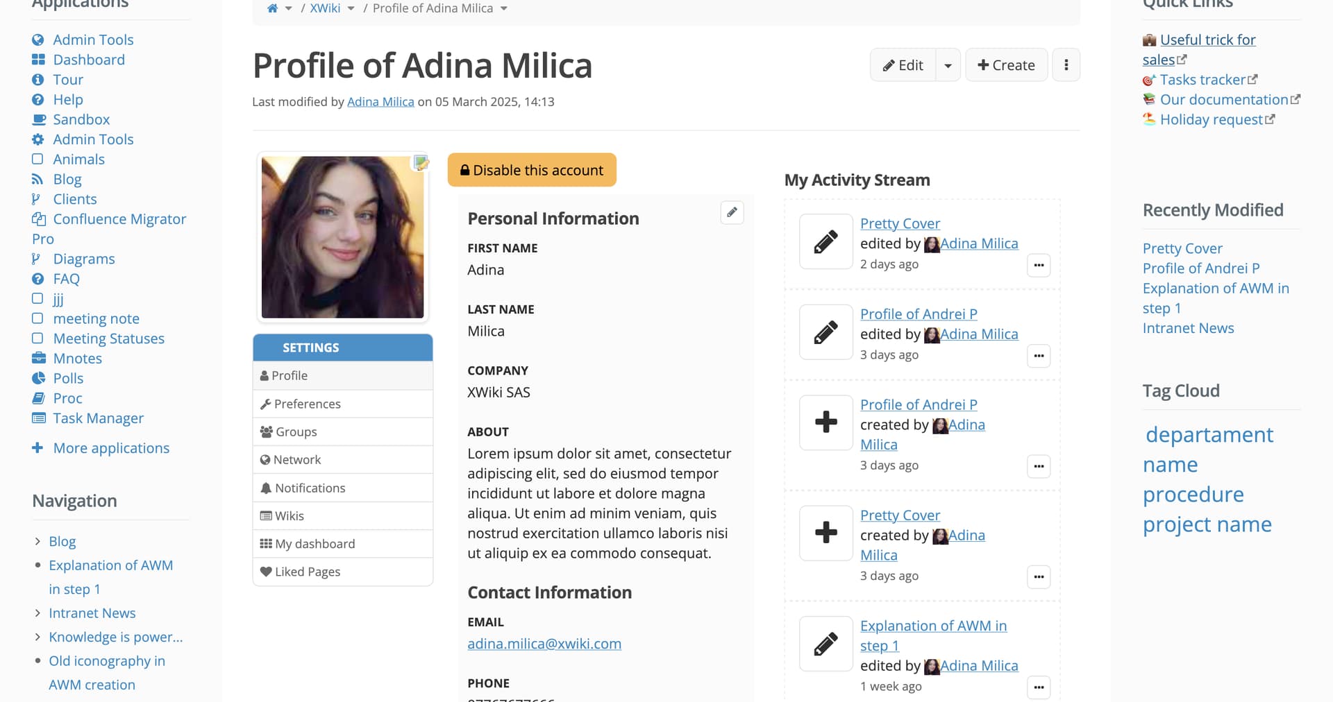
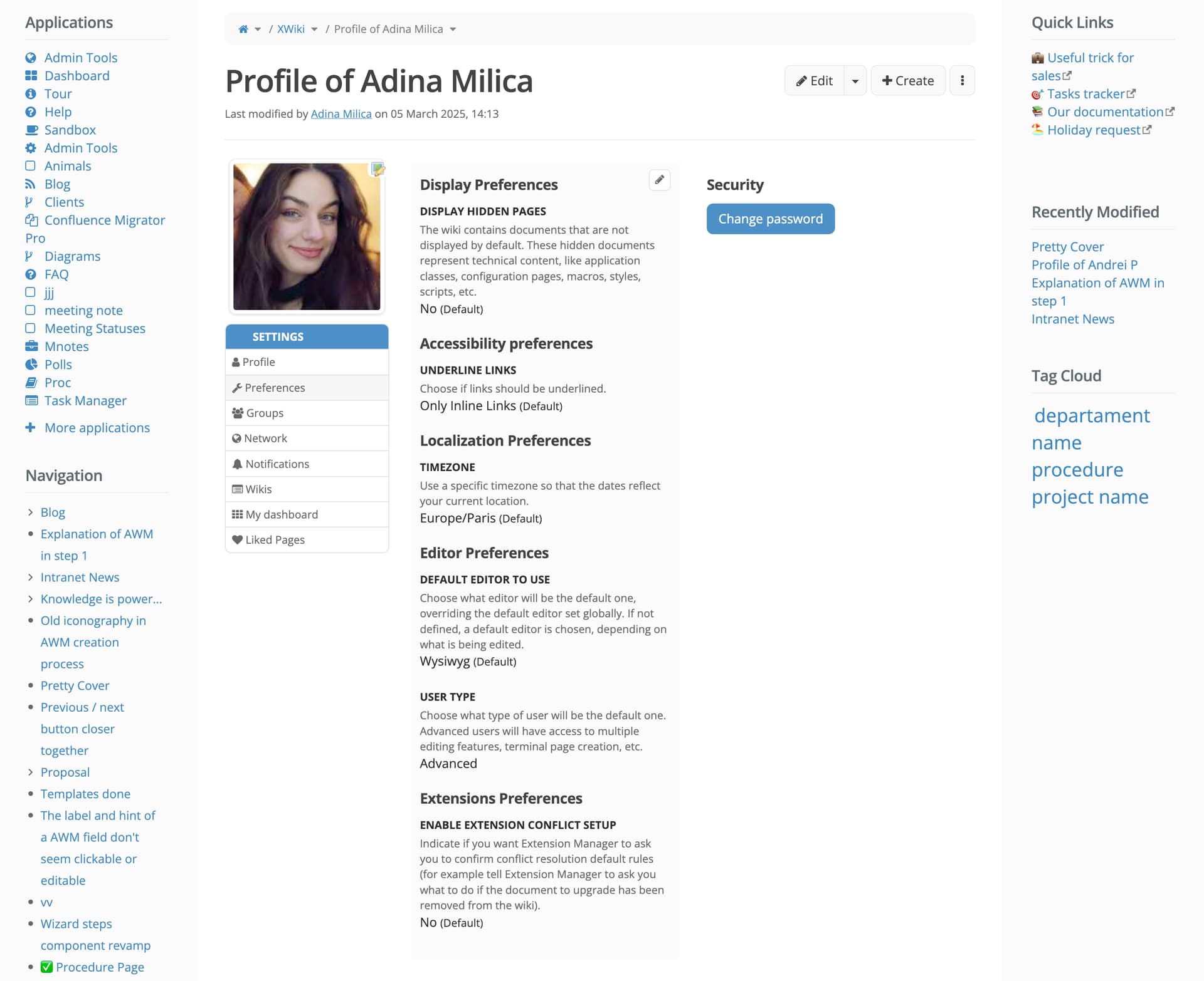
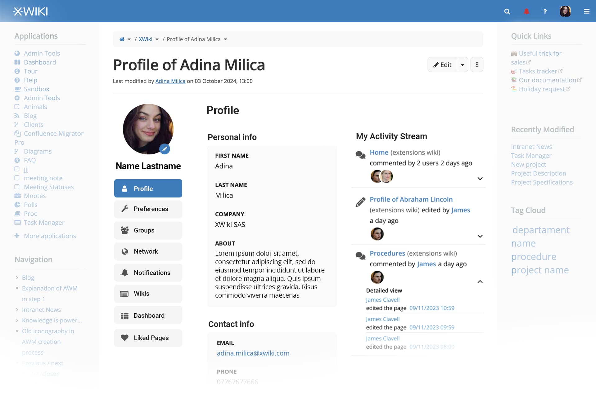
Current look 
Profile page (home)
Preferences page
Mobile look

Identified issues 
Some definitions first:
- Sections: Profile, Preferences, Groups, Network…
- Sub-sections: Display Preferences, Accessibility Preferences,…
#1 The navigation side bar of the profile page isn’t like any other menus in XS, AFAIK.
#2 In the navigation side bar, the currently selected section isn’t very clearly distinguishable from the non-selected ones.
#3 On mobile, the navigation bar isn’t optimized.
#4 The Create button is confusing in its meaning as it creates a subpage of the wiki homepage, not of the profile page.
#5 The profile picture ocuppies a significant space both on mobile and on desktop.
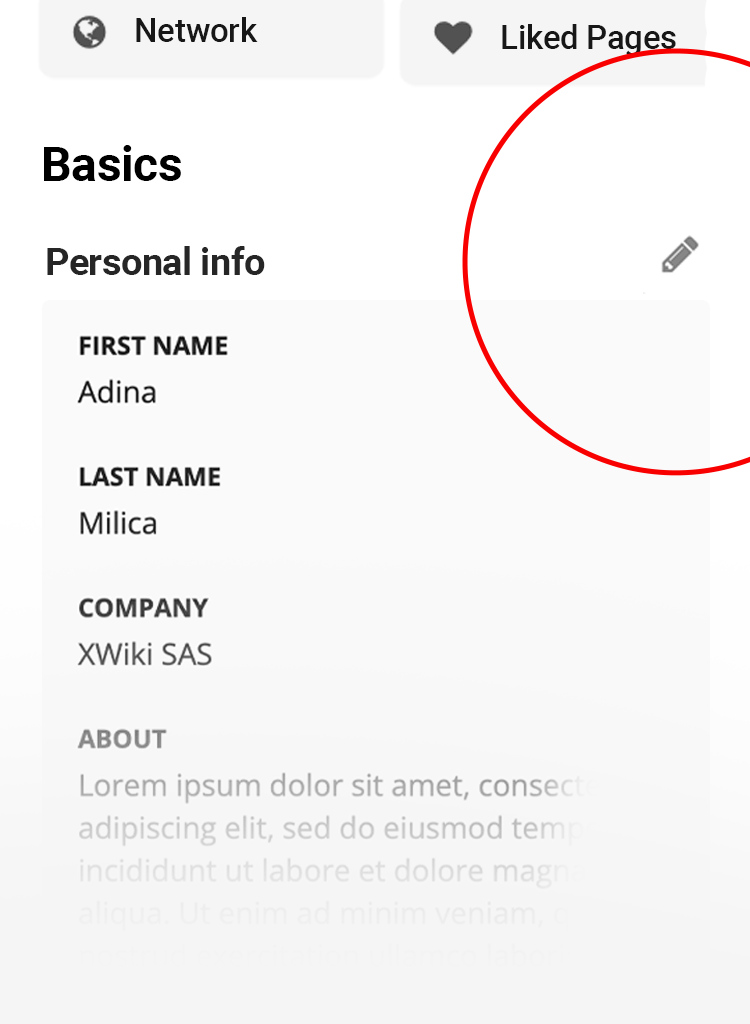
#6 The edit profile picture icon isn’t mapped out to FA icon set theme. ( version of my wiki is 16.4.6)
#7 Each section’s content has multiple subsections, but they are placed in one or too few big rectangles, visually grouping them as one and not allowing the eye to scan each sub-section on its own. I will offer visual examples below.
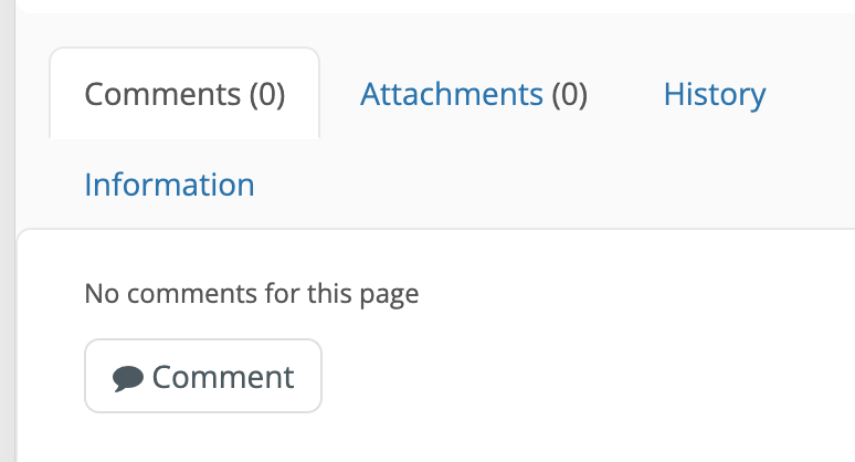
#8 Currently, each sub-section of a section has its own edit button, similar to the Edit Page button, but made icon-only. AFAIK, this style of button isn’t used anywhere else in XS. Please correct me if I’m wrong, I just couldn’t find it. Moreover, even if each subsection has its own icon, when clicked, it doesn’t enable block editing as expected, but it moves into Edit Page mode.
Global Improvements 
#1 We make the navigation side bar in the same style as in the Global Admin proposal
#2 We seperate each sub-section in its own rectangle, with the title of the sub-section outside of the rectangle, to allow for better scanning of the contents.
#3 We make use of the activity stream revamp made my @tkrieck in his Notifications Revamp.
#4 We take out the Create button at the top of the page as it doesn’t conform to the user’s expectations (it doesn’t do what they expect)
#5 We take out the sub-section edit buttons, leaving only the page’s Edit button at the top to allow for entering the page. I have some reservations about this, as I don’t think the edit button is very very visible (the content of the profile page overpowers him visually), but I’d like to know your opinions
#6 We make the profile picture round. I know this needs to be proposed as a global proposal, but I though I’d include here as well.
Preferences Page 
The Preferences Page is the UI that shows best the difference in splittting or merging sub-sections.
Here is the revamp of the page following improvement #2 :
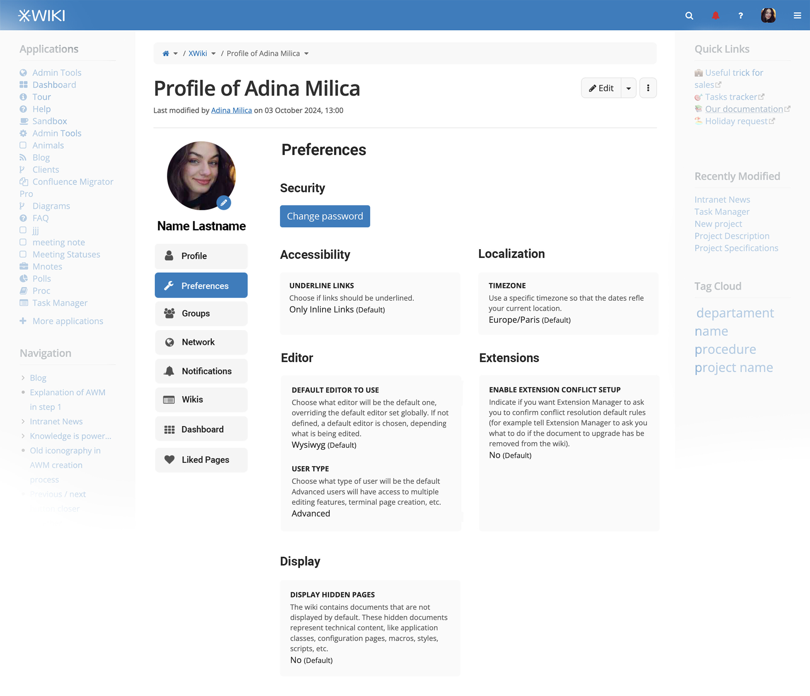
Spcific improvements to the preferences page:
#7 We wrap the sub-sections one after another, respecting the Z pattern of scanning webpages.
#8 We take out the word “Preferences” at the end of each sub-section’s name.
Mobile Immprovements 
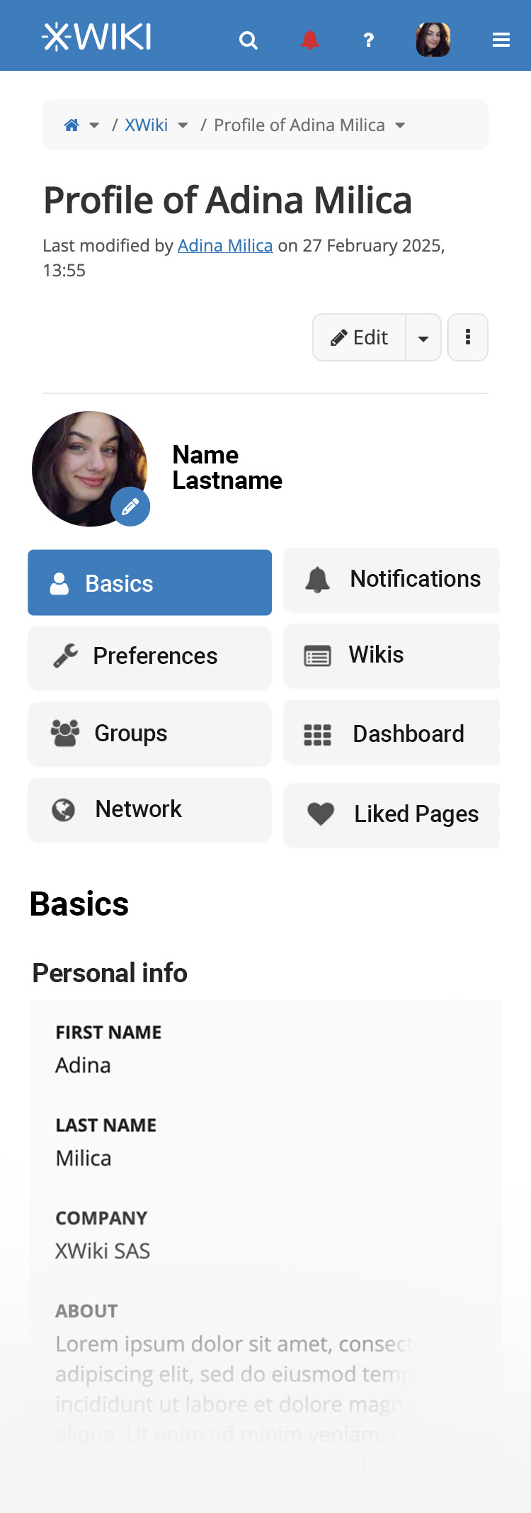
#9 We wrap the navigation sections on 2 columns to make use of the horizontal space we got, while not taking as much from the vertical (that’s the most important on mobile).
#10 We make the profile picture smaller and the name of the user follows it on the same line
On mobile, I believe improvement number #5 shouldn’t be taken into consideration, as it is much more inconvenient for the user to scroll upwards just to tap the Edit button.
#11 In this case, if we keep the sub-section edit buttons for mobile, we can adopt the block editing button which would translate in this:
Going further 
I thought multiple times through my time in XWiki SAS that it would be great to have a personal small page/wiki for each user.
- Somewhere to take notes at meetings just for myself but still in the organiztaion wiki (to be able to add links easily and stuff),
- somewhere to easily have a script that lists tasks related to me,
- somewhere to have my last 10 created pages
- and so on.
I believe it would be interesting to have the profile page have an editable wiki syntax field.
It can either be:
- part of an existing section (we would rename that section to better fit both usecases)
- or create another tab in the navigation bar just for it (Notes)