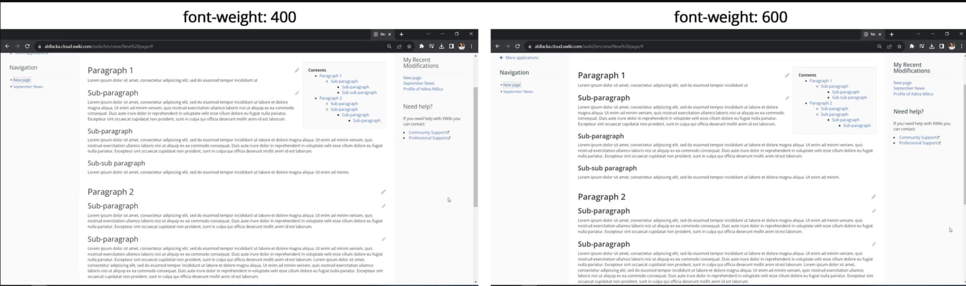
the headings font-size are bolder (from 400 to 600)
Open Sans is now provided and used by all. Before, the sans-serif font available in the user’s system was used, unless Open Sans was available. As different fonts support weight in different ways, it was making the boldness of the headings quite unpredictable.
As we received a few informal complaints about a feeling how heaviness, I’d like to re-open a discussion on this topic.
First, to allow everybody to give their opinion after having the chance to use it in practice.
Then, to decide of a change to make everybody happy with this improvement.
This kind of change usually brings its own set of challenges because it is in a fundamental aspect of the UI. Typography, spacing, coloring are all basic design tokens used by all interface elements and can be divisive if changed.
Having said that, while I agree with the basic premise of the original discussions I would try to make changes in smaller increments to check adoption, bugs and complaints.
One changing aspect in particular that I think is very welcome is the increased contrast between regular text and headings. Before, it was subtle and made the visual scanning of the document more difficult, as @amilica previously noted with the screenshot below. The scaling of text I would not change initially as the bold text already solves the contrast problem.
This particular change I’ve had to do in the past in an intranet made with XWiki.
However, I would restrict the changes proposed just to only these headings for now and only on the content area, making them bolder by default like the example. Changing it in the whole UI can lead to unforeseen consequences so it would need to be thoroughly tested, and probably would lead to other changes in the interface as well (spacing for example).
Regarding Open Sans, we are in a weird spot. The font was declared but not provided, so only systems that had the font installed could see them, otherwise the browser would change the font to any alternative without serifs.
One way we could go forward is to embrace this behavior and use something like the System Font Stack. Booking and Zendesk are products that use it and have documented their journey in this area.
But I know it kinds of leave us in a similar spot. Some adaptation on part of our users would be necessary, some control on visual design would be lost, but also some gains would be made in the performance aspect and visual recognizability of the default OS font.
In a very particular opinion I would go for the system font stack, after a period of instability I think this would leave us in a better spot regarding visuals and performance.
There is the possibility that headings feel a bit much because of their letter-spacing.
At the moment it is default, but on heading typography it’s usually recommended to make the letter spacing a tiny bit smaller, for example -0.01em or -0.02em (I use -0.02em on my own instance).
This recommandation is made because fonts are usually designed for paragraphs, but not always adapted to display contexts (headings, big quotes, etc.) and so, their initial spacing is not ideal for larger sized text.
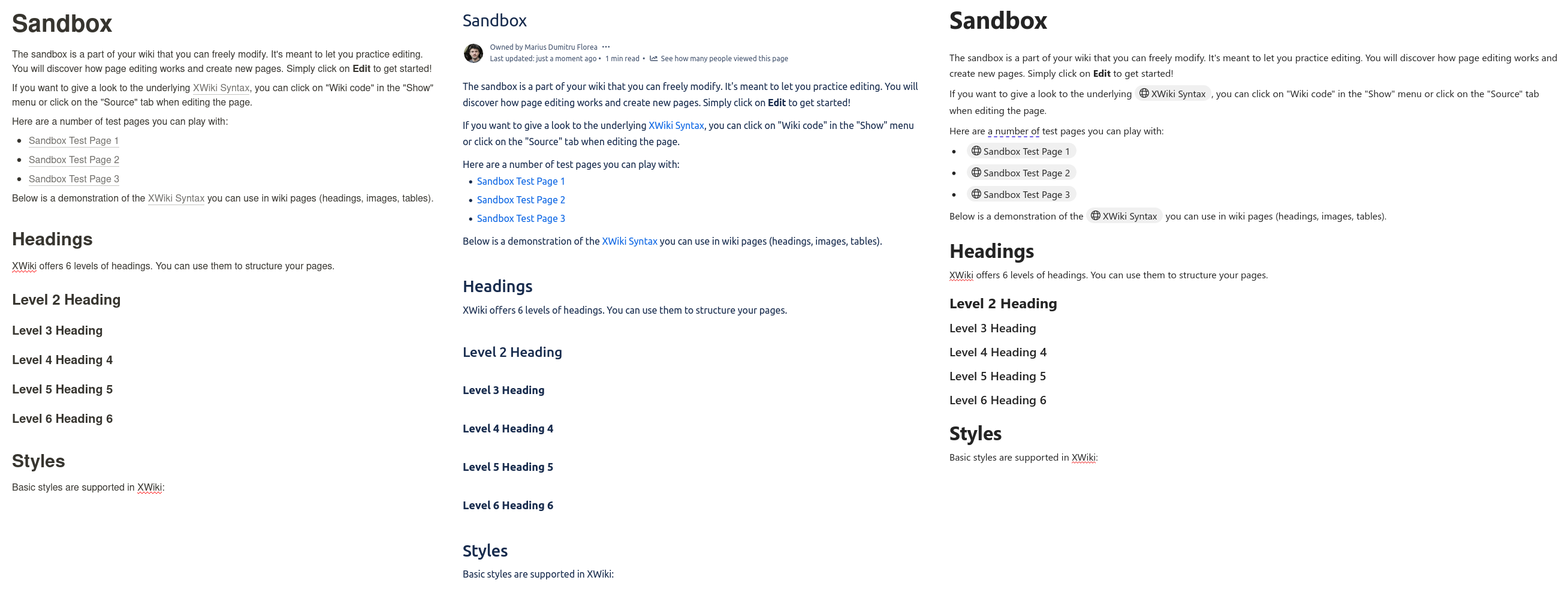
Sizing / scale update
Another possibility is that the heading size increase may be too much. While I, personally, like that there is a higher contrast between heading levels (which is extremely useful in my own experience when you reach at least H3 level in knowledge structuring), we may need to revert back to the original sizing.
Bold headings
I think bold headings should definetly stay unless we have more users specifically disliking the bold headings (which can be made normal again in the advanced section, right?) and not the font that the headings are using.
Font kerning
As @pjeanjean pointed out in an internal XWiki chat, Open Sans may also have some problems with kerning on different systems. I’m not sure if there is a way of imposing a certain kerning and how much that setting would help, tbh. On my instance font-kerning:normal; (font kerning information stored in the font must be applied) doesn’t seem to do anything, but maybe in other contexts it does?
Reading the discussion above, I propose to have the following short term changes.
Revert back to a smaller scale ratio
I propose to lower the scale ratio for 1.250 to 1.190.
That way, the larger fonts would be approximately the same size as they were before, and simply bolder.
And the lower level headings would be slightly smaller, but bold.
The values in parentheses are the size difference to the level above.
Level
Before
Now (15.9)
After
document title
34px
43px
34px
1
29px (-5px)
35px (-8px)
29px (-5px)
2
26px (-3px)
28px (-7px)
24px (-5px)
3
23px (-3px)
22px (-6px)
20px (-4px)
4
20px (-3px)
18px (-4px)
17px (-3px)
5
18px (-2px)
14px (-4px)
14px (-3px)
6
16px (-2px)
13px (-1px)
13px (-1px)
Level 6 stays smaller that the default font size (14px) but is easy to distinguish visually as it is bold.
Open Sans
Only apply open sans and bold on headings of the content.
Meaning that the rest of the content would be the default font of the system.
This would lead to a visible change for users that had open sans install but not as the default.
Also, the font would not be the same for headings and for the rest
That way, we guarantee that other issues with Open Sans will only impact the headings while still making sure that the right level of bold is presented to the user (e.g., in case of local font not supporting bold 700).
Regarding system font stack, this looks interesting but I would only go that way on the 16.x cycle.
What in my opionion is very important for headings too but often overlooked, is the line spacing/distance of the new heading to the previous paragraphs (above). In my opinion simply a bigger line height is no good solution as it affects both the upper and lower spacing equally and a heading should not be to disconnected from the paragraph below it, as it is literally the heading for that paragraph.
I solved it for our internal design with an additional “margin-top” of >2x the base font size, which looks quite good to my taste. The downside to this simple approach is, it also affects the heading if a heading is the very first thing on a page.
Heading-Test 1
In fact exactly in this forum the heading line spacing above and below an heading are very good combined with their bold style and font size for my taste. See how “Heading-Test 1” fits very good to this paragraph and “Heading-Test 2” has a good distance above it, as it is the heading for the next “thing”.
Heading-Test 2
Just looking at your 3 example pictures:
Notion: not so good - look at “Headings” the normal paragraph below it and then “Level 2 Headings”: the heading feels like in between and disconnected from the text its the heading for
relative distance above the heading: 2,18x of the distance below it
Confluence: very good relative distance, but line height overall is quite high.
relative distance above the heading: 3x of the distance below it
Microsoft Loop: Its more compact overall but the relative distance above and below the heading still feels good.
relative distance above the heading: 2,5x of the distance below it
When using margin-top and margin-bottom, the headings can get smaller overall and still easily pop into the eye. If possible it should be solved a bit more sophisticated, so that there is no margin-top if an heading is the very first thing on a page.
Extra note: (What is weird however on this forum is that the spacing before and after a bullet lists is the same, in my opinion that is an example where the spacing above and below should be the oposite to the headings. It should be small above and larger below.)
We’ve had some comments from our users that the document title size feels too big for our wiki, as many pages being created have lengthier titles (more like a newspaper headline than a webpage title).
Where would we go to change the document title font? I had thought adding to the LESS code for the Theme might work, but it’s not rendering any title-related code I’ve added to the style sheet.
Thanks for the input @TomTheWise.
Currently, the top margin of headings is a fixed 20px for h1/h2/h3, and 10px for h3/h4/h5.
Feel free to create an improvement issue on https://jira.xwiki.org/, and we’ll try to see how this can be part of our ongoing UI improvements.
The easiest option is to override @font-size-document-title (a special level for the document title, virtually a h0 above h1), @font-size-h1, @font-size-h2, @font-size-h3, @font-size-h4, @font-size-h5, or @font-size-h6 with fixed values.
Another option is to update @font-size-headings-scale, and @font-size-headings-scale-min with respectively define the scaling (e.g., size-h1 = size-h2 * scaling) between heading levels. The default values are 1.190 and 1.125. Be aware that the closer to 1 this value is, the least size difference you will see between headings size.