Headings Ratio - Minimalist Skin 6

Hellooo everyone! :blush:

Yesterday I opened the discussion on headings and how to make them stand out more when compared to the body text, in an effort to make it easier for users to scan the content of the page.

While the previous proposal focused on the font-weight of headings (bolding them out), this current one is about the size and, more specificcaly, the ratio between each level of headings.

Current situation

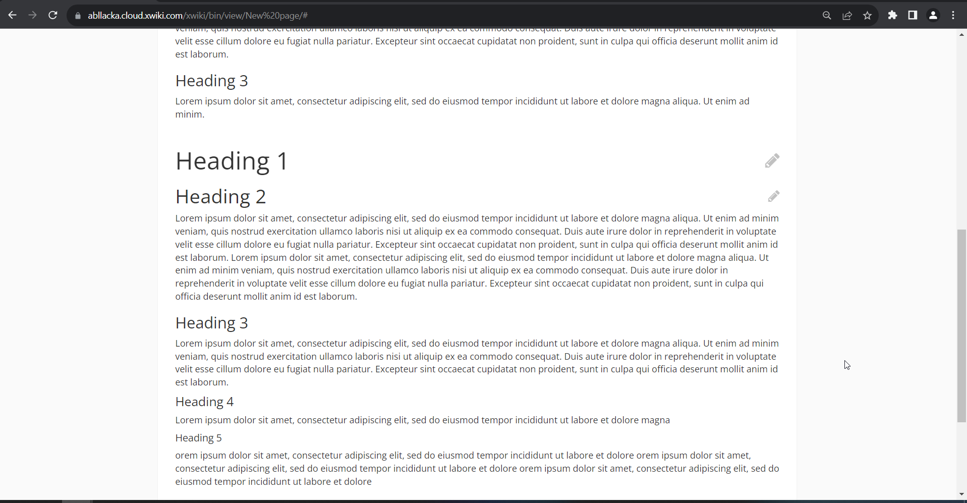
This is how the headings look independent from the body text:
image

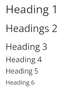
This would translate in an aproximate Major Second Scale for typography.

image

As you can observe the difference between each level is pretty small. This affects the visual hierarchy of the information, making it harder for the user to understand quickly at which level is the information they are reading (h1, h2,h3ā€¦).

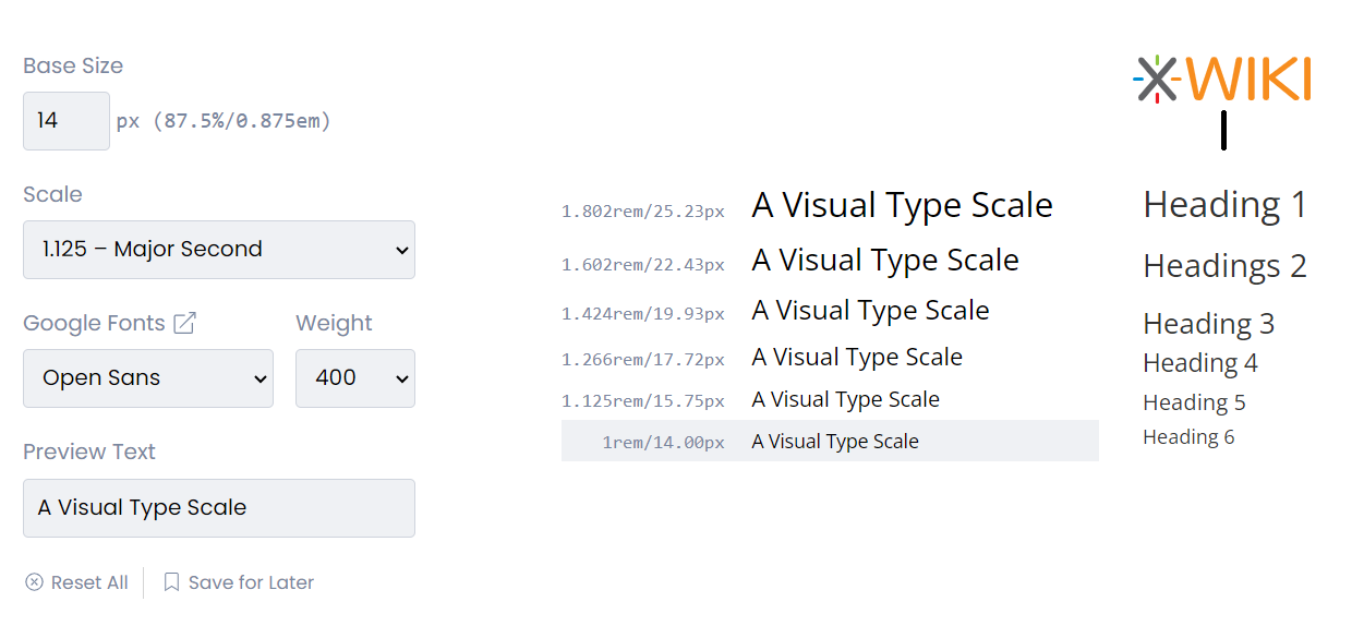
Typography Scales & Contrast

Many typography scales can be positioned in different ā€œcontrast categoriesā€. This kind of typographic contrast refers to how big of a difference is there between each level.

As described here:

High Contrast Scales

Designs that demand a fair amount of contrast between types can use high contrast and hugely benefit from Augmented Fourth, Perfect Fifth, and Golden Ratio. These can be a perfect fit for large screen devices.

Medium Contrast Scales

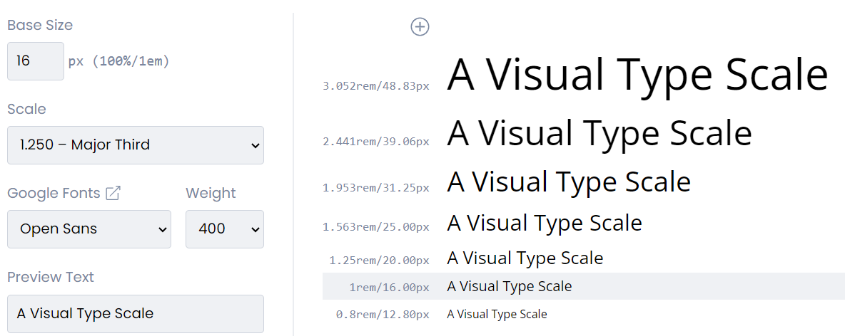
Medium contrast can use The Major Third, Major Second, or Perfect Fourth scales as the contrast between types is not drastic and can fit more content.
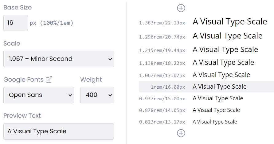
Low Contrast Scales

Designs that should be versatile, such as dashboards and mobile apps, often use low-contrast scales as they allow the content to be flexible. Low contrast scales include Minor Second and Major Second.

Examples of scales

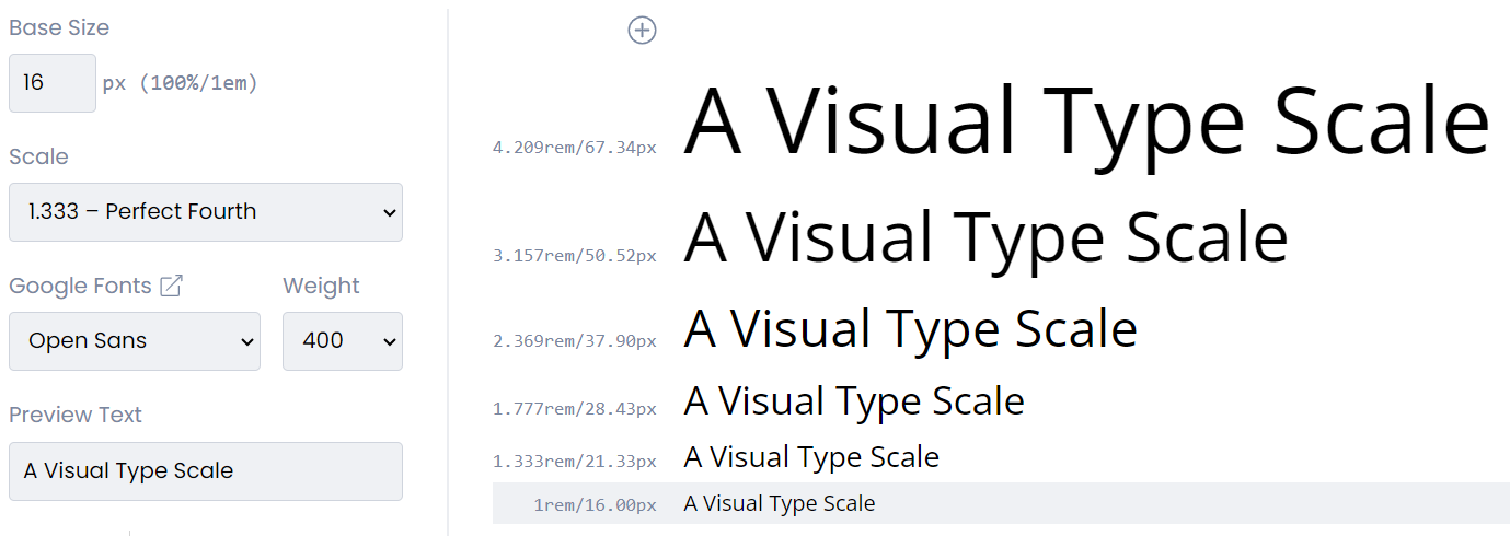
Play with all of them here.

Minor Second (1.200) - low contrast, but versatile (good on dashboards, for example)

image

Major third (1.250) - medium contrast, enough contrast, but not too drastic, still leaving a lot of space for other stuff (good work well for XS)

image

Perfect Fourth(1.333) - higher contrast, good for large screens with lots of space

image

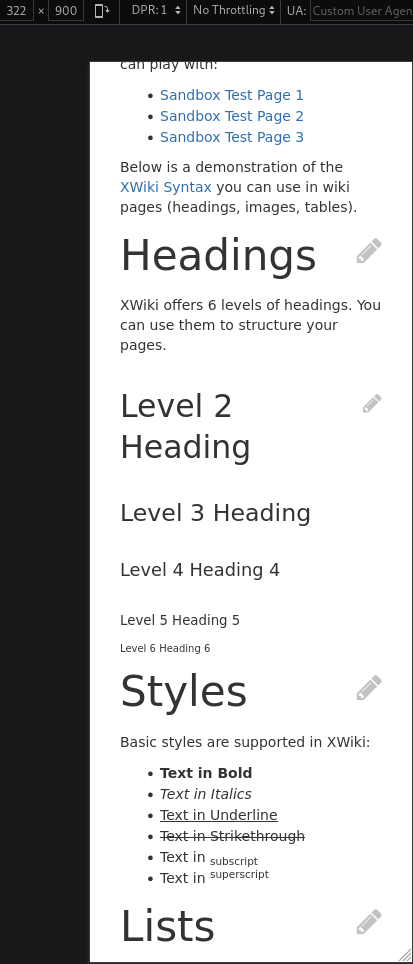
Proposal & Bootstrap 5

Because of these reasons, I believe what would fit XS best is Major Third (1.250), the scale that Bootstrap 5 is using. It has enough difference in levels that it enhances the visual hierarchy, without taking too much space in the content like other higher-contrast scales would:

image

What do you think? :thinking:

I think you should adapt the size of regular text to this too. From what I can see, Heading 5 is barely larger than regular text, and when trying to quickly test it out, my heading 6 is 1rem, which is smaller than the regular text.


Here is a quick view of how this proposal would show up on a low width screen.
image

I think we could change the scale for headings based on the display width (media query). It would allow to use the fourth perfect or a high contrast scale for a better UX on regular computer screens, without having small devices filled up with a single title wrapping over the whole screen. We could go with: large screen ā†’ fourth perfect, small screen ā†’ minor third. Is that an idea to avoid? I think most users wouldnā€™t be able to spot the difference if we did such a switch in scales between devices, but it would still improve readability of the page on small devices.


Overall :+1: from me, as long as the size difference between regular text and low priority headings is handled properly.

Thank you for the proposal, it was really well built :slight_smile:

Note that, according to w3c, having headers with a size smaller than regular text is fine. See the h6 style on 15.3.6 Sections and headings

Also, the default from bootstrap 3 is the following, where h6 is smaller than the font size, and h5 equals to the font size.

@font-size-h1:            floor((@font-size-base * 2.6));  // ~36px
@font-size-h2:            floor((@font-size-base * 2.15)); // ~30px
@font-size-h3:            ceil((@font-size-base * 1.7));   // ~24px
@font-size-h4:            ceil((@font-size-base * 1.25));  // ~18px
@font-size-h5:            @font-size-base;                 // 14px
@font-size-h6:            ceil((@font-size-base * .85));   // ~12px
1 Like

Thatā€™s an interesting idea.
I initially considered using a combination of calc and vw unit (see this article) to make the font scale gradually according to viewport size while keeping coherent min and max heading sizes.
The main cons of this approach is that we would loose the use of the @font-size-hX bootstrap variables.

If we want to stay compliant with bootstrap 3, one option is to define 3 heading size scales for the small/medium/large media sizes that bootstrap 3 support.

1 Like

Iā€™ve quickly put the idea in application with the following less:

  • xs = major second (1.125)
  • sm = minor third (1.200)
  • md = major third (1.250)
  • lg = perfect fourth (1.333)
/* Extra Small devices (up to 768px) */
@media (max-width: @screen-sm-min) {
  h1, .h1 { font-size: 22px;}
  h2, .h2 { font-size: 20px;}
  h3, .h3 { font-size: 18px;}
  h4, .h4 { font-size: 16px;}
  h5, .h5 { font-size: 14px;}
  h6, .h6 { font-size: 12px;}
}

/* Small devices (tablets, 768px and up) */
@media (min-width: @screen-sm-min) {
  h1, .h1 { font-size: 29px;}
  h2, .h2 { font-size: 24px;}
  h3, .h3 { font-size: 20px;}
  h4, .h4 { font-size: 17px;}
  h5, .h5 { font-size: 14px;}
  h6, .h6 { font-size: 12px;}
}

/* Medium devices (desktops, 992px and up) */
@media (min-width: @screen-md-min) {
  h1, .h1 { font-size: 34px;}
  h2, .h2 { font-size: 27px;}
  h3, .h3 { font-size: 22px;}
  h4, .h4 { font-size: 18px;}
  h5, .h5 { font-size: 14px;}
  h6, .h6 { font-size: 11px;}
}

/* Large devices (large desktops, 1200px and up) */
@media (min-width: @screen-lg-min) {
  h1, .h1 { font-size: 44px;}
  h2, .h2 { font-size: 33px;}
  h3, .h3 { font-size: 25px;}
  h4, .h4 { font-size: 19px;}
  h5, .h5 { font-size: 14px;}
  h6, .h6 { font-size: 11px;}
}

This is the result on the sandbox page (donā€™t mind the color, this is just here to make it easier for me to know the currently applied css):
Screenshot 2023-09-05 at 16-53-39 Sandbox - XWiki
Screenshot 2023-09-05 at 16-53-29 Sandbox - XWiki
Screenshot 2023-09-05 at 16-53-18 Sandbox - XWiki

Screenshot 2023-09-05 at 16-53-11 Sandbox - XWiki

2 Likes

Thanks a lot for trying this out and showcasing how itā€™d look for each screen size. From my point of view, itā€™s a definite improvement and the way to go. :partying_face:

One thing Iā€™d change: I do believe that no heading should be smaller than the body text. The Web standards may not specify this but I feel like we should go an extra mile.

I believe that the smallest size for a heading should be equal to the body text, but never go under. Yes, weā€™ll lose the sense of hierarchy between levels when we reach levels 6 and under, but, at the very least, itā€™s easy to differentiate a heading from the normal text.

Iā€™m not 100% sure for that part, if all headings are equal or larger to the base font, assuming we start from a 14px font, that would lead to the sizes listed below.
For the large theme which most users on desktop should currently experience, that would mean a h1 of size 58 instead of 44.
Iā€™ll do some more tests next week but it feels very large.

/* multiplicator: 1.125*/
h1 { width: 25px; /* before: 22px; */ }
h2 { width: 22px; /* before: 19px; */ }
h3 { width: 19px; /* before: 17px; */ }
h4 { width: 17px; /* before: 15px; */ }
h5 { width: 15px; /* before: 14px; */ }
h6 { width: 14px; /* before: 12px; */ }
/* multiplicator: 1.2*/
h1 { width: 34px; /* before: 29px; */ }
h2 { width: 29px; /* before: 24px; */ }
h3 { width: 24px; /* before: 20px; */ }
h4 { width: 20px; /* before: 16px; */ }
h5 { width: 16px; /* before: 14px; */ }
h6 { width: 14px; /* before: 11px; */ }
/* multiplicator: 1.25*/
h1 { width: 42px; /* before: 34px; */ }
h2 { width: 34px; /* before: 27px; */ }
h3 { width: 27px; /* before: 21px; */ }
h4 { width: 21px; /* before: 17px; */ }
h5 { width: 17px; /* before: 14px; */ }
h6 { width: 14px; /* before: 11px; */ }
/* multiplicator: 1.333*/
h1 { width: 58px; /* before: 44px; */ }
h2 { width: 44px; /* before: 33px; */ }
h3 { width: 33px; /* before: 24px; */ }
h4 { width: 24px; /* before: 18px; */ }
h5 { width: 18px; /* before: 14px; */ }
h6 { width: 14px; /* before: 10px; */ }

I think I didnā€™t explain myself well enough, sorry for that. What I meant was not starting directly from 14, but making sure that any heading is at least equal to the body text, despite the multiplicator or the base font size.

For example, I took your initial less and added h7,h8 to further explain what I thought: we still start from a lower size, but then overwrite it (if that makes sense?).

/* Extra Small devices (up to 768px) */
@media (max-width: @screen-sm-min) {
  h1, .h1 { font-size: 22px;}
  h2, .h2 { font-size: 20px;}
  h3, .h3 { font-size: 18px;}
  h4, .h4 { font-size: 16px;}
  h5, .h5 { font-size: 14px;}
   h6, .h6 { font-size: 14px;}
  h7, .h7 { font-size: 14px;}
  h8, .h8 { font-size: 14px;}
}

/* Small devices (tablets, 768px and up) */
@media (min-width: @screen-sm-min) {
  h1, .h1 { font-size: 29px;}
  h2, .h2 { font-size: 24px;}
  h3, .h3 { font-size: 20px;}
  h4, .h4 { font-size: 17px;}
  h5, .h5 { font-size: 14px;}
   h6, .h6 { font-size: 14px;}
  h7, .h7 { font-size: 14px;}
  h8, .h8 { font-size: 14px;}
}

/* Medium devices (desktops, 992px and up) */
@media (min-width: @screen-md-min) {
  h1, .h1 { font-size: 34px;}
  h2, .h2 { font-size: 27px;}
  h3, .h3 { font-size: 22px;}
  h4, .h4 { font-size: 18px;}
  h5, .h5 { font-size: 14px;}
   h6, .h6 { font-size: 14px;}
  h7, .h7 { font-size: 14px;}
  h8, .h8 { font-size: 14px;}
}

/* Large devices (large desktops, 1200px and up) */
@media (min-width: @screen-lg-min) {
  h1, .h1 { font-size: 44px;}
  h2, .h2 { font-size: 33px;}
  h3, .h3 { font-size: 25px;}
  h4, .h4 { font-size: 19px;}
  h5, .h5 { font-size: 14px;}
  h6, .h6 { font-size: 14px;}
  h7, .h7 { font-size: 14px;}
  h8, .h8 { font-size: 14px;}
}

afaik levels below h6 (i.e., h7, h8) are not existing html elements. We could of course introduce h7/h8 css classes but Iā€™m not really sure this is needed.

Iā€™m not convinced having several levels of the same size without any other way to distinguish them visually is a good thing. You wouldnā€™t be able to understand the hierarchy defined by the headers on the document.

On the other hand, Iā€™m not sure that having very low level headings (i.e., h6) slightly slower than the content is an issue.

We can discuss the boldness of the headings text if we want to make them easy to identify?

Note that aria proposes a syntax to define additional header levels. However, this is not well supported by screen readers, so AFAIK we should avoid using them, and instead improve the structure of the document that would need them (possibly split it into different pages).

Bootstrap 3 doesnā€™t support additional heading levels past 6, so I donā€™t think this is a good idea to try and support them ourselves.

1 Like

Oki doki, fair enough, I think I may have overcomplicated things a bit (for some reason, I thought we had lower levels than h6). From my pov, we can go with the initial sizing that youā€™ve proposed and talk about the boldness of the headings next

2 Likes

I also think itā€™s more important to be able to distinguish the different heading levels visually, than have heading be bigger than regular content.

Yep, makes sense! Thanks for the feedback!

You can now find the corresponding pull request:

  • Replace the headings sizes with a size scale
  • Make the headings size proportional to the viewport width, the size is still bounded and wonā€™t get smaller below 768px, or larger above 1200px.
  • The size scale is based on two headings size scale (1.250 for the larger screens, and 1.125 for the smaller screens)
2 Likes

Iā€™ve looked at the PR and from my perspective the changes implemented on the scale look great.

Especially on the smaller screen size, the change makes a big improvement!

also, very cool formula youā€™ve found for computing heading sizes, Iā€™ll take a more in depth look at it

Thanks a lot for working on this, Manuel!!! :partying_face: :star_struck:

XWIKI-21333: Update the weight and font size of headings by manuelleduc Ā· Pull Request #2360 Ā· xwiki/xwiki-platform Ā· GitHub merged

1 Like