Hi to all.
Is it possible customize theme to create boxes like this:
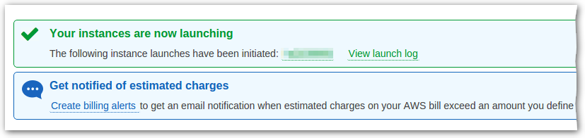 ?
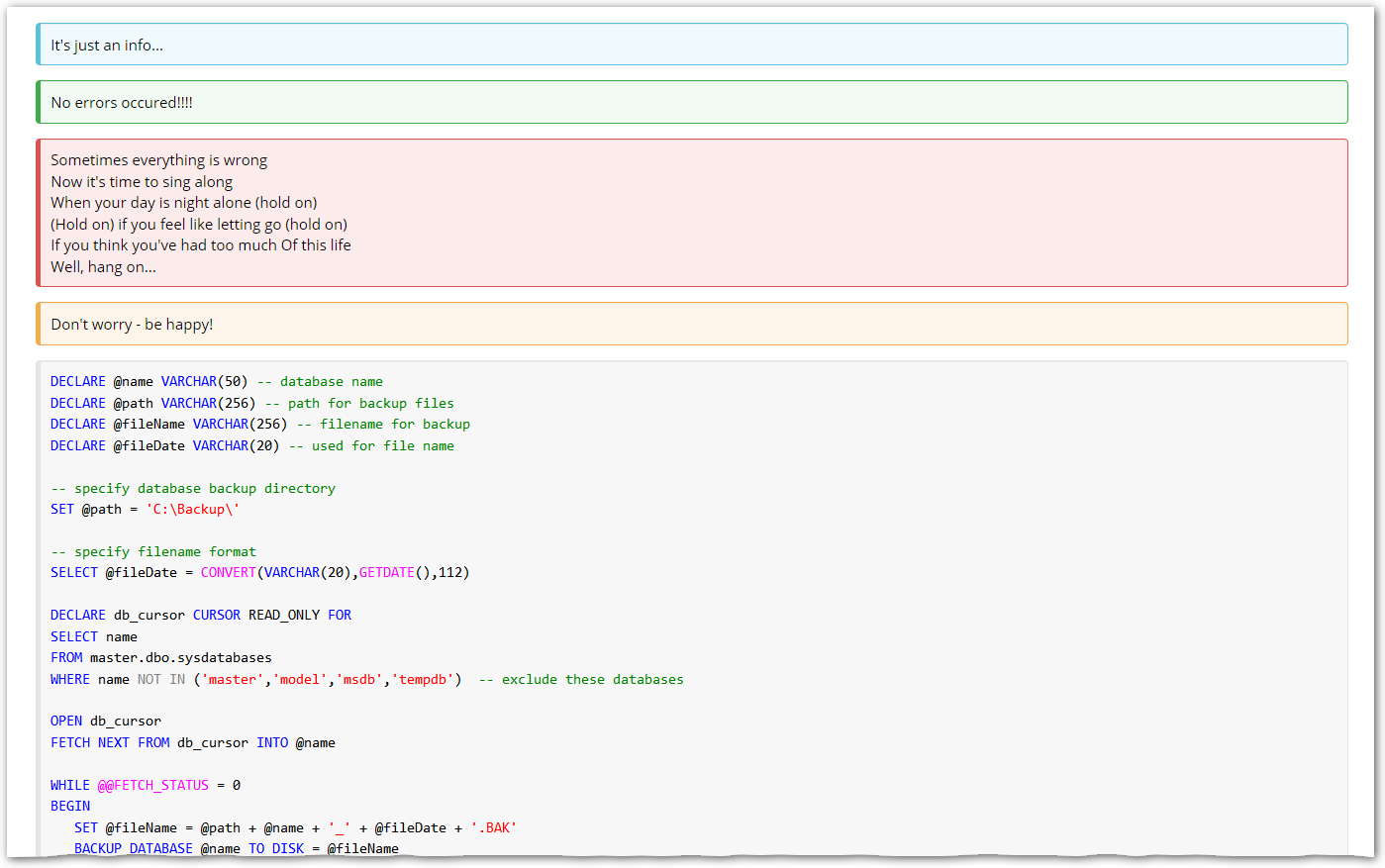
?
Want to be able set bg-color, font-color, border-color; text must be aligned by the left side (not wrapped around image) with configurable pads/margings.
Thanks for advices.
Hi to all.
Is it possible customize theme to create boxes like this:
?
Want to be able set bg-color, font-color, border-color; text must be aligned by the left side (not wrapped around image) with configurable pads/margings.
Thanks for advices.
Yes it’s possible using CSS. Try googling for xwiki skin extension to learn how to inject CSS for wiki pages.
I apologize for my stupid question: everything is much simpler than I imagined.
Just changed the theme by adding the following code:
.box {
  color: @text-color;
  border-style:  solid;
  border-width:  1px 1px 1px 5px;
  border-radius: 4px;
  padding: 10px;
  margin: 0px;
}

.successmessage {
  border-color:     @brand-success;
  background-color:  lighten(@brand-success, 50%);
}

.errormessage {
  border-color:     @brand-danger;
  background-color: lighten(@brand-danger, 37%);
}

.warningmessage {
  border-color:     @brand-warning;
  background-color: lighten(@brand-warning, 33%);
}

.infomessage {
  border-color:     @brand-info;
  background-color: lighten(@brand-info, 35%);
}

//----------------------
Indeed I forgot to mention this option too, cool that you found it! 
Awesome! Thanks for sharing this snippet. Could be the new XWiki default. 
could you post screenshots of the before/after to see how it looks different? Thx
Hi!
Glad to help you and all users 
I added the following snippet to the Advanced section of the Iceberg theme in XWiki 14.0
and adjuest the brand colors:
@brand-success: #56b881
@brand-info: #AAB8C6
@brand-warning: #FFEAAE
@brand-danger: #D04437
which do not deviate too much from the defaults, but Info is not blue anymore.
Still unclear to me, if Note should use the same style as Warning.
.box {
  color: @text-color;
  border-style:  solid;
  border-width:  1px 1px 1px 5px;
  border-radius: 4px;
  padding: 10px;
  margin: 10px;
}

/* We customize the box style */
.successmessage {
  border-color:     @brand-success;
  background-color:  lighten(@brand-success, 40%);
}

.errormessage {
  border-color:  @brand-danger;
  background-color: lighten(@brand-danger, 40%);
}

.warningmessage {
  border-color:     @brand-warning;
  background-color: lighten(@brand-warning, 12%);
}

.infomessage {
  border-color:     @brand-info;
  background-color: lighten(@brand-info, 20%);
}

/*
   We want to show icons globally, without adjusting the macro itself.
   The float:left is doing here the trick to apply to both a box with
   a title and a box without a title.
   Currently only supports for fa-v4 icons https://fontawesome.com/v4/icons/
*/

.successmessage:before {
    font-family: FontAwesome;
    content: "\f058";
    margin-right: 5px;
    float: left;
}

.errormessage:before {
    font-family: FontAwesome;
    content: "\f06a";
    margin-right: 5px;
    float: left;
}

.warningmessage:before {
    font-family: FontAwesome;
    content: "\f071";
    margin-right: 5px;
    float: left;
}

.infomessage:before{
    font-family: FontAwesome;
    content: "\f05a";
    float: left;
    margin-right: 5px;
}
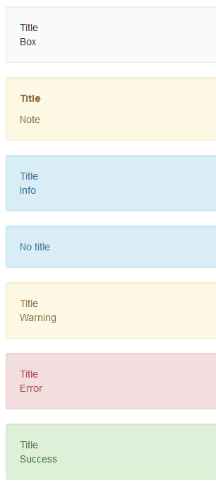
Before:
After:
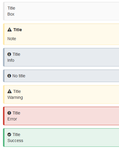
That’s much more attractive. I think it would make for a nicer default.
/copies it into my custom css file/