Hello all,
This proposal is related to Improve the listing of XClass in the XClass picker and place itself in the context of a non-technical user with the need of picking an XClass.
Note that I will not discuss the need to avoid presenting the technical notions of XClass/XObject to end users. That’s going to be for another discussion.
Currently, the information presented to users is the following:
- Spaces
- Page title
The XClasses are grouped by space.
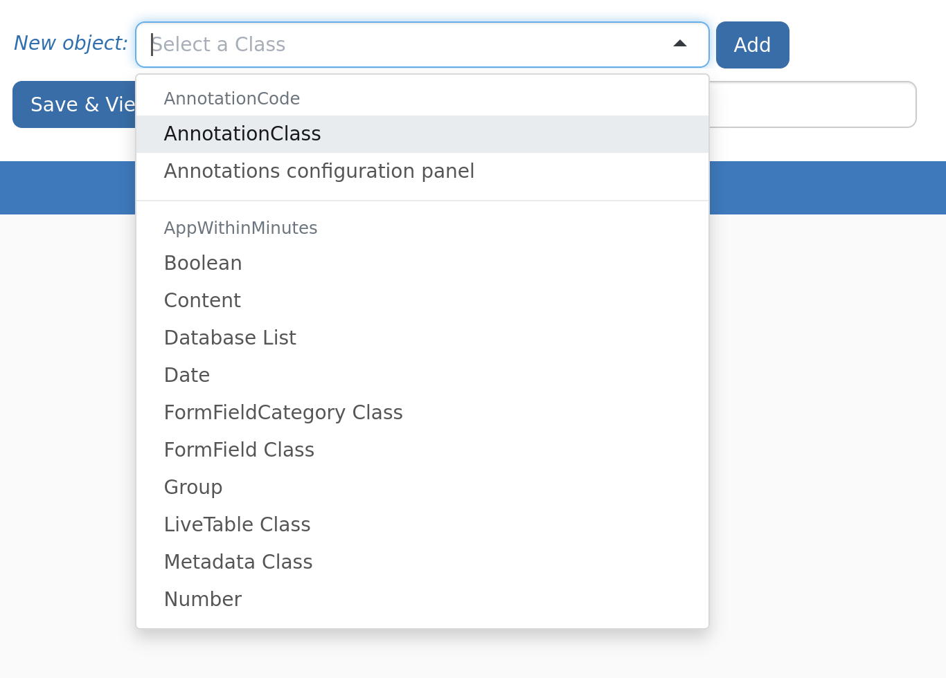
In my option, the proposed information could be improved to
- Help distinguish between different choices
- More easily find and discover the available XClasses
To give a broad idea of what we aim for, see the screenshot below, that I’ll detail afterward. Take the visual with a grain of salt, this is not fully accurate.
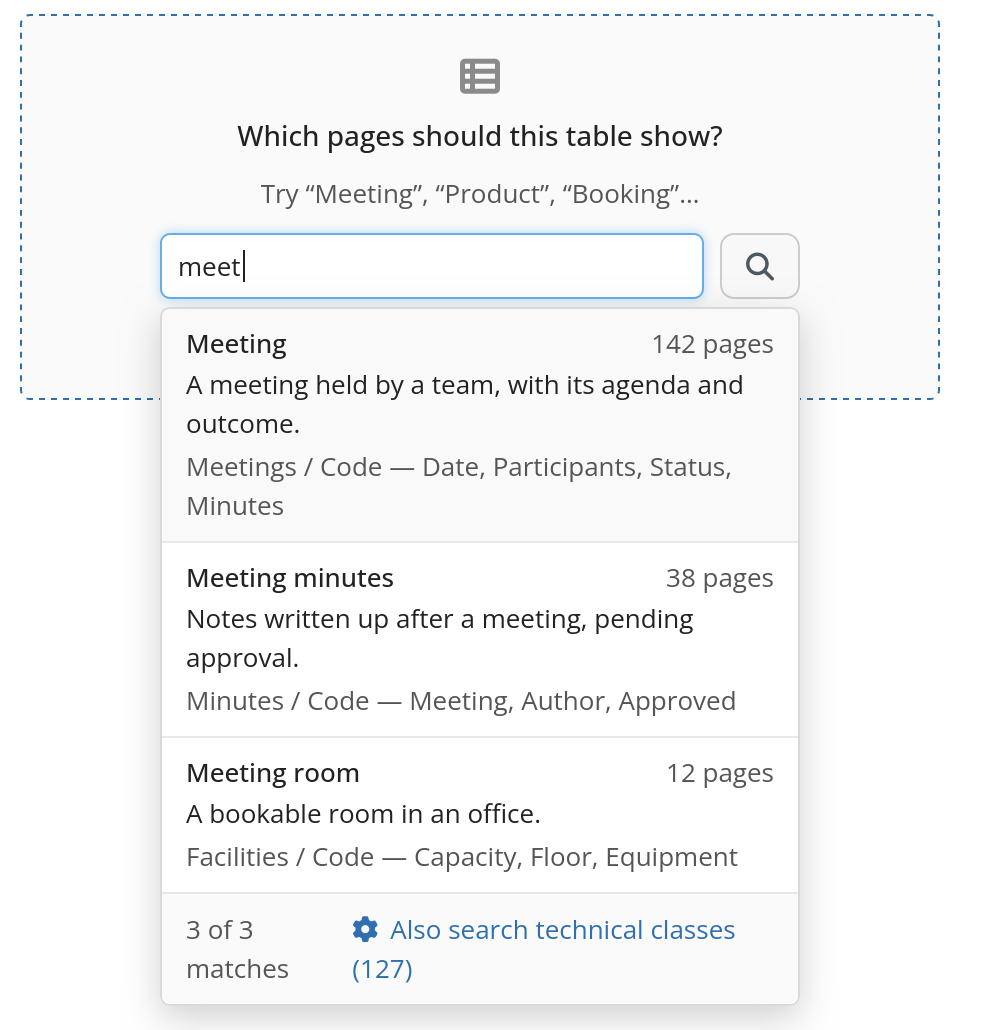
- I1 XClass description in natural language
- I2 Listing of property names
- I3 Count of pages (or XObject instances)
- I4 Toggle to also display XClasses visible to advanced users only (related to Improve the listing of XClass in the XClass picker)
Other UX aspects to consider (mainly for @tkrieck)
UX1 scroll or pagination + display of the count and advanced toggle at the bottom.
Currently, the list can simply be scrolled down when there are more results that the vertical size can fit.
If we wish to display something at the bottom, we could
- display them at a fixed position at the bottom and keep the scrolling for the XClass listing
- Add a “more…” button at the bottom to add more entries
Conclusion
I’m +1 for I1, I2.
I’m +1 for I3 if it is not too slow to execute (since we’ll probably need to take into account the view rights of the current user, which can add complexity). But I’d like to validate that we find this information useful first.
I’m +0 for I4. We usually don’t offer a toggle to switch to advanced. But, it might be useful in cases where the user looks for something, and can’t find it because it is considered advanced for some reason.
UX1.1 seems good enough for me.
Thanks for reading.
WDYT?